
Navigate Smarter with the New WPF OfficeNavigationBar

Need a fancy navigation bar for your WPF apps? And want it to resemble the well-known and daily-used one from your Microsoft Outlook app? Look no more—the RadOfficeNavigationBar component is her for you!
The R1 2023 release has a fresh arrival in the Progress Telerik UI for WPF galaxy—the RadOfficeNavigationBar component.
If I were to create a brief definition for a navbar, it would go this way:
A navigation bar that allows for creating intuitive navigation for any WPF app and that features clickable navigation items, each of which provides the ability to invoke a particular functionality and displays a fully customizable Peek Popup with useful information.
And if I were to create the perfect look for it and show it to you, it would go this way:
Mission Intuitive Navigation
I already mentioned “intuitive navigation” and here is why. It is essential to the success of any application as it helps the end user find any information in a quick and easy manner. Such navigation leads to improved user satisfaction and increases willingness to use the app further.
Well, that is where the RadOfficeNavigationBar comes in handy. So, let’s get to know it in detail together!
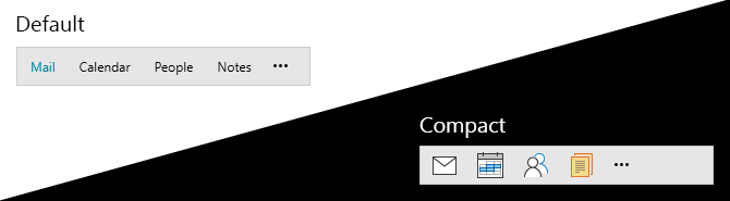
Compact or Not?
First and foremost, I believe that there is a need to introduce you to the possible modes you can choose between to specify how items are visualized.
There is a Default mode which displays the items as text only. And there is an option for a compact one with icons only, which is enabled by the IsInCompactMode property. When this mode is selected, the RadOfficeNavigationBar will use the specified values of CompactContent, CompactContentTemplate and CompactContentTemplateSelector properties of each RadOfficeNavigationBarItem element.
But hey, what about reaching the next level with a more complex structure?
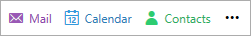
Let’s experiment with the ContentTemplate together:
<telerik:RadOfficeNavigationBar HorizontalAlignment="Left" HorizontalContentAlignment="Left" Background="White">
<telerik:RadOfficeNavigationBarItem Content="Mail">
<telerik:RadOfficeNavigationBarItem.ContentTemplate>
<DataTemplate>
<StackPanel Orientation="Horizontal">
<telerik:RadGlyph Glyph="" Foreground="#9A59B5"/>
<TextBlock Text="{Binding}" Foreground="#8D44AD" Margin="5 0 0 0"/>
</StackPanel>
</DataTemplate>
</telerik:RadOfficeNavigationBarItem.ContentTemplate>
</telerik:RadOfficeNavigationBarItem>
<telerik:RadOfficeNavigationBarItem Content="Calendar">
<telerik:RadOfficeNavigationBarItem.ContentTemplate>
<DataTemplate>
<StackPanel Orientation="Horizontal">
<telerik:RadGlyph Glyph="" Foreground="#3598DB"/>
<TextBlock Text="{Binding}" Foreground="#297FB8" Margin="5 0 0 0"/>
</StackPanel>
</DataTemplate>
</telerik:RadOfficeNavigationBarItem.ContentTemplate>
</telerik:RadOfficeNavigationBarItem>
<telerik:RadOfficeNavigationBarItem Content="Contacts">
<telerik:RadOfficeNavigationBarItem.ContentTemplate>
<DataTemplate>
<StackPanel Orientation="Horizontal">
<telerik:RadGlyph Glyph="" Foreground="#2DCC70"/>
<TextBlock Text="{Binding}" Foreground="#27AE61" Margin="5 0 0 0"/>
</StackPanel>
</DataTemplate>
</telerik:RadOfficeNavigationBarItem.ContentTemplate>
</telerik:RadOfficeNavigationBarItem>
</telerik:RadOfficeNavigationBar>
Here is the result:
Preview Available with Peek Callout
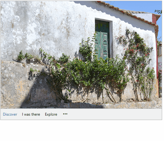
Proceeding with the cool stuff, the office navigation bar can display a Peek Callout popup preview window. And it is certainly ready to serve a variety of needs.
The popup appears when the user is hovering over an office navigation bar item. It lets you display the content of your choice—simply anything that you desire could be shown—the magic happens with PeekPopupContent, PeekPopupContentTemplate and PeekPopupContentTemplateSelector properties. If you want to benefit from all of this, you just need to enable it by setting the IsPeekPopupEnabled property to True.
Check out the Peek Popup section of the control’s online documentation for tips and tricks around popup adjustments.
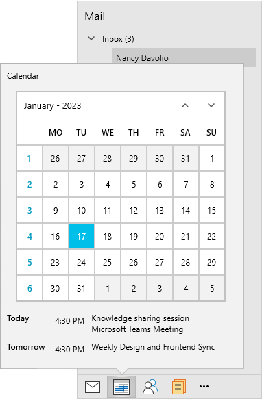
As the popup is using RadCallout you have all its features, too! Yep, this totally means freedom for creating a variety of different shapes and looks of popups and adjusting each detail until you achieve the perfect Peek Callout layout through the PeekPopupStyle. Oh, I almost forgot the PeekPopupShowDelay and PeekPopupCloseDelay props, which I believe are self-explanatory.
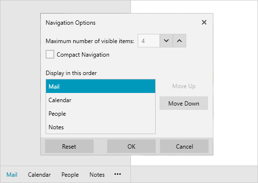
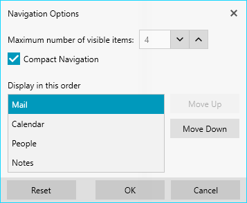
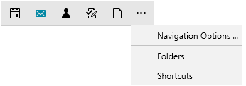
The Three Dots
Noticed the three dots? No more wondering what clicking them does … It opens the navigation options dialog. Here you can choose the mode of the control—Compact or Default, how many items you wish to display, as well as their display order. Once finished, make sure to click OK to confirm it all. 😊
Overflowing
Having too many items is tough. The need to fit them in a small app space—even tougher. But hey, don’t worry! The RadOfficeNavigationBar’s Overflow menu is here to save the day—it will help you control the visible items in the navbar and the order in which they appear.
Reordering
Let’s talk some arrangements. I know you’re wondering whether and how you can change the order the items are arranged without using the Navigation Options dialog. And the answer is yes. Here, the IsDragReorderEnabled property will do the trick. Switching it on is almost enough. The other important thing is to set the DragDropManager.AllowCapturedDrag attached property for each RadOfficeNavigationBarItem element.
<telerik:RadOfficeNavigationBar x:Name="radOfficeNavigationBar" IsDragReorderEnabled="True" Grid.Row="3" Margin="30" HorizontalAlignment="Left" HorizontalContentAlignment="left">
    <telerik:RadOfficeNavigationBar.ItemContainerStyle>
        <!--Set BasedOn property if NoXaml assemblies are used: BasedOn="{StaticResource RadOfficeNavigationBarItemStyle}"-->
        <Style TargetType="telerik:RadOfficeNavigationBarItem">
            <Setter Property="telerik:DragDropManager.AllowCapturedDrag" Value="True"/>
            <Setter Property="MinWidth" Value="50"/>
        </Style>
    </telerik:RadOfficeNavigationBar.ItemContainerStyle>
    <telerik:RadOfficeNavigationBar.Items>
        <telerik:RadOfficeNavigationBarItem Content="Mail "/>
        <telerik:RadOfficeNavigationBarItem Content="Calendar "/>
        <telerik:RadOfficeNavigationBarItem Content="People"/>
        <telerik:RadOfficeNavigationBarItem Content="Notes"/>
        <telerik:RadOfficeNavigationBarItem Content="Tasks"/>
    </telerik:RadOfficeNavigationBar.Items>
</telerik:RadOfficeNavigationBar>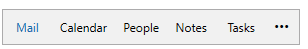
Skin Changing
Um, no, the office nav bar is not a snake, but it can have as many different skins as one, lol. The RadOfficeNavigaion comes with the full variety of the UI for the WPF Themes Suite. Don’t be afraid to experiment with different colors by using our ColorThemeGenerator as well.
Alliance Greatness
Do you know that the RadOfficeNavigationBar and the RadNavigationView form a great alliance? The nav bar is simply a great complement to the nav view’s bottom nav panel. Shall we see how this looks?
Time for Feedback
Your opinion matters! So, share your thoughts about our new RadOfficeNavigationBar control in the comments below. Or visit the Telerik UI for WPF Feedback Portal and let us know if you have any suggestions or if you need any particular features.
And in case you haven’t already done so, do not wait another minute to try out the latest:
Maria Hadzhieva
Maria Hadzhieva is a front-end developer on the Progress Telerik team.
Related Posts
Comments
All articles
Topics

Latest Stories
in Your Inbox
Subscribe to be the first to get our expert-written articles and tutorials for developers!
All fields are required