In this article, we will build a to-do app to see TanStack DB in action. We’ll cover how to set up collections, what “live queries” are, and why “differential dataflow” makes it so fast. We'll also cover when to use TanStack DB and when TanStack Query alone is enough.TanStack Query is a popular library for developers to manage server data in React applications. While it excels at fetching and caching data, it has one fundamental limitation: it treats all data as independent key-value pairs.
For example, TanStack Query doesn’t understand that your ['todos'] data is related to your ['categories'] data. When you need to show “all todos in the Work category,” you’re forced to write messy, manual .filter() and .find() logic and cross-reference data inside your components.
This is the exact problem TanStack DB solves. It’s not a replacement for TanStack Query; it’s a new layer that enhances it. TanStack Query still handles all server communication (fetching, caching, revalidation), but it feeds that data into a high-performance, local, queryable database with proper relationships.
Instead of filtering arrays manually, your components query the local database using a structured query. The result is cleaner components, better performance and automatic reactivity when data changes.
In this article, we’ll build a to-do app to see it in action. We’ll see how to set up the collection, what “live queries” are, and why “differential dataflow” makes it so fast. We’ll also cover when you should actually reach for this and when you’re better off just sticking with plain TanStack Query.
Evolution of Data Fetching in React
To understand why TanStack DB is a big deal, it helps to look at different ways developers have tried to handle data fetching in React.
The useEffectHook
If you’ve been building React for a while, you’ve seen useEffect used for data fetching everywhere. A typical pattern looks like this:
function TodoList() {
const [todos, setTodos] = useState([]);
const [loading, setLoading] = useState(true);
const [error, setError] = useState(null);
useEffect(() => {
setLoading(true);
fetch('/api/todos')
.then(res => res.json())
.then(data => {
setTodos(data);
setLoading(false);
})
.catch(err => {
setError(err);
setLoading(false);
});
}, []);
if (loading) return <div>Loading...</div>;
if (error) return <div>Error!</div>;
return <div>{}</div>;
}
This pattern was everywhere, and it worked, but it had serious problems. Every component mount triggered a data fetch since there was no caching. You had to manually track loading and error states every single time. Once you fetched the data, it just sat there getting stale with no background updates, and if two components needed the same data, they’d fetch it separately.
Tanstack Query (React Query)
TanStack Query solved these problems by abstracting away the complexity of data fetching.
function TodoList() {
const { data: todos, isLoading, error } = useQuery({
queryKey: ['todos'],
queryFn: fetchTodos
});
if (isLoading) return <div>Loading...</div>;
if (error) return <div>Error!</div>;
return <div>{}</div>;
}
The code snippet above is way cleaner, right? TanStack Query came with powerful features like automatic caching that lets you fetch once and use everywhere, background refetching that keeps data fresh automatically, built-in loading and error states, request deduplication so multiple components only fetch once, and stale-while-revalidate patterns. TanStack Query basically solved the “fetching from APIs” problem.
Despite all these perks, there’s still a problem. The thing with TanStack Query is that it’s great at getting data, but once that data arrives, it treats everything as separate entities—no relationships.
Imagine we’re building a to-do app with categories. We fetch todos, we fetch categories. Both queries work perfectly. But what if we want to show “all uncompleted Work todos,” how do we do it?
We’d end up writing something like this:
const { data: todos } = useQuery(['todos'], fetchTodos);
const { data: categories } = useQuery(['categories'], fetchCategories);
const workCategory = categories.find(c => c.name === 'Work');
const uncompletedWorkTodos = todos .filter(t => t.categoryId === workCategory?.id) .filter(t => !t.completed);
This works. But notice what’s happening? We’re manually filtering and joining data, and code like this runs on every render. With 10 todos? It feels seamless. But scale that to a thousand todos, and we’ll start feeling the lag, especially if we’re not careful with memoization. Our app gets sluggish.
The issue here is that the todos cache and the categories cache don’t know about each other. They’re completely isolated. If we want to connect them, we’d have to do that manually every single time.
Project Setup
We’re going to set up a simple to-do app from scratch. The goal is to build two lists, “Pending” and “Completed,” and watch items move between them instantly. No manual state management, no useMemo hooks for filtering, just a reactive, local-first database.
We’ll use Vite. It’s the fastest way to get a React + TypeScript project running.
Open your terminal and run the following command:
npm create vite@latest tanstack-db-demo -- --template react-ts
Once that’s finished, move into the new directory and install the default packages:
cd tanstack-db-demo
npm install
With the basics installed, let’s add our two core libraries. We’ll install react-query (the “delivery service”) and react-db (our new “smart warehouse”).
Next, we’ll install TanStack Query to handle server syncing and TanStack DB to store that data in a queryable local database.
npm install @tanstack/react-query @tanstack/db
Setting up the File Structure
Let’s clean up the src folder. You can delete the App.css file and the assets folder that Vite gives you. We’ll replace them with our own index.css and two new files: types.ts and db.ts.
When you’re done, your src folder should look like this:
src/
── components/   (We'll add this later)
── App.tsx       (Already there, we'll edit it)
── db.ts         (New file)
── index.css     (Already there, we'll edit it)
── main.tsx      (Already there, we'll edit it)
── types.ts      (New file)
Defining the Local Collection
With our project set up, let’s get to the core of our app’s data logic. We’ll do this in a new file, src/db.ts. It’s important to understand that TanStack DB is built to work with TanStack Query, not replace it.
This db.ts file will set up both the QueryClient, which is the standard engine from TanStack Query, and the main cache that all our data will flow through, and the Collection, which is the new part from TanStack DB—our actual, reactive table that will hold the todos.
We’ll start with localOnlyCollectionOptions to build a simple, in-memory collection first. This lets us build our UI without worrying about a server yet. Go ahead and add the following to your src/db.ts file:
import { QueryClient } from "@tanstack/react-query";
import {
createCollection,
localOnlyCollectionOptions,
} from "@tanstack/react-db";
import type { Todo } from "./types";
export const queryClient = new QueryClient();
const initialTodos: Todo[] = [
{ id: 1, text: "Learn TanStack DB", completed: true },
{ id: 2, text: "Write the blog post", completed: false },
{ id: 3, text: 'Show "live queries"', completed: false },
];
export const todoCollection = createCollection<Todo, number>(
localOnlyCollectionOptions({
id: "todos",
getKey: (todo) => todo.id,
initialData: initialTodos,
})
);
The code snippet above is pretty straightforward. Let’s break it down and be clear on what each part does:
- queryClient: This is just the standard QueryClient from
@tanstack/react-query. We create one and export it because our whole app needs to share a single cache. - initialTodos: This is just some dummy data, so our app doesn’t start empty.
- todoCollection: This is the core of our setup. We’re defining our “table.”
- localOnlyCollectionOptions: This is our starting point. It’s a helper that tells TanStack DB to be a local-only database. It won’t try to fetch anything or talk to a server. It’s the perfect way to build out our UI before we’ve written an API.
- getKey: This is important. It’s the primary key for our “table,” telling TanStack DB how to find any specific to-do. So we’ll just use
todo.id.
Now, we have a fully typed, in-memory database populated with initial data, all in one file. We just need to tell our React app to actually use this setup. We’ll do that in the next step by wiring up our queryClient in main.tsx file.
Configuring the App
We have our queryClient and todoCollection defined in the src/db.ts file . But the thing is, our React app doesn’t automatically know they exist. They’re just isolated pieces of code right now.
To make everything work together, we need to connect that queryClient to our component tree. This isn’t a TanStack DB-specific thing; it’s how TanStack Query works, and we’ll need a QueryClientProvider at the root. This provider uses React Context under the hood to pass the client instance down, making sure all your hooks (useQuery, useMutation and eventually useLiveQuery) are all talking to the same central cache.
It’s a straightforward setup in our main entry file, src/main.tsx. We just need to do two things:
- Import the
queryClient that we already exported from ./db - Wrap our main
<App /> component with <QueryClientProvider>, passing that imported queryClient to its client prop
Here’s what that looks like in the code:
import { StrictMode } from "react";
import { createRoot } from "react-dom/client";
import { QueryClientProvider } from "@tanstack/react-query";
import "./index.css";
import App from "./App.tsx";
import { queryClient } from "./db";
createRoot(document.getElementById("root")!).render(
  <StrictMode>
    <QueryClientProvider client={queryClient}>
      <App />
    </QueryClientProvider>
  </StrictMode>
);
With that provider set up, our app is ready. The queryClient is available everywhere, which means TanStack DB can now hook into it. All the groundwork is done.
Next, let’s build the UI in App.tsx file and see how useLiveQuery pulls our data into the components.
Building the UI with Live Queries
We have our setup at this point. Our queryClient is provided, and our todoCollection is ready, so the next thing is to pull our data into the UI.
This is where useLiveQuery comes in. It’s a hook TanStack DB gives us to read from our database, and it’s the core of what makes this whole setup “reactive.” In this context, “reactive” means our UI will update immediately and automatically whenever our data changes, without us having to force a re-render manually.

If we were doing this the old way, we would fetch data, dump it into our useState hook, and then if we added a new todo, we would have to call setTodos([...todos, newTodo]) just to see the change.
But with useLiveQuery, we don’t need to do that. Our component subscribes to the database, and when we call todoCollection.insert(), the useLiveQuery sees the change, retrieves the new data, and our component re-renders.
Let’s look at useLiveQuery as subscribing to your database. What happens behind the scenes is this: when your component mounts, useLiveQuery subscribes to the database. It runs your query and gives you the current data, then keeps watching the database for any changes. When data changes (insert, update, delete), it automatically reruns your query. Your component receives the fresh data and re-renders, without you having to manage any state manually.

Let’s build our UI. We’ll start by creating two simple components: TodoForm and TodoList.
Creating Components
Run the command below in your terminal to create a new src/components folder:
mkdir src/components
We’ll put our new components here. These are presentational components—they just take props and render UI. They have no knowledge of TanStack DB.
Create a src/components/TodoForm.tsx file and add the following to it:
import { useState } from "react";
type TodoFormProps = {
  onAdd: (text: string) => void;
};
export const TodoForm = ({ onAdd }: TodoFormProps) => {
  const [newTodoText, setNewTodoText] = useState("");
  const handleSubmit = (e: React.FormEvent) => {
    e.preventDefault();
    if (!newTodoText.trim()) return;
    onAdd(newTodoText);
    setNewTodoText("");
  };
  return (
    <form onSubmit={handleSubmit} className="todo-form">
      <input
        type="text"
        value={newTodoText}
        onChange={(e) => setNewTodoText(e.target.value)}
        placeholder="What needs to be done?"
        className="todo-input"
      />
      <button type="submit" className="todo-add-button">
        Add
      </button>
    </form>
  );
};
This is a controlled component that manages the input field’s value in its own state. When submitted, it passes the text up to the parent component via the onAdd prop.
Create a src/components/TodoList.tsx file and add the following to it:
import type { Todo } from "../types";
type TodoListProps = {
title: string;
todos: Todo[];
onToggle: (todo: Todo) => void;
onDelete: (todo: Todo) => void;
};
export const TodoList = ({
title,
todos,
onToggle,
onDelete,
}: TodoListProps) => {
return (
  <div className="todo-list-container">
    <h2 className="todo-list-title">
      {title} ({todos.length})
    </h2>
    {todos.length === 0 ? (
      <p className="todo-item-placeholder">Nothing here!</p>
    ) : (
      <ul className="todo-list">
        {todos.map((todo) => {
          const checkboxId = `todo-checkbox-${todo.id}`;
          return (
            <li
              key={todo.id}
              className={`todo-item ${todo.completed ? "completed" : ""}`}
            >
              <input
                type="checkbox"
                id={checkboxId}
                checked={todo.completed}
                onChange={() => onToggle(todo)}
                className="todo-item-checkbox"
              />
              <label
                htmlFor={checkboxId}
                style={{ color: "black", display: "inline" }}
              >
                {todo.text || "NO TEXT"}
              </label>
              <button
                onClick={() => onDelete(todo)}
                className="todo-delete-button"
              >
                <svg
                  xmlns="http://www.w3.org/2000/svg"
                  fill="none"
                  viewBox="0 0 24 24"
                  stroke="currentColor"
                >
                  <path
                    strokeLinecap="round"
                    strokeLinejoin="round"
                    strokeWidth={2}
                    d="M19 7l-.867 12.142A2 2 0 0116.138 21H7.862a2 2 0 01-1.995-1.858L5 7m5 4v6m4-6v6m1-10V4a1 1 0 00-1-1h-4a1 1 0 00-1 1v3M4 7h16"
                  />
                </svg>
              </button>
            </li>
          );
        })}
      </ul>
    )}
  </div>
);
};
This component is only responsible for displaying the list of todos. It receives the todos array as a prop, shows a “Nothing here!” message if the list is empty, or maps over the array to render each item.
Updating App.tsx File
Now let’s open src/App.tsx and wire everything together. First, we need to import our new components (TodoForm and TodoList). Then we’ll call useLiveQuery twice—one query to get all todos where completed is false, and a second query to get all todos where completed is true.
Next, we’ll create our event handlers (handleAddTodo, handleToggleTodo, handleDeleteTodo), which is where we write to the database. Finally, we’ll render the components and pass the data and handlers as props.
Here’s what our src/App.tsx file should look like:
import { useMemo } from "react";
import { useLiveQuery, eq } from "@tanstack/react-db";
import { todoCollection } from "./db";
import type { Todo } from "./types";
import { TodoForm } from "./components/TodoForm";
import { TodoList } from "./components/TodoList";
function TodoApp() {
  const { data: pendingTodos = [] } = useLiveQuery((q) =>
    q
      .from({ todo: todoCollection })
      .where(({ todo }) => eq(todo.completed, false))
  );
  const { data: completedTodos = [] } = useLiveQuery((q) =>
    q
      .from({ todo: todoCollection })
      .where(({ todo }) => eq(todo.completed, true))
  );
  const sortedPending = useMemo(
    () => [...pendingTodos].reverse(),
    [pendingTodos]
  );
  const sortedCompleted = useMemo(
    () => [...completedTodos].reverse(),
    [completedTodos]
  );
  const handleAddTodo = (text: string) => {
    const newTodo: Todo = {
      id: Date.now(),
      text,
      completed: false,
    };
    console.log("APP: Inserting new todo", newTodo);
    todoCollection.insert(newTodo);
  };
  const handleToggleTodo = (todo: Todo) => {
    console.log("APP: Toggling todo", todo);
    todoCollection.update(todo.id, (draft) => {
      draft.completed = !draft.completed;
    });
  };
  const handleDeleteTodo = (todo: Todo) => {
    console.log("APP: Deleting todo", todo);
    todoCollection.delete(todo.id);
  };
  return (
    <div className="app-container">
      <h1 className="app-title">TanStack DB To-Do</h1>
      <TodoForm onAdd={handleAddTodo} />
      <TodoList
        title="Pending"
        todos={sortedPending}
        onToggle={handleToggleTodo}
        onDelete={handleDeleteTodo}
      />
      <TodoList
        title="Completed"
        todos={sortedCompleted}
        onToggle={handleToggleTodo}
        onDelete={handleDeleteTodo}
      />
    </div>
  );
}
export default TodoApp;
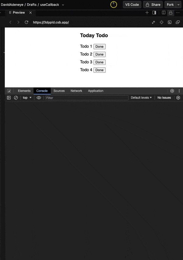
Notice the useLiveQuery hooks and what they look like when you’re querying a SQL database. If you run npm run dev at this point, you’ll have a local-only to-do app.
The key takeaway here is our App component doesn’t manage any state. There are no useState hooks for the to-do lists. It just asks TanStack DB for two different lists (Pending and Completed).
When you add a new to-do, handleAddTodo calls todoCollection.insert(). The data is added to the local database, and TanStack DB automatically reruns any query affected by this change. The UI updates instantly because we’re just writing to a local database. This is a concept called an “optimistic update,” and we get it for free.
Right now, this is all happening in the browser. In the next step, we’ll connect this to a server.
Syncing to a Server
Before we update our db.ts file, we need an API to talk to. We don’t have a real backend, so we’re going to simulate a fake one. This is the best way to see optimistic updates in action because we can add an artificial delay to simulate real network lag.
Let’s create a new file, src/api.ts, that uses localStorage to save todos so they actually persist when we refresh. And we’ll add a one-second setTimeout to every request to mimic what it feels like when your app is talking to a real server.
Add the following to your src/api.ts file:
import type { Todo } from "./types";
const TODOS_STORAGE_KEY = "todos";
const wait = (ms: number) => new Promise((resolve) => setTimeout(resolve, ms));
const loadTodos = (): Todo[] => {
const data = localStorage.getItem(TODOS_STORAGE_KEY);
return data ? (JSON.parse(data) as Todo[]) : [];
};
const saveTodos = (todos: Todo[]) => {
localStorage.setItem(TODOS_STORAGE_KEY, JSON.stringify(todos));
};
export const api = {
todos: {
getAll: async () => {
await wait(1000);
console.log("SERVER: (GET) Fetched all todos");
return loadTodos();
},
create: async (newTodo: Todo) => {
await wait(1000);
const todos = loadTodos();
const updatedTodos = [...todos, newTodo];
saveTodos(updatedTodos);
console.log("SERVER: (POST) created new todo", newTodo);
return newTodo;
},
update: async (updatedTodo: Todo) => {
await wait(1000);
const todos = loadTodos();
const updatedTodos = todos.map((todo) =>
todo.id === updatedTodo.id ? updatedTodo : todo
);
saveTodos(updatedTodos);
console.log("SERVER: (PUT) updated todo", updatedTodo);
return updatedTodo;
},
delete: async (id: number) => {
await wait(1000);
const todos = loadTodos();
const updatedTodos = todos.filter((todo) => todo.id !== id);
saveTodos(updatedTodos);
console.log("SERVER: (DELETE) deleted todo", id);
return { id };
},
},
};
Now that we have our src/api.ts ready, the next step is to update our db.ts to tell it to use our API. This is where we’ll swap the localOnlyCollectionOptions for queryCollectionOptions, just as we discussed earlier.
At this point, we need to do three things: install the adapter package that connects TanStack Query and TanStack DB, import the queryCollectionOptions from this new package, and replace localOnlyCollectionOptions with queryCollectionOptions.
Run this install command in your terminal:
npm install @tanstack/query-db-collection
This package gives us the bridge between TanStack Query (server state) and TanStack DB (local state).
Now replace the entire content of your src/db.ts file with the following:
import { QueryClient } from "@tanstack/react-query";
import { createCollection } from "@tanstack/react-db";
import { queryCollectionOptions } from "@tanstack/query-db-collection";
import { api } from "./api";
import type { Todo } from "./types";
export const queryClient = new QueryClient();
export const todoCollection = createCollection<Todo, number>(
queryCollectionOptions({
queryClient,
queryKey: ["todos"],
queryFn: api.todos.getAll,
getKey: (todo) => todo.id,
onInsert: async ({ transaction }) => {
console.log("DB: Inserting...", transaction.mutations[0].modified);
await api.todos.create(transaction.mutations[0].modified as Todo);
},
onUpdate: async ({ transaction }) => {
console.log("DB: Updating...", transaction.mutations[0].modified);
await api.todos.update(transaction.mutations[0].modified as Todo);
},
onDelete: async ({ transaction }) => {
console.log("DB: Deleting...", transaction.mutations[0].original);
await api.todos.delete(transaction.mutations[0].original.id);
},
})
);
Start your app and try adding a new todo or toggling an existing one. The UI updates instantly, right? Now open your browser console and watch the sequence:
- Immediately:
DB: Inserting… – our local database write - One second later:
SERVER: Created new todo... – server sync
This is the optimistic update in action, and it’s an important concept. The simple idea is we update the UI immediately, before we’ve even confirmed the change with the server. Our app is being optimistic that the server request will succeed.
The user gets an app that feels fast and instant. All the work of saving data happens in the background. The user never sees a loading spinner. They never wait. They just see their change appear immediately.

Let’s break the above diagram down. It starts with the user clicking a button in the app. The UI sends a write command to the database: todoCollection.insert(). That’s all, just write to the local database.
Now here is where the fun happens. The moment that the local database receives the new data, it does two things at the same time:
- Immediate optimistic update – The
useLiveQuery() hook in our app is always listening. It gets the new data instantly. The app re-renders, and the user sees their new todo appear. - Background server sync – At the same time, the local database triggers the server sync. It calls the
onInsert function we wrote, which starts the slow one-second request to the server.
The key takeaway here is that the user’s experience is only tied to Step 1, that is, the immediate update. They get instant feedback. All the slow/heavy requests happen in the background.

Differential Data-Flow
We’ve talked about live queries and optimistic updates. Now let’s look at what makes TanStack DB fast: differential dataflow. Let’s break down this concept to understand why TanStack DB feels so smooth.
In a React app, when data changes, you recalculate everything that depends on it. For instance, say we have 2,000 todos and you mark one as completed. What happens?
One approach is:
const pendingTodos = todos.filter(t => !t.completed);
const completedTodos = todos.filter(t => t.completed);
const pendingCount = pendingTodos.length;
const completedCount = completedTodos.length;
This is the traditional approach. One thing changes, and you had to loop through 2,000 todos twice, then count them both. With a small number of todos—let’s say 10-20—this won’t be a problem, but with over a thousand, the app might start to feel slow.
Let’s look at what happens under the hood when we have 2,000 todos:
- Loop through 2,000 todos and filter pending todos—that’s 2,000 operations
- Loop through 2,000 todos again to filter completed todos—another 2,000 operations
- Count pending—one operation
- Count completed—one operation
At the end of the day, we’ll have over 4,000 operations just for this simple computation of finding completed tasks.
On the other hand, with differential dataflow, it just asks: “What changed?” Instead of recalculating everything, it only updates what was affected.
Let’s look at how differential dataflow handles it:
- First, it detects that todo #101 has changed
- Next, it figures out which queries care:
- Pending list (remove todo #101)
- Completed list (add todo #101)
- Pending count (subtract 1)
- Completed count (add 1)
That’s approximately five operations.
Notice the difference: the first approach loops through everything. Differential dataflow only cares about what changed. One todo changed, so it does the work for one todo. The rest of the data remains untouched.
When to Use TanStack DB
TanStack DB makes the most sense when you’re dealing with related data. If you have todos connected to categories, posts linked to authors or products with reviews, it makes working with those relationships way easier than manually joining arrays.
TanStack DB is also a great fit if you need to run complex queries on the client side or if you’re building an app that needs real-time UI updates. If you’re building an offline-first app where users need to work without an internet connection and sync when they’re back online, TanStack DB is built to handle that.
On the other hand, if your data is simple, maybe you’re just fetching a list or a single blog post, TanStack Query alone is fine. There are no relationships to handle, so TanStack DB isn’t worth it.
And if your data rarely changes and you’re OK with manual refetching, live queries are probably overkill. TanStack DB isn’t for every app, but when you need it, it does a very good job.
Conclusion
So that’s TanStack DB. A reactive database that lives in your browser gives you relationships between your data, updates your UI instantly with live queries, and stays fast even with thousands of items—all thanks to differential dataflow.
It’s important to note that it’s not replacing TanStack Query. It works alongside it. TanStack Query handles your server state: fetching from APIs, caching and keeping things in sync. TanStack DB handles your client state: storing that data locally and letting you query it like a real database. Together, they give you the best of both worlds—server syncing and fast local queries.
 ]]>
]]>


 ]]>
]]>
 ]]>
]]> ]]>
]]> ]]>
]]>
 ]]>
]]>
 ]]>
]]>


 ]]>
]]>
 ]]>
]]> ]]>
]]>
 ]]>
]]>
 ]]>
]]>
 ]]>
]]> ]]>
]]>


 ]]>
]]>