Today, we are excited to announce the availability of R2 2022 release. In this blog post we will cover the highlights of the release for the Telerik desktop and mobile products.R2 2022 brings a plethora of new components and features for Telerik mobile and desktop products, support for the latest Preview of .NET 7, ARM64 support and an extremely beautiful new Windows 11 theme for the desktop products. The Telerik UI for .NET
MAUI suite also continues to grow with new components and desktop support, making it the largest UI component suite for .NET MAUI out there.
Here are a few links to the different sections in this blog to help you navigate directly to the section of interest.
Table of Contents
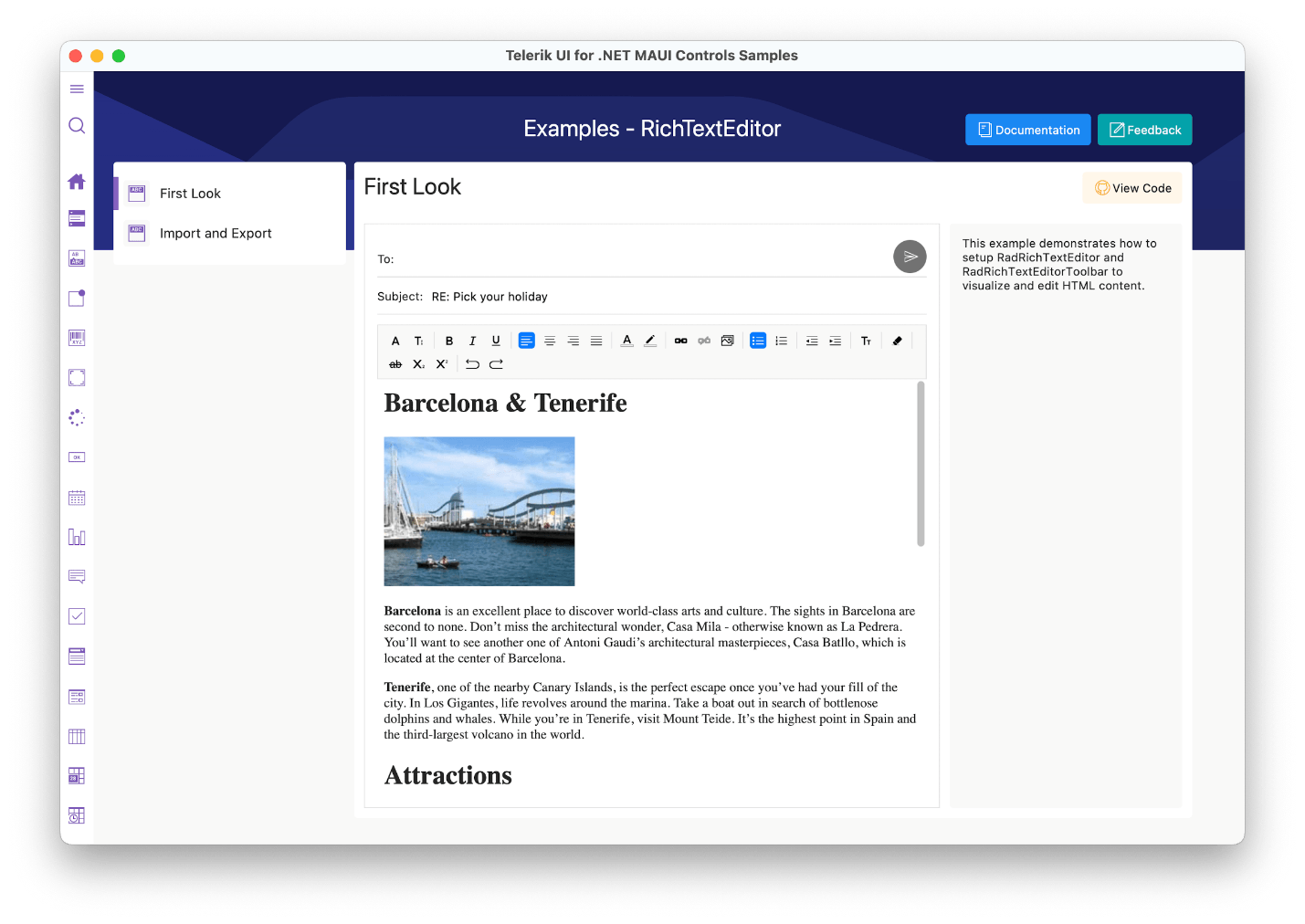
Telerik UI for .NET MAUI
New DateTimePicker Component
One of the new additions to the Telerik UI for .NET MAUI family is the .NET MAUI DateTimePicker control. It provides users with an easy and intuitive way to pick a date and/or time. The component has several features that allow you to set a date range, date and time format, and fully customize
the dialog appearance.

Here are some of the key features to look for:
- Spinner format: The component allows you to use a standard or custom date format string through its SpinnerFormat property. Depending on what format is set, the picker visualizes spinner controls with the prepopulated values ready
to be picked.
- Picker mode: You can choose between Popup and DropDown UI for showing the spinner controls with the available date and time values. For desktop, the default picker mode is DropDown, while for mobile it’s Popup.
- Templates: The DateTimePicker provides templates for its header and footer as well as exposes templates for its placeholder and display text.
- DisplayString format: You can choose what text will be displayed when a date is selected by using the DisplayStringFormat property of the DateTimePicker.
- Date ranges: You can also define date ranges by setting minimum and maximum date values and choose a date within that range.
- Flexible styling API: The DateTimePicker provides a number of styling capabilities.
For more information on getting started with the Telerik UI for .NET MAUI DateTimePicker control, visit the documentation.
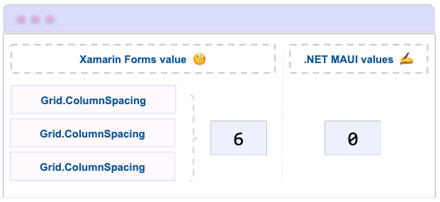
Desktop Support for All Picker Components
With R2 2022, we are introducing desktop support for the powerful picker components—you can now use them to develop apps for Windows and macOS. The full list of updated controls includes .NET MAUI DatePicker, TimePicker, TimeSpanPicker, ListPicker
and TemplatedPicker.
Moreover, with this release, all listed components (plus the DateTimePicker) now have a PickerMode property, which lets you choose what interface to use for picking a value. The default picker mode for mobile is Popup and for desktop—DropDown.
- Popup – Shows the UI for picking a date inside a popup. It’s the default value for mobile (Android and iOS).

- DropDown – Opens the UI for picking a date inside a dropdown. It’s the default value for desktop (Windows, macOS).

Updated NumericInput Component
In line with our commitment to provide the best, most comprehensive .NET MAUI UI library, we work hard to ensure developers can build native applications for Windows, macOS, Android and iOS, taking advantage of the technology’s full power. That’s
why one of the main goals of this complete redesign of the NumericInput component was to migrate it from a Xamarin.Forms Renderer to a native .NET MAUI Handler. Beyond that, you can expect mobile-first views on iOS/Android and a desktop-friendly look
when running on Windows/MacOS.

New BadgeView Component
The new BadgeView component brings a modern way to notify users or grab their attention to perform a certain activity on your application in a mobile or desktop scenario.
Subtly alerting the users of your .NET MAUI applications for status changes has never been easier! The Telerik UI for .NET MAUI BadgeView control allows you to display notifications or short messages via a set of predefined badges right into your cross-platform
application.
Here are some of the key features:
- Badge Position: BadgeView allows you to specify the badge position based on its content.
- Badge Alignment: You can easily align the badge according to its content.
- Badge Animation: You can choose whether to have an animation while displaying the badge. In addition, you can specify the animation duration and animation easing.
- Badge Types: You can choose between various predefined badge types. Also, you have the option to customize and style the badge types.
- Flexible Styling API and Customization Options: The styling capacities of the BadgeView control allow you to apply BackgroundColor, Border Thickness and Color. Also, we have an exposed API, which you can use to fully customize and
style the badge indicator.
For more information on getting started with the Telerik UI for .NET MAUI BadgeView control, visit our documentation.

Updated Entry Component
The Telerik UI for .NET MAUI Entry component has evolved. The text entry control that accepts string inputs is now built against the latest UI guidelines and comes with many enhancements in its API. Here are the most important features of the control:
- Password functionality: You can hide the characters that users type for privacy and security reasons.
- Keyboard support: You can add a virtual keyboard and specify its type—for example, Numeric.
- Non-editable (read-only) state: You can define whether users will be able to edit the Entry or not by setting a single property.
- Maximum number of symbols: The Entry component enables you to set a maximum length for its input.
- Text selection: You can specify the starting position of the selected text as well as the number of characters of the selected Entry input.
- Text prediction: Define whether to have a predictive text while typing in the Entry.
- Validation: If the user is entering a value not matching the requirements, the Entry will display an error message, which you can easily customize.
- Clear button: Gives you the option to clear all the text entered in the Entry using a single button.
- Commands support: Use the Return command to implement additional logic when pressing the keyboard return key.
- Various styling options: For applying corner radius, clear button color, placeholder color and more.
For more information on dabbling with the Telerik UI for .NET MAUI Entry control, visit the documentation.

Telerik UI for WinUI
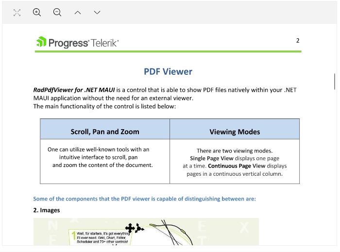
PdfViewer
Announcing the first PdfViewer control in the WinUI world—RadPdfViewer! View PDF documents right within your WinUI application without the need for an external viewer. Allow your
users to easily operate with the currently loaded document through the additional PdfViewerToolbar control providing all the common interaction options. Check out the full list with features below:
- Pan and Text Selection view modes
- Zooming
- Smooth scrolling
- Rotation of document
- Save As – option to save the previewed document to new file
- PdfViewerToolbar – predefined Toolbar control providing all the common PdfViewer functionalities
- Fonts – support for TrueType, Type 1, Type 3 and CID fonts
- Virtualization for ensuring great performance with large documents
- Extensible support for different stream compression filters
- Support for documents encrypted with Encryption Algorithm 4 (RC4/AES-128)
- The API provides different options for extending and customizing the control
- Uses Windows Composition rendering for native performance
For more information about the control, make sure to check out the WinUI Pdf Viewer section in our online help documentation.

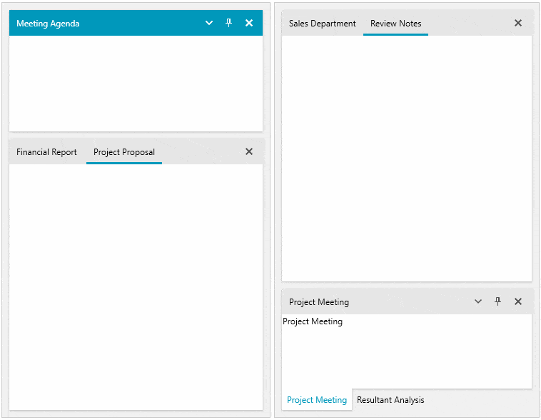
TabControl
RadTabControl is a flexible navigation component, used to build tabbed interfaces in WinUI applications. Thanks to the related RadTabItem control, you can organize your controls into different content
pages, thus improving the overall user experience (UX) of your applications. Here are the top feature the control provides:
- Built-in pin and close functionality buttons in the tab headers
- Drag reorder for tabs is available out of the box
- Multi-line tabs support
- Flexible tab headers – tab headers are easy to customize by incorporating content or Data Templates
- Selection – manipulate the selected tab and define the control behavior on tab close
- Data Binding – the control can be data bound to a wide variety of data sources
- Overflow – when the available space is not enough, the tabs will overflow in an overflow area
- Theming – style and customize the control utilizing the rich styling API
- Customization – built in options for defining tabs position, alignment, orientation, size, style and more
For more details, check out the
WinUI TabControl section in our help documentation.

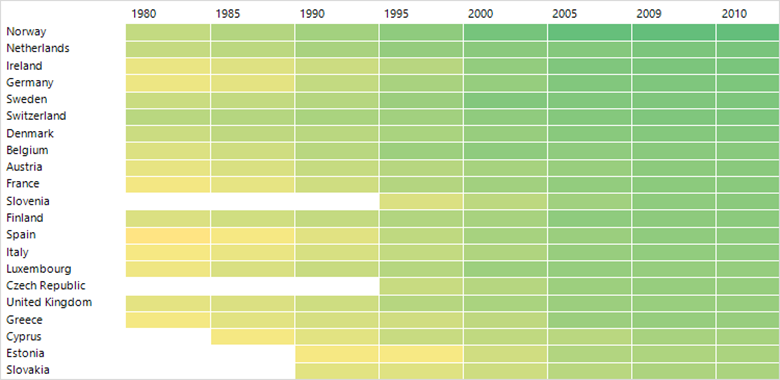
HeatMap
RadHeatMap is a control that displays numeric data in a matrix-like manner using two axes. Each value is represented by a colored rectangle, which makes it quite easy for the end user to quickly perceive and compare all values.
Here is a list with the main features of the control:
- Visualization Mechanisms – Categorical and Horizontal/Vertical
- Colorizers – different options colorize the values
- UI Selection – built-in Single and Multiple selection
- Tooltips – specify a Tooltip template and display the details of the item
- Labels – show custom labels in the cells
- Header Customization Options – easily change their appearance
- Customization Options – change the appearance of the control as well as its elements
Make sure to play around with the control in our WinUI examples app and to check the RadHeatMap section in our help documentation.

ChartView: Minor Ticks and Stripes (Breaking Change)
The new minor ticks support will allow you to utilize a more punctual view of the ticks in the axis. With it, you can define the number of minor ticks to be displayed between major ticks. They are heavily customizable with the available APIs to define
the number of minor ticks between major ones, the tick length, offset from the major tick, the tick template and style.
With the support for minor ticks, another useful feature is the support for stripes. Stripes are the visual representation of the minor ticks in the chart area and can be used to display where the minor ticks are, for the user to easily spot the value
of a certain tick and compare it to a data point on the chart. Stripes support defining the stripe visibility, style, dash array and more.
Important: With the minor ticks feature we renamed some of the already existing properties listed below:
- PolarChartGrid
- GridLineVisibility -> MajorGridLinesVisibility
- StripesVisibility -> MajorStripesVisibility
- PolarLineStyle -> MajorPolarLinesStyle
- RadialLineStyle -> MajorRadialLinesStyle
- CartesianChartGrid
- StripLinesVisibility -> MajorStripLinesVisibility
For more details, check out the Minor Ticks and Stripes article from our Chart documentation.

Latest Windows App SDK Support (1.0.3)
As usual we are up to date providing support for latest Windows App SDK version 1.0.3.
Document Processing
For a list of the new features shipped in the Telerik Document Processing Libraries shipped with Telerik UI for WinUI, see below.
Check Out the Detailed Release Notes
We have a lot more! To get an overview of all the latest features and improvements we’ve made, check out the release notes for the products: Telerik UI for WinUI (Release Notes).
Telerik UI for WPF
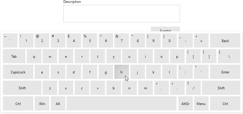
VirtualKeyboard
Announcing the brand-new WPF VirtualKeyboard component. RadVirtualKeyboard is basically a screen keyboard that mimics the familiar physical device. Users can interact with the Virtual Keyboard via the mouse or a touch
device and, for richer experience, the default click or any custom sound can be enabled. The component can be also placed directly in XAML, in a convenient place in your application or it can be shown above the app through the dedicated RadVirtualKeyboardWindow that
will allow you to use it for all other applications.
Here is list with major features the control provides:
- Layouts – There are three predefined key layouts and an option load completely custom layout from XML file.
- Display options – The keyboard can be shown inline or in a dedicated window that can be moved.
- Customization – The visualization of each key can easily be changed.
- System synchronization – Tracks system language changes and updates the keys automatically.
- Culture support – The component supports assigning a specific culture that will be applied to the letter keys.
- Native key input – Each button click sends a native key down action that is passed to the currently focused element.
I hope this control will be useful in various types of applications. For more information, check out our online VirtualKeyboard help documentation.
Windows 11 Theme

The newest and most modern Telerik UI for WPF theme is here—welcome the Windows 11 theme! It is inspired by the Windows 11 OS and brings nice smooth round shapes in two color variations—Light and Dark. Enjoy
the out-of-the-box native look and feel of RadWindow when the app is running on Windows 11 with the famous Mica backdrop material effect!
A couple other cool things about the theme are the System color variation that automatically transforms the theme depending on the systems settings and the option to use the system accent color as accent color of theme.
You can see below how some of most popular controls look wearing the new theme:
.png?sfvrsn=dbc4df24_1 "WPF Windows 11 Theme (3)")
.gif?sfvrsn=ec513f3d_1 "WPF Windows 11 Theme (2)")
>.png?sfvrsn=2d972561_1 "WPF Windows 11 Theme (4)")
.png?sfvrsn=d5cffb26_1 "WPF Windows 11 Theme (5)")
.png?sfvrsn=f2175d1c_1 "WPF Windows 11 Theme (6)")
They look good, don’t they?
As with our other recent WPF themes, you can easily customize the theme colors to suit your taste with the Color Theme Generator for WPF! For more
details about all the features of the theme, please check out this help article.
The theme comes with brand-new Telerik font with glyphs—for more details, check out the Font Glyph section from our online help docs.
Latest .NET 7 Preview and ARM64 Support
As always, we are up to date with the latest technology trends, and we are happy to announce that Telerik UI for WPF provides .NET 7 Preview 3 and ARM64 support. The .NET 7 Preview binaries can be found in a separate zip archive in your Telerik account—download it and give
it a try!
As for the ARM64 support, this means that your .NET 6 app built with Telerik UI for WPF will run flawlessly on a device like Surface Pro X (with ARM64 processor)—test it if you have such a device and let us know if you have any feedback.
VirtualGrid: Support for UI Elements in the Cells (Cell Templates)
RadVirtualGrid becomes even more powerful with this feature. Now it is possible to apply custom cell template on each cell and show whatever content you want—UI elements, images, other controls—it is up to you. What you need
to do is to hook to the CellTemplateNeeded and provide the desired DataTemplate depending on the cell value.
Make sure to check out the Custom Cell Content article for more details.

ChartView: Minor Ticks and Stripes
The new minor ticks support will allow you to utilize a more punctual view of the ticks in the axis. With it, you can define the number of minor ticks to be displayed between major ticks. They are heavily customizable with the available APIs to define
the number of minor ticks between major ones, the tick length, offset from the major tick, the tick template and style.
With the support for minor ticks, another useful feature is the support for stripes. Stripes are the visual representation of the minor ticks in the chart area and can be used to display where the minor ticks are, for the user to easily spot the value
of a certain tick and compare it to a data point on the chart. Stripes support defining the stripe visibility, style, dash array and more.
For more about those features, see the Minor Tick and Stripes article from the WPF ChartView help documentation.

GridView: Zooming Support & Filtering TextBox for Distinct Values
This release we are adding two highly desired features GridView features:
- Zooming – now the control can be zoomed programmatically or with the Ctrl + MouseWheel combination. To enable zooming with the mouse, you would need to set the EnableMouseWheelScaling property of the control
to true. For more details, check out the Zooming article from the WPF GridView documentation.
- Filtering the Distinct Value – you can now easily display filtering TextBox inside of the Filtering Control. Users will no longer have to scroll down the distinct filtering values and can quickly type in a desired value to find
it.

DesktopAlert: Show on the Current Display
Until this release, it was only possible to display the DesktopAlert on the main monitor even if your app was on the secondary monitor. With this new feature, you will be able to show the alert depending on the location of your application window (or
any window). You need to simply attach the DesktopAlertManager to the desired Window:
var manager = new RadDesktopAlertManager();
manager.Attach(App.Current.MainWindow);
And that’s it—the alerts will be automatically shown on the monitor where the Window is currently located. For more details, check out the Show on Current Screen help article.
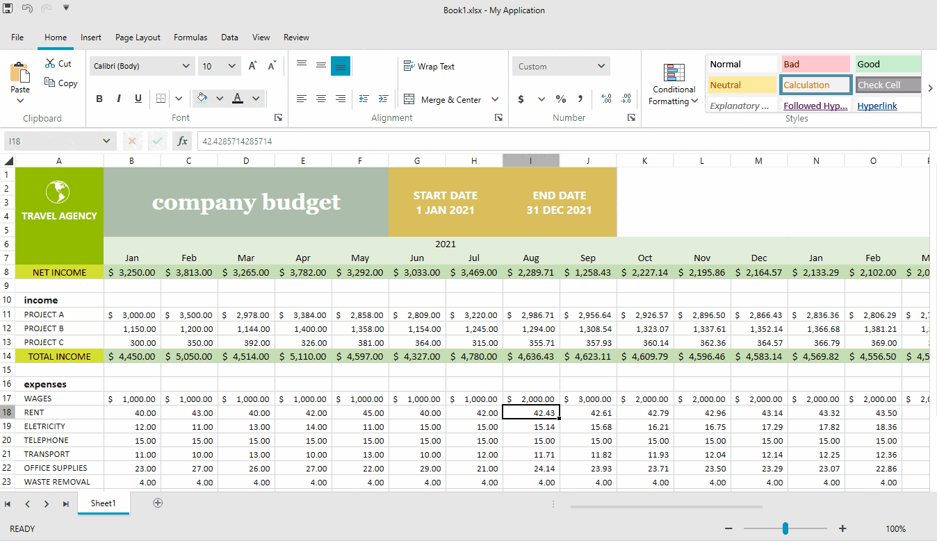
Spreadsheet: Conditional Formatting
Based on your feedback, we are happy to introduce a conditional formatting functionality in the Spreadsheet control for WPF. With it, your end users can easily format the entire sheet or section based on either some of the readily available predefined
conditions or by utilizing formulas. To learn more visit the Conditional Formatting documentation article.

Spreadsheet: Support for Threaded Comments
After introducing the Notes functionality in the previous release, we have now upgraded the components
to enable you to also work with comments and replies. You can check our help topics for more information WPF Spreadsheet Comments.
Spreadsheet: Support for References to Whole Columns and Rows
Now you can use references to whole rows and columns instead of specific cell ranges only. You can use this functionality to include all the values from a row/column to a formula, for example.

Spreadsheet: CONCAT Function
Although the components support 200+ built-in functions, we keep adding more to ensure everything you might need is ready to use. The full list of supported functions is available in the Functions article.
Document Processing
For a list of the new features shipped in the Telerik Document Processing Libraries shipped with Telerik UI for WPF, see below.
Other Features
- ChartView: Added ability to control the tension of the spline ( link)
- ChartView3D: Added SeriesProvider for dynamic creation of series ( link)
- ContextMenu: Modifier keys can be show without holding Alt when opening the menu via mouse's right button ( link)
- Diagram: Fit-to-page support plus additional setting of the print preview dialog ( link)
- Pivot: Named sets are placed in a correctly named folder, read from a cube’s metadata
Check Out the Detailed Release Notes
We have a lot more! To get an overview of all the latest features and improvements we’ve made, check out the release notes for the products below:
Telerik UI for Xamarin
The second official release for the year of Telerik UI for Xamarin, namely R2 2022, has just arrived giving you much requested ProgressBar control, as well as DataGrid improvements and a demo for sharing/saving pdf files.
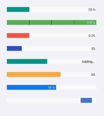
ProgressBar
The ProgressBar control allows you to display to your users the progress of a long-running operation, such as downloading a file, requesting information, etc. The ProgressBar sets a clear expectation of the load time, so it’s quite useful in a
number of scenarios when the action takes more than a few seconds. The ProgressBar for Xamarin comes packed with a variety of useful features like indeterminate state, segments support, as well as being fully customizable.

Let’s take a closer look at the features the new ProgressBar for Xamarin provides!
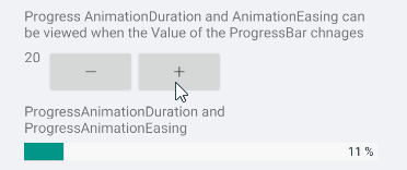
Value, Value Range & Progress
The Value property defines the current progress status of the ProgressBar. There are options for specifying the value range with the Minimum and Maximum properties.
The Progress property, on the other hand, is used to report the current progress status. Progress is updated internally after Value is updated and progress animation is complete.
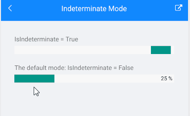
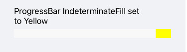
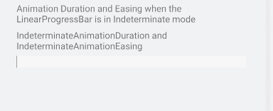
Indeterminate Mode
ProgressBar is used to visually indicate the progress of a task. Still, there are cases when the progress is unknown—in those scenarios use the indeterminate mode of the control:
<telerikPrimitives:RadLinearProgressBar Value="25"
                                        IsIndeterminate="True"/>

Segments Support
Divide ProgressBar into segments in cases the task has predefined number of steps—this is as easy as just applying SegmentCount property:
<telerikPrimitives:RadLinearProgressBar Value="45"
                                        ValueDisplayMode="Value"
                                        SegmentCount="8"/>

Label Customizations Options
In addition to the progress indicator, the ProgressBar control also shows a label to provide more information on the current progress. As the design requirements may vary from case to case, there are various customization options available—you can
set the label horizontal alignment, apply string format, as well as use different display modes—display the progress as Value, as percent from the range from minimum to maximum, or use custom text.
Here are some examples of label customization options:
<telerikPrimitives:RadLinearProgressBar Value="35"
ValueDisplayMode= "Value" />
<telerikPrimitives:RadLinearProgressBar Value="45"
ValueDisplayMode= "Text"
CustomText= "loading..." />
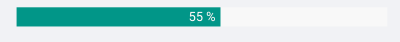
<telerikPrimitives:RadLinearProgressBar Value="55"
LabelHorizontalOptions= "Center" />

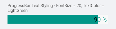
Styling Options
If you want to customize the ProgressBar color scheme so it matches the design of your app, we’ve handled that as well. ProgressBar provides flexible styling API for customizing the progress fill, track fill, indeterminate fill, label text color,
font size and more.
<telerikPrimitives:RadLinearProgressBar Value="90"
TrackFill="LightBlue"
ProgressFill="Blue"
TextColor="Black"
AlternateTextColor="LightBlue"
FontSize="20"
HeightRequest="30"/>

For a full list of the styling properties, visit the ProgressBar: Styling documentation topic.
DataGrid Row Height
DataGrid provides full control over the way its cells are rendered through various Column types—TextColumn, NumericalColumn, BooleanColumn and TemplateColumn, to name a few. Still, there was one missing bit—until now there wasn’t a direct
way to explicitly define the height of the grid rows. Now with R2 2022 release, Telerik DataGrid for Xamarin exposes the RowHeight property, which gives you a quick and easy way to control the height of each row. For detailed information on how to
use the new property, refer to DataGrid: Row Height documentation topic.
Document Processing
For a list of the new features shipped in the Telerik Document Processing Libraries shipped with Telerik UI for Xamarin, see below.
Demo for Sharing/Saving PDF Documents
We have received many requests to provide options for sharing and saving PDF documents from the PdfViewer’s Toolbar. Then we decided to create a demo that includes these two options. You can find the running demo in our Telerik Xamarin Sample application.

For Pdf Sharing we used the Xamarin.Essentials Share class.
private async Task ShareAsync()
{
    Assembly assembly = typeof(SaveSharePdfView).Assembly;
    string fileName = assembly.GetManifestResourceNames().FirstOrDefault(n => n.Contains("pdfviewer-firstlook.pdf"));
    Stream stream = assembly.GetManifestResourceStream(fileName);
    var cacheFile = Path.Combine(FileSystem.CacheDirectory, "pdfviewer-firstlook.pdf");
    using (var file = new FileStream(cacheFile, FileMode.Create, FileAccess.Write))
    {
        stream.CopyTo(file);
    }

    var fileShareService = DependencyService.Get<IFileShareService>();
    await fileShareService.ShareFileAsync(cacheFile);
}
For Pdf Saving the document visualized in the viewer is saved on the local application data.
private async Task SaveAsync()
{
    var fileName = "pdf-telerik.pdf";
    var localFolder = Environment.GetFolderPath(Environment.SpecialFolder.LocalApplicationData);
    var filePath = Path.Combine(localFolder, fileName);

    if (this.Document == null)
    {
        return;
    }

    using (Stream output = File.OpenWrite(filePath))
    {
        var provider = new PdfFormatProvider();
        provider.Export(this.Document, output);
    }
    await Application.Current.MainPage.DisplayAlert("Saved on this device as pdf-telerik.pdf.", "Location: " + filePath, "OK");
}
New Features in Telerik Document Processing Library
PdfProcessing: Choose whether the font files to be embedded when exporting PDF documents.
RadPdfPdocessing library provides easy to use API which allows you to choose whether to include the font files while exporting the pdf document.
❗ Removing the fonts from the PDF document makes it dependent on the operating system to provide the needed fonts. If they are not installed on the system, the document will not be successfully opened.

SpreadProcessing: Comments support
Easily insert a comment related to a specific document position. In addition, you can add replies to each comment. A sample runnable demo can be found in Telerik Xamarin Sample application under the SpreadProcessing control section.

Below we will look into what the R2 2022 release of Telerik UI for WinForms brings.
New Component: Office Navigator Bar
With the new Office Navigation Bar control, developers can create intuitive navigation in WinForms applications, similar to the one Microsoft Outlook provides. The control features a list of items represented by text and/or images that the user can select.
In addition, there is an overflow functionality for the items that cannot fit in the available space.
My favorite feature of this component is the peek functionality—a popup that is shown above the items on mouse hover. This popup can contain any Windows Forms Control in it and is convenient either for allowing the user to perform a quick action
or to display some additional information.
Feature highlights:
- View Modes – Two view modes are available: Compact to display just image or text in the item, and Full where both image and text are displayed.
- Overflow – Items that cannot fit in the control will overflow into a menu for the user to access them.
- Peek Window – A window displayed when the user hovers the item and where any control can be added.
- Options dialog – A built-in dialog with options for configuring Visible items, Display Style and Item order, which the user can access via the overflow menu.
- Design-time support – A convenient designer is available, allowing to configure the main options of the component from its Smart Tag.
- Localization provider – A convenient localization provider allowing translating the control strings into a language of your choice.

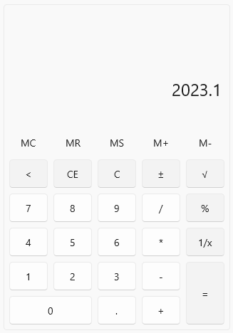
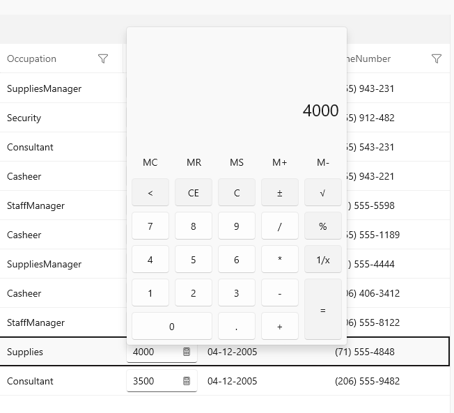
New Component: Calculator
We have heard from our users that some LOB applications can take advantage of a calculator component, embedded in the WinForms app. Meet RadCalculator—an easy-to-use component that can be added to Windows Forms applications and enable users to make
calculations right in the app, without the need to switch context.
Feature highlights:
- All basic calculations like add, subtract, multiply and divide come out of the box
- More complex calculations are also available – reciprocal, sq root, negate, percentage
- Memory functions – all the memory calculations that you may expect are readily available: M+, M-, MS, MR, MC
- Custom calculations – utilize the flexible API to create your own calculation that the control will execute
- Easy-to-customize UI – the entire UI is highly customizable; you can access every element of the control and amend its look and feel, or add your own elements
- Touch and keyboard support is provided out of the box

Compatibility With Preview 3 of .NET 7
For the enthusiasts who always want to play with the latest .NET version, together with the official bits of R2 2022, we are also shipping bits that target Preview 3 of .NET 7 so you can continue to use your favorite Telerik UI for WinForms controls in
your development. Once you install R2 2022, look into the installation folder for assemblies build for .NET 7.
ARM64 Support
With .NET 6, Microsoft has shipped native support for ARM64 on machines that run Windows on ARM devices like Surface Pro X, Samsung Galaxy Book and more. We are happy to confirm that all Telerik UI for WinForms controls are compatible with ARM64 and can
be utilized for applications targeting it.

VisualStudio 2022 Theme: Color Blending
In the previous release, we shipped the awesome Visual Studio 2022 theme, and this release we are happy to share that we have also enabled the color blending functionality for it. With color blending, you can easily blend every color used in the theme with another color of your choice, which allows you to quickly change the color scheme used in
a particular theme.

More Interactive .NET Core Designer Now With Support for Item Glyphs and Inline Editing
This release marks a major milestone for Telerik UI for WinForms in the adoption of the new Windows Forms designer in Visual Studio. We are excited to share that we are the first and only vendor on the market who now has full feature parity between the
old and the new WinForms designer in Visual Studio, and users of Telerik UI for WinForms can now enjoy the full designer experience when crafting their applications.

Improved High DPI Support
This release brings yet another set of improvements in the Telerik UI for WinForms support for high DPI WinForms applications, including dynamically scaling controls added at runtime, scaling improvements to support all combinations of .NET versions and
DPI awareness modes, precise scaling in all types of Forms and UserControls, and many other improvements.
Revamped BarCode Component With Support for Reading Barcodes
With this release, we are shipping a fully revamped BarCode component—RadBarCodeView—that brings many improvements to our barcodes story, including a BarCode reader capability, which can be used to decode barcodes from Bitmap images.
Feature highlights:
- Support for one-dimensional barcodes like EAN13, EAN8, UPC-A, UPC-E and Code39 symbologies
- Support for two-dimensional barcodes like QR code, PDF417, and Data Matrix
- BarCodeReader for decoding one dimensional barcodes like Code 11, Code 128, Code 25 Interleaved, Code 25 Standard, Code 39, Code 39 Extended, Code 93, Code 93 Extended, Codabar, Code MSI, EAN 13, GSI 128, EAN 8, Postnet, Planet, Intelligent Mail,
UPC A, UPC E, UPC Supplement 2, UPC Supplement 5

Document Processing
For a list of the new features shipped in the Telerik Document Processing Libraries shipped with Telerik UI for WinForms, see below.
Telerik Document Processing Libraries
SpreadProcessing: Support for Threaded Comments
After introducing the Notes functionality in the previous release, we have now upgraded the components
to enable you also work with comments and replies. You can check our help topic for the available API.
SpreadProcessing: Support for References to Whole Columns and Rows
Now you can use references to whole rows and columns instead to specific cell ranges only. You can use this functionality to include all the values from a row/column to a formula, for example. All types of references and examples of how you can use them
are available in the Reference Ranges topic.
SpreadProcessing: CONCAT Function
Although the components support 200+ built-in functions, we keep adding more to ensure everything you might need is ready to use. The full list of supported functions is available in the Functions article.
WordsProcessing: Support for Continuous Section Break When Exporting to PDF
This type of section break was exported as a page break in previous versions of WordsProcessing. It is now properly respected, and the layout of the document is preserved.
WordsProcessing: Support for Alternate Text of Images
The alt attribute of the img HTML element is preserved even when its value is an empty string. The functionality is also supported for the image shapes defined in a DOCX document.
PdfProcessing: Support for Type 3 Fonts
The Type 3 fonts are a feature specific to the PDF standard. The Type 3 fonts consist of glyphs defined with PDF graphic operators. Usually, the entire font is embedded in the PDF document, which allows you to view it on devices without accessing fonts
from the operating system. With R2 2022, PdfProcessing provides you with full support for this type of fonts.

PdfProcessing: Support for Setting Different Permissions When Creating Encrypted Documents
These settings enable you to specify whether the user can print the document, copy or modify its content. For more details, check the PdfFormatProvider|Settings topic.
PdfProcessing: Exposed Settings Allow You To Control Font Embedding
The PDF standard requires all fonts except the standard ones to be embedded inside the document to ensure it will always look the same way no matter the device or application used to open it. However, this inevitably leads to increasing the file size.
With PdfProcessing, you are now allowed to skip the embedding if the file size is crucial for the scenario. For more information on how to use this functionality, check the PdfFormatProvider|Settings topic.
Got Feedback?
As always, we highly appreciate user feedback, and we would like to invite you to continue sending it to our feedback portals. Only with your feedback we can be sure that we are building the things that you benefit your application development the most!
Download the Latest Bits
For existing users to download the latest bits, visit the Download section of Your Telerik Account or get the Telerik Control Panel and it will take care of that for you.
For all new users who want to try the products, visit the following pages:
Live Webinar and Twitch Session—May 16 & 17
Join us for the live R2 2022 release webinar on Tuesday, May 17 at 11 a.m. ET as our Developer Advocates Ed Charbeneau and Sam Basu present in detail the major updates across our .NET UI libraries.
Save your Seat
In addition, we will be hosting a live Twitch demo session on Monday, May 16, 10:00 a.m. ET, where our Developer Advocates
dive into their favorite new features in an interactive live streaming session.
 ]]>
]]>
 ]]>
]]>

 ]]>
]]>


 ]]>
]]>

.gif?sfvrsn=307bf102_1)
 ]]>
]]>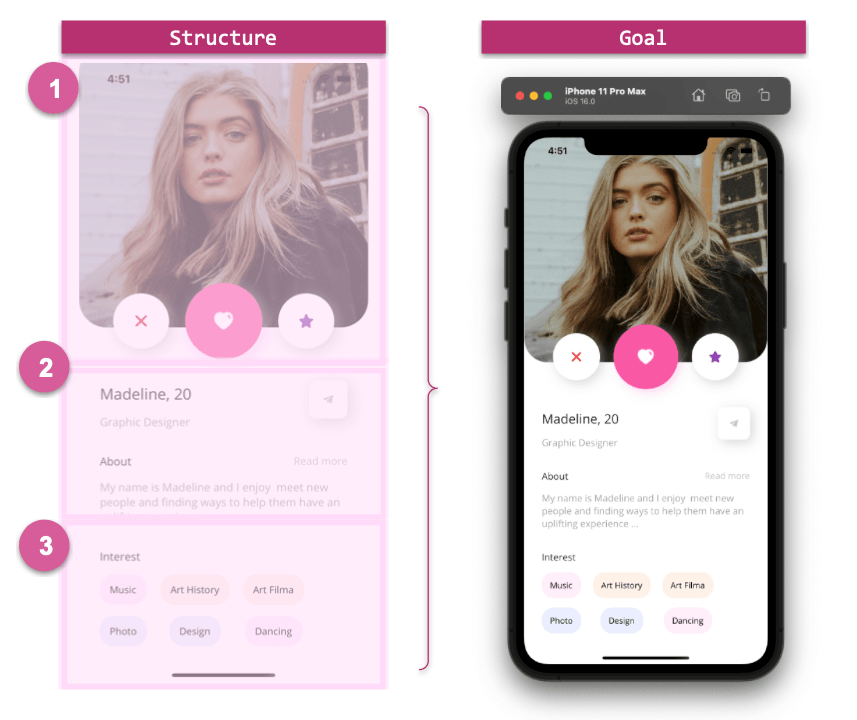
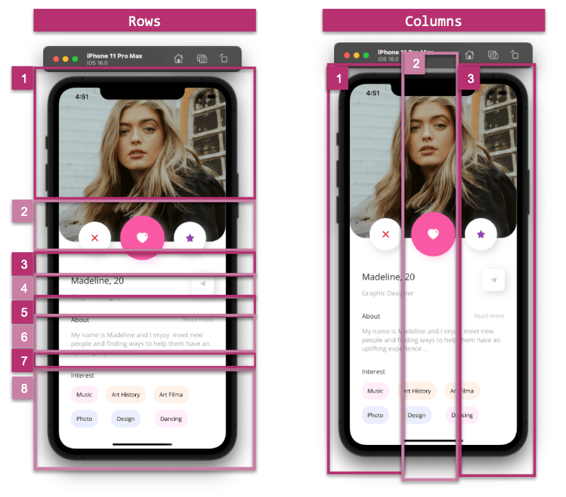
 Main Image
and Floating Buttons
Main Image
and Floating Buttons
 Details
 Interest
List
Interest
List
 ]]>
]]>
 ]]>
]]>
 ]]>
]]> ]]>
]]>
 ]]>
]]>
 ]]>
]]>


 ]]>
]]>
 ]]>
]]>


 ]]>
]]>


 ]]>
]]>