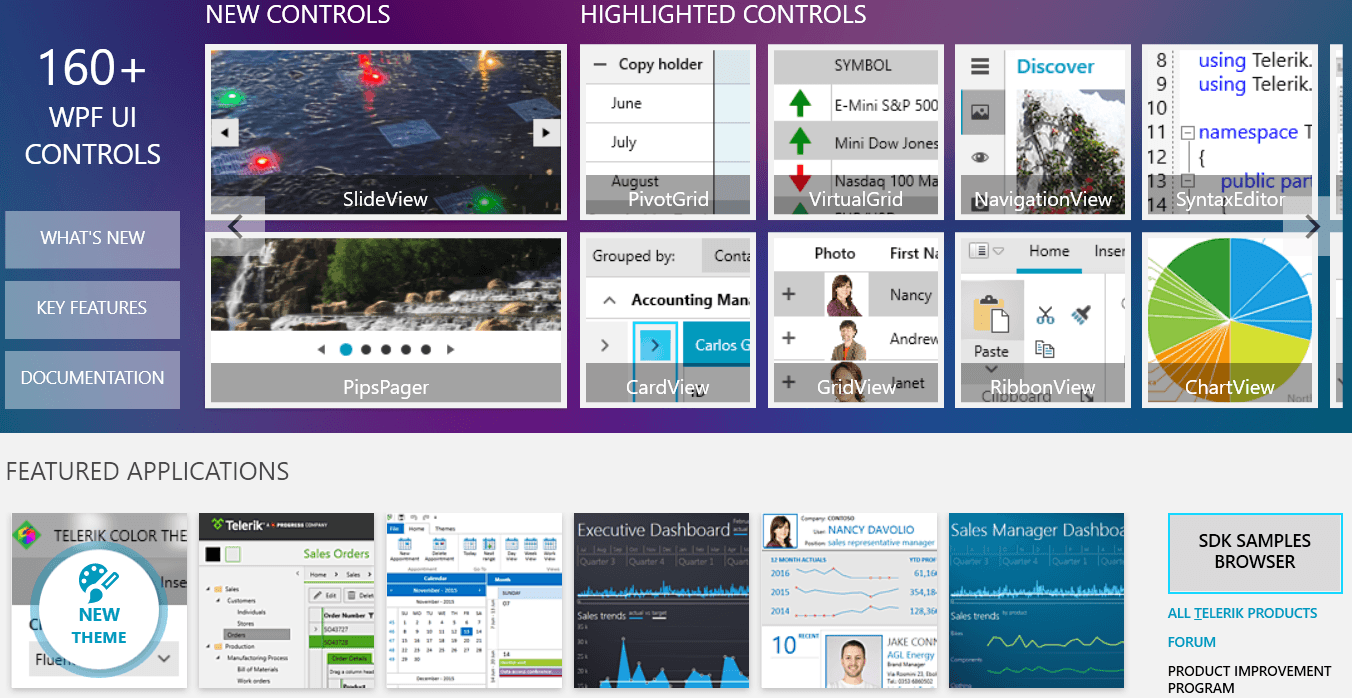
Telerik Mobile and Desktop products offer expanded .NET 7 support, improved Document Processing Library features and new components!As with every release, we are eager to share what the new updates are, so let’s jump right in! Hop to your favorite section:
What’s New in Telerik UI for WinUI 2.2.0
PropertyGrid

Announcing the RadPropertyGrid component for WinUI! The control provides an easy and versatile approach to processing data objects’ properties. Utilizing its auto-generation features and the intuitive custom editor capabilities,
users will be able either to display data in a way that best fits their needs or modify it with minimal effort.
RadPropertyGrid can be bound to an item with just a single line of code, and you may start exploring or editing its properties. The proper editor controls are auto-generated—text fields for string properties, CheckBoxes for Boolean,
DateTimePickers for dates, etc. In addition, PropertyGrid allows flexible manual setting and customization of editors and their layout via the standard WinUI styling and templating mechanisms. It is highly customizable, allowing the user to modify
the default look in an easy and intuitive manner.
Check out the key features below:
- Automatic property generation – the control generates fields to read/write all public properties of the target object
- Built-in property editors – predefined editors UI for the different data types
- Nested properties support
- Customizable property fields – customize the property definitions and the corresponding data editors
- Keyboard support
- Grouping
- Filtering
- Data validation
For more information about the control, make sure to check out the PropertyGrid section in our online help documentation.
CollectionEditor & CollectionEditorPicker

RadCollectionEditor and RadCollectionEditorPicker are two small components used to visualize the items in a collection and generate editors for each property using the built-in PropertyGrid component. You can use
the ItemTemplate of the control to specify how the items from the collection should appear. The difference between them is that the CollectionEditorPicker uses a dropdown to display the CollectionEditor.
For more details, check out the CollectionEditor section in our help documentation.
CollectionNavigator

RadCollectionNavigator is the next new control this release. A light component that provides seamless navigation and editing of a collection, it provides built-in customizable commands, predefined customizable buttons and more. For
more details, make sure to check out the CollectionNavigator section from our online help documentation.
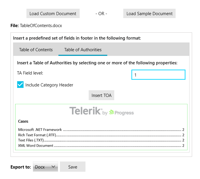
DataGrid: Export

Our DataGrid gets export support—thanks to the Telerik Document Processing Libraries that are included in the WinUI distribution. The new functionality provides methods to export the current dataset displayed in the control. You can export in a synchronous or an async manner, modify the exported data and the final document.
Currently the built-in export supports the following formats:
Hope this feature will be useful. For more details, check out the Export section from our DataGrid documentation.
RibbonView & Other: Updated Windows 11 Appearance


In this release, we did many improvements in the default styles of many controls to provide a better Windows 11 look and feel. Now I want to focus on the RibbonView control—we completely redesigned it to resemble the new Office 365 Experience!
It looks totally awesome and I’m sure it will improve the overall appearance of your modern WinUI application.

Make sure to check out the controls in our refreshed WinUI examples application and play around with them.
Other Features
Check Out the Detailed Release Notes
We have a lot more! To get an overview of all the latest features and improvements we’ve made, check out the release notes for the products below:
Telerik UI for WinUI (Release Notes)
Share Your Feedback
- Get in touch by email – drop us a line, for anything related to product or just to say hi at TelerikWinUI@progress.com
- Feedback Portal – share any feature request (or bug reports) that you might have
- Telerik Forums – if you need any technical assistance with the product, let us know and we will help
Get the Bits
Don’t wait—try out the latest:
Telerik UI for WinUI
In case you missed it, here are some of the updates from our previous release.
What’s New in Telerik UI for WPF With R3 2022
CircularProgressBar

Announcing our brand-new WPF CircularProgressBar component. CircularProgressBar is a control that will allow your customers to track the progress of different tasks in a circular manner. It provides many
customization options that will allow you to achieve a lot of different scenarios. You have probably seen such components in many different places—from health tracking smartphone applications to automatic coffee machines.
Now you can easily plug it in your Telerik WPF application as well!
Check out the list of the major features of the control below:
- Segments – CircularProgressBar can be split into numerous segments to indicate different types of progress.
- Color Ranges – CircularProgressBar supports defining ranges with different colors.
- Determinate and indeterminate states – The determinate state shows a specific amount of the progress. The indeterminate one plays an animation of the circular progress.
- Customizable content – CircularProgressBar supports complex implementation for the content of its progress.
- Radius manipulation – The control allows you to customize the indicator and track inner and outer radiuses.
- Angles – You can control the beginning and ending angles of the component for a more customized appearance.
- Secondary progress indicator – CircularProgressBar allows you to visualize an additional progress indicator.
- Indeterminate animation customization – You can modify the played animation when CircularProgressBar is in an indeterminate state.
I hope this control will be useful in various types of applications. For more information, check out our online CircularProgressBar help documentation.
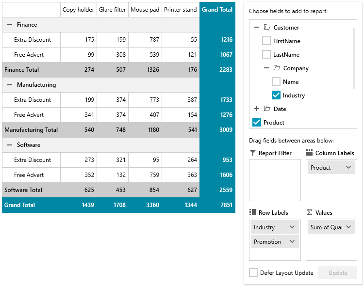
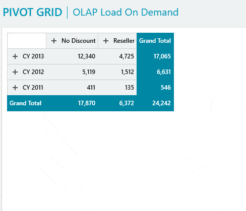
PivotGrid: Configuring PivotGrid Without PivotFieldList

The most desired PivotGrid feature is finally here! It allows using the control without the additional PivotFieldList control. The new functionality provides support of all existing PivotFieldList features—directly
accessible trough the UI of RadPivotGrid. Your customers will be able to filter, sort, modify the descriptions and more through the built-in dropdown menus, dialogs and buttons. The feature can be enabled by simply
setting the attached
FieldListBehavior.ShowInline property as shown below:
<pivot:RadPivotGrid x:Name="pivotGrid" pivot:FieldListBehavior.ShowInline="True" />
For more details, make sure to check out the Inline PivotFieldList section from our online
help documentation.
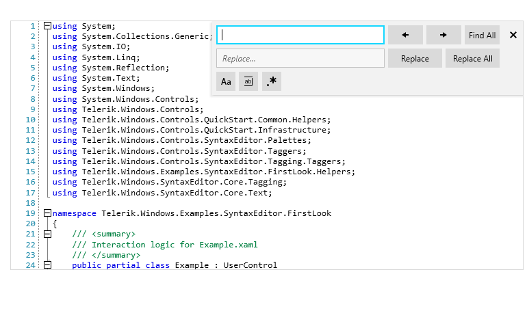
SyntaxEditor: Word Wrapping

A new cool feature for the SyntaxEditor is Word Wrapping! When the feature is enabled, the horizontal scroll bar is removed and all the text is horizontally fit in the available space. We
have also included an additional
margin that holds the icons and can be removed if needed. I’m sure you have seen this view
mode in many editors and IDEs, so I hope it will make your WPF applications more useful and user friendly.
For more info, check out the Word Wrap article from the SyntaxEditor help documentation.
ChartView: ErrorBar Series

We are adding a new ChartView series this release—ErrorBar Series! This type of series visualizes its data points using error bar shapes. The error bar shape allows you to
display an error or uncertainty in the plotted data. The shape consists of a single line with caps at the two ends. An additional marker that shows the expected measure can be displayed too.
For more information about all of the setup and customization options of the new series, please check out the ErrorBar Series article from the ChartView help documentation.
Latest .NET 7 Preview Support
As always, we are up to date with the latest technology trends, and we are happy to announce that Telerik UI for WPF provides support for the latest .NET 7 Preview 7. The .NET 7 Preview binaries can be found in a separate zip archive in your account—download it and give it a try! They will be included in
the NuGet packages and in full distribution once .NET 7 becomes official. Also we plan to remove the .NET 5 support with the .NET 7 introduction, so please consider upgrading your .NET 5 applications to newer .NET. (If such
a change somehow affects your plans, please contact us and share more details.)
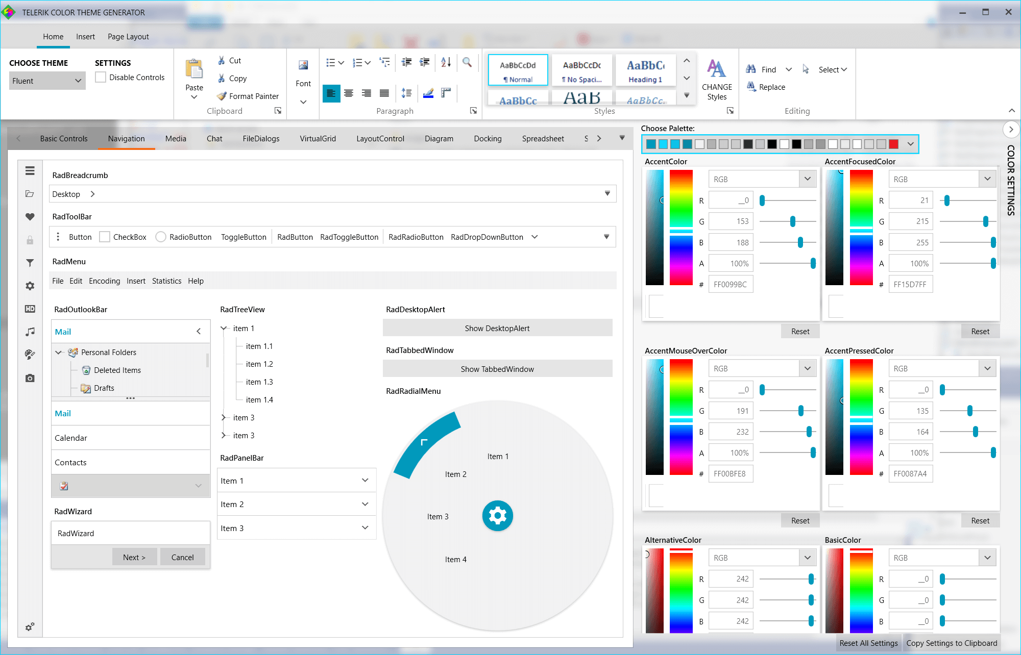
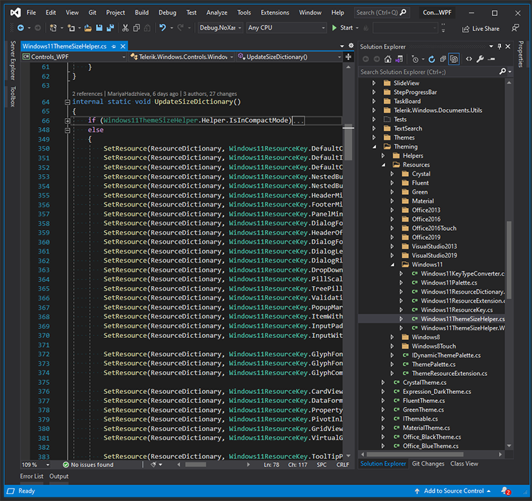
RibbonView: New Windows11 Theme Appearance

We improved the default RibbonView styling for the Windows 11 theme in order to resemble the new Office 365 Experience. Looks nice, doesn’t it?
If you want to see the theme in action, make sure to play around with our Color Theme Generator for WPF app! For more details
about all the features of the Windows 11 theme, please check out this help article.
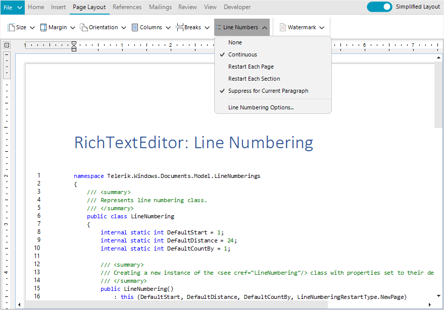
RichTextBox: Line Numbering

The latest RichTextBox feature enables you to display the appropriate number beside each line of text—this is useful for specific types of content, such as scripts, legal or medical documents. Through
the intuitive API of this feature, you will be able to easily control how the numbering appears. You can change the initial number, the increment number, the distance between the numbering and the document content, and
when the numbering should restart. For more information, check out the Line Numbering help article.
Spreadsheet: Repeat Specific Rows or Columns on Every Printed Page

This new Spreadsheet functionality allows you to specify a row or a column that will be repeated on every printed page. This functionality is useful when you need to print or export to PDF data spanning multiple
pages and still allows the users to see the important information on the top/left side for better orientation. For more details, check out the Printing section of our Spreadsheet documentation.
Other Features
- SyntaxEditor: FontWeight and FontStyle of the highlighted words
- VirtualGrid: FontWeight and FontStyle of the cells
- RibbonWindow: Windows 11 Theme acrylic effect now can be enabled on all Windows 11 version, not only on the preview ones
Check Out the Detailed Release Notes
We have a lot more! To get an overview of all the latest features and improvements we’ve made, check out the release notes for the products below:
Telerik UI for WPF (Release Notes)
Telerik UI for Silverlight (Release Notes)
Share Your Feedback
Feel free to drop us a comment below sharing your thoughts. Or visit our Feedback Portals about UI for WPF, Silverlight and Document Processing Libraries and let us know if you have
any suggestions or if you need any particular features/controls.
Try out the latest:
Telerik UI for WPF
Telerik UI for Silverlight
In case you missed it, here are some of the updates from our last major release and previous Service Pack.
Spreadsheet Charts
Hold up? Is that true? Yes, you read it right. Charts are coming to RadSpreadsheet control for Telerik WinForms. What could be a better improvement than visualizing your data beyond the RadSpreadsheet grid? Adding charts
to a workbook can help you identify important statistics and trends in your data that may not be obvious when only looking at numbers. With RadSpreadsheet you can show charts as well as add, remove and manipulate chart
objects in your spreadsheet documents.

Supported Chart Types
Different chart types give you the flexibility that your data requires. From Bar to Line, from Point to Bubble, from Pie to Area, show your users that you care. The Spreadsheet component for WinForms supports more than
a dozen different types of charts allowing you to visualize categorical data, numerical data, time series data and more. You can get familiar with all supported types in the RadSpreadsheet Charts help article.
Splash Screen
What could be better to notify the end user that something big is loading than showing a splash screen form? Our newest reinforcement to the Telerik UI for the WinForms suite is here. Splash Screen allows you to display
a Telerik themed control that notifies the user that the program is loading. You can customize the image of the splash screen, its animations and loading process visualization per your requirement.

Overlay and Flyout Screens
If you want something more to sample, just to say “give me a second to set up the data,” we have just the things for you. Overlay and Flyout Screens will fit perfectly in a case where you want to dim the content
and show the end users to be patient. You could use the Overlay Screen to show only the loading indicator. However, there could be a case where you want to notify the user that he needs to reenter his credentials to continue working on the application.
In this case, Flyout Screen is what you need. The Flyout can be used to display some content over the application or be used as an interactive control. The screen can be customized in a way that you can place input
controls in it, while the Overlay does not accept such customization.
Overlay

Flyout

Changes to Distribution
As of R3 2022 in Telerik UI for WinForms, the .NET 2.0 distribution is removed. From this release, the suite offers .NET 4.8 distribution. With this release, you not only get the .NET Framework projects of the Telerik source
code, but .NET Core projects as well.
Bug Fixes & Improvements
Our development team managed to fix/improve more than ONE HUNDRED bugs reported by our customers. We always listen to feedback and try to produce the top-notch controls on the market.
Share your feedback with us in the Feedback Portal!
Get the Bits
Don’t wait—try out the latest:
Telerik UI for WinForms
What’s New in Telerik Document Processing Libraries With R3 2022
PdfProcessing
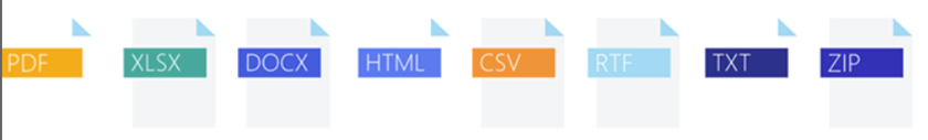
Export PDF pages to images:
We have added the ability to convert the pages of a PDF document to images. This feature uses the SkiaSharp library. It will work with the .NET Standard version and does not depend on any Windows libraries.
WordsProcessing
Page Numbering Fields: PAGE, PAGEREF, NUMPAGES,
SECTIONPAGES and SECTION fields are now supported in our library. These are commonly used fields for inserting page numbering. We have added the ability to update the field values as well.
Shapes support: With this release, we have enabled
users to preserve the shapes when importing and exporting a DOCX document. We will continue working on extending the functionality to allow you to insert and manipulate these objects in the next releases.
SpreadStreamProcessing
SpreadStreamProcessing Import: We have added support
for reading XLSX and CSV files. This functionality allows you to easily get the data from large files without loading the entire document in the memory. It has great performance as well.
SpreadProcessing
Repeat specific rows or columns on every printed page:
This feature allows you to specify a row or a column that will be repeated on every printed page.
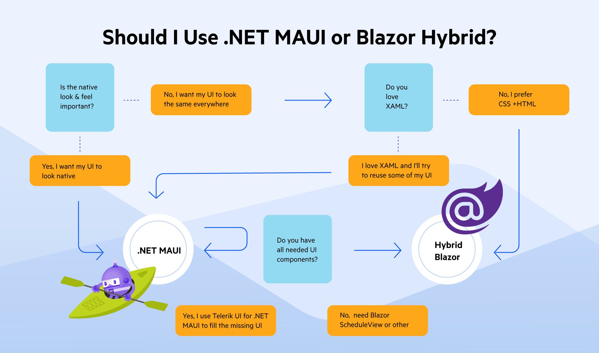
What’s New in Telerik UI for .NET MAUI With R3 2022
Aloha, and welcome to another Telerik UI for .NET MAUI release! In addition to the mandatory support for the latest version of .NET MAUI, we are now shipping three brand-new controls as part of our growing Telerik UI for
.NET MAUI suite—DataForm, AutoComplete and Expander components! We’ve also added many enhancements to our powerful DataGrid control. Let’s have a sneak peek at the most interesting stuff we have for
you in this release.
Latest .NET MAUI & Visual Studio 2022 Support
We follow the Microsoft release cadence closely and have consistently offered early support for all new .NET MAUI versions—including Day-Zero support when the framework was released in General Availability. Since
then, cross-platform developers have been able to use Telerik UI for .NET MAUI, the most comprehensive cross-platform development UI library on the market, together with the latest .NET MAUI features and fixes: an unbeatable
combination.
Moreover, with .NET MAUI tooling getting formal support in Visual Studio 2022 17.3, Telerik UI for .NET MAUI is now also tightly integrated with the latest VS version. Developers can also take advantage of dedicated Visual
Studio Extensions with .NET MAUI templates for project creation and a UI Toolbox.
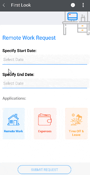
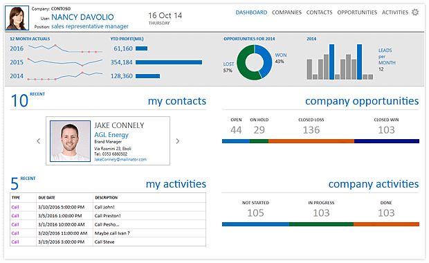
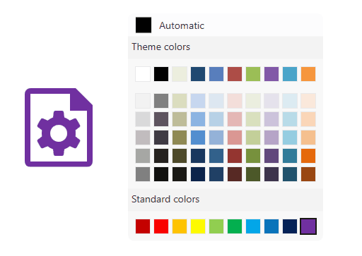
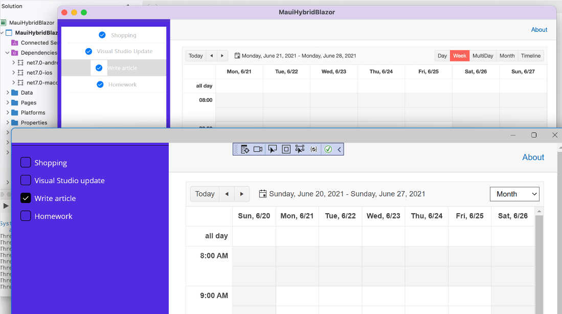
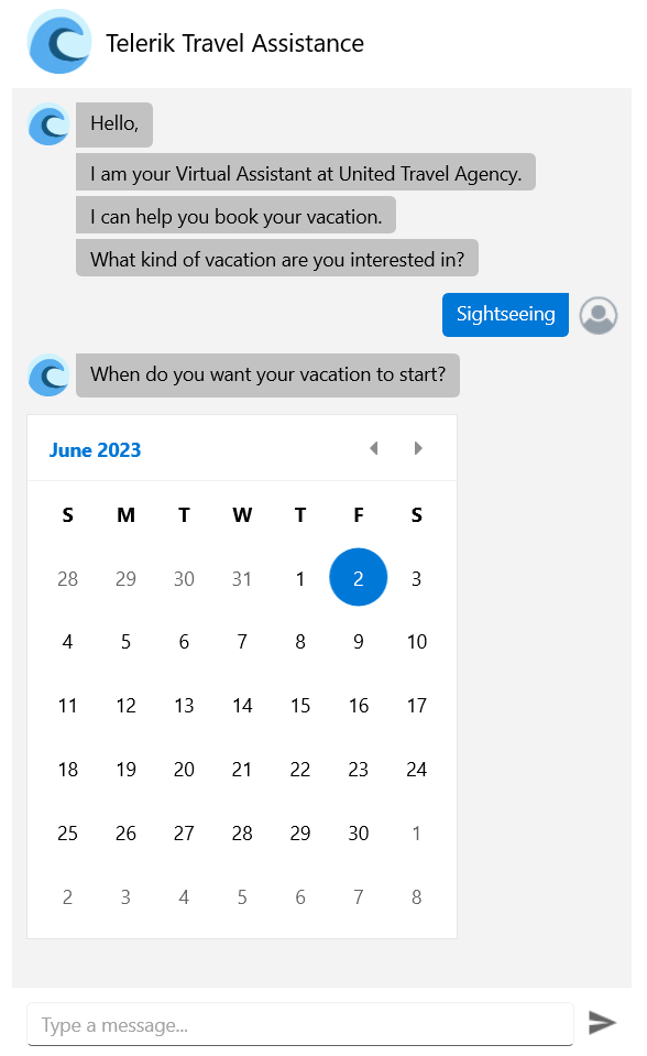
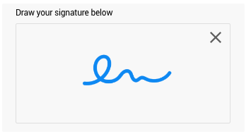
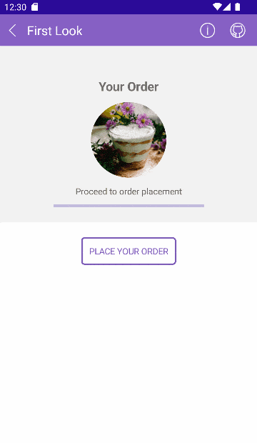
I’d like to introduce you to the new DataForm control in Telerik UI for .NET MAUI. This powerful control helps you to automatically create a form for collecting or editing data. For
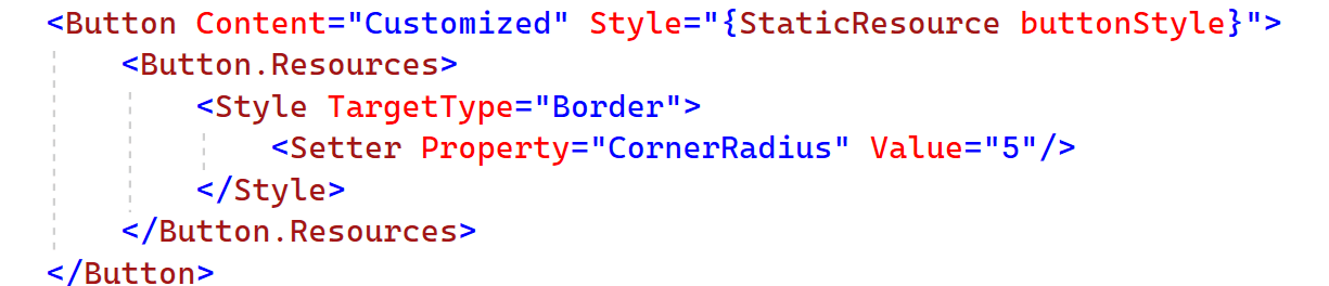
example, using the RadDataForm, you can easily create form-over-data UI for both mobile and desktop, like these:
Desktop:

Mobile:

The component supports different commit modes, allowing you to commit property values one by one or to commit the whole form at once. It’s also very easy to add validation to your forms and group UI elements to make
large forms more manageable.
With the DataForm control, you can not only build the needed UI by using the rich set of editors that are provided out of the box, but you can easily customize those forms through the flexible styling API.
Here are some of the key features you get in the new DataForm:
- Built-in editors: The DataForm provides a set of built-in editors for the available primitive types such as numeric, string, boolean, enumerations, DateTime and TimeSpan. The control detects the types
of the data object’s properties and automatically displays the appropriate editor.
- Validation support: You can use the built-in validation support that gives you full control over the data collected through the control.
- Commit modes: DataForm provides editing support with three types of commit modes to determine when the edited value should be synchronized with the business object.
- Grouping support: This allows you to easily group the form’s editors.
- Data Annotations support: You can decorate the data models using Data Annotations attributes which specify validation conditions to be applied to a specific field in the DataForm. You can use different
annotations like Requires, DataType, Display, RegularExpression and more.
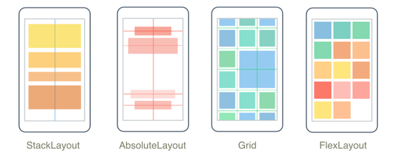
- Different layouts: You can arrange the editors and the groups by using different layouts such as stack, grid and more.
- Commands support: You can execute your validation logic or commit/cancel all pending changes in the form by using the built-in commands for these actions.
Visit our product documentation for more information on getting started with the Telerik UI for .NET MAUI DataForm control.
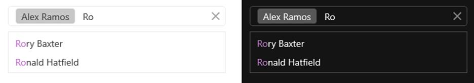
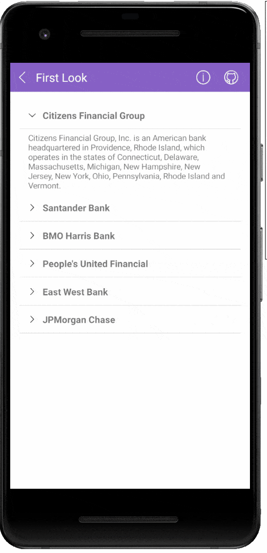
AutoComplete Joins the Family
The AutoComplete component is a popular control for various mobile and desktop applications and use cases. Especially useful when you have to display a long, predefined list to choose from, such as a list of airports
or a list of known recipients. Your app users expect this in modern apps, and now you can deliver it out of the box.

Some of the main features of the .NET MAUI AutoComplete are:
- Tokens support: You can enable the users of your application to search for and select several items from the source of the AutoComplete. These items appear as tokens that can easily be deselected
using their close button.
- Filtering options: You can define the filtering behavior to display all the matches that either “StartsWith” or “Contains” the typed symbols.
- Different suggest modes support: RadAutoComplete exposes three different modes (Suggest, Append, SuggestAppend) for providing suggestions.
- Placeholder: This is used to give guidance to the end user on what should be entered in the text input.
- NoResults message: NoResults message appears in the popup used for the list of suggestions whenever the control cannot find any matching items. Read more about this here.
- Visualized text formatting: You can modify the displayed details of the selected item by using DisplayTextFormatter property of AutoComplete.
- Custom templates: If any of the default templates do not fit a particular scenario, you can easily define a custom template.
- Highlight customization: This gives you the ability to highlight the text inside the custom template.
- Nested properties support: This allows binding of a complex object to the RadAutoComplete’s TextSearchPath property.
Visit our product documentation for more information on getting started with the Telerik UI for .NET MAUI AutoComplete control.
.NET MAUI Expander
RadExpander is a flexible control that helps you save space and achieve easier navigation through your app. You can place the Expander anywhere on your page and embed any content inside the dropdown area. The Expander
control also gives you control over its ExpandDirection to let you adjust the control as per your custom layout.

Here are some of the features the Expander control ships with:
- Collapsed and Expanded States: The control hosts the content in an expandable container that can be easily expanded/collapsed by tapping on its header.
- Animation: The RadExpander control provides a property that allows you to enable or disable the animation when the content is collapsed/expanded. If you want to enable/disable the animation,
you need to use the IsAnimationEnabled property.
- Customization Options: The rich API for customization of the Expander component allows you to customize the visual appearance of the control in a variety of ways. You can manipulate the Animation’s
duration and easing, the header of the control and its border styles.
Visit our product documentation for more information on getting started with the Telerik UI for .NET MAUI Expander control.
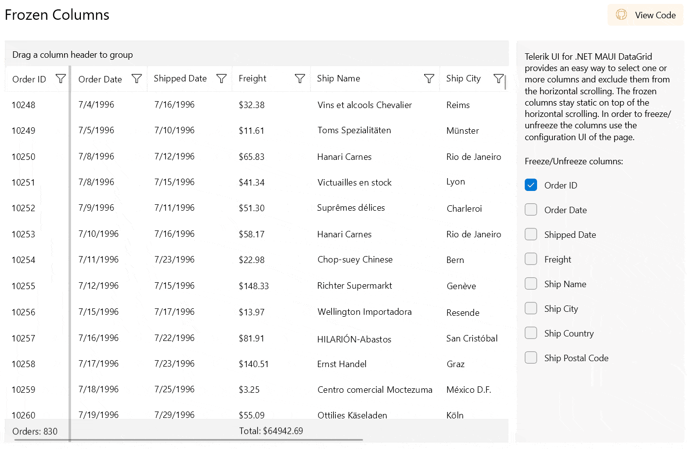
DataGrid Just Got a New Grouping UI
With our latest release, our powerful DataGrid component has evolved. The new enchantment is the so-called Grouping UI.

This area is called the DataGridServicePanel and allows the user to drag and drop column headers into the panel in order to group the data in the RadDataGrid at runtime.
The user is not limited to group just a single column—they are allowed to drag several columns into the panel, or rearrange the grouping. Grouping in this manner gives the user power to control how they
want to view the data and reduces the coding part for the developer.
If you want to restrict the user from grouping the data or limit the grouping to certain columns, you can do it by using DataGrid’s intuitive API for that.
More information about this feature can be found in DataGrid’s product documentation.
Column Footers
The new addition to the DataGrid control—the Column Footers functionality—allows you to display additional information which applies to the columns in a specific
row placed at the bottom of the control. This row consists of individual footer cells for each column. It is of type object, so you are not limited to just using plain text in it.

By default, column footers are hidden, so if you want to make them visible you have to set the DataGrid’s ShowColumnFooters property to True.
More information about this feature can be found in DataGrid’s product documentation.
Group Footers
DataGrid exposes the Group Footers feature, which provides the option to render a footer under each group in the data grid component. Group footers contain footer cells
that correspond to data columns and can display group summaries.
This footer row is also hidden by default. If you want to take advantage of this feature, you will have to enable it by setting the ShowGroupFooters property of the DataGrid to True.
More information about this feature can be found in DataGrid’s product documentation.
DataGrid Aggregate Functions
There are situations when displaying numbers in the DataGrid in which users would like to be able to see the results from aggregate calculations at the bottom of the DataGrid’s groups or columns.
Now, this can be easily achieved with the new addition to the DataGrid control—aggregate functions support. It allows you to display aggregated information for the data in the column’s
footer, in the group’s header or in the group’s footer.
DataGrid offers built-in support for the most popular aggregate functions: Average, Count, Sum, Min, Max and
Count. All you need to do is to add a PropertyAggregateDescriptors into DataGrid’s AggregateDescriptors with the needed function:
<telerikGrid:RadDataGrid>
  <telerikGrid:RadDataGrid.AggregateDescriptors>
    <telerikCore:PropertyAggregateDescriptor  PropertyName="Points" Function=
                                            "Average"/>
                                                </telerikGrid:RadDataGrid.AggregateDescriptors>
                                                </telerikGrid:RadDataGrid>
If you have a more complex scenario, you are also covered—there is an option for creating a custom aggregate function by using a DelegateAggregateDescriptor.
More information about this feature can be found in DataGrid’s product documentation.
Sign Up for a Trial
If you’re interested in starting to play with .NET MAUI, or if you’re already actively working with .NET MAUI to develop applications, I encourage you to check out Telerik UI for .NET
MAUI.
To get the bits, you just need to sign up for our free 30-day trial, which gives you access to the components as well as our legendary technical support. Head to the Telerik UI for .NET MAUI overview page or click the button below and sign up for
a trial today!
Try Telerik UI For .NET MAUI
Share Your Feedback
Please share your feedback, ideas and suggestions, either by commenting below or by visiting our Feedback Portal about Telerik UI for .NET MAUI. Let us know if
you have any suggestions and submit your features/controls requests.
What’s New in Telerik UI for Xamarin With R3 2022
Xamarin DataGrid Aggregates
With the new aggregate functions in the Xamarin DataGrid, you can display aggregated information for the data in the group’s header, or in the group/column’s footer.

The new feature comes with built-in support for the most popular aggregate functions: Average, Count, Sum, Min, Max and
Count. You can easily set up the aggregates by adding PropertyAggregateDescriptors into DataGrid’s AggregateDescriptors with the desired
function:
<telerikGrid:RadDataGrid>
  <telerikGrid:RadDataGrid.AggregateDescriptors>
    <telerikCore:PropertyAggregateDescriptor  PropertyName="Points"  Function="Average"/>
  </telerikGrid:RadDataGrid.AggregateDescriptors>
</telerikGrid:RadDataGrid>
The aggregates also support multiple types of complex scenarios through the extensibility point for defining a custom descriptor—DelegateAggregateDescriptor.
Visit our product documentation for more information on the Telerik UI for Xamarin Data Grid control and Aggregates.
The new addition to the DataGrid control—the Column Footers functionality—allows you to display additional information which applies to the columns in a specific row placed at the
bottom of the control. This row consists of individual footer cells for each column. It is of type object, so you are not limited to just using plain text in it.

By default, column footers are hidden, so if you want to make them visible, you have to set the DataGrid’s ShowColumnFooters property to True.
Visit our product documentation for more information on the Telerik UI for Xamarin Data Grid control and Column Footers.
With the current release, you have the ability to render a footer under each group inside the DataGrid component. The footer cells correspond to data columns and you can use them to display
group summaries.
All you need to do to use this functionality is set the DataGrid.ShowGroupFooters property to true.
Visit our product documentation for more information on getting started with the Telerik UI for Xamarin Data Grid control.
New IsLooping Property Now Available for All Xamarin Date and Time Pickers
With the latest release of Telerik UI for Xamarin, you can easily stop the looping functionality in the Date, Time, DateTime, Time and TimeSpan Pickers using just a single property—IsLooping.
When IsLooping is True, which is by default, the items of each spinner can loop infinitely unless that spinner is restricted to show only a subset of the available values.
Picker with disabled looping
Picker with enabled looping


Visit our product documentation for more information on the Telerik UI for Xamarin DatePicker control IsLooping property.
Get the Latest & Let Us Know Your Feedback
Please share your feedback, ideas and suggestions, either by commenting below or by visiting our Feedback Portal about
Telerik UI for Xamarin.
Don’t hesitate to check out the latest:
Try Telerik UI For Xamarin
Telerik .NET Web, Desktop & Mobile Products Webinar & Twitch Session

Wednesday, September 21, 2022 | 11:00 a.m. – 1:00 p.m. ET
Discover all updates across Telerik UI for Blazor, UI for ASP.NET Core, UI for ASP.NET MVC, UI for ASP.NET
AJAX, UI for WPF, UI for WinForms, UI for WinUI, UI for Xamarin and UI for .NET MAUI.
Save Your Seat
Join Us on Twitch Today
Live from Devreach’22 @ Progress360: Join the live community session from the Progress360 Streaming Studio on September 14 from 10 a.m. – 11:30 a.m. ET to hear the release highlights and celebrate the DevReach spirit with us at our
Livestream Release Party.
And the Best Part About the Release Webinars?
The live webinars and Twitch sessions are a great opportunity for you to ask questions before and during the webinars. We’ll be waiting to hear from you on Twitter—just use the
#heyTelerik and #heyKendoUI hashtags.
Another great option is the live chat during our release session on CodeItLive, our Twitch channel.
 ]]>
]]>
 ]]>
]]>
 ]]>
]]>
 ]]>
]]>
 ]]>
]]>
 ]]>
]]>


 ]]>
]]>
 ]]>
]]>
 ]]>
]]>
 ]]>
]]>


.gif?sfvrsn=307bf102_1)


 ]]>
]]>
 ]]>
]]>

 ]]>
]]>


 ]]>
]]>


 ]]>
]]>