The .NET MAUI Conversational UI (Chat) component allows integrating chat experiences into your mobile and desktop applications. Learn how to work with this chat component, use cases and how to integrate LLM models.One of the best ways to connect with a customer is through conversations, whether with a real person or through an AI agent that provides information about the company or solves problems using a knowledge base.
If you are creating .NET MAUI applications, you should know that in the Progress Telerik suite you can find the .NET MAUI Conversational UI (Chat) component, featuring several characteristics that will allow you to create chat-based applications quickly.
Throughout this post, we will create an app that uses AI models to provide tips on healthy eating. Let’s see how to do it!
Understanding the RadChat Control from Telerik for .NET MAUI
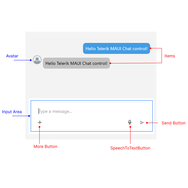
The RadChat control from Telerik for .NET MAUI is a component that allows users to interact through a conversational interface, production-ready, capable of handling text messages, attachments, voice-to-text integration and full customization so you can adapt it to your own style, among many other features.
The control is composed of different graphical elements that we can control and modify through code, as shown in the following image:
Some typical use cases for the control include:
- AI chatbots
- Real-time customer support
- Messaging applications
- Virtual assistants
- Image analysis with vision AI models
- Among many others
Let’s see how to implement the control in a real application.
Setting Up a .NET MAUI Project to Integrate Chat Conversations
The first and most important thing when using the chat component in our applications is to follow the official installation guide, which shows different ways to set up your environment.
Additionally, if you want to use any AI model, you need to set up the project by installing the corresponding NuGet packages. As a personal preference, I always like to use Microsoft.Extensions.AI, as it greatly simplifies handling requests to both OpenAI and Azure OpenAI. For this, install the following packages:
Azure.AI.OpenAIMicrosoft.Extensions.AIMicrosoft.Extensions.AI.OpenAI
Finally, to facilitate handling with the MVVM pattern, I recommend installing the community toolkit through the following package:
With the packages installed, let’s implement the control.
Integrating Chat Functionality into a .NET MAUI Project
To use the RadChat control in a .NET MAUI application, you need to do this using the RadChat tag as shown in the following example:
<ContentPage ...
    xmlns:telerik="http://schemas.telerik.com/2022/xaml/maui">

    <telerik:RadChat x:Name="chat" />

</ContentPage>
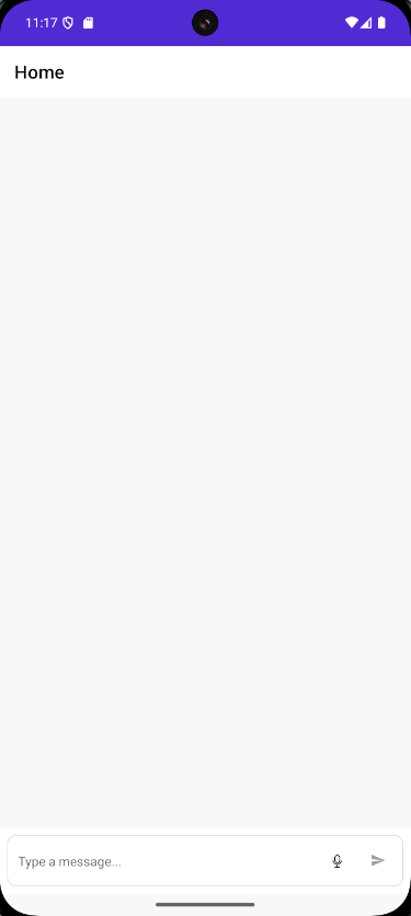
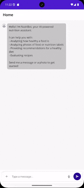
By including the above code, we will immediately see the chat control in the emulator:
Interacting with Chat Messages in a .NET MAUI App
To work with chat messages, you should know that the class ChatMessage is the basic class for handling messages, which contains the property Author, used to define the information of a participant that will appear in the UI. Author contains data such as Name, Avatar and Data.
It is possible to extend this class as the control itself does through TextMessage, which inherits from ChatMessage by adding the property Text.
Knowing this, we will create a list of TextMessage to maintain the conversation history, as well as define the different roles of type Author that will be used in the conversation. For the example, I have created the class ChatViewModel, which looks as follows:
public partial class ChatViewModel : ObservableObject
{
    [ObservableProperty]
    private ObservableCollection<TextMessage> items = [];

    public Author Me { get; }
    public Author Bot { get; }

    public ChatViewModel()
    {
        Me = new Author { Name = "You" };
        Bot = new Author { Name = "NutriBot" };

        Items.Add(new TextMessage
        {
            Author = Bot,
            Text = "Hello!  I'm NutriBot, your AI-powered nutrition assistant.\n\n" +
                    "I can help you with:\n" +
                    "Analyzing how healthy a food is\n" +
                    "Analyzing photos of food or nutrition labels\n" +
                    "Providing recommendations for a healthy diet\n" +
                    "Evaluating recipes\n\n" +
                    "Send me a message or a photo to get started!"
        });
    }
}
On the other hand, the RadChat control has the properties Author, which allows specifying who is interacting, in addition to Items, responsible for managing the message history:
<telerik:RadChat
    x:Name="chat"
    Author="{Binding Me}"
    ItemsSource="{Binding Items}" />
For the previous viewmodel to work correctly, remember to configure both the code-behind of your page and the dependency injection as follows:
MauiProgram.cs
public static class MauiProgram
{
    public static MauiApp CreateMauiApp()
    {
        var builder = MauiApp.CreateBuilder();
        ...
        builder.Services.AddTransient<ChatViewModel>();
        ...
        return builder.Build();
    }
}
MainPage.xaml.cs
public MainPage(ChatViewModel viewModel)
{
    InitializeComponent();
    BindingContext = viewModel;
}
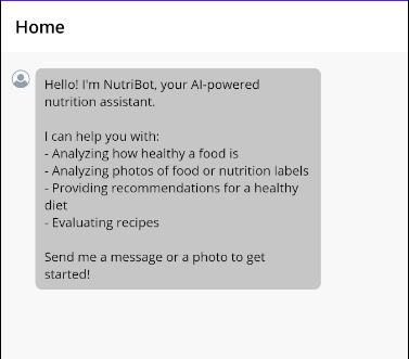
Executing the previous code allows you to see the welcome message in the chat history:
Receiving and Returning Chat Messages
So far, we have a list of messages in the application; however, there is no real interaction, meaning that messages are not sent or received back. The control has some commands by default that can help us with this task:
SendMessageCommand: executes when a message is sentPickFileCommand: executes when attempting to attach a filePickPhotoCommand: executes when wanting to attach a photoTakePhotoCommand: executes when the camera opens to take a photo
There are other commands for working with attachments, but the main ones are the above.
Let’s implement the functionality to send and receive messages in the viewmodel, creating a property Message that allows binding the user’s message, in addition to a method SendMessage, which will be linked to SendMessageCommand as follows:
public partial class ChatViewModel : ObservableObject
{
    ...
    [ObservableProperty]
    private string message = string.Empty;
    ...

    [RelayCommand]
    private async Task SendMessage()
    {
        var messageText = Message;
        Message = string.Empty;

        Items.Add(new TextMessage { Author = Me, Text = messageText });

        Items.Add(new TextMessage { Author = Bot, Text = "Message received!" });
    }
}
In the UI page, you need to bind this pair of elements using Message and SendMessageCommand:
<telerik:RadChat ...
    Message="{Binding Message}"
    SendMessageCommand="{Binding SendMessageCommand}" />
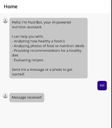
With these new changes, we can see that there is a response in the chat window after an interaction:
Now let’s see how to connect an AI model so that we can have more realistic conversations.
Connecting an LLM Model to a Chat App in .NET MAUI
To use AI in our application, I have created a service-like class that manages the prompt, model information and methods related to obtaining results from the LLM.
It is worth noting that I have created some variables to store the connection data with the model, solely for demonstration purposes. Ideally, these data should be stored securely on the device, create an external service to handle it, etc.
The class looks like this:
public class ChatService
{
private const string Endpoint = "your-endpoint";
private const string DeploymentName = "your-deployment-name";
private const string ApiKey = "your-api-key";
private readonly IChatClient _chatClient;
private readonly List<ChatMessage> _history;
private const string SystemPrompt = """
You are an expert and friendly nutritionist. Your role is to:
- Analyze food photographs and nutrition labels (nutrition facts)
- Evaluate how healthy a food is for a balanced diet
- Provide healthy eating recommendations
- Suggest healthier alternatives when necessary
- Analyze recipes and give your professional opinion
- Answer questions about nutrition, diets, and food wellness
When analyzing an image:
1. Identify the food or nutrition label
2. Give a rating from 1-10 on how healthy it is
3. Explain the nutritional pros and cons
4. Suggest improvements or alternatives
Always respond in a concise but informative manner.
Don't use emojis.
""";
public ChatService()
{
_chatClient = new AzureOpenAIClient(
new Uri(Endpoint),
new ApiKeyCredential(ApiKey))
.GetChatClient(DeploymentName)
.AsIChatClient();
_history =
[
new(ChatRole.System, SystemPrompt)
];
}
public async Task<string> SendMessageAsync(string userMessage)
{
_history.Add(new(ChatRole.User, userMessage));
var response = await _chatClient.GetResponseAsync(_history);
var assistantMessage = response.Text ?? string.Empty;
_history.AddMessages(response);
return assistantMessage;
}
public async Task<string> SendMessageWithImageAsync(string userMessage, byte[] imageBytes, string mimeType)
{
var contents = new List<AIContent>
{
new TextContent(string.IsNullOrWhiteSpace(userMessage)
? "Analyze this image from a nutritional perspective. How healthy is it?"
: userMessage),
new DataContent(imageBytes, mimeType)
};
var message = new ChatMessage(ChatRole.User, contents);
_history.Add(message);
var response = await _chatClient.GetResponseAsync(_history);
var assistantMessage = response.Text ?? string.Empty;
_history.AddMessages(response);
return assistantMessage;
}
}
In the code above, you can see that the methods SendMessageAsync are defined to send only text messages, and SendMessageWithImageAsync to send text along with images, which prepares us for the following sections.
To use it, we must update the viewmodel code to receive the instance of the new service:
public partial class ChatViewModel : ObservableObject
{
    private readonly ChatService _chatService;
    ...
    public ChatViewModel(ChatService chatService)
    {
        _chatService = chatService;
        ...
    }
    [RelayCommand]

    private async Task SendMessage()
    {
        ...
        try
        {
            Items.Add(new TextMessage { Author = Me, Text = messageText });

            var response = await _chatService.SendMessageAsync(messageText);

            Items.Add(new TextMessage { Author = Bot, Text = response });
        }
        catch (Exception ex)
        {
            Items.Add(new TextMessage
            {
                Author = Bot,
                Text = $"⚠️ Error processing your message: {ex.Message}"
            });
        }
    }
}
In the previous update, you can also see that I have changed the method SendMessage, adding an try-catch for any error that might occur, in addition to using the service to obtain a response from the LLM model. You should also add the new service to the dependency container in MauiProgram.cs:
builder.Services.AddSingleton<ChatService>();
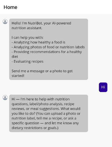
With the previous changes, we will see a more realistic response created thanks to an LLM model:
Attaching Elements to the Conversation
Next, we will see how we can attach images to the conversation, with the purpose of querying the AI model for information about them. The first thing we will do is create a model that represents the attachments:
public partial class AttachedFileData : ObservableObject
{
    [ObservableProperty]
    private string name = string.Empty;

    [ObservableProperty]
    private long size;

    [ObservableProperty]
    private Func<Task<Stream>> getStream = () => Task.FromResult<Stream>(Stream.Null);

    [ObservableProperty]
    private byte[]? imageBytes;

    [ObservableProperty]
    private string? mimeType;
}
With the class that defines an attachment ready, we can create a list with a generic AttachedFileData, which will allow us to display them in a special section in the chat window.
public partial class ChatViewModel : ObservableObject
{
    ...
    [ObservableProperty]
    private ObservableCollection<AttachedFileData> attachedFiles = [];
    ...
    [RelayCommand]
    private async Task AttachFile(IList<AttachedFileData>? filesToAttach)
    {
        if (filesToAttach is null) return;

        foreach (var file in filesToAttach)
        {
            AttachedFiles.Add(file);
        }

        filesToAttach.Clear();
    }
In the code above, we have also defined a method called AttachFile, which will allow us to attach the attachments to the list. In the graphic control, we need to perform two operations.
- Activate the button to attach files via
IsMoreButtonVisible - Bind
AttachFilesCommand to the viewmodel method - Bind
AttachedFilesSource to AttachedFiles
We can see this below:
<telerik:RadChat ...
    AttachFilesCommand="{Binding AttachFilesCommand}"
    AttachedFilesSource="{Binding AttachedFiles}"
    IsMoreButtonVisible="True" />
With the previous modifications, we will see a new button to attach attachments. Although we might think that the above is enough for the LLM to respond correctly to messages with images, if we try to query something with an attached image, we will get a response regarding the LLM model’s unawareness of the attached file:
This happens because we have not added the attached file to the message list. To achieve this, several steps need to be followed:
- Detect when the collection of files changes:
public ChatViewModel(ChatService chatService)
{
   ...
    AttachedFiles.CollectionChanged += OnAttachedFilesChanged;
}
- Create the event handler for when the collection changes. This will allow adding the corresponding information according to the type of file:
private async void OnAttachedFilesChanged(object? sender, NotifyCollectionChangedEventArgs e)
{
if (e.Action == NotifyCollectionChangedAction.Add && e.NewItems != null)
{
foreach (AttachedFileData file in e.NewItems)
{
await LoadFileData(file);
}
}
}
private async Task LoadFileData(AttachedFileData file)
{
try
{
using var stream = await file.GetStream();
using var ms = new MemoryStream();
await stream.CopyToAsync(ms);
file.ImageBytes = ms.ToArray();
var extension = Path.GetExtension(file.Name).ToLowerInvariant();
file.MimeType = extension switch
{
".jpg" or ".jpeg" => "image/jpeg",
".png" => "image/png",
".gif" => "image/gif",
".webp" => "image/webp",
_ => "image/jpeg"
};
}
catch (Exception ex)
{
Items.Add(new TextMessage
{
Author = Bot,
Text = $"⚠️ Error loading file {file.Name}: {ex.Message}"
});
}
}
- In addition to the above, we need to modify the method for sending messages. Before doing that, to display the new messages in the history, we need to create a new class to handle the image information. In our case, it is as follows:
public partial class ChatMessageItem : ObservableObject
{
    [ObservableProperty]
    private object? author;

    [ObservableProperty]
    private string text = string.Empty;

    [ObservableProperty]
    private byte[]? imageData;

    [ObservableProperty]
    private string? imageMimeType;

    [ObservableProperty]
    private string? imageFileName;
}
With this change, we can now update the method that sends the messages, adding the necessary code for a message to contain information about the image. Make sure to change all references from TextMessage to ChatMessageItem:
[RelayCommand]
private async Task SendMessage()
{
    var messageText = Message;
    var filesToSend = AttachedFiles.ToList();
    Message = string.Empty;

    try
    {
        if (filesToSend.Count > 0)
        {
            var file = filesToSend[0];

            Items.Add(new ChatMessageItem
            {
                Author = Me,
                Text = string.IsNullOrWhiteSpace(messageText)
                    ? " Analyzing this image..."
                    : messageText,
                ImageData = file.ImageBytes,
                ImageMimeType = file.MimeType,
                ImageFileName = file.Name
            });

            var response = await _chatService.SendMessageWithImageAsync(
                string.IsNullOrWhiteSpace(messageText)
                    ? "Analyze this image from a nutritional perspective."
                    : messageText,
                file.ImageBytes!,
                file.MimeType ?? "image/jpeg");

            Items.Add(new ChatMessageItem { Author = Bot, Text = response });
        }
        else
        {
           ...
        }
    }
    ...
}
If you try to run the application at this moment, you will encounter an exception like the following:
`Unable to convert item of type MauiRadChatTests.ChatMessageItem to Telerik.Maui.Controls.Chat.ChatItem. You need to set the ItemConverter of the RadChat`.
The message is very descriptive about what we need to do: assign a value to ItemConverter. Let’s do that next.
Displaying Attachments in the Conversation History
To understand this section, you should know that the control RadChat works internally with its own types, such as ChatItem, ChatAttachedFile, etc. However, in an MVVM architecture, the viewmodel should not know or depend on specific types in the UI. This is why the control mandates the use of some converters to perform a conversion between business objects and graphical control elements.
ItemConverter is a property we need to assign through a class that inherits from IChatItemConverter. Its purpose is to convert a data model ChatMessageItem (or the type you have defined) into a Telerik UI type ChatItem, so that binding to the property ItemsSource can be done correctly.
The method ConvertToChatItem is used every time RadChat needs to render an element of the collection ItemSource, while ConvertToDataItem is used when RadChat wants to create a new item automatically, such as when the user presses Send. We will use null because we will handle everything from the viewmodel.
In the following example, you can see how we compare whether it is a text message or an image, and based on that we return either ChatAttachmentsMessage or TextMessage:
public class ChatItemConverter : IChatItemConverter
{
    public ChatItem ConvertToChatItem(object dataItem, ChatItemConverterContext context)
    {
        var item = (ChatMessageItem)dataItem;

        var vm = (ChatViewModel)context.Chat.BindingContext;
        var author = item.Author == vm.Bot ? vm.Bot : context.Chat.Author;

        if (item.ImageData != null && item.ImageData.Length > 0)
        {
            var imageSource = ImageSource.FromStream(() => new MemoryStream(item.ImageData));

            var attachment = new ChatAttachment
            {
                FileName = item.ImageFileName ?? "image.jpg",
                FileSize = item.ImageData.Length,
                Data = imageSource,
                GetFileStream = () => Task.FromResult<Stream>(new MemoryStream(item.ImageData))
            };

            var attachmentMessage = new ChatAttachmentsMessage
            {
                Data = dataItem,
                Author = author,
                Text = item.Text,
                Attachments = new List<ChatAttachment> { attachment }
            };

            return attachmentMessage;
        }

        var textMessage = new TextMessage
        {
            Data = dataItem,
            Author = author,
            Text = item.Text
        };

        return textMessage;
    }

    public object? ConvertToDataItem(object message, ChatItemConverterContext context)
    {
        return null;
    }
}
In the above code, you can see that we are very specific in loading the image through the use of ImageSource.FromStream, necessary to bind a Image control to an image. This converter needs to be bound to the property ItemConverter as we saw in the exception description:
<ContentPage
    ...
    xmlns:converters="clr-namespace:MauiRadChatTests">


    <ContentPage.Resources>
        <converters:ChatItemConverter x:Key="ChatItemConverter" />
    </ContentPage.Resources>

    <telerik:RadChat ...
        ItemConverter="{StaticResource ChatItemConverter}" />
</ContentPage>
Now, if we tried to run the application again, we would receive the following error:
The AttachedFileConverter is null. This converter must be set, so that the RadChat can automatically convert IFileInfo instances to a business object that represents an attached file, and add them to the AttachedFilesSource collection. Alternatively, you can add attachments objects in your view model via the AttachFilesCommand or AttachFiles event.
The previous error tells us that we need to implement a second converter, necessary to convert a business object and add it to the collection of attachments. This means we need to implement a class that implements the IChatAttachedFileConverter interface, which will be responsible for translating our file model AttachedFileData to a ChatAttachedFile from Telerik.
In our case, the converter looks like this:
public class AttachedFileConverter : IChatAttachedFileConverter
{
    private static AttachedFileConverter? _instance;
    public static AttachedFileConverter Instance => _instance ??= new AttachedFileConverter();

    public ChatAttachedFile ConvertToChatAttachedFile(object dataItem, ChatAttachedFileConverterContext context)
    {
        var data = (AttachedFileData)dataItem;
        var chatAttachedFile = new ChatAttachedFile
        {
            Data = data,
            FileName = data.Name,
            FileSize = data.Size
        };
        return chatAttachedFile;
    }

    public object ConvertToDataItem(Telerik.Maui.Controls.IFileInfo fileToAttach, ChatAttachedFileConverterContext context)
    {
        return CreateAttachedFileData(fileToAttach);
    }

    internal static AttachedFileData CreateAttachedFileData(Telerik.Maui.Controls.IFileInfo file)
    {
        return new AttachedFileData
        {
            Name = file.FileName,
            Size = file.FileSize,
            GetStream = file.OpenReadAsync,
        };
    }
}
In the control, we must assign the instance of the class to AttachedFileConverter, preferably allowing a single instance through the use of x:Static:
<telerik:RadChat ...
    AttachedFileConverter="{x:Static converters:AttachedFileConverter.Instance}"/>
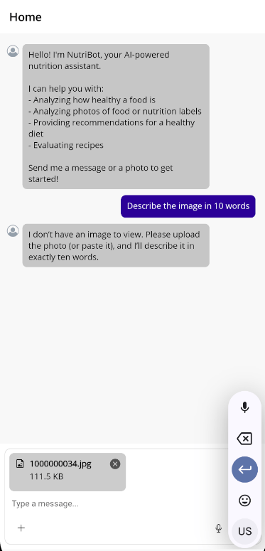
With the implementation of the previous changes, it is now possible to run the application, which returns information on a query of type image + text:
With this, we have created a useful and real application based on a chat component, which we developed quickly and easily thanks to the controls from the Telerik suite for .NET MAUI.
Conclusion
Throughout this post, we have explored the .NET MAUI Conversational UI (Chat) component, which allows integrating chat experiences into your applications. We have seen how to configure it, the parts that make it up, use cases, how to integrate LLM models for its usage, among other topics.
This is just the beginning, as in the official documentation you can find other relevant topics about customizing the control. See you in the next post.
Want to Try It Yourself?
The Telerik UI for .NET MAUI component library comes with a free 30-day trial. So go ahead!
Try Now
]]>