<?xml version="1.0" encoding="UTF-8"?>
<?xml-stylesheet type="text/xsl" media="screen" href="/~files/atom-premium.xsl"?>
                                                                                                                                                                                                                                                                                                                                                                                                                                                                                                                                             
<feed xmlns="http://www.w3.org/2005/Atom" xmlns:feedpress="https://feed.press/xmlns" xmlns:media="http://search.yahoo.com/mrss/" xmlns:podcast="https://podcastindex.org/namespace/1.0">
  <feedpress:locale>en</feedpress:locale>
  <link rel="hub" href="https://feedpress.superfeedr.com/"/>
  <logo>https://static.feedpress.com/logo/telerik-blogs-people-accessibility-6185395ed626f.jpg</logo>
  <title type="text">Telerik Blogs | People | Accessibility</title>
  <subtitle type="text">The official blog of Progress Telerik - expert articles and tutorials for developers.</subtitle>
  <id>uuid:ef233391-5030-4295-b2b7-e7980cca24b2;id=4760</id>
  <updated>2026-04-11T21:18:51Z</updated>
  <link rel="alternate" href="https://www.telerik.com/"/>
  <link rel="self" type="application/atom+xml" href="https://feeds.telerik.com/blogs/people-accessibility"/>
  <entry>
    <id>urn:uuid:8adaf186-7275-4dfe-8fbd-0e63950051ac</id>
    <title type="text">Build Accessible Components with Angular Aria</title>
    <summary type="text">A simple way to add accessibility to your Angular app is with Angular Aria, which gives you production-ready, WCAG-compliant directives. Take a look.</summary>
    <published>2026-04-01T19:25:26Z</published>
    <updated>2026-04-11T21:18:51Z</updated>
    <author>
      <name>Dany Paredes </name>
    </author>
    <link rel="alternate" href="https://feeds.telerik.com/link/23074/17311882/build-accessible-components-angular-aria"/>
    <content type="text"><![CDATA[<p><span class="featured">A simple way to add accessibility to your Angular app is with Angular Aria, which gives you production-ready, WCAG-compliant directives.</span></p><p>Building accessible components is one of those things we know we <em>should</em> do, but often skip because it feels overwhelming. We need to <a target="_blank" href="https://www.telerik.com/blogs/improving-navigation-accessibility-4-quick-tips">read about accessibility tips and tricks</a> and a lot of documentation.</p><p>You start with a simple dropdown menu, knowing you need to handle keyboard navigation, ARIA attributes, focus management and screen reader support. Before you know it, your &ldquo;simple&rdquo; component has 200 lines of accessibility code you&rsquo;re not even sure is correct. (Unless you&rsquo;re using the Progress Kendo UI for <a target="_blank" href="https://www.telerik.com/kendo-angular-ui">Angular library</a>, which has accessibility baked in for you. )</p><p>What if I told you there&rsquo;s a way to get the accessibility magic you need, regardless of component library, with full control over your styling with the magic of <a target="_blank" href="https://angular.dev/guide/aria/overview">Angular Aria</a>?</p><p>But what is Angular Aria? Let&rsquo;s make a small intro.</p><h2 id="what-is-angular-aria">What Is Angular Aria?</h2><p>Think of Angular Aria as a collection of accessibility superpowers for your components, but instead of manually implementing keyboard navigation, ARIA attributes and focus management, you import a directive, add it to your HTML and, boom, your component is accessible.</p><p>The Angular team built these directives following the <a target="_blank" href="https://www.w3.org/WAI/ARIA/apg/">W3C Accessibility Guidelines</a>, so you don&rsquo;t have to become an accessibility expert to build compliant components.</p><h2 id="hold-on-what-about-angular-material">Hold On, What About Angular Material?</h2><p>Great question! If you&rsquo;ve been using Angular for a while, you&rsquo;re probably thinking: <em>&ldquo;We already have <a target="_blank" href="https://material.angular.io/">Angular Material</a>. Why do we need another library?&rdquo;</em></p><p>Here are the key differences:</p><p>Angular Material gives you complete, prestyled components. They look great out of the box, but they come with Material Design opinions baked in. If you want a button that doesn&rsquo;t look like a Material button, you&rsquo;re going to fight the framework.</p><p>Angular Aria gives you headless directives&mdash;just the accessibility logic, zero styling. You get all the keyboard navigation, ARIA attributes and screen reader support, but you control every pixel of how it looks.</p><p>Think of it this way:</p><ul><li>Angular Material: It is plug and play, looks good, works immediately, but everyone has the same result. If you were building a physical doorway to your business, it would look like all other businesses, just with your business name on the sign.</li><li>Angular Aria: This tool is more like the ramp to your front door, enabling anyone to access the business entrance, while allowing you to choose the awning, the window display and the door color.</li></ul><p>So when should you use each one? We&rsquo;ll dive deeper into that later in the article, but here&rsquo;s the quick answer:</p><ul><li>Use <strong>Angular Material</strong> when you need to ship fast and Material Design works for you.</li><li>Use <strong>Angular Aria</strong> when you have custom design requirements and need full control.</li></ul><p>Remember, accessibility isn&rsquo;t optional anymore. It&rsquo;s a <a target="_blank" href="https://www.telerik.com/blogs/what-does-european-accessibility-act-mean-developers">legal requirement</a> in many countries, and, more importantly, it&rsquo;s the right thing to do.</p><p>But implementing accessibility correctly is <strong>hard</strong>. You need to know:</p><ul><li>Which ARIA attributes to use (and when)</li><li>How keyboard navigation should work for each pattern</li><li>How to manage focus properly</li><li>How screen readers interpret your markup</li></ul><p>Angular Aria handles this complexity for you. You focus on the HTML structure, CSS styling and business logic, and Angular Aria takes care of accessibility.</p><p>But, as always, the best way to learn is by building something. Let&rsquo;s do it!</p><h2 id="set-up-the-project">Set Up the Project</h2><p>First, create a new Angular application. In your terminal, run the following command (be sure to have Node.js installed).</p><pre class=" language-bash"><code class="prism  language-bash">npx @angular/cli@latest new angular-aria-demo
</code></pre><p>When CLI prompts stylesheet format, pick CSS.</p><pre class=" language-bash"><code class="prism  language-bash">  - **Which stylesheet <span class="token function">format</span> would you like to use?** &rarr; CSS
</code></pre><p>Now, navigate to your project and add Angular Aria:</p><pre class=" language-bash"><code class="prism  language-bash"><span class="token function">cd</span> angular-aria-demo
<span class="token function">npm</span> <span class="token function">install</span> @angular/aria
</code></pre><p>That&rsquo;s it. We now have a fresh Angular project with Angular Aria installed. Let&rsquo;s build something accessible!</p><h2 id="building-an-accessible-toolbar">Building an Accessible Toolbar</h2><p>Let&rsquo;s build a text formatting toolbar, the kind you see in rich text editors. This is a perfect example because it looks simple but has surprising accessibility complexity.</p><p>Using the CLI, generate a new component editor-toolbar:</p><pre class=" language-bash"><code class="prism  language-bash">ng generate c components/editor-toolbar
</code></pre><p>Perfect! Open the component with your editor, and import <code>Toolbar</code>, <code>ToolbarWidget</code> and <code>ToolbarWidgetGroup</code> directives provided by <code>@angular/aria/toolbar</code>.</p><pre class=" language-typescript"><code class="prism  language-typescript">  <span class="token keyword">import</span> <span class="token punctuation">{</span> Component <span class="token punctuation">}</span> <span class="token keyword">from</span> <span class="token string">'@angular/core'</span><span class="token punctuation">;</span>
  <span class="token keyword">import</span> <span class="token punctuation">{</span> Toolbar<span class="token punctuation">,</span> ToolbarWidget<span class="token punctuation">,</span> ToolbarWidgetGroup <span class="token punctuation">}</span> <span class="token keyword">from</span> <span class="token string">'@angular/aria/toolbar'</span><span class="token punctuation">;</span>
  
  @<span class="token function">Component</span><span class="token punctuation">(</span><span class="token punctuation">{</span>
    selector<span class="token punctuation">:</span> <span class="token string">'app-editor-toolbar'</span><span class="token punctuation">,</span>
    templateUrl<span class="token punctuation">:</span> <span class="token string">'./editor-toolbar.component.html'</span><span class="token punctuation">,</span>
    styleUrl<span class="token punctuation">:</span> <span class="token string">'./editor-toolbar.component.css'</span><span class="token punctuation">,</span>
    imports<span class="token punctuation">:</span> <span class="token punctuation">[</span>Toolbar<span class="token punctuation">,</span> ToolbarWidget<span class="token punctuation">,</span> ToolbarWidgetGroup<span class="token punctuation">]</span><span class="token punctuation">,</span>
  <span class="token punctuation">}</span><span class="token punctuation">)</span>
  <span class="token keyword">export</span> <span class="token keyword">class</span> <span class="token class-name">EditorToolbarComponent</span> <span class="token punctuation">{</span><span class="token punctuation">}</span>
</code></pre><p>Now it&rsquo;s time to build the HTML structure. We create a div container with the directive <code>[ngToolbar]</code>, which works as the main container. We also need <code>ToolbarWidget</code> to use with individual buttons and <code>ToolbarWidgetGroup</code> for groups of related buttons.</p><p>In the following HTML, we use every directive with divs and button elements. Copy it and paste into the <code>editor-toolbar.html</code>.</p><pre class=" language-html"><code class="prism  language-html">  <span class="token tag"><span class="token tag"><span class="token punctuation">&lt;</span>div</span> <span class="token attr-name">ngToolbar</span> <span class="token attr-name">aria-label</span><span class="token attr-value"><span class="token punctuation">=</span><span class="token punctuation">"</span>Text Formatting Tools<span class="token punctuation">"</span></span><span class="token punctuation">&gt;</span></span>
  <span class="token tag"><span class="token tag"><span class="token punctuation">&lt;</span>div</span> <span class="token attr-name">class</span><span class="token attr-value"><span class="token punctuation">=</span><span class="token punctuation">"</span>group<span class="token punctuation">"</span></span><span class="token punctuation">&gt;</span></span>
   <span class="token tag"><span class="token tag"><span class="token punctuation">&lt;</span>button</span> <span class="token attr-name">ngToolbarWidget</span>
           <span class="token attr-name">value</span><span class="token attr-value"><span class="token punctuation">=</span><span class="token punctuation">"</span>undo<span class="token punctuation">"</span></span>
           <span class="token attr-name">type</span><span class="token attr-value"><span class="token punctuation">=</span><span class="token punctuation">"</span>button<span class="token punctuation">"</span></span>
           <span class="token attr-name">aria-label</span><span class="token attr-value"><span class="token punctuation">=</span><span class="token punctuation">"</span>undo<span class="token punctuation">"</span></span><span class="token punctuation">&gt;</span></span>
     Undo
   <span class="token tag"><span class="token tag"><span class="token punctuation">&lt;/</span>button</span><span class="token punctuation">&gt;</span></span>
   <span class="token tag"><span class="token tag"><span class="token punctuation">&lt;</span>button</span> <span class="token attr-name">ngToolbarWidget</span>
           <span class="token attr-name">value</span><span class="token attr-value"><span class="token punctuation">=</span><span class="token punctuation">"</span>redo<span class="token punctuation">"</span></span>
           <span class="token attr-name">type</span><span class="token attr-value"><span class="token punctuation">=</span><span class="token punctuation">"</span>button<span class="token punctuation">"</span></span>
           <span class="token attr-name">aria-label</span><span class="token attr-value"><span class="token punctuation">=</span><span class="token punctuation">"</span>redo<span class="token punctuation">"</span></span><span class="token punctuation">&gt;</span></span>
     Redo
   <span class="token tag"><span class="token tag"><span class="token punctuation">&lt;/</span>button</span><span class="token punctuation">&gt;</span></span>
 <span class="token tag"><span class="token tag"><span class="token punctuation">&lt;/</span>div</span><span class="token punctuation">&gt;</span></span>

 <span class="token tag"><span class="token tag"><span class="token punctuation">&lt;</span>div</span> <span class="token attr-name">class</span><span class="token attr-value"><span class="token punctuation">=</span><span class="token punctuation">"</span>separator<span class="token punctuation">"</span></span> <span class="token attr-name">role</span><span class="token attr-value"><span class="token punctuation">=</span><span class="token punctuation">"</span>separator<span class="token punctuation">"</span></span><span class="token punctuation">&gt;</span></span><span class="token tag"><span class="token tag"><span class="token punctuation">&lt;/</span>div</span><span class="token punctuation">&gt;</span></span>

 <span class="token comment">&lt;!-- Text formatting group --&gt;</span>
 <span class="token tag"><span class="token tag"><span class="token punctuation">&lt;</span>div</span> <span class="token attr-name">class</span><span class="token attr-value"><span class="token punctuation">=</span><span class="token punctuation">"</span>group<span class="token punctuation">"</span></span><span class="token punctuation">&gt;</span></span>
   <span class="token tag"><span class="token tag"><span class="token punctuation">&lt;</span>button</span> <span class="token attr-name">ngToolbarWidget</span>
           <span class="token attr-name">value</span><span class="token attr-value"><span class="token punctuation">=</span><span class="token punctuation">"</span>bold<span class="token punctuation">"</span></span>
           <span class="token attr-name">type</span><span class="token attr-value"><span class="token punctuation">=</span><span class="token punctuation">"</span>button<span class="token punctuation">"</span></span>
           <span class="token attr-name">aria-label</span><span class="token attr-value"><span class="token punctuation">=</span><span class="token punctuation">"</span>bold<span class="token punctuation">"</span></span>
           <span class="token attr-name">#bold</span><span class="token attr-value"><span class="token punctuation">=</span><span class="token punctuation">"</span>ngToolbarWidget<span class="token punctuation">"</span></span>
           <span class="token attr-name">[aria-pressed]</span><span class="token attr-value"><span class="token punctuation">=</span><span class="token punctuation">"</span>bold.selected()<span class="token punctuation">"</span></span><span class="token punctuation">&gt;</span></span>
     Bold
   <span class="token tag"><span class="token tag"><span class="token punctuation">&lt;/</span>button</span><span class="token punctuation">&gt;</span></span>
   <span class="token tag"><span class="token tag"><span class="token punctuation">&lt;</span>button</span> <span class="token attr-name">ngToolbarWidget</span>
           <span class="token attr-name">value</span><span class="token attr-value"><span class="token punctuation">=</span><span class="token punctuation">"</span>italic<span class="token punctuation">"</span></span>
           <span class="token attr-name">type</span><span class="token attr-value"><span class="token punctuation">=</span><span class="token punctuation">"</span>button<span class="token punctuation">"</span></span>
           <span class="token attr-name">aria-label</span><span class="token attr-value"><span class="token punctuation">=</span><span class="token punctuation">"</span>italic<span class="token punctuation">"</span></span>
           <span class="token attr-name">#italic</span><span class="token attr-value"><span class="token punctuation">=</span><span class="token punctuation">"</span>ngToolbarWidget<span class="token punctuation">"</span></span>
           <span class="token attr-name">[aria-pressed]</span><span class="token attr-value"><span class="token punctuation">=</span><span class="token punctuation">"</span>italic.selected()<span class="token punctuation">"</span></span><span class="token punctuation">&gt;</span></span>
     Italic
   <span class="token tag"><span class="token tag"><span class="token punctuation">&lt;/</span>button</span><span class="token punctuation">&gt;</span></span>
 <span class="token tag"><span class="token tag"><span class="token punctuation">&lt;/</span>div</span><span class="token punctuation">&gt;</span></span>

 <span class="token tag"><span class="token tag"><span class="token punctuation">&lt;</span>div</span> <span class="token attr-name">class</span><span class="token attr-value"><span class="token punctuation">=</span><span class="token punctuation">"</span>separator<span class="token punctuation">"</span></span> <span class="token attr-name">role</span><span class="token attr-value"><span class="token punctuation">=</span><span class="token punctuation">"</span>separator<span class="token punctuation">"</span></span><span class="token punctuation">&gt;</span></span><span class="token tag"><span class="token tag"><span class="token punctuation">&lt;/</span>div</span><span class="token punctuation">&gt;</span></span>

 <span class="token comment">&lt;!-- Alignment group (radio buttons) --&gt;</span>
 <span class="token tag"><span class="token tag"><span class="token punctuation">&lt;</span>div</span> <span class="token attr-name">ngToolbarWidgetGroup</span>
      <span class="token attr-name">role</span><span class="token attr-value"><span class="token punctuation">=</span><span class="token punctuation">"</span>radiogroup<span class="token punctuation">"</span></span>
      <span class="token attr-name">class</span><span class="token attr-value"><span class="token punctuation">=</span><span class="token punctuation">"</span>group<span class="token punctuation">"</span></span>
      <span class="token attr-name">aria-label</span><span class="token attr-value"><span class="token punctuation">=</span><span class="token punctuation">"</span>Text alignment options<span class="token punctuation">"</span></span><span class="token punctuation">&gt;</span></span>
   <span class="token tag"><span class="token tag"><span class="token punctuation">&lt;</span>button</span> <span class="token attr-name">ngToolbarWidget</span>
           <span class="token attr-name">role</span><span class="token attr-value"><span class="token punctuation">=</span><span class="token punctuation">"</span>radio<span class="token punctuation">"</span></span>
           <span class="token attr-name">type</span><span class="token attr-value"><span class="token punctuation">=</span><span class="token punctuation">"</span>button<span class="token punctuation">"</span></span>
           <span class="token attr-name">value</span><span class="token attr-value"><span class="token punctuation">=</span><span class="token punctuation">"</span>align left<span class="token punctuation">"</span></span>
           <span class="token attr-name">aria-label</span><span class="token attr-value"><span class="token punctuation">=</span><span class="token punctuation">"</span>align left<span class="token punctuation">"</span></span>
           <span class="token attr-name">#leftAlign</span><span class="token attr-value"><span class="token punctuation">=</span><span class="token punctuation">"</span>ngToolbarWidget<span class="token punctuation">"</span></span>
           <span class="token attr-name">[aria-checked]</span><span class="token attr-value"><span class="token punctuation">=</span><span class="token punctuation">"</span>leftAlign.selected()<span class="token punctuation">"</span></span><span class="token punctuation">&gt;</span></span>
     Left
   <span class="token tag"><span class="token tag"><span class="token punctuation">&lt;/</span>button</span><span class="token punctuation">&gt;</span></span>
   <span class="token tag"><span class="token tag"><span class="token punctuation">&lt;</span>button</span> <span class="token attr-name">ngToolbarWidget</span>
           <span class="token attr-name">role</span><span class="token attr-value"><span class="token punctuation">=</span><span class="token punctuation">"</span>radio<span class="token punctuation">"</span></span>
           <span class="token attr-name">type</span><span class="token attr-value"><span class="token punctuation">=</span><span class="token punctuation">"</span>button<span class="token punctuation">"</span></span>
           <span class="token attr-name">value</span><span class="token attr-value"><span class="token punctuation">=</span><span class="token punctuation">"</span>align center<span class="token punctuation">"</span></span>
           <span class="token attr-name">aria-label</span><span class="token attr-value"><span class="token punctuation">=</span><span class="token punctuation">"</span>align center<span class="token punctuation">"</span></span>
           <span class="token attr-name">#centerAlign</span><span class="token attr-value"><span class="token punctuation">=</span><span class="token punctuation">"</span>ngToolbarWidget<span class="token punctuation">"</span></span>
           <span class="token attr-name">[aria-checked]</span><span class="token attr-value"><span class="token punctuation">=</span><span class="token punctuation">"</span>centerAlign.selected()<span class="token punctuation">"</span></span><span class="token punctuation">&gt;</span></span>
     Center
   <span class="token tag"><span class="token tag"><span class="token punctuation">&lt;/</span>button</span><span class="token punctuation">&gt;</span></span>
   <span class="token tag"><span class="token tag"><span class="token punctuation">&lt;</span>button</span> <span class="token attr-name">ngToolbarWidget</span>
           <span class="token attr-name">role</span><span class="token attr-value"><span class="token punctuation">=</span><span class="token punctuation">"</span>radio<span class="token punctuation">"</span></span>
           <span class="token attr-name">type</span><span class="token attr-value"><span class="token punctuation">=</span><span class="token punctuation">"</span>button<span class="token punctuation">"</span></span>
           <span class="token attr-name">value</span><span class="token attr-value"><span class="token punctuation">=</span><span class="token punctuation">"</span>align right<span class="token punctuation">"</span></span>
           <span class="token attr-name">aria-label</span><span class="token attr-value"><span class="token punctuation">=</span><span class="token punctuation">"</span>align right<span class="token punctuation">"</span></span>
           <span class="token attr-name">#rightAlign</span><span class="token attr-value"><span class="token punctuation">=</span><span class="token punctuation">"</span>ngToolbarWidget<span class="token punctuation">"</span></span>
           <span class="token attr-name">[aria-checked]</span><span class="token attr-value"><span class="token punctuation">=</span><span class="token punctuation">"</span>rightAlign.selected()<span class="token punctuation">"</span></span><span class="token punctuation">&gt;</span></span>
     Right
   <span class="token tag"><span class="token tag"><span class="token punctuation">&lt;/</span>button</span><span class="token punctuation">&gt;</span></span>
 <span class="token tag"><span class="token tag"><span class="token punctuation">&lt;/</span>div</span><span class="token punctuation">&gt;</span></span>
<span class="token tag"><span class="token tag"><span class="token punctuation">&lt;/</span>div</span><span class="token punctuation">&gt;</span></span>
</code></pre><p>The final step is adding some CSS styles to make it look nice. Open the editor-toolbar.css and paste the following style:</p><pre class=" language-css"><code class="prism  language-css">  <span class="token selector"><span class="token attribute">[ngToolbar]</span> </span><span class="token punctuation">{</span>
 <span class="token property">display</span><span class="token punctuation">:</span> flex<span class="token punctuation">;</span>
 <span class="token property">gap</span><span class="token punctuation">:</span> <span class="token number">8</span>px<span class="token punctuation">;</span>
 <span class="token property">padding</span><span class="token punctuation">:</span> <span class="token number">8</span>px<span class="token punctuation">;</span>
 <span class="token property">background</span><span class="token punctuation">:</span> <span class="token hexcode">#f5f5f5</span><span class="token punctuation">;</span>
 <span class="token property">border-radius</span><span class="token punctuation">:</span> <span class="token number">4</span>px<span class="token punctuation">;</span>
<span class="token punctuation">}</span>

<span class="token selector"><span class="token class">.group</span> </span><span class="token punctuation">{</span>
 <span class="token property">display</span><span class="token punctuation">:</span> flex<span class="token punctuation">;</span>
 <span class="token property">gap</span><span class="token punctuation">:</span> <span class="token number">4</span>px<span class="token punctuation">;</span>
<span class="token punctuation">}</span>

<span class="token selector"><span class="token class">.separator</span> </span><span class="token punctuation">{</span>
 <span class="token property">width</span><span class="token punctuation">:</span> <span class="token number">1</span>px<span class="token punctuation">;</span>
 <span class="token property">background</span><span class="token punctuation">:</span> <span class="token hexcode">#ddd</span><span class="token punctuation">;</span>
<span class="token punctuation">}</span>

<span class="token selector">button </span><span class="token punctuation">{</span>
 <span class="token property">padding</span><span class="token punctuation">:</span> <span class="token number">8</span>px <span class="token number">12</span>px<span class="token punctuation">;</span>
 <span class="token property">border</span><span class="token punctuation">:</span> <span class="token number">1</span>px solid <span class="token hexcode">#ddd</span><span class="token punctuation">;</span>
 <span class="token property">background</span><span class="token punctuation">:</span> white<span class="token punctuation">;</span>
 <span class="token property">border-radius</span><span class="token punctuation">:</span> <span class="token number">4</span>px<span class="token punctuation">;</span>
 <span class="token property">cursor</span><span class="token punctuation">:</span> pointer<span class="token punctuation">;</span>
<span class="token punctuation">}</span>

<span class="token selector">button<span class="token attribute">[aria-pressed="true"]</span>,
button<span class="token attribute">[aria-checked="true"]</span> </span><span class="token punctuation">{</span>
 <span class="token property">background</span><span class="token punctuation">:</span> <span class="token hexcode">#007acc</span><span class="token punctuation">;</span>
 <span class="token property">color</span><span class="token punctuation">:</span> white<span class="token punctuation">;</span>
<span class="token punctuation">}</span>
</code></pre><p>Perfect, we just added HTML, CSS and Angular Aria directives. To test it, open the app.html and add <code>&lt;app-editor-toolbar&gt;&lt;/app-editor-toolbar&gt;</code>, save changes and run your app.</p><pre class=" language-bash"><code class="prism  language-bash">ng serve
Initial chunk files <span class="token operator">|</span> Names         <span class="token operator">|</span> Raw size
main.js             <span class="token operator">|</span> main          <span class="token operator">|</span> 10.50 kB <span class="token operator">|</span> 
styles.css          <span class="token operator">|</span> styles        <span class="token operator">|</span> 95 bytes <span class="token operator">|</span> 

                    <span class="token operator">|</span> Initial total <span class="token operator">|</span> 10.59 kB

Application bundle generation complete. <span class="token punctuation">[</span>0.641 seconds<span class="token punctuation">]</span> - 2026-01-25T10:16:33.843Z

Watch mode enabled. Watching <span class="token keyword">for</span> <span class="token function">file</span> changes<span class="token punctuation">..</span>.
NOTE: Raw <span class="token function">file</span> sizes <span class="token keyword">do</span> not reflect development server per-request transformations.
  ➜  Local:   http://localhost:4200/
  ➜  press h + enter to show <span class="token function">help</span>
</code></pre><p><img src="https://d585tldpucybw.cloudfront.net/sfimages/default-source/blogs/2026/2026-03/keyboard-navigating-buttons.gif?sfvrsn=b37b8cd8_8" alt="User navigates buttons with keyboard arrow keys" /></p><p>
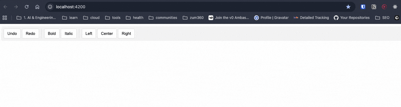
Try to use your toolbar with your keyboard. You&rsquo;ll find it works, and we didn&rsquo;t have to write any code for keyboard navigation logic (like: Arrow keys, Home, End), focus management, ARIA role attributes, screen reader announcements or selection state management. All of that complexity? Gone.</p><p>The <code>ngToolbar</code>, <code>ngToolbarWidget</code> and <code>ngToolbarWidgetGroup</code> directives handle all of that automatically.</p><p>We now have a fully accessible toolbar that works with keyboard navigation and screen readers, and we only wrote the HTML structure and CSS.</p><p>Angular Aria provides directives for the most common interactive patterns, we can get components for search and selection (like Autocomplete, Listbox and Select), navigation and actions (Menu, Menubar and Toolbar like we just built), and content organization (Accordion, Tabs, Tree and Grid). Every directive comes with complete documentation, working examples and API references. You can see the <a target="_blank" href="https://angular.dev/guide/aria/overview#whats-included">full list of available components</a> in the official Angular Aria documentation.</p><h2 id="but-im-a-fan-of-angular-material">But I&rsquo;m a Fan of Angular Material</h2><p>Yes, I understand Angular Material has a long relationship with Angular devs. You can continue using Angular Material when you:</p><ol><li><strong>Need to ship fast</strong> &ndash; You&rsquo;re building an MVP or internal tool and don&rsquo;t want to spend time on custom styling.</li><li><strong>Like Material Design</strong> &ndash; You&rsquo;re OK with the Google Material Design aesthetic.</li><li><strong>Have limited design resources</strong> &ndash; Your team doesn&rsquo;t have dedicated designers.</li></ol><p>Remember, <a target="_blank" href="https://material.angular.io/">Angular Material</a> is amazing, but it comes with opinions about how things should look.</p><p>If you try to heavily customize Material components, you&rsquo;ll spend more time fighting the framework than building features. I&rsquo;ve been there&mdash;overriding Material styles with <code>::ng-deep</code> and <code>!important</code> until the CSS becomes unmaintainable.</p><p>And don&rsquo;t even get me started on theming. Creating a custom theme for Angular Material is&hellip; let&rsquo;s just say &ldquo;special.&rdquo; It&rsquo;s doable, but it&rsquo;s tricky and requires deep knowledge of Sass and Material&rsquo;s theming system. (If you&rsquo;re curious about the complexity, I wrote about it in <a target="_blank" href="https://www.telerik.com/blogs/theme-ui-frameworks-angular-part-2-custom-theme-angular-material">Theme UI Frameworks in Angular: Part 2 - Custom Theme for Angular Material</a>.)</p><p>Angular Aria solves this by giving you <strong>zero styles</strong>. You start with a blank canvas and build exactly what you need.</p><p>Remember for simple cases, native elements are already accessible when you use <code>&lt;button&gt;</code> for buttons, <code>&lt;input type="radio"&gt;</code> for radio buttons or <code>&lt;select&gt;</code> for simple dropdowns. But Angular Aria gives you a third option: <strong>headless accessible components</strong> that you can style however you want, we can meet accessibility requirements, maintain full design control and avoid reinventing the wheel.</p><h2 id="recap">Recap</h2><p>We learned that accessibility doesn&rsquo;t have to be overwhelming. Angular Aria gives you production-ready, WCAG-compliant directives that handle the complex parts.</p><p>We provide the HTML structure and CSS and Angular Aria provides the accessibility without pain!</p><h3 id="but-what-about-kendo-ui">But What About Kendo UI?</h3><p>Maybe you want to ship faster (really fast) and have complex scenarios with datalist, charts, schedulers and complex UI patterns. If you read this article and are thinking: <em>&ldquo;This is great, but I still have to write all the HTML and CSS myself. Why not just use a complete component library?&rdquo;</em> you&rsquo;re asking the right question.</p><p>Here&rsquo;s when Progress <strong>Kendo UI for Angular</strong> makes more sense than Angular Aria or Angular Material:</p><p><strong>Use Kendo UI when you want:</strong></p><ol><li><strong>Everything out of the box</strong> &ndash; Prebuilt components with professional styling, themes and accessibility already done</li><li><strong>Advanced features included</strong> &ndash; Things like data grids with sorting/filtering, charts, schedulers and complex UI patterns</li><li><strong>Consistent design system</strong> &ndash; A cohesive look across all components without writing custom CSS</li><li><strong>Enterprise-grade support</strong> &ndash; Professional support, regular updates and guaranteed compatibility</li><li><strong>Speed PLUS customization</strong> &ndash; You need to ship fast <em>and</em> need options to customize (you&rsquo;ll have five fully built theme options plus the ability to tweak those or create your own theme)</li></ol><p>There&rsquo;s no &ldquo;wrong&rdquo; choice&mdash;just different tools for different jobs.</p><p>If you&rsquo;re building internal tools or you like the Kendo UI design system, Kendo UI saves you weeks of work, and, honestly? I can build complex stuff (data grids, schedulers, charts) in minutes, making Kendo UI the right answer for me.</p><p>Plus, you can use the Kendo UI for <a target="_blank" href="https://www.telerik.com/kendo-angular-ui/components/ai-tools/ai-assistant/getting-started">Angular AI Coding Assistant</a>, an MCP server that automatically scaffolds components for AI agents. Instead of manually writing Kendo UI components, your AI assistant can do it for you. </p><blockquote><p>Want to learn more? Check out my article: <a target="_blank" href="https://www.telerik.com/blogs/angular-kendo-ui-mcp-making-agents-work">
 Angular and Kendo UI MCP: Making Agents Work for You</a></p></blockquote><ul><li><a target="_blank" href="https://github.com/danywalls/angular-aria-example">Source code</a></li><li><a target="_blank" href="https://angular.dev/guide/aria/overview">Angular Aria Documentation</a></li></ul><img src="https://feeds.telerik.com/link/23074/17311882.gif" height="1" width="1"/>]]></content>
  </entry>
  <entry>
    <id>urn:uuid:5b2a3c79-efa5-4bc4-b24c-1cd5b9ea13e5</id>
    <title type="text">Accessibility (A11y) in .NET MAUI: What It Is and How to Implement It</title>
    <summary type="text">It’s time to add accessibility into the early stages of your .NET MAUI development cycle. The POUR principles can help.</summary>
    <published>2026-03-16T18:26:50Z</published>
    <updated>2026-04-11T21:18:51Z</updated>
    <author>
      <name>Leomaris Reyes </name>
    </author>
    <link rel="alternate" href="https://feeds.telerik.com/link/23074/17300343/accessibility-net-maui-what-how-to-implement"/>
    <content type="text"><![CDATA[<p><span class="featured">It&rsquo;s time to add accessibility into the early stages of your .NET MAUI development cycle. The POUR principles can help.</span></p><p>Developing applications that can be used by everyone is a goal that any app should keep in mind. When I say &ldquo;for everyone,&rdquo; I mean that our applications should be able to communicate a clear and understandable purpose, so that people with or without disabilities can use them without issues. In other words, it&rsquo;s not just about &ldquo;making it work,&rdquo; nor about limiting it to a single way of use (such as only being understandable if you can read the buttons).</p><p>You&rsquo;ve probably heard the term <strong>A11y,</strong> and maybe you&rsquo;ve stopped to think&hellip; What does it mean?  A11y refers to the <strong>accessibility</strong> of our applications. While it&rsquo;s much more common to hear this term in the web space, mobile applications should also take it into account to offer a better product.</p><p>In this article, you&rsquo;ll learn more about accessibility, some guidelines you can follow to apply it correctly in <strong>.NET MAUI</strong>, the aspects you should start paying attention to and why <strong>A11y is not an extra</strong>, but a fundamental part of the quality of a well-built application.</p><h2 id="let’s-talk-more-about-a11y">Let&rsquo;s Talk More About A11y</h2><p><strong>A11y</strong> is an abbreviated form of the word <strong>accessibility</strong>, and its goal is to allow people with or without visual, auditory, motor or cognitive disabilities to use your apps. A11Y is a type of abbreviation very common in technology, and it is known as a <strong>numeronym.</strong></p><p><img src="https://d585tldpucybw.cloudfront.net/sfimages/default-source/blogs/2026/2026-03/01_accessibilitysample.png?sfvrsn=2429b72_2" alt="A c c e s s i b i l i t y : Diagram showing why ‘Accessibility’ is abbreviated as A11y, with 11 letters between A and Y." /></p><p>It works as follows:</p><ul><li><strong>A:</strong> is the first letter of the word.</li><li><strong>11:</strong> is the number of characters that come after the first letter and before the last one. In Accessibility, specifically in &ldquo;ccessibilit,&rdquo; there are 11 letters.</li><li><strong>Y:</strong> is the last letter of the word.</li></ul><p>That&rsquo;s why it is abbreviated as: <strong>A11y.</strong> This method makes it much more convenient to write long terms in a faster way and helps standardize lengthy terminology.</p><h2 id="how-can-we-apply-a11y-in-our-apps">How Can We Apply A11y in Our Apps?</h2><p>To implement this in our applications, there are accessibility guidelines such as <strong>WCAG,</strong> which instruct us on how to adapt the tools that mobile devices already provide so they can work together with our apps.</p><p>The <strong><a target="_blank" href="https://www.w3.org/TR/WCAG22/">Web Content Accessibility Guidelines (WCAG)</a></strong> are a set of international guidelines created by the <strong>World Wide Web Consortium (W3C).</strong> Although web is part of their name, I always recommend applying these practices to all types of applications, including mobile. Our users will thank us for it.</p><p>In fact, the official documentation states the following:</p><blockquote><p>&ldquo;These guidelines address accessibility of web content on any kind of device (including desktops, laptops, kiosks, and mobile devices).&rdquo;</p></blockquote><p>The WCAG are built on <strong>four fundamental principles,</strong> known as <strong>POUR.</strong> WCAG defines what an application must comply with to be accessible, while POUR helps us understand how to think about accessibility from a development perspective.</p><p>These four criteria that make up <strong>POUR</strong> are:</p><ul><li><strong>P</strong>erceivable</li><li><strong>O</strong>perable</li><li><strong>U</strong>nderstandable</li><li><strong>R</strong>obust</li></ul><p>Let&rsquo;s take a closer look at <strong>POUR</strong>&mdash;what each principle means and some examples of how we can translate them into our <strong>.NET MAUI</strong> applications:</p><h2 id="perceivable">Perceivable</h2><p>This principle indicates that all the information in the app (including text and UI components) must be <strong>perceivable by the user</strong>, regardless of how they interact with the device. In other words, our app should not be based solely on visual information.</p><p>This is especially important for users who:</p><ul><li>Use screen readers such as <strong>TalkBack</strong> or <strong>VoiceOver</strong></li><li>Have low vision or use larger text sizes</li></ul><p>In <strong>.NET MAUI</strong>, we have <strong>SemanticProperties</strong>, which help us a lot with this aspect.</p><p> Semantic properties are the Microsoft-recommended approach in .NET MAUI to provide accessibility values in applications. This allows us to add a description to our visual elements so that they can be read by the screen reader.</p><p>Additionally, I recommend exploring <strong><a target="_blank" href="https://www.telerik.com/blogs/exploring-semanticorderview-net-maui-community-toolkit">SemanticOrderView</a></strong>. While the individual reading of each visual element is important, being able to provide the user with a <strong>reading order</strong> so that this reading is coherent greatly enhances a good user experience. For this, we can use <strong>SemanticOrderView</strong> from the <strong>.NET MAUI Community Toolkit</strong>.</p><p>Let&rsquo;s explore some examples of implementing the Percievable principle in .NET MAUI:</p><h3 id="alternative-text-for-images-and-icons">Alternative Text for Images and Icons</h3><p>Images and icons are very common in mobile apps, but for a screen reader, an image without a description is <strong>100% invisible</strong>. That&rsquo;s why it&rsquo;s recommended to tell the screen reader that there is something there and <strong>what it should read</strong>.</p><p>In the following example, you can see the <strong>warning.png</strong> image used in the UI. When navigating the app with VoiceOver or TalkBack, this image will be announced as &ldquo;Warning icon.&rdquo; For this reason, I recommend being as specific as possible when defining its description.</p><pre class=" language-xml"><code class="prism  language-xml">&lt;Image Source="warning.png"
 SemanticProperties.Description="Warning icon" /&gt;
</code></pre><h3 id="what-about-decorative-images">What About Decorative Images?</h3><p>Not all images provide information. In these cases, we can <strong>remove them from the accessibility tree</strong> so the screen reader ignores them (meaning it won&rsquo;t read them):</p><pre class=" language-xml"><code class="prism  language-xml">&lt;Image Source="divider.png"
 AutomationProperties.IsInAccessibleTree="False" /&gt;
</code></pre><p>This helps keep the experience cleaner and prevents the screen reader from reading unnecessary elements.</p><h3 id="headings">Headings</h3><p>Screen readers don&rsquo;t just &ldquo;read in order&rdquo; and stop there; they also allow users to <strong>navigate by sections</strong>. For this reason, it&rsquo;s important to mark titles or main sections as <strong>semantic headings</strong>.</p><pre class=" language-xml"><code class="prism  language-xml">&lt;Label Text="Payment Settings" 
 FontSize="24" 
 SemanticProperties.HeadingLevel="Level1" /&gt;
</code></pre><p>This way, the screen reader recognizes this element as a heading and makes navigation within the screen much easier.</p><h3 id="supporting-scalable-text">Supporting Scalable Text</h3><p>In addition to screen readers, there is also a significant number of users with low vision. You may have noticed that some people use very large text on their phones; that&rsquo;s probably why.</p><p>As developers, we can contribute to making our app more accessible by allowing it to adapt to the text size users feel most comfortable with.</p><p>For this, in .NET MAUI we have <strong>FontAutoScalingEnabled</strong>, a property that allows the text in our app to automatically scale according to the system preferences.</p><pre class=" language-xml"><code class="prism  language-xml">&lt;Label Text="Payment Settings" 
 FontSize="24" 
 FontAutoScalingEnabled="True" /&gt;
</code></pre><p>With this, if the user increases the text size from the device settings, the Label will scale accordingly, improving readability and aligning with the <strong>Perceivable</strong> principle.</p><h2 id="operable">Operable</h2><p>The Operable principle states that users must be able to interact with the app without difficulty, regardless of the way they use the device.</p><p>In other words, not all users interact in the same way. Some use screen readers, others use a keyboard or assisted navigation. For this reason, the app should not rely solely on complex gestures or interactions that do not provide a clear alternative.</p><p>In mobile applications, this principle basically translates into:</p><ul><li>Easy-to-tap controls</li><li>Clear and predictable navigation</li><li>Avoiding interactions that require extreme precision</li></ul><p>In .NET MAUI, many of these best practices can be applied directly using the components we already work with. Let&rsquo;s see NET MAUI some Operable examples we can apply:</p><h3 id="appropriate-size-for-interactive-elements">Appropriate Size for Interactive Elements</h3><p>A very common problem is having <strong>icons or buttons that are too small</strong>, which limits interaction and can make the app difficult&mdash;or even impossible&mdash;to use for some users.</p><p>For this reason, it is recommended to respect minimum sizes for interactive elements:</p><ul><li><p><strong>iOS:</strong> minimum <strong>44 &times; 44 pt</strong><br />This recommendation comes from Apple&rsquo;s Human Interface Guidelines, where this minimum size is established for interactive elements such as buttons or tappable icons.</p></li><li><p><strong>Android</strong>: minimum <strong>48 &times; 48 dp</strong><br />On Android, this recommendation comes from the Android Accessibility Guidelines and Material Design.</p></li></ul><p>In .NET MAUI, we can apply this easily, for example:</p><pre class=" language-xml"><code class="prism  language-xml">&lt;Button Text="Continue" 
 HeightRequest="48" 
 Padding="16,12" /&gt;
</code></pre><p>Or for icon ImageButton:</p><pre class=" language-xml"><code class="prism  language-xml">&lt;ImageButton Source="close.png" 
 WidthRequest="48" 
 HeightRequest="48" 
 Padding="12" 
 SemanticProperties.Description="Close" /&gt;
</code></pre><h2 id="understandable">Understandable</h2><p>This principle states that the information and interactions within our app must be <strong>easy to understand</strong>.</p><p>Why is this important?</p><ul><li>Not all users have the same technical level.</li><li>Some may have cognitive difficulties.</li><li>Others are simply using the app for the first time.</li></ul><p>In mobile applications, this principle mainly translates into:</p><ul><li>Clear and direct text</li><li>Consistent navigation</li><li>Predictable actions</li><li>Error messages that explain what happened and what to do next</li></ul><p>Some examples of Understandable in .NET MAUI:</p><h3 id="clear-language-in-text-and-labels">Clear Language in Text and Labels</h3><p>Avoid ambiguous or overly technical texts (I&rsquo;ve literally seen &ldquo;state error&rdquo; in apps &hellip; that should not happen), especially in buttons and important messages.</p><p>For example, for a save button, use text that clearly describes the action:</p><pre class=" language-xml"><code class="prism  language-xml">&lt;Button Text="Save changes" /&gt;
</code></pre><p>Once the save action is executed, if an error occurs, <strong>don&rsquo;t leave the user guessing or hanging</strong>. Tell them exactly what happened.</p><p>❌ Saving changes failed</p><p>✅ The name field cannot contain special characters</p><p>The idea is for the user to understand what happened and what the next step is, without having to interpret technical messages.</p><h2 id="robust">Robust</h2><p>This principle states that the app must be <strong>robust enough</strong> to work correctly across different environments or devices. In other words, the app should continue to work when:</p><ul><li>It runs on different versions of the operating system</li><li>It is used with screen readers such as TalkBack or VoiceOver</li><li>It is used across different platforms</li><li>It adapts to different screen sizes (small, medium and large) without affecting usability or content clarity</li></ul><p>An example of the Robust principle in <strong>.NET MAUI</strong> is the use of <strong>OnPlatform</strong>.</p><h3 id="onplatform">OnPlatform</h3><p>Although .NET MAUI abstracts many platform differences&mdash;and personally, I try to use OnPlatform as little as possible to keep maintenance easier across Android and iOS, always looking for visual elements that give me the same result&mdash;in some cases, Android and iOS behave differently, and using it becomes necessary.</p><p>If you run into that situation, you can use OnPlatform to keep the behavior on both platforms exactly how you want it:</p><pre class=" language-xml"><code class="prism  language-xml">&lt;Button Text="Continue" 
 HeightRequest="{OnPlatform iOS=44, Android=48}" 
 Padding="{OnPlatform iOS='16,12', Android='16,14'}" /&gt;
</code></pre><p>This way, you respect each platform&rsquo;s recommendations while keeping an accessible and consistent experience, aligned with the <strong>Robust</strong> principle.</p><h2 id="conclusion">Conclusion</h2><p>And that&rsquo;s it!  In this article, we talked about <strong>A11y</strong> and why accessibility should be part of how we build mobile apps with <strong>.NET MAUI,</strong> not something added at the end. By understanding the <strong>POUR principles</strong> we saw how accessibility can be applied through small, intentional UI decisions.</p><p>From making content perceivable and interactions operable, to keeping things understandable and keeping our apps robust across platforms, each choice helps create a better experience for more users.</p><p>Remember: users may not know what A11Y is, but they definitely feel it when an app is accessible. </p><p>See you in the next article! &zwj;♀️✨</p><aside><hr data-sf-ec-immutable="" /><div class="row"><div class="col-4 u-normal-full u-small-mb0"><h4 class="u-fs20 u-fw5 u-lh125 u-mb0">The Next Development Discipline Is ADD</h4></div><div class="col-8"><p class="u-fs16 u-mb0"><a target="_blank" href="https://www.telerik.com/blogs/next-development-discipline-add">Accessibility-Driven Development turns WCAG into a discipline.</a> With the EU Accessibility Act as the deadline, ADD is the next discipline to drive quality.</p></div></div></aside><img src="https://feeds.telerik.com/link/23074/17300343.gif" height="1" width="1"/>]]></content>
  </entry>
  <entry>
    <id>urn:uuid:4be62d7c-fd95-4c8a-8ea3-e79ab0ee59df</id>
    <title type="text">The Next Development Discipline Is ADD</title>
    <summary type="text">Accessibility-Driven Development turns WCAG into a discipline. With the EU Accessibility Act as the deadline, ADD is the next discipline to drive quality.</summary>
    <published>2025-11-10T16:04:25Z</published>
    <updated>2026-04-11T21:18:51Z</updated>
    <author>
      <name>Teon Beijl </name>
    </author>
    <link rel="alternate" href="https://feeds.telerik.com/link/23074/17206640/next-development-discipline-add"/>
    <content type="text"><![CDATA[<p><span class="featured">Accessibility-Driven Development turns WCAG into a discipline. With the EU Accessibility Act as the deadline, ADD is the next discipline to drive quality.</span></p><p>Maybe you know the acronyms: TDD, BDD or DDD. If not, go on Reddit and you will find enough debates to learn it keeps our industry busy.</p><p>Each acronym shifted how we think and how we build software. Now, with new accessibility laws setting a hard deadline, it&rsquo;s time to add one more: ADD. Accessibility-Driven Development.</p><h2 id="compliance-as-a-driver-of-quality">Compliance as a Driver of Quality</h2><p>For years, accessibility was treated as optional or &ldquo;nice to have.&rdquo; A box you ticked if you had time. But history shows us that regulations and compliance raise quality and drive standardization.</p><p>Think about hardware safety regulations or industry protocols. At first, they seemed like a burden. But once enforced, they became the baseline that allowed whole industries to build better. Today, shipping is faster than ever. Compliance is the safeguard that helps prevent quality from being skipped.</p><h2 id="a-time-change-in-accessibility">A Time Change in Accessibility</h2><p>If you&rsquo;ve worked in UX or frontend development, you&rsquo;ve probably heard of the Web Content Accessibility Guidelines (WCAG). They&rsquo;ve been around for decades, laying out the rules: make software perceivable, operable and understandable.</p><p>WCAG has been the global guideline for accessibility. But for years, adoption was inconsistent. Companies did what they wanted, or what they could afford.</p><p>That changes now. The European Accessibility Act (EAA) is in force as of June 28, 2025. It harmonizes accessibility requirements across the EU and sets real deadlines for compliance. This is the moment accessibility shifts from voluntary guidance to enforceable law. A time change for the industry.</p><p>In the U.S., the Americans with Disabilities Act (ADA) has fueled a rise in lawsuits over inaccessible websites and apps. Similarly, Section 508 of the Rehabilitation Act requires federal agencies and contractors to conform to WCAG. Between lawsuits and procurement contracts, WCAG has become the standard in the U.S. too.</p><p>Different routes, same outcome: WCAG tells us that we need better software for everyone.</p><h2 id="the-disciplines-we-already-know">The Disciplines We Already Know</h2><p>Disciplines reshape the way we develop software. They&rsquo;re mindsets that force us to shift perspective and raise the quality of the software we ship.</p><h3 id="tdd-test-driven-development">TDD: Test-Driven Development</h3><p>With TDD, we write failing tests before we write code. It flips the order. Instead of coding first and testing later, we define the boundaries up front.</p><p><em>The discipline: build resilience by considering how software might fail.</em></p><h3 id="bdd-behavior-driven-development">BDD: Behavior-Driven Development</h3><p>BDD takes this further. Instead of only testing functions, we write scenarios in plain language: Given, When, Then. It&rsquo;s not only developers who can understand, but also stakeholders, product owners, testers.</p><p><em>The discipline: align software with real user expectations.</em></p><h3 id="ddd-domain-driven-design">DDD: Domain-Driven Design</h3><p>DDD steps back another layer. It tells us: don&rsquo;t just model features, model the domain itself. Speak the same language as the business. Reflect its truth in your system.</p><p><em>The discipline: design software that mirrors business reality.</em></p><p>Each of these disciplines changed how we think. They aren&rsquo;t just tools; they&rsquo;re shifts in mindset.</p><h3 id="add-accessibility-driven-development">ADD: Accessibility-Driven Development</h3><p>Now it&rsquo;s time for the next discipline: Accessibility-Driven Development.</p><p>ADD means designing and testing for the edge user first&mdash;the one with constraints. The one who doesn&rsquo;t use your product the way you do. If it works for them, it will work for everyone.</p><p>Think of it like TDD. In TDD, you write a failing test first. In ADD, you define the hardest case first.</p><p>Keyboard-only navigation becomes your failing test. A screen reader flow becomes your scenario. High-contrast mode becomes your business constraint. You design and build until those pass.</p><p>ADD shifts the mindset. Accessibility isn&rsquo;t something you sprinkle in at the end. It is a discipline that shapes decisions during building.</p><p><em>The discipline: build software that is accessible to many, not to some.</em></p><h2 id="why-add-matters-now">Why ADD Matters Now</h2><p>Why now? Without the <a href="https://www.telerik.com/blogs/what-does-european-accessibility-act-mean-developers" target="_blank">European Accessibility Act</a>, many teams would keep treating accessibility as optional. But with compliance dates set, ignoring accessibility is no longer a choice.</p><p>ADD helps you shift from reactive to proactive. Instead of scrambling with audits and lawsuits, you build accessibility into the process. Compliance becomes a habit, not a fire drill.</p><p>Here&rsquo;s the point: designing for edge cases improves the experience for everyone. It&rsquo;s called the <em>curb cut effect.</em> Those sidewalk ramps built for wheelchairs are also used by parents with strollers, travelers with luggage and kids on scooters.</p><p>You&rsquo;re not wasting resources on a minority. You&rsquo;re building better software. Accessibility isn&rsquo;t overhead. It&rsquo;s an advantage.</p><p>By designing for the most constrained environments, you raise the quality of the entire system.</p><h2 id="closing">Closing</h2><p>Accessibility is not a gesture. It&rsquo;s a discipline.</p><p>A new standard to comply with in software. And compliance has always been a driver of quality. Industry protocols in manufacturing. Safety standards in hardware. Now, accessibility in software.</p><p>You don&rsquo;t have to choose between TDD, BDD and DDD. They&rsquo;re not a menu. They&rsquo;re a collection of development disciplines that shape how we build.</p><p>The one you need to add next is ADD: Accessibility-Driven Development.</p><aside><hr data-sf-ec-immutable="" /><div class="row"><div class="col-4 u-normal-full u-small-mb0"><h4 class="u-fs20 u-fw5 u-lh125 u-mb0">The Hidden Costs of Inaccessible Apps for Enterprises and How to Avoid Them</h4></div><div class="col-8"><p class="u-fs16 u-mb0"><a target="_blank" href="https://www.telerik.com/blogs/hidden-costs-inaccessible-apps-enterprises-how-avoid">Learn the hidden costs of inaccessible</a> enterprise applications and see some strategies for building accessible enterprise solutions.</p></div></div></aside><img src="https://feeds.telerik.com/link/23074/17206640.gif" height="1" width="1"/>]]></content>
  </entry>
  <entry>
    <id>urn:uuid:f3cec785-fd2d-44e2-a12d-4ed49ad74a3f</id>
    <title type="text">Design, Code, Comply: Accessibility in Workforce Learning</title>
    <summary type="text">See how Resolute helped one client build a more functional, accessible and scalable web experience by instituting accessibility best practices and leveraging Progress tools.</summary>
    <published>2025-09-17T15:34:40Z</published>
    <updated>2026-04-11T21:18:51Z</updated>
    <author>
      <name>Leman Pehlivanova </name>
    </author>
    <link rel="alternate" href="https://feeds.telerik.com/link/23074/17162051/design-code-comply-accessibility-workforce-learning"/>
    <content type="text"><![CDATA[<p><span class="featured">See how Resolute helped one client build a more functional, accessible and scalable web experience by instituting accessibility best practices and leveraging Progress tools.</span></p><p>In a world where most of our lives play out online, web accessibility shouldn&rsquo;t be treated as an afterthought. Designing with inclusivity in mind is no longer optional; it&rsquo;s essential. Just like a chair needs four sturdy legs to be safe for everyone, digital experiences need to be built with all users in mind.</p><p>But when the platform in question is educational, the stakes are even higher. These platforms serve a diverse range of learners&mdash;some with visual, auditory, motor or cognitive impairments, and face stricter accessibility requirements than general websites.</p><p>That&rsquo;s why <a target="_blank" href="https://www.resolutesoftware.com/">Resolute</a> was proud to partner with a U.S.-based company providing online training tools for frontline employees. The platform had recently been acquired by a leading provider of online compliance and workforce training, further raising the bar for performance, accessibility and scalability. The goal: build a more functional, accessible and scalable web experience.</p><h2 id="when-design-slows-you-down">When Design Slows You Down</h2><p>The project started with a familiar pain point: fragmentation. The client&rsquo;s design ecosystem was spread across multiple sources:</p><ul><li>An internal Figma library shaped by years of brand tweaks</li><li>A partially customized theme inside <a target="_blank" href="https://www.telerik.com/themebuilder">Progress ThemeBuilder</a></li><li>A live site with Progress Kendo UI components that didn&rsquo;t always align with the designs</li></ul><p>This led to confusion, delays and inconsistencies, especially around accessibility. Developers struggled to map designs to actual components. Theming was brittle. And certain UI patterns weren&rsquo;t usable for people relying on keyboard navigation or assistive technologies.</p><p>Resolute was brought in to clean it up, streamline the workflow and help the client move toward a more compliant and scalable solution.</p><h2 id="fixing-the-foundation-themebuilder-in-action">Fixing the Foundation: ThemeBuilder in Action</h2><p>Our UX/UI team began by auditing the client&rsquo;s existing design system. They worked closely with their internal team to unify the visual language and migrate it into Progress ThemeBuilder, which served as the central source of truth for styling and theming moving forward.</p><p>ThemeBuilder wasn&rsquo;t just a convenience; it helped enforce consistency in <a href="https://www.telerik.com/blogs/design-tokens-fundamental-building-blocks-design-systems" target="_blank">design tokens</a> like colors, borders and spacing, while also helping to align with accessibility best practices.</p><p><strong>The UX/UI team&rsquo;s work included:</strong></p><ul><li>Consolidating redundant button and form variations</li><li>Fixing visual issues with contrast, spacing and typography</li><li>Helping the design team understand how to use ThemeBuilder effectively to support long-term accessibility</li></ul><h2 id="from-visuals-to-code-accessibility-in-the-build">From Visuals to Code: Accessibility in the Build</h2><p>Once the design foundation was solid, our frontend team began implementing the new UI in code. Over several months, the platform&rsquo;s frontend was rebuilt with accessibility as a core requirement, focusing not just on how it looked, but how it worked for every user.</p><p>This wasn&rsquo;t just about good UX; it was also about meeting real compliance needs. Since the platform serves a broad user base in the U.S., including educational and government-affiliated organizations, several legal standards apply, including:</p><ul><li><strong>ADA (Americans with Disabilities Act)</strong>: Particularly Title III, which applies to educational institutions and commercial websites</li><li><strong>Section 508 of the Rehabilitation Act</strong>: For platforms receiving federal funding or working with government entities</li></ul><p>To meet these requirements, we aligned the build with <strong>WCAG 2.1 Level AA</strong> guidelines developed by the <a target="_blank" href="https://www.w3.org/TR/WCAG21/">W3C</a> (World Wide Web Consortium), currently the most widely used benchmark for web accessibility in the U.S.</p><p><strong>What that looked like in code:</strong></p><ul><li>Every interactive element was accessible via <strong>keyboard navigation</strong> (tab, arrows, etc.).</li><li>Clear, visible <strong>focus states</strong> were implemented for all buttons, links and forms.</li><li>We structured the app using <strong>semantic HTML</strong> and applied <strong>ARIA roles</strong> for assistive tech (e.g., <code class="inline-code">&lt;button&gt;</code>, <code class="inline-code">&lt;nav&gt;</code>, <code class="inline-code">&lt;form&gt;</code>). Yet, we applied ARIA roles only when necessary for custom components or non-semantic elements, avoiding over-reliance on ARIA. It&rsquo;s crucial to use ARIA only when native HTML elements can&rsquo;t provide the required functionality.</li><li>For use cases beyond the default configurations of Kendo UI or ThemeBuilder, we wrote <strong>custom HTML overrides</strong>.</li><li>Duplicate labels or screen reader confusion were avoided using attributes like <code class="inline-code">aria-hidden="true"</code> where needed.</li></ul><p>Testing was both automated and manual. Tools like <a target="_blank" href="https://chromewebstore.google.com/detail/axe-devtools-web-accessib/lhdoppojpmngadmnindnejefpokejbdd">axe DevTools</a>, <a target="_blank" href="https://wave.webaim.org/">WAVE</a> and ChromeVox helped flag contrast issues, label duplication and navigation traps. But human testing mattered just as much. Therefore, a touchscreen laptop was used to simulate real user scenarios, check responsiveness and validate how elements behaved across screen sizes and input types.</p><h2 id="when-customization-adds-complexity">When Customization Adds Complexity</h2><p>Telerik ThemeBuilder and Kendo UI offer strong accessibility features, but when components are heavily customized, unexpected issues can appear. Resolute helped the client troubleshoot several edge cases:</p><ul><li>Buttons built without the base component didn&rsquo;t render properly</li><li>Some forms displayed labels twice to screen readers (e.g., &ldquo;Username Username&rdquo;)</li><li>Blazor components lacked alt-text bindings, requiring a workaround</li></ul><p>None of these problems were dealbreakers, but they showed how expertise matters. Without frontend developers who understand both the framework and accessibility requirements, these issues could have gone unnoticed.</p><h2 id="accessibility--structure--semantics--seo">Accessibility = Structure + Semantics + SEO</h2><p>There&rsquo;s another benefit to building with accessibility in mind: better search engine optimization (SEO). Many of the same practices that support users with disabilities, like using <a target="_blank" href="https://www.telerik.com/blogs/why-semantic-html-matters-introductory-guide-new-developers">semantic HTML</a>, a well-structured HTML DOM (Document Object Model) and meaningful headings, also help search engines understand and rank your content.</p><p>The frontend implementation in this case included:</p><ul><li>One <code class="inline-code">&lt;h1&gt;</code> per page, with clean heading hierarchies for structure like <code class="inline-code">&lt;h2&gt;</code> for sections and <code class="inline-code">&lt;h3&gt;</code> inside components</li><li>Alt-text for all meaningful images</li><li>Descriptive link text and accessible navigation</li></ul><p>The result? A platform that&rsquo;s easier to use, more discoverable and legally compliant.</p><h2 id="knowledge-transfer-matters">Knowledge Transfer Matters</h2><p>Resolute&rsquo;s role expanded beyond design and development work. We trained the client&rsquo;s internal team to maintain and build on the system with accessibility in mind. That included:</p><ul><li>Documenting all accessibility decisions and techniques used</li><li>Providing reusable design patterns in ThemeBuilder</li><li>Running training sessions on WCAG basics and development workflow tips</li></ul><p>Accessibility isn&rsquo;t something you do once. It&rsquo;s a practice. So, we made sure the team could carry that forward.</p><h2 id="final-thoughts">Final Thoughts</h2><p>Accessibility is a shared responsibility&mdash;across design, development and leadership. Our client understood that, and, with the right tools and support, made serious progress toward a platform that works for everyone.</p><p>Progress ThemeBuilder helped streamline and standardize the design-to-code process. Resolute helped connect the dots by aligning compliance, usability and long-term scalability.</p><p>Learn more about how Resolute can help address usability issues, starting with the <a target="_blank" href="https://www.resolutesoftware.com/services/ux-assessment/">UX Assessment</a>.</p><img src="https://feeds.telerik.com/link/23074/17162051.gif" height="1" width="1"/>]]></content>
  </entry>
  <entry>
    <id>urn:uuid:c9e68897-ddf6-4578-b3f2-02f84bb846e5</id>
    <title type="text">It’s Global Accessibility Awareness Day: Do the Quiz!</title>
    <summary type="text">In celebration of Global Accessibility Awareness Day, we have a quiz to test your knowledge of accessibility best practices, including a few specific to React.</summary>
    <published>2025-05-15T13:15:08Z</published>
    <updated>2026-04-11T21:18:51Z</updated>
    <author>
      <name>Hassan Djirdeh </name>
    </author>
    <link rel="alternate" href="https://feeds.telerik.com/link/23074/17031433/its-global-accessibility-awareness-day-do-quiz"/>
    <content type="text"><![CDATA[<p><span class="featured">In celebration of Global Accessibility Awareness Day, we have a quiz to test your knowledge of accessibility best practices, including a few specific to React.</span></p><p>Today is Global Accessibility Awareness Day (GAAD). Celebrated each year on the third Thursday of May, GAAD is dedicated to raising awareness about digital accessibility and inclusion for the more than one billion people worldwide who live with disabilities.</p><p>To mark the occasion, we&rsquo;ve created a quick and interactive accessibility quiz using the Progress <a target="_blank" href="https://www.telerik.com/kendo-react-ui/components/form/wizard">KendoReact Form Wizard</a>. The quiz includes questions on accessibility history, core principles and practical tips for React developers.</p><p><img src="https://d585tldpucybw.cloudfront.net/sfimages/default-source/blogs/2025/2025-05/accessibility-quiz.png?sfvrsn=1a673678_2" alt="Web Accessibility Quiz" /></p><blockquote><p>If you&rsquo;re building your own accessible forms, be sure to check out the <a target="_blank" href="https://www.telerik.com/kendo-react-ui/components/form/guidelines-with-examples">React Form Design Guidelines</a> for helpful tips and best practices.</p></blockquote><p>Once you&rsquo;re ready, take the quiz and see how much you know about digital accessibility.</p><blockquote><p> Start the <a target="_blank" href="https://react-prufa4j8-rffzmhm2.stackblitz.io/">quiz here</a>.</p></blockquote><h2 id="want-to-brush-up-before-you-start">Want to Brush Up Before You Start?</h2><p>If you&rsquo;d like a refresher before diving into the quiz, we&rsquo;ve gathered a few helpful articles that provide background on key accessibility concepts and trends:</p><h3 id="web-history">Web History</h3><ul><li><a target="_blank" href="https://www.telerik.com/blogs/history-web-accessibility-how-impacts-design-today">The History of Web Accessibility and How It Impacts Design Today</a></li></ul><h3 id="react">React</h3><ul><li><a target="_blank" href="https://www.telerik.com/blogs/getting-started-accessibility-react">Getting Started with Accessibility for React</a></li></ul><h3 id="standards">Standards</h3><ul><li><a target="_blank" href="https://www.telerik.com/blogs/what-accessible-ux-design-what-accessible-application">What Is Accessible UX Design, and What is an Accessible Application?</a></li><li><a target="_blank" href="https://www.telerik.com/blogs/what-does-european-accessibility-act-mean-developers">What Does the European Accessibility Act Mean for Developers?</a></li></ul><h3 id="business">Business</h3><ul><li><a target="_blank" href="https://www.telerik.com/blogs/hidden-costs-inaccessible-apps-enterprises-how-avoid">The Hidden Costs of Inaccessible Apps for Enterprises and How to Avoid Them</a></li></ul><h2 id="why-accessibility-matters-now-more-than-ever">Why Accessibility Matters Now More Than Ever</h2><p>Two recent developments are bringing digital accessibility into sharper focus.</p><h3 id="the-european-accessibility-act-eaa">The European Accessibility Act (EAA)</h3><p>The <a target="_blank" href="https://eur-lex.europa.eu/legal-content/EN/TXT/?uri=CELEX%3A32019L0882">European Accessibility Act</a>, which goes into effect on <strong>June 28, 2025</strong>, makes accessibility legally required for digital products used in the EU. Whether your team builds websites, mobile apps or software, if EU citizens use it, you&rsquo;ll need to comply with standards like WCAG 2.1 Level AA and EN 301 549.</p><blockquote><p>For more details on the EAA, be sure to check out the previous article we&rsquo;ve written on the topic: <a target="_blank" href="https://www.telerik.com/blogs/what-does-european-accessibility-act-mean-developers">What Does the European Accessibility Act Mean for Developers?</a></p></blockquote><h3 id="a-surge-in-accessibility-lawsuits">A Surge in Accessibility Lawsuits</h3><p>In March 2025 alone, <strong>457</strong> digital accessibility lawsuits were filed in the U.S., targeting businesses of all sizes&mdash;from global brands like <a target="_blank" href="https://www.canali.com/">Canali</a> and <a target="_blank" href="https://www.palmers.com/">Palmer&rsquo;s</a> to small shops and nonprofits. The rise in legal action highlights the growing risk of non-compliance with accessibility standards like the Americans with Disabilities Act (ADA), making inclusive design not just a best practice but a legal necessity.</p><blockquote><p>For more data on recent legal activity, you can get more details on the March 2025 lawsuit report here: <a target="_blank" href="https://aaatraq.com/news/2025/04/accessibility-lawsuits-on-the-rise-march-2025-data">Accessibility Lawsuits on the Rise: March 2025 Data Highlights Growing Compliance Risks</a>.</p></blockquote><img src="https://feeds.telerik.com/link/23074/17031433.gif" height="1" width="1"/>]]></content>
  </entry>
  <entry>
    <id>urn:uuid:8abd4713-958f-490d-a7fb-9b94c4be6f25</id>
    <title type="text">The Hidden Costs of Inaccessible Apps for Enterprises and How to Avoid Them</title>
    <summary type="text">Learn the hidden costs of inaccessible enterprise applications and see some strategies for building accessible enterprise solutions.</summary>
    <published>2025-04-29T14:15:07Z</published>
    <updated>2026-04-11T21:18:51Z</updated>
    <author>
      <name>Hassan Djirdeh </name>
    </author>
    <link rel="alternate" href="https://feeds.telerik.com/link/23074/17018467/hidden-costs-inaccessible-apps-enterprises-how-avoid"/>
    <content type="text"><![CDATA[<p><span class="featured">Learn the hidden costs of inaccessible enterprise applications and see some strategies for building accessible enterprise solutions.</span></p><p>Enterprise applications are the backbone of modern businesses, driving efficiency, enabling collaboration and streamlining complex operations. From platforms like <a target="_blank" href="https://www.salesforce.com/ca/">Salesforce</a> and <a target="_blank" href="https://www.sap.com/canada/index.html">SAP</a> to collaboration tools like <a target="_blank" href="https://www.microsoft.com/en-ca/microsoft-teams/group-chat-software">Microsoft Teams</a> and <a target="_blank" href="https://slack.com/">Slack</a>, these applications play a crucial role in the success of many businesses.</p><p>Enterprise apps aren&rsquo;t just tools&mdash;they shape workflows, impact employee productivity and directly influence customer engagement. When accessibility is not prioritized, the impact extends beyond usability challenges by creating barriers that affect business outcomes, employee satisfaction and legal compliance.</p><p>In this article, we&rsquo;ll explore the hidden costs of inaccessible enterprise applications and provide some actionable strategies for building accessible enterprise solutions.</p><blockquote><p>For details on what makes the user experience of an application accessible, be sure to read the article we&rsquo;ve written earlier on <a target="_blank" href="https://www.telerik.com/blogs/what-accessible-ux-design-what-accessible-application">What Is Accessible UX Design, and What Is an Accessible Application?</a></p></blockquote><h2 id="what-are-enterprise-apps">What Are Enterprise Apps?</h2><p>Enterprise applications are specialized software solutions designed to support the complex needs of large organizations. These applications enable communication, optimize data management and automate business processes while offering compatibility with legacy systems and maintaining security and scalability standards.</p><p>Enterprise apps come in various forms, including internal tools that enhance operational efficiency, <a target="_blank" href="https://en.wikipedia.org/wiki/Enterprise_resource_planning">enterprise resource planning (ERP) systems</a> that manage company-wide resources, and customer-facing platforms that drive revenue. Whether it&rsquo;s an HR system that streamlines onboarding or a <a target="_blank" href="https://en.wikipedia.org/wiki/Customer_relationship_management">customer relationship management (CRM) tool</a> that facilitates customer interactions, these applications are integral to business success.</p><p>When accessibility is neglected, enterprise apps can sometimes create significant user barriers, leading to reduced productivity, frustrated employees and increased operational costs. The following section will explore the hidden costs of inaccessible enterprise applications and how businesses can proactively address them.</p><h2 id="the-hidden-costs-of-inaccessible-apps">The Hidden Costs of Inaccessible Apps</h2><p>When enterprise applications lack accessibility features, organizations face consequences beyond mere inconvenience. These hidden costs include legal liabilities, financial impact, brand damage and reduced efficiency. Let&rsquo;s examine these often-overlooked consequences in a bit more detail.</p><h3 id="legal-and-compliance-risks">Legal and Compliance Risks</h3><p>Accessibility regulations are becoming more stringent worldwide. Standards like the <a target="_blank" href="https://www.w3.org/WAI/standards-guidelines/wcag/">Web Content Accessibility Guidelines</a> <a target="_blank" href="https://www.w3.org/TR/WCAG21/">(WCAG)</a>, the <a target="_blank" href="https://www.ada.gov/">Americans with Disabilities Act (ADA)</a> and the <a target="_blank" href="https://eur-lex.europa.eu/legal-content/EN/TXT/?uri=CELEX%3A32019L0882">European Accessibility Act (EAA)</a> set clear expectations for digital accessibility. The level of risk enterprises face often depends on whether the app is customer-facing or used internally. Public-facing applications must meet stricter legal requirements, while internal tools that exclude employees with disabilities can lead to workplace discrimination claims and compliance violations under labor laws.</p><blockquote><p>For more details on the European Accessibility Act (EAA), be sure to read our article &ldquo;<a target="_blank" href="https://www.telerik.com/blogs/what-does-european-accessibility-act-mean-developers">What Does the European Accessibility Act Mean for Developers?</a>&rdquo;</p></blockquote><p>Beyond legal consequences, addressing accessibility issues after an application is built is both costly and resource-intensive. Retrofitting often requires significant code rewrites, whereas integrating accessibility from the start eases compliance while reducing long-term technical debt.</p><blockquote><p><strong>Domino&rsquo;s Pizza ADA Lawsuit</strong><br />In a landmark case that reached the Supreme Court, Domino&rsquo;s Pizza faced significant legal consequences when a blind customer sued them because their website and mobile app weren&rsquo;t accessible with screen readers. After the <a target="_blank" href="https://www.cnbc.com/2019/10/07/dominos-supreme-court.html">Supreme Court declined to hear Domino&rsquo;s appeal in 2019</a>, the company was required to make their digital properties accessible and pay damages.</p></blockquote><h3 id="financial-impact">Financial Impact</h3><p>Excluding users from an application due to accessibility barriers can lead to lost opportunities. Whether employees struggle with inaccessible internal tools or customers are unable to engage with a platform, usability issues can directly impact productivity and revenue.</p><p>Beyond lost productivity and revenue, organizations that fail to prioritize accessibility may face legal fees, regulatory fines, and settlement costs (see <strong>Legal and Compliance Risks</strong> section above). A lack of accessibility can also increase customer support costs, as users encountering accessibility issues are more likely to require manual assistance.</p><h3 id="damage-to-brand-reputation">Damage to Brand Reputation</h3><p>In today&rsquo;s digital-first world, a large part of a company&rsquo;s reputation is built on user experience. When enterprise applications fail to meet accessibility standards, it signals a lack of inclusivity&mdash;which may result in negative feedback, customer frustration and potential brand erosion.</p><p>Conversely, businesses championing accessibility can differentiate themselves, strengthening customer loyalty and attracting a more diverse user base. Prioritizing accessibility reduces risks and enhances a company&rsquo;s reputation as an inclusive and socially responsible organization.</p><blockquote><p><strong>Microsoft&rsquo;s Accessibility Transformation</strong><br />Microsoft exemplifies how prioritizing accessibility can elevate brand reputation. After <a target="_blank" href="https://www.linkedin.com/pulse/moment-forever-changed-our-lives-satya-nadella/">CEO Satya Nadella&rsquo;s personal experience with his son, who has cerebral palsy</a>, the company transformed its approach to inclusive design across enterprise applications. The results were tangible: innovative features like <a target="_blank" href="https://support.microsoft.com/en-us/windows/get-started-with-eye-control-in-windows-1a170a20-1083-2452-8f42-17a7d4fe89a9">Eye Control</a> in Windows 10 and <a target="_blank" href="https://support.microsoft.com/en-us/topic/learning-tools-eff7f7e3-7e21-42f0-a6f1-da7027f98261">Learning Tools</a> in Office not only served users with disabilities but enhanced usability for everyone.</p></blockquote><h3 id="operational-and-employee-productivity-challenges">Operational and Employee Productivity Challenges</h3><p>When enterprise applications aren&rsquo;t accessible, they create friction in daily workflows. Employees who rely on assistive technologies&mdash;such as <a target="_blank" href="https://developer.mozilla.org/en-US/docs/Learn_web_development/Core/Accessibility/Tooling#screen_readers">screen readers</a>, <a target="_blank" href="https://developer.mozilla.org/en-US/docs/Web/Accessibility/Understanding_WCAG/Keyboard">keyboard navigation</a> or voice commands&mdash;may struggle to complete tasks efficiently, leading to frustration and decreased productivity. This is particularly problematic in fast-paced business environments where delays can have cascading effects on operations.</p><p>Moreover, inaccessible tools can limit team collaboration, preventing employees from fully participating in meetings, documentation processes and decision-making. Organizations that fail to address these barriers may inadvertently exclude skilled employees, impacting team morale and retention rates.</p><h2 id="how-to-avoid-accessibility-pitfalls">How to Avoid Accessibility Pitfalls</h2><p>Implementing accessibility in enterprise applications doesn&rsquo;t need to be overwhelming or prohibitively expensive. With strategic planning and the right approach, organizations can create inclusive digital experiences while minimizing costs and maximizing benefits. The following section will discuss a few strategies for integrating accessibility into enterprise application development.</p><h3 id="build-with-accessibility-from-the-start">Build with Accessibility from the Start</h3><p>Adopting an &ldquo;accessibility-first&rdquo; approach when building and maintaining an enterprise application is probably the most important strategy we can discuss. Integrating accessibility into the initial design and development phases is far more efficient than retrofitting existing applications.</p><p>By building with accessibility from the start, development teams can address potential barriers before they become embedded in the product architecture. This approach involves incorporating <a target="_blank" href="https://www.w3.org/WAI/standards-guidelines/wcag/">WCAG</a> guidelines into design requirements, establishing accessibility checkpoints throughout the development lifecycle and helping all team members to understand accessibility principles.</p><h3 id="conduct-regular-accessibility-audits">Conduct Regular Accessibility Audits</h3><p>Even with the best intentions, accessibility issues can emerge as applications evolve. Implementing a schedule of regular accessibility audits helps identify and address barriers before they impact users. These audits should combine automated testing tools with manual evaluations by accessibility experts and, ideally, feedback from users with disabilities.</p><h3 id="use-accessible-ui-component-libraries">Use Accessible UI Component Libraries</h3><p>Enterprise applications often incorporate numerous UI components, from form controls to complex data visualizations. Rather than building these components from scratch, organizations can leverage accessible UI component libraries that have already been tested for compatibility with assistive technologies.</p><p>Progress <a target="_blank" href="https://www.telerik.com/home.aspx">Telerik</a> and <a target="_blank" href="https://www.telerik.com/kendo-ui">Kendo UI</a> libraries offer robust solutions for accessible enterprise application development across multiple frameworks, including <a target="_blank" href="https://www.telerik.com/kendo-react-ui">React</a>, <a target="_blank" href="https://www.telerik.com/kendo-angular-ui">Angular</a>, <a target="_blank" href="https://www.telerik.com/kendo-vue-ui">Vue</a> and <a target="_blank" href="https://www.telerik.com/blazor-ui">Blazor</a>. These libraries provide <a target="_blank" href="https://www.telerik.com/accessibility">WCAG-compliant</a> components out of the box, significantly reducing the development effort required to create accessible interfaces while ensuring compliance with international standards, including <a target="_blank" href="https://www.section508.gov/manage/laws-and-policies/">Section 508</a> and <a target="_blank" href="https://en.wikipedia.org/wiki/EN_301_549">EN 301 549</a>.</p><p>The <a target="_blank" href="https://www.telerik.com/accessibility">accessibility</a> benefits of using Kendo UI components extend beyond essential compliance. Each component is engineered with proper semantic markup, appropriate ARIA attributes and keyboard navigation support. For example, complex interactive elements like charts, data grids, date pickers and dropdown menus in Kendo UI work smoothly with screen readers and support alternative input methods, so users can effectively navigate and interact with enterprise applications.</p><p><img src="https://d585tldpucybw.cloudfront.net/sfimages/default-source/blogs/2025/2025-04/kendo-react-charts.png?sfvrsn=ce6152ad_2" alt="Accessible Data Visualization with Kendo UI Charts" /></p><h2 id="wrap-up">Wrap-up</h2><p>Accessibility in enterprise applications isn&rsquo;t just about compliance&mdash;it&rsquo;s a business imperative with far-reaching impacts. Inaccessible apps create legal risks, financial losses, reputation damage and productivity barriers, while accessible design delivers competitive advantages through expanded talent pools, improved user satisfaction and enhanced brand perception.</p><p>The strategies outlined in this article&mdash;building accessibility from the start, conducting regular audits, and using accessible component libraries like Kendo UI&mdash;provide a starting point for creating inclusive enterprise applications.</p><p>Accessibility requires ongoing commitment rather than one-time fixes. By making this investment, enterprises not only mitigate risks but position themselves for greater innovation and market reach in an increasingly inclusive digital landscape. For more details on accessibility best practices and security compliance, be sure to explore the following resources:</p><ul><li><a target="_blank" href="https://www.youtube.com/watch?v=r5xPhYO0FFQ">Accessibility and Digital Experience | Fireside Chat with Neil Milliken</a>: <iframe width="560" height="315" src="https://www.youtube.com/embed/r5xPhYO0FFQ?si=mtNMiRraUb_6LobJ" title="YouTube video player"></iframe></li><li><a target="_blank" href="https://www.progress.com/resources/papers/human-centered-software-design--a-state-of-the-marketplace-report">Human-Centered Software Design: A State of the Marketplace Report | Whitepaper</a></li></ul><hr /><p><span style="font-size:14px;"><em>The information provided on this blog does not, and is not intended to, constitute legal advice. Any reader who needs legal advice should contact their counsel to obtain advice with respect to any particular legal matter. No reader, user or browser of this content should act or refrain from acting on the basis of information herein without first seeking legal advice from counsel in their relevant jurisdiction.</em></span></p><img src="https://feeds.telerik.com/link/23074/17018467.gif" height="1" width="1"/>]]></content>
  </entry>
  <entry>
    <id>urn:uuid:5f963e45-6866-4b42-9026-6bf64e1077ed</id>
    <title type="text">What Is Accessible UX Design, and What Is an Accessible Application?</title>
    <summary type="text">Accessible UX design means anyone can use your digital product. Learn some of the ways to make your digital experience more accessible.</summary>
    <published>2025-03-26T14:48:13Z</published>
    <updated>2026-04-11T21:18:51Z</updated>
    <author>
      <name>Hassan Djirdeh </name>
    </author>
    <link rel="alternate" href="https://feeds.telerik.com/link/23074/16992111/what-accessible-ux-design-what-accessible-application"/>
    <content type="text"><![CDATA[<p><span class="featured">Accessible UX design means anyone can use your digital product. Learn some of the ways to make your digital experience more accessible.</span></p><p>Accessibility in user experience (UX) design enables <strong>digital products and services to be used by everyone</strong>, including individuals with disabilities. A user with low vision should be able to magnify text without losing readability. In contrast, a user with motor disabilities should be able to navigate a site using only a keyboard or voice commands. </p><p>A well-designed, accessible UX strategy accounts for these and many other considerations, leading to an <em>accessible</em> experience for all users, not just those with disabilities.</p><p>In this article, we explore some key factors that make an application accessible and how leveraging accessible UI libraries, such as <a href="https://www.telerik.com/kendo-ui">Progress Kendo UI libraries</a>, can simplify the development process while assisting users to meet accessibility standards compliance.</p><h2 id="what-makes-an-application-accessible">What Makes an Application Accessible?</h2><p>An accessible application (e.g., a web application) is one that can be perceived, understood, navigated and interacted with by people of all abilities. While technical standards like <a href="https://www.w3.org/TR/WCAG21/">WCAG 2.1</a> and <a href="https://en.wikipedia.org/wiki/EN_301_549">EN 301 549</a> provide a framework for accessibility, a genuinely accessible application builds on checklist compliance to deliver an equivalent user experience.</p><p>Key aspects of accessible applications include structured content, <a href="https://www.telerik.com/blogs/why-semantic-html-matters-introductory-guide-new-developers" target="_blank">semantic HTML</a>, keyboard navigability and adaptable interfaces. Every interactive element&mdash;whether a button, form field or chart&mdash;should be clearly identifiable, operable without a mouse and presented with sufficient contrast. Moreover, proper use of <a href="https://www.w3.org/WAI/standards-guidelines/aria/">WAI-ARIA</a> attributes enhances assistive technology support by conveying meaningful roles and states for elements that may not have inherent accessibility.</p><p>A well-designed accessible application enables functional usability and maintains visual clarity for all users. Text should meet minimum contrast ratios&mdash;4.5:1 for regular text and 3:1 for large text, as outlined by <a href="https://www.w3.org/TR/WCAG21/">WCAG 2.1 AA</a>&mdash;to remain readable for individuals with low vision. Additionally, relying solely on color to communicate meaning can create barriers for users with color vision deficiencies. Important information should always be reinforced with alternative indicators, such as text labels, icons or patterns, to aid in clarity for all users.</p><p>Beyond the technical aspects, accessibility also extends to content itself. Providing meaningful error messages, alternative text for images and captions for multimedia allows users receive the same level of information, regardless of their method of interaction. By integrating accessibility from the outset, developers can create applications that are not only compliant but also user-friendly and inclusive.</p><h2 id="the-european-accessibility-act-eaa-and-its-impact">The European Accessibility Act (EAA) and Its Impact</h2><p>Accessibility has long been a consideration in software development, but the <a href="https://eur-lex.europa.eu/legal-content/EN/TXT/?uri=CELEX%3A32019L0882">European Accessibility Act (EAA)</a>, coming into effect on June 28, 2025, reinforces its significance as a legal mandate. The EAA broadens accessibility requirements beyond public sector websites to encompass private businesses offering digital products and services within the EU.</p><p>This directive applies to industries ranging from software and ecommerce to finance and transportation. Companies that operate digital platforms, whether websites, mobile applications or self-service kiosks, must verify that their offerings meet specific accessibility standards. Even businesses based outside the EU must comply if they serve EU users.</p><blockquote><p>For more details on the EAA and its implications for developers, see our previous article, &ldquo;<a href="https://www.telerik.com/blogs/what-does-european-accessibility-act-mean-developers">What Does the European Accessibility Act Mean for Developers?</a>&rdquo;</p></blockquote><h2 id="component-libraries--accessibility">Component Libraries &amp; Accessibility</h2><p>For developers seeking efficient ways to meet accessibility requirements, leveraging prebuilt accessible UI components can significantly streamline the process. For example, <a href="https://www.telerik.com/kendo-ui">Kendo UI</a>, a bundle of UI libraries designed for jQuery, Angular, React and Vue applications, is built with <a href="https://www.telerik.com/accessibility">accessibility</a> in mind.</p><p>Kendo UI libraries, like KendoReact, <a href="https://www.telerik.com/kendo-react-ui/components/accessibility">adhere to WCAG 2.2 AA</a>, for streamlined compliance across various interactive elements and components. Because <a href="https://www.telerik.com/kendo-react-ui/components/accessibility#wai-aria">KendoReact follows WAI-ARIA</a> best practices, the components provided by these libraries provide clear role definitions, intuitive keyboard navigation and proper semantic markup. This eliminates the need for developers to implement accessibility from scratch, saving time while providing robust support for users with disabilities.</p><p>Beyond compliance, Kendo UI components prioritize usability and performance. The components are customizable, responsive and optimized for high-performance rendering. As an example, let&rsquo;s examine how the <a href="https://www.telerik.com/kendo-react-ui/components/charts" target="_blank">React Chart component</a> facilitates accessible data visualization, so that interactive charts and graphs are usable by all users, including those relying on assistive technologies.</p><p>Progress Kendo UI also provides the <a href="https://www.telerik.com/design-system/docs/themes/kendo-themes/default/swatches/#ocean-blue-accessibility-swatch"><strong>A11y Ocean Blue Theme</strong></a>, which adheres to WCAG 2.1 AA standards:</p><ul><li>Improves color contrast for better readability.</li><li>Adjusts text sizes and spacing for better legibility.</li><li>Works out of the box and can be further customized for specific a11y needs.</li></ul><h3 id="accessible-data-visualization-with-kendo-ui-charts">Accessible Data Visualization with Kendo UI Charts</h3><p>One of the most challenging aspects of application accessibility is data visualization. While powerful tools for conveying insights, charts and graphs often present barriers for users relying on assistive technologies. Making that data visualization inclusive requires a combination of thoughtful design, structured markup and well-implemented keyboard interactions.</p><p>Kendo UI Charts set an excellent standard for accessible data visualization. Designed to be visually engaging and fully navigable, they offer extensive accessibility support that enables users with disabilities to interact with data effortlessly. The <a href="https://www.telerik.com/kendo-react-ui/components/charts/chart/accessibility/wai-aria-support">charts comply with WCAG 2.2 AA</a>, support keyboard navigation and work well with screen readers.</p><p><img src="https://d585tldpucybw.cloudfront.net/sfimages/default-source/blogs/2025/2025-03/kendo-charts.png?sfvrsn=3ce99112_2" alt="Accessible chart visualizations of column chart, line chart, pie chart and area chart" /></p><p>Each chart component within a Kendo UI library is enriched with <a href="https://www.telerik.com/kendo-react-ui/components/charts/chart/accessibility/wai-aria-support#wai-aria">ARIA attributes</a> to provide meaningful descriptions and roles. Users <a href="https://www.telerik.com/kendo-react-ui/components/charts/chart/keyboard-navigation">navigating via keyboard</a> can focus on specific data points, legends and tooltips using arrow keys, for a structured reading order. Additionally, the charts offer customization options that allow developers to fine-tune interactions, contrast levels and label readability.</p><p>Comprehensive <a href="https://www.telerik.com/kendo-react-ui/components/charts/chart/accessibility/wai-aria-support#testing">testing</a> has been conducted to validate the accessibility of Kendo UI Charts with automated tools like <a href="https://www.deque.com/axe/">axe-core</a> and manual testing with screen readers such as <a href="https://www.nvaccess.org/download/">NVDA</a> and <a href="https://www.freedomscientific.com/products/software/jaws/">JAWS</a>. This level of testing shows that the charts deliver an inclusive experience across various environments.</p><p>While we&rsquo;ve shared links above that direct you to the Chart component in the KendoReact library, the Chart component is available in all the different Kendo UI libraries:</p><ul><li><a href="https://www.telerik.com/kendo-angular-ui/components/charts">Angular Charts &mdash; Kendo UI for Angular</a></li><li><a href="https://www.telerik.com/kendo-react-ui/components/charts">React Charts &mdash; KendoReact</a></li><li><a href="https://www.telerik.com/kendo-vue-ui/components/charts">Vue Native Charts &mdash; Kendo UI for Vue</a></li><li><a href="https://demos.telerik.com/kendo-ui/charts/index">jQuery Charts &mdash; Kendo UI for jQuery</a></li></ul><h2 id="wrap-up">Wrap-up</h2><p>Accessible UX design and applications are not just regulatory requirements&mdash;they are essential for creating inclusive digital experiences that serve everyone. As the European Accessibility Act comes into effect, compliance with standards like <a href="https://www.w3.org/TR/WCAG21/">WCAG 2.1 Level AA</a> and <a href="https://en.wikipedia.org/wiki/EN_301_549">EN 301 549</a> becomes mandatory, urging developers and businesses to embed accessibility into every facet of their design and development processes.</p><p>Building accessible applications requires a holistic approach&mdash;addressing content structure, keyboard navigation, visual clarity and assistive technology support. By leveraging prebuilt accessible UI components, such as those available in Kendo UI for <a href="https://www.telerik.com/kendo-angular-ui">Angular</a>, <a href="https://www.telerik.com/kendo-react-ui">React</a>, <a href="https://www.telerik.com/kendo-vue-ui">Vue</a> and <a href="https://www.telerik.com/kendo-jquery-ui">jQuery</a>, development teams can significantly streamline accessibility implementation without sacrificing functionality or performance.</p><p>For more details on accessibility best practices and security compliance, be sure to explore the following resources:</p><ul><li><a href="https://www.telerik.com/security-and-accessibility">Accessibility and Security Compliance &ndash; Progress Telerik</a></li><li><a href="https://eur-lex.europa.eu/legal-content/EN/TXT/?uri=CELEX%3A32019L0882">European Accessibility Act (EAA) &ndash; Full Legal Text</a></li><li><a href="https://www.progress.com/resources/papers/human-centered-software-design--a-state-of-the-marketplace-report">Human-Centered Software Design: A State of the Marketplace Report | Whitepaper</a></li><li><a href="https://www.youtube.com/watch?v=r5xPhYO0FFQ">Accessibility and Digital Experience | Fireside Chat with Neil Milliken</a>, or watch below:</li></ul><iframe width="560" height="315" src="https://www.youtube.com/embed/r5xPhYO0FFQ?si=DkmsJOsC54azK-dl" title="YouTube video player"></iframe><img src="https://feeds.telerik.com/link/23074/16992111.gif" height="1" width="1"/>]]></content>
  </entry>
  <entry>
    <id>urn:uuid:1318911b-3c16-4648-a1a6-873ab0c252c6</id>
    <title type="text">Improving Your Navigation Accessibility: 4 Quick Tips</title>
    <summary type="text">Any one of these four improvements to your app’s navigation would vastly advance its accessibility. See them in practice within an Angular app.</summary>
    <published>2025-03-10T14:15:21Z</published>
    <updated>2026-04-11T21:18:51Z</updated>
    <author>
      <name>Alyssa Nicoll </name>
    </author>
    <link rel="alternate" href="https://feeds.telerik.com/link/23074/16980437/improving-navigation-accessibility-4-quick-tips"/>
    <content type="text"><![CDATA[<p><span class="featured">Any one of these four improvements to your app&rsquo;s navigation would vastly advance its accessibility. See them in practice within an Angular app.</span></p><p>Accessibility (a11y) is a crucial part of web development, allowing your app to be usable by all, including people with disabilities. One of the most impactful places to start improving accessibility is <strong>navigation</strong>&mdash;the doorway and hallways of your application. If users can&rsquo;t move through your app <strong>effectively</strong> (or at all), the rest of your content doesn&rsquo;t matter.</p><p>In this article, I&rsquo;ll cover a few key improvements you can make to enhance <strong>keyboard and screen reader accessibility, improve contrast and provide better user state identification</strong> in your navigation. While these examples are shown in an Angular app, the principles apply to any framework&mdash;the implementation is the only thing that changes.</p><blockquote><p>Some accessibility updates are now required by the <a href="https://www.telerik.com/blogs/what-does-european-accessibility-act-mean-developers" target="_blank">European Accessibility Act. Learn more.</a></p></blockquote><h2 id="improve-active-link-identification-for-clear-navigation">1. Improve Active Link Identification for Clear Navigation</h2><h3 id="using-routerlinkactive--ariacurrentwhenactive">Using RouterLinkActive &amp; AriaCurrentWhenActive</h3><p>Many users rely on <strong>visual cues</strong> to understand where they are in an application&mdash;but <strong>not all users can see those cues</strong>. If an active link is only styled visually (e.g., with color), screen reader users won&rsquo;t have a clear indication of their location, and users with low vision or color blindness may struggle to differentiate between active and inactive links.</p><p>To make navigation clearer for <strong>everyone</strong>, we need to:</p><p style="margin-left:30px;">✅ <strong>Visually indicate the active page</strong> (e.g., bold text, underlines or high contrast)<br />✅ <strong>Programmatically indicate the active page</strong> so assistive technologies can announce it</p><h3 id="step-1.1-setting-up-routes-in-angular">Step 1.1: Setting Up Routes in Angular</h3><p>Before we start, we need to define our routes. In modern Angular, routes are typically defined in a <code class="inline-code">routes.ts</code> file and provided via <code class="inline-code">provideRouter()</code> in <code class="inline-code">app.config.ts</code>.</p><p><strong>routes.ts</strong></p><pre class=" language-typescript"><code class="prism  language-typescript">import {Routes} from '@angular/router';
import {HomeComponent} from './home/home.component';
import {UserComponent} from './user/user.component';
import { ShopComponent } from './shop/shop.component';
export const routes: Routes = [
  { path: '', title: 'App Home Page', component: HomeComponent },
  { path: 'home', title: 'Home Page', component: HomeComponent },
  { path: 'user', title: 'User Page', component: UserComponent },
  { path: 'shop', title: 'Shop Page', component: ShopComponent },
];
</code></pre><p><strong>app.config.ts</strong></p><pre class=" language-typescript"><code class="prism  language-typescript">import {ApplicationConfig} from '@angular/core';
import {provideRouter} from '@angular/router';
import {routes} from './app.routes';
export const appConfig: ApplicationConfig = {
  providers: [provideRouter(routes)],
};
</code></pre><h3 id="step-1.2.-adding-navigation-with-active-styling">Step 1.2. Adding Navigation with Active Styling</h3><p>Next, we&rsquo;ll create a simple navigation menu with <code class="inline-code">routerLink</code> to connect each route and a <code class="inline-code">&lt;router-outlet&gt;</code> to display the active route&rsquo;s content.</p><blockquote><p>⚠️ <strong>Heads up!</strong> Don&rsquo;t forget to import <code class="inline-code">RouterLink</code> into your navigation component. If you skip this, your links may fail silently.</p></blockquote><p><strong>app.component.ts</strong></p><pre class=" language-typescript"><code class="prism  language-typescript">import { Component } from '@angular/core';
import { RouterOutlet, RouterLink } from '@angular/router';

@Component({
  selector: 'app-root',
  template: `
    &lt;nav&gt;
      &lt;a routerLink="home"&gt;Home&lt;/a&gt;
      &lt;a routerLink="user"&gt;User&lt;/a&gt;
      &lt;a routerLink="shop"&gt;Shop&lt;/a&gt;
    &lt;/nav&gt;
    &lt;router-outlet /&gt;
  `,
  imports: [RouterOutlet, RouterLink],
})
export class AppComponent {}
</code></pre><p>We have working routes but we need to <strong>style it properly for better visibility</strong>. Let&rsquo;s use <code class="inline-code">routerLinkActive</code> to give each anchor an special CSS class, indicating which anchor is currently active.</p><h3 id="step-1.3-give-the-active-link-an-active-indicator">Step 1.3: Give the Active Link an Active Indicator</h3><p><strong>app.component.ts (Adding Active Styling)</strong></p><pre class=" language-typescript"><code class="prism  language-typescript">import { Component } from '@angular/core';
import { RouterOutlet, RouterLink, RouterLinkActive } from '@angular/router';
@Component({
  selector: 'app-root',
  template: `
    &lt;nav&gt;
      &lt;a routerLink="home" routerLinkActive="active-page"&gt;Home&lt;/a&gt;
      &lt;a routerLink="user" routerLinkActive="active-page"&gt;User&lt;/a&gt;
      &lt;a routerLink="shop" routerLinkActive="active-page"&gt;Shop&lt;/a&gt;
    &lt;/nav&gt;
    &lt;router-outlet /&gt;
  `,
  imports: [RouterOutlet, RouterLink, RouterLinkActive],
})
export class AppComponent {}
</code></pre><p>At this point, Angular will <strong>dynamically apply</strong> the <code class="inline-code">active-page</code> class when a link is active. Now, let&rsquo;s add some CSS to make it visually clear.</p><h3 id="step-1.4-styling-the-active-link">Step 1.4: Styling the Active Link</h3><p><strong>CSS (either in your component file or an external one, your choice)</strong></p><pre class=" language-css"><code class="prism  language-css">.active-page { 
  font-weight: 800; //bold would also work
  text-decoration: underline; 
  color: hotpink; 
}
</code></pre><p>So here, we are giving the active link a CSS class of <code class="inline-code">active-page</code> and then adding styles to that class name in our css file:</p><p><img src="https://d585tldpucybw.cloudfront.net/sfimages/default-source/blogs/2025/2025-03/active-class-css.gif?sfvrsn=bbc301d8_2" alt="Clicking on the different navigation links makes the anchor text change color, bold and underline" /></p><p style="margin-left:30px;">✅ <strong>Now, users can clearly see which page is active.</strong><br /> <strong>But we still have an issue:</strong> This solution only benefits <strong>sighted users</strong>. Screen readers still <strong>can&rsquo;t tell which link is active</strong>&mdash;which we&rsquo;ll fix next.</p><p><strong> Summary of improvements so far:</strong></p><p style="margin-left:30px;">✔️ <strong>Active links now have clear visual indicators</strong> (bold + underline, as well as color)<br />✔️ <strong>Keyboard users can navigate links properly</strong><br />✔️ <strong>Still missing:</strong> A way for screen readers to recognize the active link (<em>we&rsquo;ll fix that next!</em>)</p><h2 id="making-active-links-accessible-with-ariacurrentwhenactive">2. Making Active Links Accessible with ariaCurrentWhenActive</h2><p>While visual indicators like <strong>color, bold text and underlining</strong> help sighted users, <strong>screen readers need additional context</strong>. The <code class="inline-code">RouterLinkActive</code> directive allows us to set an <code class="inline-code">aria-current</code> attribute using <code class="inline-code">ariaCurrentWhenActive</code>. This <strong>tells assistive technologies which link represents the active page</strong>, improving the navigation experience for non-visual users. (Some screen readers will even announce what you set this value to. More on this later.)</p><p>So, to recap:</p><p style="margin-left:30px;"> Sighted users benefit from <strong>bold text and underlines</strong>, but <strong>screen reader users need more context</strong>.<br /> The <strong><code class="inline-code">RouterLinkActive</code> directive</strong> helps visually, but it doesn&rsquo;t provide semantic meaning for assistive technologies.<br /> <strong>Solution:</strong> Use <code class="inline-code">aria-current</code> to <strong>programmatically identify</strong> the active page.</p><p><strong>app.component.ts <em>updated!</em></strong></p><pre class=" language-typescript"><code class="prism  language-typescript">import { Component } from '@angular/core';
import { RouterOutlet, RouterLink, RouterLinkActive } from '@angular/router';
@Component({
  selector: 'app-root',
  template: `
    &lt;nav&gt;
      &lt;a routerLink="home"
          routerLinkActive="active-page"
          ariaCurrentWhenActive="page"&gt;
        Home
      &lt;/a&gt;
      &lt;a routerLink="user"
          routerLinkActive="active-page"
          ariaCurrentWhenActive="page"&gt;
        User
      &lt;/a&gt;
      &lt;a routerLink="shop"
          routerLinkActive="active-page"
          ariaCurrentWhenActive="page"&gt;
        Shop
      &lt;/a&gt;
    &lt;/nav&gt;

    &lt;router-outlet /&gt;
  `,
  imports: [RouterOutlet, RouterLink, RouterLinkActive],
})
export class AppComponent {}
</code></pre><p>✅ With this in place, screen readers will <strong>announce</strong> the active page when users navigate, improving accessibility.</p><h3>Demo: Watching Aria-Current in Action</h3><p>Below is a screen recording demonstrating how the active class (<code class="inline-code">active-page</code>) and <code class="inline-code">aria-current</code> attribute update as you navigate between links.</p><p><img src="https://d585tldpucybw.cloudfront.net/sfimages/default-source/blogs/2025/2025-03/active-class-aria-current.gif?sfvrsn=13f42a77_2" alt="Elements inspect tool is open, showing how the active class via active page and aria current change, as the user clicks through the different navigation links and the anchor text changes color, bold and underline" /></p><h3>Key Takeaways</h3><p style="margin-left:30px;">✅ Use <code class="inline-code">RouterLinkActive</code> with <code class="inline-code">ariaCurrentWhenActive</code> to make active links accessible.<br />✅ Check that your active links <em>do</em> have enough visual contrast.<br />✅ Style active links with <strong>more than just color</strong>&mdash;use bold text, underlines or other distinguishable elements.</p><h2 id="test-with-a-screen-reader-to-provide-users-meaningful-feedback">3. Test with a Screen Reader to Provide Users Meaningful Feedback</h2><p>Once you&rsquo;ve added <code class="inline-code">RouterLinkActive</code> with <code class="inline-code">ariaCurrentWhenActive</code>, it&rsquo;s important to test how it behaves with a screen reader. Verifying that assistive technologies properly recognize and announce active links is critical to creating an accessible navigation experience.</p><p>After adding <code class="inline-code">RouterLinkActive</code> with <code class="inline-code">ariaCurrentWhenActive</code>, I tested the implementation using VoiceOver on my Mac. The improvements were immediately noticeable. For example, I was able to use the <code class="inline-code">Tab</code> key to navigate between links, and when I pressed <code class="inline-code">Enter</code>, the selected link was properly activated. (This didn&rsquo;t work before.) Additionally, VoiceOver correctly announced the value we set for <code class="inline-code">ariaCurrentWhenActive</code>, stating &ldquo;Current Page&rdquo; when the active link was reached.</p><p>This made the navigation experience much clearer and more intuitive for users relying on screen readers. Without <code class="inline-code">ariaCurrentWhenActive</code>, there would be no clear indication of the currently active page, leading to potential confusion. The ability to easily determine one&rsquo;s position in the app is essential for accessibility, and it enhances the overall user experience for those using assistive technologies.</p><p>️ <strong>Before:</strong></p><ul><li>The <code class="inline-code">Tab</code> key could navigate between links, but pressing <code class="inline-code">Enter</code> did not activate them reliably.</li><li>Screen readers did not announce which link was currently active.</li></ul><p>✅ <strong>After:</strong></p><ul><li>Pressing <code class="inline-code">Enter</code> now reliably activates links.</li><li>VoiceOver correctly announces &ldquo;Current Page&rdquo; when the active link is reached.</li></ul><p>Given how useful this feature is, I wish that <code class="inline-code">ariaCurrentWhenActive</code> were automatically generated whenever <code class="inline-code">routerLink</code> is used. It would save developers time while equipping better accessibility by default. Until that happens, it&rsquo;s a best practice to explicitly include <code class="inline-code">ariaCurrentWhenActive</code> whenever implementing navigation in an Angular app.</p><p><strong>If you&rsquo;re ready to start improving accessibility, don&rsquo;t overthink it&mdash;just pick one assistive technology and try it with your product.</strong> You&rsquo;ll likely notice major accessibility gaps right away. And don&rsquo;t let &ldquo;testing&rdquo; freak you out or bog you down&mdash;just choose one <strong>simple but common task</strong> (like navigating your site, signing in or adding something to the cart) and try doing it with an assistive technology active, using only your keyboard instead of your mouse.</p><p>Here are a few options to get started. Pick one and spend just 10 minutes testing. That quick effort can reveal insights that will significantly enhance your user experience!</p><p><strong>Recommended Assistive Technologies:</strong><br /> <strong>Windows:</strong> NVDA (free), JAWS (paid)<br /> <strong>Mac:</strong> VoiceOver (built-in)</p><h3 id="in-chrome">In Chrome</h3><p><strong>1. Screen Reader Testing Extensions</strong><br />&bull; <a href="https://chrome.google.com/webstore/detail/chromevox/sllmkckfnmbpgnmgmmodfpjjgfhhgidj" target="_blank"><strong>ChromeVox</strong></a> &ndash; Google&rsquo;s screen reader for quick tests (not a full JAWS/NVDA replacement)<br />&bull; <a href="https://chrome.google.com/webstore/detail/screen-reader/jpkfjicglakibpenojifdiepckckakgk" target="_blank"><strong>Screen Reader</strong></a> &ndash; A simple browser-based tool for basic navigation tests</p><p><strong>2. Accessibility Audit &amp; Debugging Tools</strong><br />&bull; <a href="https://chrome.google.com/webstore/detail/axe-devtools-web-accessib/lhdoppojpmngadmnindnejefpokejbddh" target="_blank"><strong>Axe DevTools</strong></a> &ndash; Best for automated accessibility testing; identifies issues related to screen reader navigation<br />&bull; <a href="https://chrome.google.com/webstore/detail/wave-evaluation-tool/jbbplnpkjmmeebjpijfedlgcdilocofh" target="_blank"><strong>WAVE Evaluation Tool</strong></a> &ndash; Highlights accessibility errors visually<br />&bull; <a href="https://chrome.google.com/webstore/detail/accessibility-insights-fo/pbjjkligggfmakdaogkfomddhfmpjeni" target="_blank"><strong>Accessibility Insights for Web</strong></a> &ndash; Guided testing from Microsoft<br />&bull; <a href="https://chrome.google.com/webstore/detail/aria-devtools/efbjojhplkelaegfbieplglfidafgoka" target="_blank"><strong>ARIA DevTools</strong></a> &ndash; Helps you inspect ARIA attributes to check compatibility with screen readers</p><p><strong>3. Simulate Visual Impairments</strong><br />&bull; <a href="https://chrome.google.com/webstore/detail/nocoffee/jjeeggmbnhckmgdhmgdckeigabjfbddl" target="_blank"><strong>NoCoffee Vision Simulator</strong></a> &ndash; Helps you see how users with low vision, color blindness or contrast issues experience your app</p><p>So for a complete test, you could select one from each category for your browser of choice:</p><p>&bull; <strong>Axe DevTools</strong> or <strong>WAVE</strong> for an initial audit.<br />&bull; <strong>ChromeVox</strong> to test actual screen reader navigation.<br />&bull; <strong>ARIA DevTools</strong> to verify proper ARIA attributes.<br />&bull; (As well as voiceover, for testing from the system&rsquo;s side)</p><p>But again, a step in the right direction is better than looking the other way. So if you just have time for one, then do it!</p><h2 id="step-4-use-provided-a11y-tools">Step 4: Use Provided A11y Tools</h2><p>Are you using a component library? If so, I bet they have taken steps (like the Angular team with their aria directive on routes) to help improve <a target="_blank" href="https://www.telerik.com/accessibility">accessibility</a> wherever possible. One example of this would be with the <a href="https://www.telerik.com/kendo-angular-ui" target="_blank">Angular component library</a> from Progress Kendo UI. It has a new theme swatch to enhance contrast.</p><p>Progress Kendo UI&rsquo;s <a href="https://www.telerik.com/design-system/docs/themes/kendo-themes/default/swatches/#ocean-blue-accessibility-swatch" target="_blank"><strong>A11y Ocean Blue Theme</strong></a> adheres to WCAG 2.1 AA standards:</p><ul><li>Improves color contrast for better readability.</li><li>Adjusts text sizes and spacing for better legibility.</li><li>Works out of the box and can be further customized for specific a11y needs.</li></ul><p>So to get started with our Kendo UI A11y theme, first, let&rsquo;s install it in our project. </p><p><strong>1. Install the desired theme package via npm:</strong></p><p>&bull; For the Default theme:</p><pre><code>npm install --save @progress/kendo-theme-default</code></pre><p><strong>2. Include the theme in your project:</strong></p><p><strong>a. Using SCSS (recommended for customization):</strong></p><p>&bull; Import the entire theme in your main SCSS file (e.g., styles.scss):</p><pre class=" language-scss"><code class="prism  language-scss">@use "@progress/kendo-theme-default/scss/all.scss";</code></pre><p>&bull; Alternatively, to reduce the CSS size, import only the components you use:</p><pre class=" language-css"><code class="prism  language-css">@use "@progress/kendo-theme-default/scss/index.scss";
        @include kendo-button;
        @include kendo-grid;</code></pre><p><strong>b. Using precompiled CSS:</strong></p><p>&bull; In your angular.json file, add the CSS file to the styles array:</p><pre class=" language-css"><code class="prism  language-css">"styles": [
          "node_modules/@progress/kendo-theme-default/dist/all.css",
          "src/styles.css"
          ]</code></pre><p>Then, we are going to include the the A11y Ocean Blue swatch on top of the default theme. Here is how:</p><p><strong>style.scss</strong></p><pre class=" language-css"><code class="prism  language-css">@use "@progress/kendo-theme-default/dist/default-ocean-blue-a11y.scss" as *;
</code></pre><p>For more detailed information, refer to the <a href="https://www.telerik.com/kendo-angular-ui/components/styling#installing-the-npm-package" target="_blank">Kendo UI for Angular Styling and Themes documentation</a>.</p><p>Now, any of our components will have higher contrast, just by enabling this theme.</p><h2 id="final-thoughts-small-changes-big-impact">Final Thoughts: Small Changes, Big Impact</h2><p>Improving your navigation accessibility doesn&rsquo;t have to be overwhelming. By implementing just a few key changes&mdash;like <strong>visually and programmatically indicating active links, testing with a screen reader and leveraging built-in accessibility tools</strong>&mdash;you can create a <strong>more inclusive and user-friendly experience for everyone</strong>.</p><h3>Key Takeaways</h3><p style="margin-left:30px;">✔️ Use <strong>RouterLinkActive</strong> with <strong>ariaCurrentWhenActive</strong> to make active links both visually and programmatically identifiable.<br />✔️ <strong>Test your navigation with assistive technologies</strong>&mdash;even 10 minutes of testing can reveal major accessibility gaps.<br />✔️ <strong>Take advantage of available tools</strong>, whether it&rsquo;s browser extensions, screen readers or high-contrast themes like <strong>Kendo UI&rsquo;s A11y Ocean Blue Theme</strong>.<br /> <strong>Next Steps:</strong> Pick one thing from this guide&mdash;just one&mdash;and give it a try. Whether it&rsquo;s adding <code class="inline-code">ariaCurrentWhenActive</code>, testing your app with a screen reader, or adjusting contrast, <strong>any step toward accessibility is a step in the right direction</strong>.</p><p>The web should be accessible to everyone&mdash;let&rsquo;s build it that way. </p><aside><hr data-sf-ec-immutable="" /><div class="row"><div class="col-4 u-normal-full u-small-mb0"><h4 class="u-fs20 u-fw5 u-lh125 u-mb0">UX Crash Course: Nielsen&rsquo;s Usability Heuristics</h4></div><div class="col-8"><p class="u-fs16 u-mb0">What makes a site especially usable (or especially difficult to use)? <a href="https://www.telerik.com/blogs/ux-crash-course-nielsens-usability-heuristics" target="_blank">Try using Jakob Nielsen&rsquo;s 10 Usability Heuristics as a basis for internal review</a>&mdash;you might be surprised how much you&rsquo;re able to improve the product before it&rsquo;s ever touched by a user!</p></div></div></aside><img src="https://feeds.telerik.com/link/23074/16980437.gif" height="1" width="1"/>]]></content>
  </entry>
  <entry>
    <id>urn:uuid:984a907a-c785-44ec-8a72-ea918c0d135b</id>
    <title type="text">What Does the European Accessibility Act Mean for Developers?</title>
    <summary type="text">European Accessibility Act (EAA) compliance is mandatory by June 28, 2025, for any digital product used in Europe. Here’s what you need to know to make that happen.</summary>
    <published>2025-03-05T12:36:20Z</published>
    <updated>2026-04-11T21:18:51Z</updated>
    <author>
      <name>Hassan Djirdeh </name>
    </author>
    <link rel="alternate" href="https://feeds.telerik.com/link/23074/16976896/what-does-european-accessibility-act-mean-developers"/>
    <content type="text"><![CDATA[<p><span class="featured">European Accessibility Act (EAA) compliance is mandatory by June 28, 2025, for any digital product used in Europe. Here&rsquo;s what you need to know to make that happen.</span></p><p>Accessibility in digital experiences has long been a goal for developers, but the <a target="_blank" href="https://eur-lex.europa.eu/legal-content/EN/TXT/?uri=CELEX%3A32019L0882">European Accessibility Act (EAA)</a> introduces legal mandates that make it an imperative. With the EAA coming into effect on <strong>June 28, 2025</strong>, developers need to verify that their digital products and services comply with its accessibility standards.</p><p>In this article, we&rsquo;ll break down:</p><ul><li>What the European Accessibility Act entails</li><li>How it affects developers and businesses</li><li>Recommended solutions to streamline accessibility implementation</li></ul><h2 id="understanding-the-european-accessibility-act-eaa">Understanding the European Accessibility Act (EAA)</h2><p>The <strong>European Accessibility Act (EAA)</strong> is a directive designed to improve accessibility across digital products and services within the European Union. It builds upon existing regulations like the <a target="_blank" href="https://digital-strategy.ec.europa.eu/en/policies/web-accessibility">Web Accessibility Directive</a>, expanding requirements beyond public sector websites to private companies that offer digital goods and services to EU consumers. The EAA applies to various industries, including:</p><ul><li><strong>Software companies</strong> &ndash; Compliance is required if you and your team build websites, mobile apps or software used in the EU.</li><li><strong>Ecommerce and online services</strong> &ndash; Businesses selling online must provide accessible shopping experiences.</li><li><strong>Banking and financial services</strong> &ndash; Digital banking apps, ATMs and payment services must be accessible.</li><li><strong>Transport and travel services</strong> &ndash; Ticket booking platforms, airport kiosks and travel apps must accommodate all users.</li></ul><p>Even if a business is not based in the EU, if an app or service is used by EU residents, compliance with the EAA is required!</p><h2 id="technical-standards-wcag-2.1-level-aa-and-en-301-549">Technical Standards: WCAG 2.1 Level AA and EN 301 549</h2><p>The European Accessibility Act (EAA) is based on <a target="_blank" href="https://www.w3.org/TR/WCAG21/">WCAG 2.1 Level AA</a> and <a target="_blank" href="https://en.wikipedia.org/wiki/EN_301_549">EN 301 549</a>, both of which define the technical accessibility requirements for digital products and services.</p><p>WCAG 2.1 Level AA (Web Content Accessibility Guidelines) establishes four core principles to test whether content is accessible to all users:</p><ul><li><strong>Perceivable</strong> &ndash; Content must be presented in a way that all users can understand, including those with visual, auditory or cognitive impairments. This includes implementing alt text, captions and high-contrast themes.</li><li><strong>Operable</strong> &ndash; Users must be able to navigate and interact with the app using keyboards, screen readers or alternative input methods. All UI components should be focusable and usable.</li><li><strong>Understandable</strong> &ndash; Information should be easy to read and process. Forms, error messages, and instructions must be clear, consistent and concise.</li><li><strong>Robust</strong> &ndash; The app should work with assistive technologies and be compatible with evolving accessibility tools. <a target="_blank" href="https://www.telerik.com/blogs/why-semantic-html-matters-introductory-guide-new-developers">Semantic HTML</a> should be used to help enable compatibility across different platforms.</li></ul><p>While <strong>WCAG 2.1 Level AA</strong> provides the foundation for web accessibility, <a target="_blank" href="https://en.wikipedia.org/wiki/EN_301_549"><strong>EN 301 549</strong></a>, a European standard developed by <a target="_blank" href="https://www.etsi.org/">ETSI</a> under the mandate of the European Commission, extends these requirements by defining broader technical specifications, particularly for software applications, hardware and Information and Communication Technology (ICT ) products.</p><p>Under EN 301 549, additional compliance areas include:</p><ul><li><strong>Assistive technology support</strong> &ndash; Verifying that software is compatible with screen readers, braille displays and alternative input methods.</li><li><strong>Real-time text and audio descriptions</strong> &ndash; Requirements for live captions, text transcripts and alternative communication channels.</li><li><strong>Hardware and operating system accessibility</strong> &ndash; Covering physical device interfaces, operating system-level features and compatibility with accessibility settings.</li></ul><p>If your application already adheres to WCAG 2.1 Level AA, it partially meets EAA requirements. However, full compliance may require additional modifications, particularly in software interoperability, documentation and hardware integration, as outlined in EN 301 549.</p><p>For a full understanding of the technical requirements and compliance obligations, be sure to read the European Accessibility Act in detail.</p><h2 id="what-developers-need-to-do-to-build-compliant-apps">What Developers Need to Do to Build Compliant Apps</h2><p>The European Accessibility Act does not necessitate a complete redesign, but developers must make structured enhancements to meet compliance. Here are some areas developers can focus on to make their applications accessible:</p><h3 id="conduct-an-accessibility-audit">Conduct an Accessibility Audit</h3><p>Assess whether your product meets WCAG 2.1 Level AA standards using tools like <a target="_blank" href="https://www.deque.com/axe/devtools/">axe DevTools</a>, <a target="_blank" href="https://developer.chrome.com/docs/lighthouse/accessibility/scoring">Lighthouse</a> and <a target="_blank" href="https://wave.webaim.org/">WAVE</a>. Perform manual testing of keyboard navigation, form usability and screen reader compatibility.</p><h3 id="improve-keyboard-navigation--assistive-tech-support">Improve Keyboard Navigation &amp; Assistive Tech Support</h3><p>Verify that all interactive elements&mdash;buttons, forms, modals, dropdowns&mdash;are fully keyboard-accessible and work with screen readers like <a target="_blank" href="https://www.nvaccess.org/">NVDA</a>, <a target="_blank" href="https://www.apple.com/voiceover/info/guide/_1121.html">VoiceOver</a> and <a target="_blank" href="https://www.freedomscientific.com/products/software/jaws/">JAWS</a>.</p><h3 id="enhance-color-contrast--readability">Enhance Color Contrast &amp; Readability</h3><p>Maintain a minimum contrast ratio for text and avoid using color alone to indicate status. Tools like <a target="_blank" href="https://www.getstark.co/">Stark</a> and <a target="_blank" href="https://webaim.org/resources/contrastchecker/">Contrast Checker</a> can help validate contrast levels.</p><h3 id="use-an-accessible-ui-component-library">Use an Accessible UI Component Library</h3><p>Instead of developing accessibility features from scratch, developers can accelerate compliance by integrating pre-tested, WCAG-compliant UI components. Progress <a target="_blank" href="https://www.telerik.com/home.aspx">Telerik</a> and <a target="_blank" href="https://www.telerik.com/kendo-ui">Kendo UI</a> offer a robust set of accessibility-ready components for technologies including <a target="_blank" href="https://www.telerik.com/kendo-react-ui">React</a>, <a target="_blank" href="https://www.telerik.com/kendo-angular-ui">Angular</a>, <a target="_blank" href="https://www.telerik.com/kendo-vue-ui">Vue</a> and <a target="_blank" href="https://www.telerik.com/blazor-ui">Blazor</a>, reducing development effort in meeting compliance with WCAG 2.1, Section 508 and EN 301 549 standards.</p><p>For more details on how Telerik and Kendo UI support accessibility compliance, be sure to explore Progress&rsquo; <a target="_blank" href="https://www.telerik.com/security-and-accessibility">Accessibility and Security Compliance Resources</a>.</p><hr /><blockquote><p>Curious how the Progress Telerik and Kendo UI component libraries can help? <a target="_blank" href="https://www.telerik.com/accessibility">Accessibility</a> compliance comes baked in, giving developers one less thing to figure out.</p><br /><p><a href="https://www.telerik.com/accessibility" class="Btn" target="_blank">Learn more</a></p></blockquote><hr /><h2 id="wrap-up">Wrap-up</h2><p>The European Accessibility Act (EAA) marks a significant step toward creating a more inclusive digital landscape. With compliance becoming mandatory by <strong>June 28, 2025</strong>, developers and businesses must prioritize accessibility in their applications. Verifying that your digital products meet WCAG 2.1 Level AA and EN 301 549 standards aligns with legal obligations, enhances user experience, broadens audience reach and reinforces a commitment to inclusivity.</p><p>By conducting accessibility audits, improving keyboard navigation, enhancing contrast and readability, and leveraging accessible UI component libraries like Telerik and Kendo UI, development teams can efficiently meet EAA requirements while streamlining implementation.</p><p>Lastly, <strong>accessibility is not just about compliance</strong>&mdash;it&rsquo;s about providing equal access for all users. Taking proactive steps now can help future-proof your applications while fostering a more usable, inclusive and legally compliant digital environment.</p><p>For more details on accessibility best practices and security compliance, be sure to explore the following resources:</p><ul><li><a target="_blank" href="https://eur-lex.europa.eu/legal-content/EN/TXT/?uri=CELEX%3A32019L0882">European Accessibility Act (EAA) &ndash; Full Legal Text</a></li><li><a target="_blank" href="https://www.progress.com/resources/papers/human-centered-software-design--a-state-of-the-marketplace-report">Human-Centered Software Design: A State of the Marketplace Report | Whitepaper</a></li><li><a target="_blank" href="https://www.youtube.com/watch?v=r5xPhYO0FFQ">Accessibility and Digital Experience | Fireside Chat with Neil Milliken</a>, or watch it below:</li></ul><iframe width="560" height="315" src="https://www.youtube.com/embed/r5xPhYO0FFQ?si=QqOdJUBwah9B-hkm" title="YouTube video player"></iframe><img src="https://feeds.telerik.com/link/23074/16976896.gif" height="1" width="1"/>]]></content>
  </entry>
  <entry>
    <id>urn:uuid:cc1d92d0-bbb4-4f74-a289-88ca8bee82b0</id>
    <title type="text">Why Semantic HTML Matters: An Introductory Guide for New Developers</title>
    <summary type="text">Let’s look at the basics of semantic HTML and see practical examples so you can start using it effectively.</summary>
    <published>2024-11-15T16:05:00Z</published>
    <updated>2026-04-11T21:18:51Z</updated>
    <author>
      <name>Hassan Djirdeh </name>
    </author>
    <link rel="alternate" href="https://feeds.telerik.com/link/23074/16887695/why-semantic-html-matters-introductory-guide-new-developers"/>
    <content type="text"><![CDATA[<p><span class="featured">Let&rsquo;s look at the basics of semantic HTML and see practical examples so you can start using it effectively.</span></p><p>In the vast world of web development, <a target="_blank" href="https://developer.mozilla.org/en-US/docs/Web/HTML">HyperText Markup Language (HTML)</a> stands as one of the foundational languages that every web developer must grasp. It&rsquo;s the skeleton of a webpage, defining its structure and content. However, not all HTML is created equal, and understanding the nuances of <strong>semantic HTML</strong> is crucial for creating accessible, SEO-friendly and maintainable websites.</p><p>In this article, we&rsquo;ll take a look through the basics of semantic HTML, explain its importance and provide practical examples to help you start using it effectively.</p><h2 id="html-the-bedrock-of-modern-web-ui-development">HTML: The Bedrock of Modern Web UI Development</h2><p>Before diving into semantic HTML, it&rsquo;s essential to understand the role HTML plays in the broader context of web development. HTML serves as the foundational element for all webpages and is the fundamental building block upon which every website is constructed. When <a target="_blank" href="https://www.bu.edu/lernet/artemis/years/2020/projects/FinalPresentations/HTML/historyofhtml.html">Tim Berners-Lee invented HTML in 1991</a>, his goal was to create a language that allowed documents to be shared across a network of computers, which eventually evolved into the <a target="_blank" href="https://info.cern.ch/hypertext/WWW/TheProject.html">World Wide Web</a>. Since then, HTML has undergone significant transformations, adapting to the needs of a rapidly growing digital world.</p><p>HTML&rsquo;s primary purpose is to structure content on the web. It instructs the browser on how to render text, images and other multimedia elements, turning raw data into something visually meaningful and interactive. But HTML is not just about presentation; it&rsquo;s also about semantics&mdash;providing context and meaning to content, which is where the evolution into semantic HTML comes into play.</p><h2 id="what-is-semantic-html">What Is Semantic HTML?</h2><p><a target="_blank" href="https://developer.mozilla.org/en-US/docs/Glossary/Semantics#semantics_in_html"><strong>Semantic HTML</strong></a> refers to the use of HTML elements that clearly describe their meaning in a human and machine-readable way. In simple terms, when we use semantic elements, we&rsquo;re telling the browser and other technologies (like screen readers and search engines) what kind of content is inside the element.</p><p>For example, consider the following two HTML snippets:</p><pre class=" language-html"><code class="prism  language-html"><span class="token comment">&lt;!-- Non-semantic HTML --&gt;</span>
<span class="token tag"><span class="token tag"><span class="token punctuation">&lt;</span>div</span> <span class="token attr-name">id</span><span class="token attr-value"><span class="token punctuation">=</span><span class="token punctuation">"</span>header<span class="token punctuation">"</span></span><span class="token punctuation">&gt;</span></span>
  <span class="token tag"><span class="token tag"><span class="token punctuation">&lt;</span>div</span> <span class="token attr-name">class</span><span class="token attr-value"><span class="token punctuation">=</span><span class="token punctuation">"</span>logo<span class="token punctuation">"</span></span><span class="token punctuation">&gt;</span></span>MyLogo<span class="token tag"><span class="token tag"><span class="token punctuation">&lt;/</span>div</span><span class="token punctuation">&gt;</span></span>
  <span class="token tag"><span class="token tag"><span class="token punctuation">&lt;</span>div</span> <span class="token attr-name">class</span><span class="token attr-value"><span class="token punctuation">=</span><span class="token punctuation">"</span>nav<span class="token punctuation">"</span></span><span class="token punctuation">&gt;</span></span>Home | About | Contact<span class="token tag"><span class="token tag"><span class="token punctuation">&lt;/</span>div</span><span class="token punctuation">&gt;</span></span>
<span class="token tag"><span class="token tag"><span class="token punctuation">&lt;/</span>div</span><span class="token punctuation">&gt;</span></span>

<span class="token comment">&lt;!-- Semantic HTML --&gt;</span>
<span class="token tag"><span class="token tag"><span class="token punctuation">&lt;</span>header</span><span class="token punctuation">&gt;</span></span>
  <span class="token tag"><span class="token tag"><span class="token punctuation">&lt;</span>h1</span><span class="token punctuation">&gt;</span></span>MyLogo<span class="token tag"><span class="token tag"><span class="token punctuation">&lt;/</span>h1</span><span class="token punctuation">&gt;</span></span>
  <span class="token tag"><span class="token tag"><span class="token punctuation">&lt;</span>nav</span><span class="token punctuation">&gt;</span></span>
    <span class="token tag"><span class="token tag"><span class="token punctuation">&lt;</span>ul</span><span class="token punctuation">&gt;</span></span>
      <span class="token tag"><span class="token tag"><span class="token punctuation">&lt;</span>li</span><span class="token punctuation">&gt;</span></span>Home<span class="token tag"><span class="token tag"><span class="token punctuation">&lt;/</span>li</span><span class="token punctuation">&gt;</span></span>
      <span class="token tag"><span class="token tag"><span class="token punctuation">&lt;</span>li</span><span class="token punctuation">&gt;</span></span>About<span class="token tag"><span class="token tag"><span class="token punctuation">&lt;/</span>li</span><span class="token punctuation">&gt;</span></span>
      <span class="token tag"><span class="token tag"><span class="token punctuation">&lt;</span>li</span><span class="token punctuation">&gt;</span></span>Contact<span class="token tag"><span class="token tag"><span class="token punctuation">&lt;/</span>li</span><span class="token punctuation">&gt;</span></span>
    <span class="token tag"><span class="token tag"><span class="token punctuation">&lt;/</span>ul</span><span class="token punctuation">&gt;</span></span>
  <span class="token tag"><span class="token tag"><span class="token punctuation">&lt;/</span>nav</span><span class="token punctuation">&gt;</span></span>
<span class="token tag"><span class="token tag"><span class="token punctuation">&lt;/</span>header</span><span class="token punctuation">&gt;</span></span>
</code></pre><p>Both of these snippets will render similarly in a browser. However, the second example uses semantic HTML elements like <a target="_blank" href="https://developer.mozilla.org/en-US/docs/Web/HTML/Element/header"><code class="inline-code">&lt;header&gt;</code></a>, <a target="_blank" href="https://developer.mozilla.org/en-US/docs/Web/HTML/Element/Heading_Elements"><code class="inline-code">&lt;h1&gt;</code></a> and <a target="_blank" href="https://developer.mozilla.org/en-US/docs/Web/HTML/Element/nav"><code class="inline-code">&lt;nav&gt;</code></a>, which provide more context about the content they contain. This not only makes code more readable and easier to maintain but also improves accessibility and SEO.</p><h2 id="why-is-semantic-html-important">Why Is Semantic HTML Important?</h2><h3 id="accessibility">Accessibility</h3><p>Accessibility is a key consideration when developing modern websites, and semantic HTML plays a vital role in making a website accessible to users with disabilities. For example, screen readers rely on semantic elements to understand the structure of a page and to provide meaningful navigation options to users. When we use semantic tags like <a target="_blank" href="https://developer.mozilla.org/en-US/docs/Web/HTML/Element/article"><code class="inline-code">&lt;article&gt;</code></a>, <a target="_blank" href="https://developer.mozilla.org/en-US/docs/Web/HTML/Element/section"><code class="inline-code">&lt;section&gt;</code></a>, <a target="_blank" href="https://developer.mozilla.org/en-US/docs/Web/HTML/Element/header"><code class="inline-code">&lt;header&gt;</code></a> and <a target="_blank" href="https://developer.mozilla.org/en-US/docs/Web/HTML/Element/footer"><code class="inline-code">&lt;footer&gt;</code></a>, we help screen readers to better interpret the content, which enhances the user experience for individuals who rely on these technologies.</p><p>Consider a visually impaired user who uses a screen reader. If our webpage is structured with non-semantic <a target="_blank" href="https://developer.mozilla.org/en-US/docs/Web/HTML/Element/div"><code class="inline-code">&lt;div&gt;</code></a> and <a target="_blank" href="https://developer.mozilla.org/en-US/docs/Web/HTML/Element/span"><span></span></a> tags, the screen reader might struggle to convey the structure and importance of the content. On the other hand, semantic HTML provides clear cues about the role of each piece of content, making the web more inclusive.</p><h3 id="seo-search-engine-optimization">SEO (Search Engine Optimization)</h3><p>Search engines like <a target="_blank" href="http://google.com/">Google</a> also benefit from semantic HTML. Semantic tags give additional context and meaning to the content, which search engines use to understand the hierarchy and context of a webpage. This understanding helps search engines to rank a webpage more accurately for relevant queries.</p><p>For example, the <a target="_blank" href="https://developer.mozilla.org/en-US/docs/Web/HTML/Element/article"><code class="inline-code">&lt;article&gt;</code></a> tag indicates that the content inside it is a standalone piece of information, which might be important in the context of a search query. Similarly, the <a target="_blank" href="https://developer.mozilla.org/en-US/docs/Web/HTML/Element/header"><code class="inline-code">&lt;header&gt;</code></a> and <a target="_blank" href="https://developer.mozilla.org/en-US/docs/Web/HTML/Element/footer"><code class="inline-code">&lt;footer&gt;</code></a> tags define the top and bottom sections of a page, helping search engines to better comprehend the structure of a site.</p><h3 id="code-maintainability">Code Maintainability</h3><p>Writing clean, semantic HTML improves the maintainability of a codebase. When we use meaningful elements, other developers (or even your future self) can more easily understand the purpose of each section of the code. This can save time and reduce errors during updates and debugging.</p><p>Consider a large project where we need to update the navigation structure across multiple pages. If we&rsquo;ve used a <a target="_blank" href="https://developer.mozilla.org/en-US/docs/Web/HTML/Element/nav"><code class="inline-code">&lt;nav&gt;</code></a> element consistently, we can quickly locate and modify the relevant sections. In contrast, if we&rsquo;ve used non-semantic <a target="_blank" href="https://developer.mozilla.org/en-US/docs/Web/HTML/Element/div"><code class="inline-code">&lt;div&gt;</code></a> elements with arbitrary classes, finding the right elements to update could be a more time-consuming and error-prone process.</p><h2 id="common-semantic-html-elements">Common Semantic HTML Elements</h2><p>Now that we&rsquo;ve covered why semantic HTML is important, let&rsquo;s look at some of the most commonly used semantic elements and their purposes.</p><h3 id="header">Header</h3><p>The <a target="_blank" href="https://developer.mozilla.org/en-US/docs/Web/HTML/Element/header"><code class="inline-code">&lt;header&gt;</code></a> element represents introductory content or a group of navigational links. It typically contains headings, logos or other elements that are at the beginning of a section or page.</p><pre class=" language-html"><code class="prism  language-html"><span class="token tag"><span class="token tag"><span class="token punctuation">&lt;</span>header</span><span class="token punctuation">&gt;</span></span>
  <span class="token tag"><span class="token tag"><span class="token punctuation">&lt;</span>h1</span><span class="token punctuation">&gt;</span></span>Website Title<span class="token tag"><span class="token tag"><span class="token punctuation">&lt;/</span>h1</span><span class="token punctuation">&gt;</span></span>
  <span class="token tag"><span class="token tag"><span class="token punctuation">&lt;</span>nav</span><span class="token punctuation">&gt;</span></span>
    <span class="token tag"><span class="token tag"><span class="token punctuation">&lt;</span>ul</span><span class="token punctuation">&gt;</span></span>
      <span class="token tag"><span class="token tag"><span class="token punctuation">&lt;</span>li</span><span class="token punctuation">&gt;</span></span><span class="token tag"><span class="token tag"><span class="token punctuation">&lt;</span>a</span> <span class="token attr-name">href</span><span class="token attr-value"><span class="token punctuation">=</span><span class="token punctuation">"</span>#<span class="token punctuation">"</span></span><span class="token punctuation">&gt;</span></span>Home<span class="token tag"><span class="token tag"><span class="token punctuation">&lt;/</span>a</span><span class="token punctuation">&gt;</span></span><span class="token tag"><span class="token tag"><span class="token punctuation">&lt;/</span>li</span><span class="token punctuation">&gt;</span></span>
      <span class="token tag"><span class="token tag"><span class="token punctuation">&lt;</span>li</span><span class="token punctuation">&gt;</span></span><span class="token tag"><span class="token tag"><span class="token punctuation">&lt;</span>a</span> <span class="token attr-name">href</span><span class="token attr-value"><span class="token punctuation">=</span><span class="token punctuation">"</span>#<span class="token punctuation">"</span></span><span class="token punctuation">&gt;</span></span>About<span class="token tag"><span class="token tag"><span class="token punctuation">&lt;/</span>a</span><span class="token punctuation">&gt;</span></span><span class="token tag"><span class="token tag"><span class="token punctuation">&lt;/</span>li</span><span class="token punctuation">&gt;</span></span>
      <span class="token tag"><span class="token tag"><span class="token punctuation">&lt;</span>li</span><span class="token punctuation">&gt;</span></span><span class="token tag"><span class="token tag"><span class="token punctuation">&lt;</span>a</span> <span class="token attr-name">href</span><span class="token attr-value"><span class="token punctuation">=</span><span class="token punctuation">"</span>#<span class="token punctuation">"</span></span><span class="token punctuation">&gt;</span></span>Contact<span class="token tag"><span class="token tag"><span class="token punctuation">&lt;/</span>a</span><span class="token punctuation">&gt;</span></span><span class="token tag"><span class="token tag"><span class="token punctuation">&lt;/</span>li</span><span class="token punctuation">&gt;</span></span>
    <span class="token tag"><span class="token tag"><span class="token punctuation">&lt;/</span>ul</span><span class="token punctuation">&gt;</span></span>
  <span class="token tag"><span class="token tag"><span class="token punctuation">&lt;/</span>nav</span><span class="token punctuation">&gt;</span></span>
<span class="token tag"><span class="token tag"><span class="token punctuation">&lt;/</span>header</span><span class="token punctuation">&gt;</span></span>
</code></pre><h3 id="nav">Nav</h3><p>The <a target="_blank" href="https://developer.mozilla.org/en-US/docs/Web/HTML/Element/nav"><code class="inline-code">&lt;nav&gt;</code></a> element is used for defining a set of navigation links. This helps users and search engines easily identify the main navigation areas of your site.</p><pre class=" language-html"><code class="prism  language-html"><span class="token tag"><span class="token tag"><span class="token punctuation">&lt;</span>nav</span><span class="token punctuation">&gt;</span></span>
  <span class="token tag"><span class="token tag"><span class="token punctuation">&lt;</span>ul</span><span class="token punctuation">&gt;</span></span>
    <span class="token tag"><span class="token tag"><span class="token punctuation">&lt;</span>li</span><span class="token punctuation">&gt;</span></span><span class="token tag"><span class="token tag"><span class="token punctuation">&lt;</span>a</span> <span class="token attr-name">href</span><span class="token attr-value"><span class="token punctuation">=</span><span class="token punctuation">"</span>#<span class="token punctuation">"</span></span><span class="token punctuation">&gt;</span></span>Home<span class="token tag"><span class="token tag"><span class="token punctuation">&lt;/</span>a</span><span class="token punctuation">&gt;</span></span><span class="token tag"><span class="token tag"><span class="token punctuation">&lt;/</span>li</span><span class="token punctuation">&gt;</span></span>
    <span class="token tag"><span class="token tag"><span class="token punctuation">&lt;</span>li</span><span class="token punctuation">&gt;</span></span><span class="token tag"><span class="token tag"><span class="token punctuation">&lt;</span>a</span> <span class="token attr-name">href</span><span class="token attr-value"><span class="token punctuation">=</span><span class="token punctuation">"</span>#<span class="token punctuation">"</span></span><span class="token punctuation">&gt;</span></span>Blog<span class="token tag"><span class="token tag"><span class="token punctuation">&lt;/</span>a</span><span class="token punctuation">&gt;</span></span><span class="token tag"><span class="token tag"><span class="token punctuation">&lt;/</span>li</span><span class="token punctuation">&gt;</span></span>
    <span class="token tag"><span class="token tag"><span class="token punctuation">&lt;</span>li</span><span class="token punctuation">&gt;</span></span><span class="token tag"><span class="token tag"><span class="token punctuation">&lt;</span>a</span> <span class="token attr-name">href</span><span class="token attr-value"><span class="token punctuation">=</span><span class="token punctuation">"</span>#<span class="token punctuation">"</span></span><span class="token punctuation">&gt;</span></span>Contact<span class="token tag"><span class="token tag"><span class="token punctuation">&lt;/</span>a</span><span class="token punctuation">&gt;</span></span><span class="token tag"><span class="token tag"><span class="token punctuation">&lt;/</span>li</span><span class="token punctuation">&gt;</span></span>
  <span class="token tag"><span class="token tag"><span class="token punctuation">&lt;/</span>ul</span><span class="token punctuation">&gt;</span></span>
<span class="token tag"><span class="token tag"><span class="token punctuation">&lt;/</span>nav</span><span class="token punctuation">&gt;</span></span>
</code></pre><h3 id="main">Main</h3><p>The <a target="_blank" href="https://developer.mozilla.org/en-US/docs/Web/HTML/Element/main"><code class="inline-code">&lt;main&gt;</code></a> element is used to enclose the dominant content of the <a target="_blank" href="https://developer.mozilla.org/en-US/docs/Web/HTML/Element/body"><code class="inline-code">&lt;body&gt;</code></a> of a document. The content inside <code class="inline-code">&lt;main&gt;</code> should be unique to the document and not include content that is repeated across documents like sidebars or footers.</p><pre class=" language-html"><code class="prism  language-html"><span class="token tag"><span class="token tag"><span class="token punctuation">&lt;</span>main</span><span class="token punctuation">&gt;</span></span>
  <span class="token tag"><span class="token tag"><span class="token punctuation">&lt;</span>article</span><span class="token punctuation">&gt;</span></span>
    <span class="token tag"><span class="token tag"><span class="token punctuation">&lt;</span>h2</span><span class="token punctuation">&gt;</span></span>Article Title<span class="token tag"><span class="token tag"><span class="token punctuation">&lt;/</span>h2</span><span class="token punctuation">&gt;</span></span>
    <span class="token tag"><span class="token tag"><span class="token punctuation">&lt;</span>p</span><span class="token punctuation">&gt;</span></span>This is the main content of the article.<span class="token tag"><span class="token tag"><span class="token punctuation">&lt;/</span>p</span><span class="token punctuation">&gt;</span></span>
  <span class="token tag"><span class="token tag"><span class="token punctuation">&lt;/</span>article</span><span class="token punctuation">&gt;</span></span>
<span class="token tag"><span class="token tag"><span class="token punctuation">&lt;/</span>main</span><span class="token punctuation">&gt;</span></span>
</code></pre><h3 id="article">Article</h3><p>The <a target="_blank" href="https://developer.mozilla.org/en-US/docs/Web/HTML/Element/article"><code class="inline-code">&lt;article&gt;</code></a> element is intended to represent a self-contained composition in a document, page or website, which is designed to be independently distributed or repurposed, such as in syndication.</p><pre class=" language-html"><code class="prism  language-html"><span class="token tag"><span class="token tag"><span class="token punctuation">&lt;</span>article</span><span class="token punctuation">&gt;</span></span>
  <span class="token tag"><span class="token tag"><span class="token punctuation">&lt;</span>h2</span><span class="token punctuation">&gt;</span></span>Understanding Semantic HTML<span class="token tag"><span class="token tag"><span class="token punctuation">&lt;/</span>h2</span><span class="token punctuation">&gt;</span></span>
  <span class="token tag"><span class="token tag"><span class="token punctuation">&lt;</span>p</span><span class="token punctuation">&gt;</span></span>Semantic HTML is essential for accessibility, SEO, and maintainability.<span class="token tag"><span class="token tag"><span class="token punctuation">&lt;/</span>p</span><span class="token punctuation">&gt;</span></span>
<span class="token tag"><span class="token tag"><span class="token punctuation">&lt;/</span>article</span><span class="token punctuation">&gt;</span></span>
</code></pre><h3 id="section">Section</h3><p>The <a target="_blank" href="https://developer.mozilla.org/en-US/docs/Web/HTML/Element/section"><code class="inline-code">&lt;section&gt;</code></a> element represents a standalone section of content that typically comes with a heading. It&rsquo;s used to group related content together.</p><pre class=" language-html"><code class="prism  language-html"><span class="token tag"><span class="token tag"><span class="token punctuation">&lt;</span>section</span><span class="token punctuation">&gt;</span></span>
  <span class="token tag"><span class="token tag"><span class="token punctuation">&lt;</span>h3</span><span class="token punctuation">&gt;</span></span>Introduction<span class="token tag"><span class="token tag"><span class="token punctuation">&lt;/</span>h3</span><span class="token punctuation">&gt;</span></span>
  <span class="token tag"><span class="token tag"><span class="token punctuation">&lt;</span>p</span><span class="token punctuation">&gt;</span></span>This section introduces the topic.<span class="token tag"><span class="token tag"><span class="token punctuation">&lt;/</span>p</span><span class="token punctuation">&gt;</span></span>
<span class="token tag"><span class="token tag"><span class="token punctuation">&lt;/</span>section</span><span class="token punctuation">&gt;</span></span>
</code></pre><h3 id="aside">Aside</h3><p>The <a target="_blank" href="https://developer.mozilla.org/en-US/docs/Web/HTML/Element/aside"><code class="inline-code">&lt;aside&gt;</code></a> element is intended for content that is related to the surrounding content but not essential to its primary message.</p><pre class=" language-html"><code class="prism  language-html"><span class="token tag"><span class="token tag"><span class="token punctuation">&lt;</span>aside</span><span class="token punctuation">&gt;</span></span>
  <span class="token tag"><span class="token tag"><span class="token punctuation">&lt;</span>h4</span><span class="token punctuation">&gt;</span></span>Related Information<span class="token tag"><span class="token tag"><span class="token punctuation">&lt;/</span>h4</span><span class="token punctuation">&gt;</span></span>
  <span class="token tag"><span class="token tag"><span class="token punctuation">&lt;</span>p</span><span class="token punctuation">&gt;</span></span>This is additional information related to the main content.<span class="token tag"><span class="token tag"><span class="token punctuation">&lt;/</span>p</span><span class="token punctuation">&gt;</span></span>
<span class="token tag"><span class="token tag"><span class="token punctuation">&lt;/</span>aside</span><span class="token punctuation">&gt;</span></span>
</code></pre><h3 id="footer">Footer</h3><p>The <a target="_blank" href="https://developer.mozilla.org/en-US/docs/Web/HTML/Element/footer"><code class="inline-code">&lt;footer&gt;</code></a> element signifies the end section of a page or content, often including details about the author, copyright information or related links.</p><pre class=" language-html"><code class="prism  language-html"><span class="token tag"><span class="token tag"><span class="token punctuation">&lt;</span>footer</span><span class="token punctuation">&gt;</span></span>
  <span class="token tag"><span class="token tag"><span class="token punctuation">&lt;</span>p</span><span class="token punctuation">&gt;</span></span>&copy; 2024 MyWebsite. All rights reserved.<span class="token tag"><span class="token tag"><span class="token punctuation">&lt;/</span>p</span><span class="token punctuation">&gt;</span></span>
<span class="token tag"><span class="token tag"><span class="token punctuation">&lt;/</span>footer</span><span class="token punctuation">&gt;</span></span>
</code></pre><p>To see how all the above elements work in practice, let&rsquo;s consider a simple webpage structure:</p><pre class=" language-html"><code class="prism  language-html"><span class="token doctype">&lt;!DOCTYPE html&gt;</span>
<span class="token tag"><span class="token tag"><span class="token punctuation">&lt;</span>html</span> <span class="token attr-name">lang</span><span class="token attr-value"><span class="token punctuation">=</span><span class="token punctuation">"</span>en<span class="token punctuation">"</span></span><span class="token punctuation">&gt;</span></span>
  <span class="token tag"><span class="token tag"><span class="token punctuation">&lt;</span>head</span><span class="token punctuation">&gt;</span></span>
    <span class="token tag"><span class="token tag"><span class="token punctuation">&lt;</span>meta</span> <span class="token attr-name">charset</span><span class="token attr-value"><span class="token punctuation">=</span><span class="token punctuation">"</span>UTF-8<span class="token punctuation">"</span></span> <span class="token punctuation">/&gt;</span></span>
    <span class="token tag"><span class="token tag"><span class="token punctuation">&lt;</span>meta</span> <span class="token attr-name">name</span><span class="token attr-value"><span class="token punctuation">=</span><span class="token punctuation">"</span>viewport<span class="token punctuation">"</span></span> <span class="token attr-name">content</span><span class="token attr-value"><span class="token punctuation">=</span><span class="token punctuation">"</span>width=device-width, initial-scale=1.0<span class="token punctuation">"</span></span> <span class="token punctuation">/&gt;</span></span>
    <span class="token tag"><span class="token tag"><span class="token punctuation">&lt;</span>title</span><span class="token punctuation">&gt;</span></span>My Webpage<span class="token tag"><span class="token tag"><span class="token punctuation">&lt;/</span>title</span><span class="token punctuation">&gt;</span></span>
  <span class="token tag"><span class="token tag"><span class="token punctuation">&lt;/</span>head</span><span class="token punctuation">&gt;</span></span>
  <span class="token tag"><span class="token tag"><span class="token punctuation">&lt;</span>body</span><span class="token punctuation">&gt;</span></span>
    <span class="token tag"><span class="token tag"><span class="token punctuation">&lt;</span>header</span><span class="token punctuation">&gt;</span></span>
      <span class="token tag"><span class="token tag"><span class="token punctuation">&lt;</span>h1</span><span class="token punctuation">&gt;</span></span>My Webpage<span class="token tag"><span class="token tag"><span class="token punctuation">&lt;/</span>h1</span><span class="token punctuation">&gt;</span></span>
      <span class="token tag"><span class="token tag"><span class="token punctuation">&lt;</span>nav</span><span class="token punctuation">&gt;</span></span>
        <span class="token tag"><span class="token tag"><span class="token punctuation">&lt;</span>ul</span><span class="token punctuation">&gt;</span></span>
          <span class="token tag"><span class="token tag"><span class="token punctuation">&lt;</span>li</span><span class="token punctuation">&gt;</span></span><span class="token tag"><span class="token tag"><span class="token punctuation">&lt;</span>a</span> <span class="token attr-name">href</span><span class="token attr-value"><span class="token punctuation">=</span><span class="token punctuation">"</span>#<span class="token punctuation">"</span></span><span class="token punctuation">&gt;</span></span>Home<span class="token tag"><span class="token tag"><span class="token punctuation">&lt;/</span>a</span><span class="token punctuation">&gt;</span></span><span class="token tag"><span class="token tag"><span class="token punctuation">&lt;/</span>li</span><span class="token punctuation">&gt;</span></span>
          <span class="token tag"><span class="token tag"><span class="token punctuation">&lt;</span>li</span><span class="token punctuation">&gt;</span></span><span class="token tag"><span class="token tag"><span class="token punctuation">&lt;</span>a</span> <span class="token attr-name">href</span><span class="token attr-value"><span class="token punctuation">=</span><span class="token punctuation">"</span>#<span class="token punctuation">"</span></span><span class="token punctuation">&gt;</span></span>About<span class="token tag"><span class="token tag"><span class="token punctuation">&lt;/</span>a</span><span class="token punctuation">&gt;</span></span><span class="token tag"><span class="token tag"><span class="token punctuation">&lt;/</span>li</span><span class="token punctuation">&gt;</span></span>
          <span class="token tag"><span class="token tag"><span class="token punctuation">&lt;</span>li</span><span class="token punctuation">&gt;</span></span><span class="token tag"><span class="token tag"><span class="token punctuation">&lt;</span>a</span> <span class="token attr-name">href</span><span class="token attr-value"><span class="token punctuation">=</span><span class="token punctuation">"</span>#<span class="token punctuation">"</span></span><span class="token punctuation">&gt;</span></span>Contact<span class="token tag"><span class="token tag"><span class="token punctuation">&lt;/</span>a</span><span class="token punctuation">&gt;</span></span><span class="token tag"><span class="token tag"><span class="token punctuation">&lt;/</span>li</span><span class="token punctuation">&gt;</span></span>
        <span class="token tag"><span class="token tag"><span class="token punctuation">&lt;/</span>ul</span><span class="token punctuation">&gt;</span></span>
      <span class="token tag"><span class="token tag"><span class="token punctuation">&lt;/</span>nav</span><span class="token punctuation">&gt;</span></span>
    <span class="token tag"><span class="token tag"><span class="token punctuation">&lt;/</span>header</span><span class="token punctuation">&gt;</span></span>

    <span class="token tag"><span class="token tag"><span class="token punctuation">&lt;</span>main</span><span class="token punctuation">&gt;</span></span>
      <span class="token tag"><span class="token tag"><span class="token punctuation">&lt;</span>article</span><span class="token punctuation">&gt;</span></span>
        <span class="token tag"><span class="token tag"><span class="token punctuation">&lt;</span>h2</span><span class="token punctuation">&gt;</span></span>Understanding Semantic HTML<span class="token tag"><span class="token tag"><span class="token punctuation">&lt;/</span>h2</span><span class="token punctuation">&gt;</span></span>
        <span class="token tag"><span class="token tag"><span class="token punctuation">&lt;</span>p</span><span class="token punctuation">&gt;</span></span>
          Semantic HTML is essential for accessibility, SEO, and
          maintainability.
        <span class="token tag"><span class="token tag"><span class="token punctuation">&lt;/</span>p</span><span class="token punctuation">&gt;</span></span>
      <span class="token tag"><span class="token tag"><span class="token punctuation">&lt;/</span>article</span><span class="token punctuation">&gt;</span></span>

      <span class="token tag"><span class="token tag"><span class="token punctuation">&lt;</span>section</span><span class="token punctuation">&gt;</span></span>
        <span class="token tag"><span class="token tag"><span class="token punctuation">&lt;</span>h3</span><span class="token punctuation">&gt;</span></span>Benefits of Semantic HTML<span class="token tag"><span class="token tag"><span class="token punctuation">&lt;/</span>h3</span><span class="token punctuation">&gt;</span></span>
        <span class="token tag"><span class="token tag"><span class="token punctuation">&lt;</span>p</span><span class="token punctuation">&gt;</span></span>
          It helps with search engine optimization, accessibility, and code
          readability.
        <span class="token tag"><span class="token tag"><span class="token punctuation">&lt;/</span>p</span><span class="token punctuation">&gt;</span></span>
      <span class="token tag"><span class="token tag"><span class="token punctuation">&lt;/</span>section</span><span class="token punctuation">&gt;</span></span>
    <span class="token tag"><span class="token tag"><span class="token punctuation">&lt;/</span>main</span><span class="token punctuation">&gt;</span></span>

    <span class="token tag"><span class="token tag"><span class="token punctuation">&lt;</span>aside</span><span class="token punctuation">&gt;</span></span>
      <span class="token tag"><span class="token tag"><span class="token punctuation">&lt;</span>h4</span><span class="token punctuation">&gt;</span></span>Did You Know?<span class="token tag"><span class="token tag"><span class="token punctuation">&lt;/</span>h4</span><span class="token punctuation">&gt;</span></span>
      <span class="token tag"><span class="token tag"><span class="token punctuation">&lt;</span>p</span><span class="token punctuation">&gt;</span></span>Using semantic HTML can improve your site&rsquo;s accessibility.<span class="token tag"><span class="token tag"><span class="token punctuation">&lt;/</span>p</span><span class="token punctuation">&gt;</span></span>
    <span class="token tag"><span class="token tag"><span class="token punctuation">&lt;/</span>aside</span><span class="token punctuation">&gt;</span></span>

    <span class="token tag"><span class="token tag"><span class="token punctuation">&lt;</span>footer</span><span class="token punctuation">&gt;</span></span>
      <span class="token tag"><span class="token tag"><span class="token punctuation">&lt;</span>p</span><span class="token punctuation">&gt;</span></span>&copy; 2024 My Webpage. All rights reserved.<span class="token tag"><span class="token tag"><span class="token punctuation">&lt;/</span>p</span><span class="token punctuation">&gt;</span></span>
    <span class="token tag"><span class="token tag"><span class="token punctuation">&lt;/</span>footer</span><span class="token punctuation">&gt;</span></span>
  <span class="token tag"><span class="token tag"><span class="token punctuation">&lt;/</span>body</span><span class="token punctuation">&gt;</span></span>
<span class="token tag"><span class="token tag"><span class="token punctuation">&lt;/</span>html</span><span class="token punctuation">&gt;</span></span>
</code></pre><p>In the above example, we&rsquo;ve used a variety of semantic elements to structure the webpage. Each element has a specific role, making the HTML more meaningful and easier to understand for both humans and machines. For a full list of roughly 100 semantic elements that exist in HTML, refer to the <a target="_blank" href="https://developer.mozilla.org/en-US/docs/Web/HTML/Element">MDN HTML elements reference guide</a>.</p><h2 id="wrap-up">Wrap-up</h2><p>Semantic HTML is more than just a buzzword; it&rsquo;s a crucial aspect of modern web development. By using semantic elements, we can create content that is accessible, SEO-friendly and easier to maintain. Some best practices for writing semantic HTML include:</p><ul><li><strong>Use the right element for the job.</strong> Always try to use the most appropriate semantic element for the content you&rsquo;re marking up. For example, use <code class="inline-code">&lt;article&gt;</code> for blog posts or news articles and <code class="inline-code">&lt;section&gt;</code> for grouping related content.</li><li><strong>Avoid divitis.</strong> &ldquo;Divitis&rdquo; is a term used to describe the overuse of <code class="inline-code">&lt;div&gt;</code> elements. While <code class="inline-code">&lt;div&gt;</code> has its place, relying too heavily on it when more descriptive elements are available can make your code less readable and less semantic.</li><li><strong>Keep accessibility in mind.</strong> When choosing elements, consider how they will affect users who rely on assistive technologies. Use landmarks (like <code class="inline-code">&lt;nav&gt;</code>, <code class="inline-code">&lt;main&gt;</code> and <code class="inline-code">&lt;footer&gt;</code>) to help these users navigate your content more easily.</li><li><strong>Validate your HTML.</strong> Use tools like the <a target="_blank" href="https://validator.w3.org/">W3C HTML Validator</a> to check that your code is valid and follows best practices. This can help catch errors and ensure your semantic HTML is well-formed.</li></ul><p>Whether you&rsquo;re building a simple personal blog or a complex web application, understanding and applying semantic HTML will set a strong foundation for your project, making it more robust and user-friendly for all.</p><aside><hr /><div class="row"><div class="col-4 u-normal-full u-small-mb0"><h4 class="u-fs20 u-fw5 u-lh125 u-mb0">Understanding Color and Accessibility      </h4></div><div class="col-8"><p class="u-fs16 u-mb0">When it comes to making your applications accessible, <a href="https://www.telerik.com/blogs/understanding-color-accessibility" target="_blank">the colors that you choose play a huge role!</a>
 </p></div></div></aside><img src="https://feeds.telerik.com/link/23074/16887695.gif" height="1" width="1"/>]]></content>
  </entry>
  <entry>
    <id>urn:uuid:b62357d6-de6c-4f2a-afa4-99f7664eb3e0</id>
    <title type="text">Exploring SemanticOrderView in .NET MAUI Community Toolkit</title>
    <summary type="text">SemanticOrderView, a .NET MAUI Community Toolkit API, lets us establish the order of visual elements on our screen so that adaptive technology can prioritize it correctly.</summary>
    <published>2024-10-03T14:17:50Z</published>
    <updated>2026-04-11T21:18:51Z</updated>
    <author>
      <name>Leomaris Reyes </name>
    </author>
    <link rel="alternate" href="https://feeds.telerik.com/link/23074/16832687/exploring-semanticorderview-net-maui-community-toolkit"/>
    <content type="text"><![CDATA[<p><span class="featured">SemanticOrderView, a .NET MAUI Community Toolkit API, lets us establish the order of visual elements on our screen so that adaptive technology can prioritize it correctly.</span></p><p>When developing an application, it&rsquo;s important to cover as many scenarios and user needs as possible. One example is accessibility features. Imagine you have a registration form with different fields that visually make logical sense. But now, imagine a visually impaired person using it. This person will use a screen reader, but if it follows the visual order, it might not make sense to someone who is just listening.</p><p>Therefore, it&rsquo;s ideal to establish the specific order in which each field should be read. This way, our application becomes much more accessible and easy to use. For this, we will use the SemanticOrderView from the .NET MAUI Community Toolkit.</p><h2 id="what-is-.net-maui-community-toolkit">What Is .NET MAUI Community Toolkit?</h2><p> The .NET MAUI Community Toolkit is a curated collection of reusable components thoughtfully developed by the community. It encompasses a range of elements such as animations, converters and behaviors, all designed to accelerate app development. What&rsquo;s more, it provides compatibility across iOS, Android, macOS and Windows, all thanks to the power of .NET MAUI.</p><h2 id="what-is-semanticorderview">What Is SemanticOrderView?</h2><p>SemanticOrderView is an API of the .NET MAUI Community Toolkit. It allows us to set the order in which screen readers read the visual elements on our screen, so that it&rsquo;s as understandable as possible for users who do not have the visual context. Screen readers identify and interpret what is shown on screen, improving accessibility in the new application.</p><p>Imagine the following example. You have a form in your app that requires the fields: email, full name, age and country. The default screen reader reads these fields in the exact order they appear on the screen. However, reading the email field first can be confusing for someone without the full visual context of the form, unlike someone who can see it.</p><p>Therefore, it would be ideal to reorder the fields so they can be read in a way that makes the most sense, regardless of their visual order.</p><p>Let&rsquo;s look at the example visually:</p><p><img src="https://d585tldpucybw.cloudfront.net/sfimages/default-source/blogs/2024/2024-08/02_semanticorderview_example.png?sfvrsn=44041bd1_2" alt="Default order: 1. Email, 2. Full name, 3. Age, 4. Country. With SemanticOrderView: 2. Email, 1. Full name, 4. Age, 4. Country" /></p><p>Next, we will work on setting up this app!</p><h2 id="initial-setup">Initial Setup</h2><p>To correctly implement the <strong>SemanticOrderView</strong>, you&rsquo;ll need the .NET MAUI Community Toolkit properly configured in your app. Setting it up is straightforward, as outlined in the steps below:</p><p><strong>1. Installation:</strong> First, make sure to install the toolkit by adding the Community.Toolkit.Maui NuGet package.</p><p><img src="https://d585tldpucybw.cloudfront.net/sfimages/default-source/blogs/2024/2024-08/01_communitytoolkit.png?sfvrsn=a1d7eeeb_2" alt="Community.Toolkit.Maui NuGet package" /></p><p><strong>2. Setup in MauiProgram.cs:</strong> After adding the NuGet package, navigate to MauiProgram.cs. Right below <code class="inline-code">UseMauiApp&lt;App&gt;()</code>, append:</p><pre class=" language-csharp"><code class="prism  language-csharp"><span class="token punctuation">.</span><span class="token function">UseMauiCommunityToolkit</span><span class="token punctuation">(</span><span class="token punctuation">)</span>
</code></pre><p><strong>3. Namespace Addition:</strong> Include the toolkit namespace in your page:</p><pre class=" language-csharp"><code class="prism  language-csharp">xmlns<span class="token punctuation">:</span>toolkit<span class="token operator">=</span>"<span class="token punctuation">[</span>http<span class="token punctuation">:</span><span class="token operator">/</span><span class="token operator">/</span>schemas<span class="token punctuation">.</span>microsoft<span class="token punctuation">.</span>com<span class="token operator">/</span>dotnet<span class="token operator">/</span><span class="token number">2022</span><span class="token operator">/</span>maui<span class="token operator">/</span>toolki<span class="token punctuation">]</span><span class="token punctuation">(</span>http<span class="token punctuation">:</span><span class="token operator">/</span><span class="token operator">/</span>schemas<span class="token punctuation">.</span>microsoft<span class="token punctuation">.</span>com<span class="token operator">/</span>dotnet<span class="token operator">/</span><span class="token number">2022</span><span class="token operator">/</span>maui<span class="token operator">/</span>toolkit<span class="token punctuation">)</span>t&rdquo;
</code></pre><h2 id="how-to-implement-semanticorderview">How to Implement SemanticOrderView?</h2><p><strong>Step 1:</strong> Let&rsquo;s start by adding the SemanticOrderView component from the .NET MAUI Community Toolkit. To do this, add the tags indicated below with the SemanticOrderViewSample in the <code class="inline-code">x:Name</code> property. Within this tag, include the code specified in Step 2.</p><pre class=" language-xml"><code class="prism  language-xml"><span class="token tag"><span class="token tag"><span class="token punctuation">&lt;</span><span class="token namespace">toolkit:</span>SemanticOrderView</span> <span class="token attr-name"><span class="token namespace">x:</span>Name</span><span class="token attr-value"><span class="token punctuation">=</span><span class="token punctuation">"</span>SemanticOrderViewSample<span class="token punctuation">"</span></span><span class="token punctuation">&gt;</span></span>
    
  <span class="token comment">&lt;!-- Add the code for Step 2 here. --&gt;</span>
    
<span class="token tag"><span class="token tag"><span class="token punctuation">&lt;/</span><span class="token namespace">toolkit:</span>SemanticOrderView</span><span class="token punctuation">&gt;</span></span>
</code></pre><p><strong>Step 2:</strong> Now, we will add the fields that our example will contain:</p><pre class=" language-xml"><code class="prism  language-xml"><span class="token tag"><span class="token tag"><span class="token punctuation">&lt;</span>VerticalStackLayout</span> <span class="token attr-name">Padding</span><span class="token attr-value"><span class="token punctuation">=</span><span class="token punctuation">"</span>30,0<span class="token punctuation">"</span></span> <span class="token attr-name">Spacing</span><span class="token attr-value"><span class="token punctuation">=</span><span class="token punctuation">"</span>25<span class="token punctuation">"</span></span><span class="token punctuation">&gt;</span></span>
    
  <span class="token tag"><span class="token tag"><span class="token punctuation">&lt;</span>Entry</span> <span class="token attr-name"><span class="token namespace">x:</span>Name</span><span class="token attr-value"><span class="token punctuation">=</span><span class="token punctuation">"</span>Email<span class="token punctuation">"</span></span> <span class="token attr-name">Placeholder</span><span class="token attr-value"><span class="token punctuation">=</span><span class="token punctuation">"</span>Write your email<span class="token punctuation">"</span></span><span class="token punctuation">/&gt;</span></span>
    
  <span class="token tag"><span class="token tag"><span class="token punctuation">&lt;</span>Entry</span> <span class="token attr-name"><span class="token namespace">x:</span>Name</span><span class="token attr-value"><span class="token punctuation">=</span><span class="token punctuation">"</span>Fullname<span class="token punctuation">"</span></span> <span class="token attr-name">Placeholder</span><span class="token attr-value"><span class="token punctuation">=</span><span class="token punctuation">"</span>Write your full name<span class="token punctuation">"</span></span><span class="token punctuation">/&gt;</span></span>
    
  <span class="token tag"><span class="token tag"><span class="token punctuation">&lt;</span>Entry</span> <span class="token attr-name"><span class="token namespace">x:</span>Name</span><span class="token attr-value"><span class="token punctuation">=</span><span class="token punctuation">"</span>Age<span class="token punctuation">"</span></span> <span class="token attr-name">Placeholder</span><span class="token attr-value"><span class="token punctuation">=</span><span class="token punctuation">"</span>Write your age<span class="token punctuation">"</span></span><span class="token punctuation">/&gt;</span></span>
    
  <span class="token tag"><span class="token tag"><span class="token punctuation">&lt;</span>Entry</span> <span class="token attr-name"><span class="token namespace">x:</span>Name</span><span class="token attr-value"><span class="token punctuation">=</span><span class="token punctuation">"</span>Country<span class="token punctuation">"</span></span> <span class="token attr-name">Placeholder</span><span class="token attr-value"><span class="token punctuation">=</span><span class="token punctuation">"</span>Write your country name<span class="token punctuation">"</span></span><span class="token punctuation">/&gt;</span></span>
    
<span class="token tag"><span class="token tag"><span class="token punctuation">&lt;/</span>VerticalStackLayout</span><span class="token punctuation">&gt;</span></span>
</code></pre><p>⚠️ Note that all entries have the <code class="inline-code">x:Name</code> property with their respective names. This will help us complete the example in the next step.</p><p><strong>Step 3:</strong> Finally, call the <code class="inline-code">ViewOrder</code> property of the SemanticOrderViewSample and add a View List with the order in which you want the visual elements to be read. Remember to use the names you assigned earlier in the <code class="inline-code">x:Name</code> property for each element.</p><pre class=" language-csharp"><code class="prism  language-csharp"><span class="token keyword">public</span> <span class="token function">MainPage</span><span class="token punctuation">(</span><span class="token punctuation">)</span> 
  <span class="token punctuation">{</span> 
    <span class="token function">InitializeComponent</span><span class="token punctuation">(</span><span class="token punctuation">)</span><span class="token punctuation">;</span> 
    <span class="token keyword">this</span><span class="token punctuation">.</span>SemanticOrderViewSample<span class="token punctuation">.</span>ViewOrder <span class="token operator">=</span> <span class="token keyword">new</span> <span class="token class-name">List</span><span class="token operator">&lt;</span>View<span class="token operator">&gt;</span> <span class="token punctuation">{</span> Fullname<span class="token punctuation">,</span> Email<span class="token punctuation">,</span> Country<span class="token punctuation">,</span> Age<span class="token punctuation">}</span><span class="token punctuation">;</span> 
  <span class="token punctuation">}</span>
</code></pre><h2 id="yay">Yay!</h2><p>And that&rsquo;s it! In this simple way, you&rsquo;ve learned how to organize your visual elements more intuitively, making it easier for people with visual disabilities to use your app!</p><h3 id="✍️-highlight">✍️ Highlight</h3><p>This is particularly useful when creating user interfaces in a different order than how users and screen readers navigate through them.</p><h3 id="references">References</h3><p>This article was based on the official documentation:</p><ul><li><a target="_blank" href="https://learn.microsoft.com/en-us/dotnet/communitytoolkit/maui/views/semantic-order-view">https://learn.microsoft.com/en-us/dotnet/communitytoolkit/maui/views/semantic-order-view</a></li></ul><aside><hr data-sf-ec-immutable="" /><div class="row"><div class="col-4 u-normal-full u-small-mb0"><h4 class="u-fs20 u-fw5 u-lh125 u-mb0">Exploring Preferences in .NET MAUI</h4></div><div class="col-8"><p class="u-fs16 u-mb0"><a target="_blank" href="https://www.telerik.com/blogs/exploring-preferences-net-maui">Preferences</a> let us save basic information on our .NET MAUI apps, like a username, to accelerate interactions. Let&rsquo;s see!</p></div></div></aside><img src="https://feeds.telerik.com/link/23074/16832687.gif" height="1" width="1"/>]]></content>
  </entry>
  <entry>
    <id>urn:uuid:aa9ade2e-54a2-42aa-a4e0-f2a81be809c0</id>
    <title type="text">A Guide to Image SEO</title>
    <summary type="text">Use these nine strategies for image SEO, which can increase the chances of your website visuals ranking in search results, while improving overall usability and accessibility of the site.</summary>
    <published>2024-09-27T15:20:24Z</published>
    <updated>2026-04-11T21:18:51Z</updated>
    <author>
      <name>Suzanne Scacca </name>
    </author>
    <link rel="alternate" href="https://feeds.telerik.com/link/23074/16823992/guide-image-seo"/>
    <content type="text"><![CDATA[<p><span class="featured">Use these nine strategies for image SEO, which can increase the chances of your website visuals ranking in search results, while improving overall usability and accessibility of the site. </span></p><p>The search engine optimization (SEO) strategy for a website is a multifaceted one. Not only do you need to optimize your on-page content, but you need to <a target="_blank" href="https://www.telerik.com/blogs/importance-technical-seo-website-design">optimize the technical aspects of the site</a> along with your off-site presence. To make matters more complicated, you also need to be doing image SEO.</p><p>In this post, we&rsquo;ll look at what image SEO is, the benefits of doing it and nine tactics to add to your SEO strategy today.</p><h2 id="what-is-image-seo">What Is Image SEO?</h2><p>Image SEO is a strategy that increases the rankability of a webpage&rsquo;s visual content. By optimizing your imagery, you not only give your images some visibility in search results, you also provide your website with more opportunities to rank overall.</p><p>There are many different spots where your images can appear in Google and other search engines.</p><p>Google Images search is a big one.</p><p><img src="https://d585tldpucybw.cloudfront.net/sfimages/default-source/blogs/2024/2024-07/google-images-search-plants.png?sfvrsn=b461466_2" title="Google Images search plants" alt="A Google Images search for “best plants for apartments with low light”. We see three rows of results, some with images of houseplants and others with custom graphics and infographics depicting the best plants to choose." /></p><p>In this search for &ldquo;best plants for apartments with low light,&rdquo; you can see how high-quality images and custom graphics can help draw more visitors to your website.</p><p>Google Shopping is another area of search results where the optimization and quality of the images attached to your webpages&mdash;and, more specifically, your shop pages&mdash;matters.</p><p><img src="https://d585tldpucybw.cloudfront.net/sfimages/default-source/blogs/2024/2024-07/google-shopping-plant-products.png?sfvrsn=759c5587_2" title="Google Shopping results plants" alt="A Google Shopping search for “best plants for apartments with low light”. We see one row of results containing different types of potted plants, their sources (like Amazon, Etsy, and Walmart), as well as ratings and special features." /></p><p>Even regular search results pages provide an opportunity for your website visuals to appear. This is what the default &ldquo;All&rdquo; tab looks like:</p><p><img src="https://d585tldpucybw.cloudfront.net/sfimages/default-source/blogs/2024/2024-07/google-search-results-plants.png?sfvrsn=a726cc6_2" title="Google search results plants" alt="A Google search for “best plants for apartments with low light” yields different types of results with images placed alongside them. The first is a From sources across the web section, it’s titled “Plants for apartments with low light”, and there are 9 results. Below it is an organic search result from the Room for Tuesday website. The post is called “The Easiest Indoor Plants that Thrive in Low Light” and there’s a thumbnail image to the right of it." /></p><p>At the top are nine results in a &ldquo;From sources across the web&rdquo; block. The first organic search result also comes with a featured SERP thumbnail beside it.</p><p>There are other areas where images may spring up. For example:</p><ul><li>Image pack</li><li>Image carousel</li><li>Top stories</li><li>Product blocks</li><li>Knowledge panel
    </li></ul><p>Similar to regular SEO, though, there&rsquo;s no way to just hit a button or enter some HTML that automatically forces Google to display your page or imagery in search results. So you really need to know what the Google algorithm is looking for when it decides what content to rank over other content.</p><h2 id="when-should-you-do-image-seo">When Should You Do Image SEO?</h2><p>Always. Well, sort of.</p><p>When I say &ldquo;always,&rdquo; what I mean is that image SEO should always be part of a website&rsquo;s overall SEO strategy. And when I say &ldquo;sort of,&rdquo; what I mean is that not every image needs to be optimized.</p><p>Let me dig into this a bit further:</p><p>The term &ldquo;search engine optimization&rdquo; makes it seem like we&rsquo;re creating and optimizing images for Google&rsquo;s crawlers. The truth is, search engine optimization has as much to do with your visitors as it does the technology they use to find your website.</p><p>For instance, we add alt text so that search engines can &ldquo;read&rdquo; what&rsquo;s in our most important images. We also use alt text so that users with visual impairments can &ldquo;see&rdquo; what&rsquo;s inside the image.</p><p>Usability and accessibility are vital to the success of a website and its ability to convert.</p><p>But not every image needs to be used or accessed. Some images, for instance, are there merely for decorative purposes. While you will still want to do things like resize and compress the image for performance enhancement purposes, you won&rsquo;t need to add alt text to those images.</p><p>There&rsquo;s no benefit to the user to see/hear what is inside a decorative graphic or stock photo. It also won&rsquo;t matter when it comes to ranking as these kinds of images won&rsquo;t appear in search results nor would they be helpful to people searching relevant keywords.</p><p>So, yes, image SEO is something to do when building a website. However, you need to pick and choose your battles. First, decide which images need to be optimized. Then, determine what types of optimizations to apply to them.</p><h2 id="image-seo-strategies">9 Image SEO Strategies</h2><p>You may already be using some of these tactics in your regular SEO strategy, performance optimization strategy as well as your <a target="_blank" href="https://www.telerik.com/blogs/on-page-video-seo-guide">video SEO strategy</a>. Regardless, there are some other tasks to add to your list if you&rsquo;re not already doing them:</p><h3 id="use-rank-worthy-images">1. Use Rank-worthy Images</h3><p>Not every image on your site needs to rank in Google Images or accompany your pages in regular search results. However, images deserving of special placement should be chosen or designed as such.</p><p>Let&rsquo;s go back to our indoor plant example. Here are some of the images that appear a bit lower on the first search engine results page:</p><p><img src="https://d585tldpucybw.cloudfront.net/sfimages/default-source/blogs/2024/2024-07/google-unique-plant-images.png?sfvrsn=cca7834b_2" title="Google unique plant images in search" alt="In the search results for “plants for apartments with low light”, we see pages from Apartment Therapy, Apartment Guide, Lively Root, and The Spruce, all with accompany plant photos or illustrations." /></p><p>The photos that accompany Apartment Therapy and Lively Root look nice. They&rsquo;re well-lit, well-framed and colorful. They were good choices in terms of featured images.</p><p>So too are the illustrations attached to Apartment Guide and The Spruce. Let&rsquo;s take a closer look at the illustration in <a target="_blank" href="https://www.apartmentguide.com/blog/low-light-houseplants/">the Apartment Guide post</a>:</p><p><img src="https://d585tldpucybw.cloudfront.net/sfimages/default-source/blogs/2024/2024-07/apartment-guide-plant-illustration.png?sfvrsn=3fca2d27_2" title="Apartment Guide plant illustration" alt="A screenshot from a post called 33 Low-Light Houseplants to Bring Your Space to Life. It’s a custom illustration titled “Types of Indoor Light”. We see Bright Direct Light, Bright Indirect Light, Medium Light, and Low Light with drawings of the kinds of plants that go within them." /></p><p>This kind of image really stands out because it visually demonstrates what&rsquo;s about to be covered in the post. It&rsquo;s not just going to be a list of houseplants. It&rsquo;s going to show you which plants thrive in low to bright direct light.</p><p>These are the types of images that are rank-worthy because they add much more value to the page and tell a story in and of themself. That&rsquo;s not to say you can&rsquo;t rank with a stock photo, but if your goal is to increase traffic to your site, then it needs to be unique, memorable and relevant.</p><h3 id="resize-and-compress-all-images">2. Resize and Compress All Images</h3><p>According to <a target="_blank" href="https://httparchive.org/reports/state-of-images">HTTP Archive</a>, images continue to leave a huge footprint on websites.</p><p>On average, a webpage weighs about 2669.5 KB on desktop and 2364.7 KB on mobile. Images make up a little less than half of that&mdash;about 1067.9 KB on desktop and 906.5 KB on mobile.</p><p>One way to get these file sizes down is to resize and compress images before uploading them to your server. There are many tools you can use for this, starting with your graphic design software. In addition, you can use free online resizing and compression apps like:</p><ul><li><a target="_blank" href="https://imageresizer.com/bulk-resize">Image Resizer.com</a></li><li><a target="_blank" href="https://resizeimage.net/">ResizeImage.net</a></li><li><a target="_blank" href="https://imagecompressor.com/">Optimizilla</a></li></ul><p><img src="https://d585tldpucybw.cloudfront.net/sfimages/default-source/blogs/2024/2024-07/image-resizer-app.png?sfvrsn=2585e1c7_2" title="Image Resizer.com resizing tool" alt="A look at the Resize Settings tool inside the Image Resizer.com app. There’s a stock photo that’s 1200px by 600px uploaded. The user can change the Width and Height dimensions as well as the target file size and file format." /></p><p>Resizing and compressing images isn&rsquo;t so much about making your images more rank-worthy. It&rsquo;s more about improving webpage loading speeds and, by proxy, the user experience. Faster loading pages retain more visitors, which is something that Google&rsquo;s algorithms look for when determining what content to rank in results.</p><h3 id="use-the-right-image-formats">3. Use the Right Image Formats</h3><p>There are a few reasons why image formats matter in SEO.</p><h4>Page Performance</h4><p>Some formats tend to be more lightweight than others. And the lighter your page, the more quickly visitors can get to your content and enjoy their on-page experience.</p><p>WebP and SVG are the most lightweight image formats. The only problem is that they&rsquo;re not always accepted by every browser (see more on that below).</p><p>JPG and PNG are the other common image file types we use. JPG tends to be more lightweight as it uses lossy compression. However, there&rsquo;s a tradeoff and it has to do with the next point.</p><h4>Image Quality</h4><p>If you want to wow visitors with your visuals and allow them to read or see the details, then they need to be as high-resolution as possible regardless of how much compression you&rsquo;ve used.</p><p>Therein lies the problem. Let&rsquo;s say you prefer to save your images as either JPG or PNG. JPG&rsquo;s lossy compression will toss out bits of data from the file to shrink it down. Depending on how much compression you apply, this can make the image appear fuzzy.</p><p>PNG&rsquo;s lossless compression, on the other hand, will only reduce the file size slightly. The image resolution will remain crisp for the most part. However, the file will remain on the heavier side.</p><h4>Browser Compatibility</h4><p>According to <a target="_blank" href="https://caniuse.com/">Can I use&hellip;</a>, for instance, most image formats are accepted by all browsers (in their latest version).</p><p>The main exception is Internet Explorer, which doesn&rsquo;t fully accept SVG or WebP.</p><p><img src="https://d585tldpucybw.cloudfront.net/sfimages/default-source/blogs/2024/2024-07/can-i-use-webp.png?sfvrsn=cc00bd20_2" title="Can I use… WebP image format" alt="On the Can I use… website, users are able to check browser compatibility with various technologies. In this search for the WebP image format, we see that all of the latest browser versions — from Chrome to Opera — as well as smartphone browsers accept WebP. The main exception is IE (Internet Explorer)." /></p><p>So when exporting your images, there are two things you can do. Either make sure to export them in universally friendly image formats like PNG and JPG or provide a backup image file and format in case your preferred one gets rejected.</p><h3 id="use-image-html-tags">4. Use Image HTML Tags</h3><p>This is a simple tip, but it&rsquo;s critical if you want search engine crawlers to find images on your pages.</p><p>When marking up your images, make sure they&rsquo;re contained within the <code class="inline-code">&lt;img&gt;</code> element. The code will look like this:</p><pre class=" language-html"><code class="prism  language-html"><span class="token tag"><span class="token tag"><span class="token punctuation">&lt;</span>img</span> <span class="token attr-name">src</span><span class="token attr-value"><span class="token punctuation">=</span><span class="token punctuation">"</span>indoor-plants.png<span class="token punctuation">"</span></span> <span class="token attr-name">width</span><span class="token attr-value"><span class="token punctuation">=</span><span class="token punctuation">"</span>800<span class="token punctuation">"</span></span> <span class="token attr-name">height</span><span class="token attr-value"><span class="token punctuation">=</span><span class="token punctuation">"</span>500<span class="token punctuation">"</span></span><span class="token punctuation">&gt;</span></span>
</code></pre><p>You can add different attributes to your <code class="inline-code">&lt;img&gt;</code> tag as well. These are more for improving the appearance of the images on the page to provide the best user experience.</p><p>In the example above, you could include tags for width and height. For example:</p><pre class=" language-html"><code class="prism  language-html"><span class="token tag"><span class="token tag"><span class="token punctuation">&lt;</span>img</span> <span class="token attr-name">src</span><span class="token attr-value"><span class="token punctuation">=</span><span class="token punctuation">"</span>indoor-plants.png<span class="token punctuation">"</span></span> <span class="token attr-name">width</span><span class="token attr-value"><span class="token punctuation">=</span><span class="token punctuation">"</span>800<span class="token punctuation">"</span></span> <span class="token attr-name">height</span><span class="token attr-value"><span class="token punctuation">=</span><span class="token punctuation">"</span>500<span class="token punctuation">"</span></span><span class="token punctuation">&gt;</span></span>
</code></pre><p>You can also add tags for alt text, custom CSS styles, lazy loading and more.</p><p>If your CMS isn&rsquo;t configured to automatically make images responsive or you want to get specific about which files to display at certain breakpoints, you can also add <code class="inline-code">sizes</code> and <code class="inline-code">srcset</code> tags.</p><h3 id="add-descriptive-details-to-the-file">5. Add Descriptive Details to the File</h3><p>In most cases, your users will never see the file names or descriptions you add to your images. That doesn&rsquo;t mean that they&rsquo;re not needed for SEO.</p><p>There are many contributing factors when it comes to ranking webpages and images in search results. One of them is how clearly you convey to Google what your content is about. And when it comes to images, specifically, you need to provide a succinct but accurate description of what&rsquo;s in the image so that Google can &ldquo;see&rdquo; it.</p><p>There are different places to add this information into the file.</p><p>The first is the file name itself. Take, for example, the custom illustration from the Apartment Guide post above. It&rsquo;s a WebP file called <em>low-light-room-map</em>. That&rsquo;s a good way to describe it.</p><p>I probably would&rsquo;ve added a variation of the page&rsquo;s primary keyword as well, so something like <em>best-houseplants-low-light-room-map</em>. It&rsquo;s a little long, but it more accurately describes the content and purpose of the image.</p><p>Adding a title is also useful. You can do this by adding the <code class="inline-code">title</code> tag. It would look like this:</p><pre class=" language-html"><code class="prism  language-html"><span class="token tag"><span class="token tag"><span class="token punctuation">&lt;</span>img</span> <span class="token attr-name">src</span><span class="token attr-value"><span class="token punctuation">=</span><span class="token punctuation">"</span>low-light-room-map.webp<span class="token punctuation">"</span></span> <span class="token attr-name">title</span><span class="token attr-value"><span class="token punctuation">=</span><span class="token punctuation">"</span>Map of low-light room and best houseplants for it<span class="token punctuation">"</span></span><span class="token punctuation">&gt;</span></span>


There are two benefits to including a title. The first is that you have a direct way of communicating to the search engines what is inside the image. The second is that the title tag appears as a tooltip atop an image when someone hovers over it. If you feel like your images need more context, this would be useful.

An alternative would be to add a caption below the image. The code would look like this: 

```html
<span class="token tag"><span class="token tag"><span class="token punctuation">&lt;</span>figure</span><span class="token punctuation">&gt;</span></span>
  <span class="token tag"><span class="token tag"><span class="token punctuation">&lt;</span>img</span> <span class="token attr-name">src</span><span class="token attr-value"><span class="token punctuation">=</span><span class="token punctuation">"</span>low-light-room-map.webp<span class="token punctuation">"</span></span> <span class="token attr-name">width</span><span class="token attr-value"><span class="token punctuation">=</span><span class="token punctuation">"</span>600<span class="token punctuation">"</span></span> <span class="token attr-name">height</span><span class="token attr-value"><span class="token punctuation">=</span><span class="token punctuation">"</span>650<span class="token punctuation">"</span></span><span class="token punctuation">&gt;</span></span>
  <span class="token tag"><span class="token tag"><span class="token punctuation">&lt;</span>figcaption</span><span class="token punctuation">&gt;</span></span>Map of low-light room and the best houseplants for four different kinds of low light<span class="token tag"><span class="token tag"><span class="token punctuation">&lt;/</span>figcaption</span><span class="token punctuation">&gt;</span></span>
<span class="token tag"><span class="token tag"><span class="token punctuation">&lt;/</span>figure</span><span class="token punctuation">&gt;</span></span>
</code></pre><p>To include a caption, you&rsquo;ll need to place your image within a <code class="inline-code">&lt;figure&gt;</code> element.</p><h3 id="include-alt-text">6. Include Alt Text</h3><p>Alternate text (or alt text for short) is another way to share more details about the most important images on our website.</p><p>There&rsquo;s no need to add alt text to decorative images, generic stock photos or anything else that isn&rsquo;t rankable or unique. However, if you have a beautifully designed or super descriptive image on your page, then alt text is a must.</p><p>You&rsquo;ll add it to the <code class="inline-code">&lt;img&gt;</code> HTML like this:</p><pre class=" language-html"><code class="prism  language-html"><span class="token tag"><span class="token tag"><span class="token punctuation">&lt;</span>img</span> <span class="token attr-name">src</span><span class="token attr-value"><span class="token punctuation">=</span><span class="token punctuation">"</span>low-light-room-map.webp<span class="token punctuation">"</span></span> <span class="token attr-name">alt</span><span class="token attr-value"><span class="token punctuation">=</span><span class="token punctuation">"</span>An illustrated map entitled &lsquo;TYPES OF INDOOR LIGHT&rsquo;. The map points out 4 types of low light: 1 is Bright Direct Light at a window. 2 is Bright Indirect Light below or in front of a window. 3 is Medium Light that&rsquo;s close to a natural light source but not within its path. 4 is Low Light which is nowhere near a natural light source.<span class="token punctuation">"</span></span><span class="token punctuation">&gt;</span></span>
</code></pre><p>Alt text comes in handy for two reasons.</p><p>The first is because it clearly describes the details of an image. When an image plays an integral role in the narrative of a page, then the alt text gives us a way to translate the visuals into text for search engines.</p><p>Alt text is also useful when it comes to screen reading technology. For users who are visually impaired, the alt text is read out loud so that they don&rsquo;t miss critical details.</p><p>This is why it&rsquo;s important to only add alt text for descriptive images. There&rsquo;s no need to use it to describe a woman laughing while she drinks coffee by a potted plant or to endlessly describe every detail about a potted bonsai tree. It does little to improve the visitors&rsquo; comprehension of what&rsquo;s on the page.</p><h3 id="use-structured-data">7. Use Structured Data</h3><p>Structured data is another way in which we convey more details about our content to search engines. However, unlike file data which improves comprehension about an image, structured data can actually improve the chances of your images appearing in more places in search results. They can also enhance search engine results with additional details.</p><p>To add structured data, you need to familiarize yourself with the <a target="_blank" href="https://schema.org/">schema markup vocabulary</a>. We add this markup on top of the HTML.</p><p>Let&rsquo;s use our basic indoor plants example.</p><pre class=" language-html"><code class="prism  language-html"><span class="token tag"><span class="token tag"><span class="token punctuation">&lt;</span>img</span> <span class="token attr-name">src</span><span class="token attr-value"><span class="token punctuation">=</span><span class="token punctuation">"</span>indoor-plants.png<span class="token punctuation">"</span></span> <span class="token attr-name">width</span><span class="token attr-value"><span class="token punctuation">=</span><span class="token punctuation">"</span>800<span class="token punctuation">"</span></span> <span class="token attr-name">height</span><span class="token attr-value"><span class="token punctuation">=</span><span class="token punctuation">"</span>500<span class="token punctuation">"</span></span><span class="token punctuation">&gt;</span></span>
</code></pre><p>We want to apply the <a target="_blank" href="https://schema.org/ImageObject">ImageObject type</a> to our image file. Here&rsquo;s how we&rsquo;d do it:</p><pre class=" language-html"><code class="prism  language-html"><span class="token tag"><span class="token tag"><span class="token punctuation">&lt;</span>div</span> <span class="token attr-name">itemscope</span> <span class="token attr-name">itemtype</span><span class="token attr-value"><span class="token punctuation">=</span><span class="token punctuation">"</span>https://schema.org/ImageObject<span class="token punctuation">"</span></span><span class="token punctuation">&gt;</span></span>
  <span class="token tag"><span class="token tag"><span class="token punctuation">&lt;</span>img</span> <span class="token attr-name">src</span><span class="token attr-value"><span class="token punctuation">=</span><span class="token punctuation">"</span>indoor-plants.png<span class="token punctuation">"</span></span>
  <span class="token attr-name">alt</span><span class="token attr-value"><span class="token punctuation">=</span><span class="token punctuation">"</span>A lanai-enclosed sunroom full of green plants in a variety of colored pots.<span class="token punctuation">"</span></span>
  <span class="token attr-name">itemprop</span><span class="token attr-value"><span class="token punctuation">=</span><span class="token punctuation">"</span>contentUrl<span class="token punctuation">"</span></span> <span class="token punctuation">/&gt;</span></span>
  <span class="token tag"><span class="token tag"><span class="token punctuation">&lt;/</span>div</span><span class="token punctuation">&gt;</span></span>
</code></pre><p><a target="_blank" href="https://developers.google.com/search/docs/appearance/structured-data/image-license-metadata#structured-data-type-definitions">Google requires you to add at least one additional property</a> along with <code class="inline-code">contentUrl</code> when using the ImageObject type. You can choose from:</p><ul><li>creator</li><li>credittext</li><li>copyrightNotice</li><li>license</li></ul><p>Here&rsquo;s how it would look if we added the creator&rsquo;s name:</p><pre class=" language-html"><code class="prism  language-html"><span class="token tag"><span class="token tag"><span class="token punctuation">&lt;</span>div</span> <span class="token attr-name">itemscope</span> <span class="token attr-name">itemtype</span><span class="token attr-value"><span class="token punctuation">=</span><span class="token punctuation">"</span>https://schema.org/ImageObject<span class="token punctuation">"</span></span><span class="token punctuation">&gt;</span></span>
  <span class="token tag"><span class="token tag"><span class="token punctuation">&lt;</span>img</span> <span class="token attr-name">src</span><span class="token attr-value"><span class="token punctuation">=</span><span class="token punctuation">"</span>indoor-plants.png<span class="token punctuation">"</span></span>
  <span class="token attr-name">alt</span><span class="token attr-value"><span class="token punctuation">=</span><span class="token punctuation">"</span>A lanai-enclosed sunroom full of green plants in a variety of colored pots.<span class="token punctuation">"</span></span>
  <span class="token attr-name">itemprop</span><span class="token attr-value"><span class="token punctuation">=</span><span class="token punctuation">"</span>contentUrl<span class="token punctuation">"</span></span> 
  <span class="token attr-name">&lt;span</span> <span class="token attr-name">itemprop</span><span class="token attr-value"><span class="token punctuation">=</span><span class="token punctuation">"</span>creator<span class="token punctuation">"</span></span> <span class="token attr-name">itemtype</span><span class="token attr-value"><span class="token punctuation">=</span><span class="token punctuation">"</span>https://schema.org/Person<span class="token punctuation">"</span></span> <span class="token attr-name">itemscope</span><span class="token punctuation">&gt;</span></span>
        <span class="token tag"><span class="token tag"><span class="token punctuation">&lt;</span>meta</span> <span class="token attr-name">itemprop</span><span class="token attr-value"><span class="token punctuation">=</span><span class="token punctuation">"</span>name<span class="token punctuation">"</span></span> <span class="token attr-name">content</span><span class="token attr-value"><span class="token punctuation">=</span><span class="token punctuation">"</span>Mandy Mowers<span class="token punctuation">"</span></span> <span class="token punctuation">/&gt;</span></span>
  <span class="token tag"><span class="token tag"><span class="token punctuation">&lt;/</span>span</span><span class="token punctuation">&gt;</span></span>
<span class="token tag"><span class="token tag"><span class="token punctuation">&lt;/</span>div</span><span class="token punctuation">&gt;</span></span>
</code></pre><p>There are other properties and attributes you can add. For example, let&rsquo;s say you&rsquo;ve taken a photo of a beautiful sunset over the Ocean Beach Pier in San Diego. You could add location markup to the image, which would improve your chances of showing up in related location-based or &ldquo;near me&rdquo; Google Images searches.</p><p>By the way, if you&rsquo;ve added your website to <a target="_blank" href="https://www.progress.com/blogs/guide-google-search-console-web-designers-developers">Google Search Console</a> (GSC), you&rsquo;ll be able to see details about:</p><ul><li>Which pages are indexed and which are not (and why)</li><li>When your pages were indexed</li><li>Their HTTP status</li><li>If breadcrumbs are present</li><li>How many videos were discovered</li><li>Eligibility for Google&rsquo;s rich results</li></ul><p>The URL inspection tool in GSC is helpful if you&rsquo;ve added structured data to your page or images. It&rsquo;s a quick and easy way to confirm that the information was sent through and can now possibly be used by Google to enhance your search presence.</p><p>For example, here&rsquo;s the data that Google has gleaned from my homepage:</p><p><img src="https://d585tldpucybw.cloudfront.net/sfimages/default-source/blogs/2024/2024-07/google-search-console-structured-data-info.png?sfvrsn=2e59ba53_2" title="Google Search Console URL Inspection" alt="In the URL Inspection tab in Google Search Console, users will find which structured data Google has associated with individual web pages on their site. It will include any ImageObject data you’ve added to your images." /></p><p>Google has discovered image-specific markup associated with the page that shows my author photo as well as my brand logo. You can use this same tool to confirm that your structured data has been received. It&rsquo;s on the <strong>URL Inspection</strong> screen. Enter the URL for the page you want to examine. Then open the <strong>Sitelinks searchbox</strong> tab.</p><h3 id="create-an-image-sitemap">8. Create an Image Sitemap</h3><p>Every website has an XML sitemap, even if you don&rsquo;t create it by hand. Regardless, it&rsquo;s important to submit a sitemap via GSC so that Google has the latest and greatest version of it.</p><p>By default, most websites have a single sitemap. It usually resides here:</p><p>https://yourdomainname.com<strong>/sitemap_index.html</strong></p><p>However, if you&rsquo;ve spent a lot of time creating high-quality images, optimizing them for search and adding all the right information to them, you should create a separate sitemap for your images.</p><p>Here&rsquo;s what that file would look like:</p><pre class=" language-html"><code class="prism  language-html"><span class="token tag"><span class="token tag"><span class="token punctuation">&lt;</span>urlset</span> <span class="token attr-name">xmlns</span><span class="token attr-value"><span class="token punctuation">=</span><span class="token punctuation">"</span>http://www.sitemaps.org/schemas/sitemap/0.9<span class="token punctuation">"</span></span> <span class="token attr-name"><span class="token namespace">xmlns:</span>image</span><span class="token attr-value"><span class="token punctuation">=</span><span class="token punctuation">"</span>http://www.google.com/schemas/sitemap-image/1.1<span class="token punctuation">"</span></span><span class="token punctuation">&gt;</span></span>
<span class="token tag"><span class="token tag"><span class="token punctuation">&lt;</span>url</span><span class="token punctuation">&gt;</span></span>
<span class="token tag"><span class="token tag"><span class="token punctuation">&lt;</span>loc</span><span class="token punctuation">&gt;</span></span>https://yourdomainname.com/<span class="token tag"><span class="token tag"><span class="token punctuation">&lt;/</span>loc</span><span class="token punctuation">&gt;</span></span>
<span class="token tag"><span class="token tag"><span class="token punctuation">&lt;</span><span class="token namespace">image:</span>image</span><span class="token punctuation">&gt;</span></span>
<span class="token tag"><span class="token tag"><span class="token punctuation">&lt;</span><span class="token namespace">image:</span>loc</span><span class="token punctuation">&gt;</span></span>https://yourdomainname.com/uploads/hotel-hallway.png<span class="token tag"><span class="token tag"><span class="token punctuation">&lt;/</span><span class="token namespace">image:</span>loc</span><span class="token punctuation">&gt;</span></span>
<span class="token tag"><span class="token tag"><span class="token punctuation">&lt;/</span><span class="token namespace">image:</span>image</span><span class="token punctuation">&gt;</span></span>
<span class="token tag"><span class="token tag"><span class="token punctuation">&lt;</span><span class="token namespace">image:</span>image</span><span class="token punctuation">&gt;</span></span>
<span class="token tag"><span class="token tag"><span class="token punctuation">&lt;</span><span class="token namespace">image:</span>loc</span><span class="token punctuation">&gt;</span></span>https://yourdomainname.com/uploads/nervous-woman.png<span class="token tag"><span class="token tag"><span class="token punctuation">&lt;/</span><span class="token namespace">image:</span>loc</span><span class="token punctuation">&gt;</span></span>
<span class="token tag"><span class="token tag"><span class="token punctuation">&lt;/</span><span class="token namespace">image:</span>image</span><span class="token punctuation">&gt;</span></span>
<span class="token tag"><span class="token tag"><span class="token punctuation">&lt;/</span>url</span><span class="token punctuation">&gt;</span></span>
<span class="token tag"><span class="token tag"><span class="token punctuation">&lt;</span>url</span><span class="token punctuation">&gt;</span></span>
<span class="token tag"><span class="token tag"><span class="token punctuation">&lt;</span>loc</span><span class="token punctuation">&gt;</span></span>https://yourdomainname.com/about-us/<span class="token tag"><span class="token tag"><span class="token punctuation">&lt;/</span>loc</span><span class="token punctuation">&gt;</span></span>
<span class="token tag"><span class="token tag"><span class="token punctuation">&lt;</span><span class="token namespace">image:</span>image</span><span class="token punctuation">&gt;</span></span>
<span class="token tag"><span class="token tag"><span class="token punctuation">&lt;</span><span class="token namespace">image:</span>loc</span><span class="token punctuation">&gt;</span></span>https://yourdomainname.com/uploads/security-first-graphic.png<span class="token tag"><span class="token tag"><span class="token punctuation">&lt;/</span><span class="token namespace">image:</span>loc</span><span class="token punctuation">&gt;</span></span>
<span class="token tag"><span class="token tag"><span class="token punctuation">&lt;/</span><span class="token namespace">image:</span>image</span><span class="token punctuation">&gt;</span></span>
<span class="token tag"><span class="token tag"><span class="token punctuation">&lt;/</span>url</span><span class="token punctuation">&gt;</span></span>
<span class="token tag"><span class="token tag"><span class="token punctuation">&lt;/</span>urlset</span><span class="token punctuation">&gt;</span></span>
</code></pre><p>If you don&rsquo;t want to write the sitemap out by hand, you can use <a target="_blank" href="https://www.mysitemapgenerator.com/start/free.str.image">mysitemapgenerator</a> to create it for you. You can then modify the XML file, stripping out or adding any details you want before saving and then submitting to GSC.</p><p>Similar to alt text, you only need to do this if you have really valuable visual content on your website. And lots of it. This way, Google won&rsquo;t have to try to figure out which items are worth crawling since you&rsquo;ve provided the search engine with a direct map to the images worth indexing and ranking.</p><h3 id="implement-lazy-loading">9. Implement Lazy Loading</h3><p>With lazy loading, your page only loads images that your visitors scroll to. This way, if you have a long page, your browser won&rsquo;t process the HTTP requests for all of those images before fully displaying the webpage.</p><p>According to HTTP Archive, you can shave off a little bit of your page weight and speed up your loading speeds by implementing lazy loading.</p><p>On desktop, you&rsquo;ll save about 2.8 KB per page, while on mobile you&rsquo;ll save 46.4 KB.</p><p>This is another one of those optimization strategies that has less to do with image ranking and more to do with performance optimization. Though the two are ultimately connected.</p><p>Because, just as Google looks at loading speeds to determine how to rank pages in search, it also references that data when recommending images in relevant searches.</p><p>That&rsquo;s because Google doesn&rsquo;t want to send its users to websites they get frustrated with or immediately bounce away from. They want users to keep relying on the search engine, which means they need to provide high-quality page recommendations. Pages that load faster get greater priority.</p><h2 id="wrapping-up">Wrapping Up</h2><p>Images don&rsquo;t just make a website look more attractive. They can also improve visitor comprehension of what your site is all about, visually describe or summarize concepts, and provide more context.</p><p>With image search engine optimization, you accomplish a few objectives.</p><p>The first is that the images don&rsquo;t hamper the performance of your webpage. The second is that you improve the overall usability and accessibility of your website. Lastly, you make it easy for search engines to find your high-quality visuals and then rank them in relevant search results.</p><aside><hr data-sf-ec-immutable="" /><div class="row"><div class="col-4 u-normal-full u-small-mb0"><h4 class="u-fs20 u-fw5 u-lh125 u-mb0">A Guide to Google Search Console for Web Designers and Developers</h4></div><div class="col-8"><p class="u-fs16 u-mb0"><a target="_blank" href="https://www.progress.com/blogs/guide-google-search-console-web-designers-developers">Learn how to set up Google Search Console</a>, a free SEO tool, and make the most of it as a web designer or developer.</p></div></div></aside><img src="https://feeds.telerik.com/link/23074/16823992.gif" height="1" width="1"/>]]></content>
  </entry>
  <entry>
    <id>urn:uuid:cd71e30b-effa-4c14-96a3-653222413d80</id>
    <title type="text">Internationalization with React-Intl</title>
    <summary type="text">See a simple tutorial of adding internationalization to a small React application with the help of the react-intl library for easy localization to different languages, regions and cultural contexts.</summary>
    <published>2024-03-04T16:37:48Z</published>
    <updated>2026-04-11T21:18:51Z</updated>
    <author>
      <name>Hassan Djirdeh </name>
    </author>
    <link rel="alternate" href="https://feeds.telerik.com/link/23074/16600824/internationalization-react-intl"/>
    <content type="text"><![CDATA[<p><span class="featured">See a simple tutorial of adding internationalization to a small React application with the help of the react-intl library for easy localization to different languages, regions and cultural contexts.</span></p><p>Internationalization, often abbreviated as <strong>i18n</strong> (where 18 represents the number of omitted letters between &ldquo;i&rdquo; and &ldquo;n&rdquo;), is the process of designing and developing an application in a way that allows for easy localization to different languages, regions and cultural contexts. It involves separating the user interface and content from the application&rsquo;s codebase to facilitate easy translation and adaptation.</p><p>In a <a target="_blank" href="https://www.telerik.com/blogs/internationalization-web-development-designing-apps-global-audiences">previous article</a>, we discussed the importance of internationalization in web applications and some important steps one can take to get there.</p><p>In today&rsquo;s article, we&rsquo;ll go through a more practical tutorial of adding internationalization to a small React application with the help of the <a target="_blank" href="https://formatjs.io/docs/react-intl/">react-intl</a> library.</p><h2 id="react-intl">React-Intl</h2><p><a target="_blank" href="https://formatjs.io/docs/react-intl/">React-intl</a>, part of <a target="_blank" href="https://formatjs.io/">FormatJS</a>, is a popular library used to internationalize React applications. It provides React components and an API to format dates, numbers and strings, including pluralization and handling translations.</p><p>It also supports both singular and plural message translation, string substitution and rich text formatting, among other things.</p><p>In a React application, we can start by first installing the <code class="inline-code">react-intl</code> library:</p><pre class=" language-shell"><code class="prism  language-shell">npm install react-intl

# or

yarn add react-intl
</code></pre><h2 id="defining-the-language-messages">Defining the Language Messages</h2><p>To begin introducing internationalization to our app, we&rsquo;ll first need to define our language messages. This is usually done in JSON format and each language is defined in a separate file.</p><p>We&rsquo;ll create a <code class="inline-code">locales/</code> folder in the <code class="inline-code">src/</code> directory. Inside <code class="inline-code">locales/</code>, we&rsquo;ll create three files: <code class="inline-code">en.json</code>, <code class="inline-code">es.json</code> and <code class="inline-code">fr.json</code> to represent the English, Spanish and French languages.</p><p><strong>src/locales/en.json</strong></p><pre class=" language-json"><code class="prism  language-json"><span class="token punctuation">{</span>
  <span class="token string">"app.greeting"</span><span class="token punctuation">:</span> <span class="token string">"Hello, User!"</span><span class="token punctuation">,</span>
  <span class="token string">"app.description"</span><span class="token punctuation">:</span> <span class="token string">"This is a simple react application"</span>
<span class="token punctuation">}</span>
</code></pre><p><strong>src/locales/es.json</strong></p><pre class=" language-json"><code class="prism  language-json"><span class="token punctuation">{</span>
  <span class="token string">"app.greeting"</span><span class="token punctuation">:</span> <span class="token string">"&iexcl;Hola, Usuario!"</span><span class="token punctuation">,</span>
  <span class="token string">"app.description"</span><span class="token punctuation">:</span> <span class="token string">"Esta es una simple aplicaci&oacute;n de react"</span>
<span class="token punctuation">}</span>
</code></pre><p><strong>src/locales/fr.json</strong></p><pre class=" language-json"><code class="prism  language-json"><span class="token punctuation">{</span>
  <span class="token string">"app.greeting"</span><span class="token punctuation">:</span> <span class="token string">"Bonjour, Utilisateur !"</span><span class="token punctuation">,</span>
  <span class="token string">"app.description"</span><span class="token punctuation">:</span> <span class="token string">"C'est une simple application React"</span>
<span class="token punctuation">}</span>
</code></pre><p>These files will act as our dictionaries, mapping message IDs (like <code class="inline-code">app.greeting</code> and <code class="inline-code">app.description</code>) to the message in the respective language.</p><h2 id="configuring-react-intl">Configuring React-Intl</h2><p>Now, we can set up our application to use <code class="inline-code">react-intl</code>. In our main app file (<code class="inline-code">App.js</code>), we&rsquo;ll import the necessary components from <code class="inline-code">react-intl</code> as well as the different language message dictionaries we&rsquo;ve just created.</p><pre class=" language-jsx"><code class="prism  language-jsx"><span class="token keyword">import</span> <span class="token punctuation">{</span> IntlProvider<span class="token punctuation">,</span> FormattedMessage <span class="token punctuation">}</span> <span class="token keyword">from</span> <span class="token string">"react-intl"</span><span class="token punctuation">;</span>

<span class="token keyword">import</span> messages_en <span class="token keyword">from</span> <span class="token string">"./locales/en.json"</span><span class="token punctuation">;</span>
<span class="token keyword">import</span> messages_es <span class="token keyword">from</span> <span class="token string">"./locales/es.json"</span><span class="token punctuation">;</span>
<span class="token keyword">import</span> messages_fr <span class="token keyword">from</span> <span class="token string">"./locales/fr.json"</span><span class="token punctuation">;</span>
</code></pre><p>We&rsquo;ll then create an object to store all our dictionaries:</p><pre class=" language-jsx"><code class="prism  language-jsx"><span class="token keyword">const</span> messages <span class="token operator">=</span> <span class="token punctuation">{</span>
  en<span class="token punctuation">:</span> messages_en<span class="token punctuation">,</span>
  es<span class="token punctuation">:</span> messages_es<span class="token punctuation">,</span>
  fr<span class="token punctuation">:</span> messages_fr<span class="token punctuation">,</span>
<span class="token punctuation">}</span><span class="token punctuation">;</span>
</code></pre><p>Next, we&rsquo;ll wrap our app in the <a target="_blank" href="https://formatjs.io/docs/react-intl/components/#intlprovider"><code class="inline-code">&lt;IntlProvider /&gt;</code></a> component, provided by <code class="inline-code">react-intl</code>, which will provide i18n context to all the components in our app. The <code class="inline-code">&lt;IntlProvider /&gt;</code> component requires two props: <code class="inline-code">locale</code> and <code class="inline-code">messages</code>.</p><ul><li><code class="inline-code">locale</code> is a string value that represents the language locale we want to use in our application.</li><li><code class="inline-code">messages</code> is an object that contains the actual text messages (strings) that we want to display in our application.</li></ul><p>To start, we&rsquo;ll default the locale to English (<code class="inline-code">'en'</code>) and reference the english message dictionary we&rsquo;ve created.</p><pre class=" language-jsx"><code class="prism  language-jsx"><span class="token keyword">export</span> <span class="token keyword">default</span> <span class="token keyword">function</span> <span class="token function">App</span><span class="token punctuation">(</span><span class="token punctuation">)</span> <span class="token punctuation">{</span>
  <span class="token keyword">const</span> locale <span class="token operator">=</span> <span class="token string">"en"</span><span class="token punctuation">;</span> <span class="token comment">// default locale</span>

  <span class="token keyword">return</span> <span class="token punctuation">(</span>
    <span class="token tag"><span class="token tag"><span class="token punctuation">&lt;</span>IntlProvider</span> <span class="token attr-name">locale</span><span class="token script language-javascript"><span class="token punctuation">=</span><span class="token punctuation">{</span>locale<span class="token punctuation">}</span></span> <span class="token attr-name">messages</span><span class="token script language-javascript"><span class="token punctuation">=</span><span class="token punctuation">{</span>messages<span class="token punctuation">[</span>locale<span class="token punctuation">]</span><span class="token punctuation">}</span></span><span class="token punctuation">&gt;</span></span>
      <span class="token punctuation">{</span><span class="token comment">/* rest of our app goes here */</span><span class="token punctuation">}</span>
    <span class="token tag"><span class="token tag"><span class="token punctuation">&lt;/</span>IntlProvider</span><span class="token punctuation">&gt;</span></span>
  <span class="token punctuation">)</span><span class="token punctuation">;</span>
<span class="token punctuation">}</span>
</code></pre><h2 id="using-messages">Using Messages</h2><p>With <code class="inline-code">react-intl</code> now configured, we can use it in our app. We can use the <a target="_blank" href="https://formatjs.io/docs/react-intl/components/#formattedmessage">FormattedMessage</a> component from <code class="inline-code">react-intl</code> to display text.</p><pre class=" language-jsx"><code class="prism  language-jsx"><span class="token keyword">export</span> <span class="token keyword">default</span> <span class="token keyword">function</span> <span class="token function">App</span><span class="token punctuation">(</span><span class="token punctuation">)</span> <span class="token punctuation">{</span>
  <span class="token keyword">const</span> locale <span class="token operator">=</span> <span class="token string">"en"</span><span class="token punctuation">;</span>

  <span class="token keyword">return</span> <span class="token punctuation">(</span>
    <span class="token tag"><span class="token tag"><span class="token punctuation">&lt;</span>IntlProvider</span> <span class="token attr-name">locale</span><span class="token script language-javascript"><span class="token punctuation">=</span><span class="token punctuation">{</span>locale<span class="token punctuation">}</span></span> <span class="token attr-name">messages</span><span class="token script language-javascript"><span class="token punctuation">=</span><span class="token punctuation">{</span>messages<span class="token punctuation">[</span>locale<span class="token punctuation">]</span><span class="token punctuation">}</span></span><span class="token punctuation">&gt;</span></span>
      <span class="token tag"><span class="token tag"><span class="token punctuation">&lt;</span>FormattedMessage</span> <span class="token attr-name">id</span><span class="token attr-value"><span class="token punctuation">=</span><span class="token punctuation">"</span>app.greeting<span class="token punctuation">"</span></span> <span class="token punctuation">/&gt;</span></span>
      <span class="token tag"><span class="token tag"><span class="token punctuation">&lt;</span>br</span> <span class="token punctuation">/&gt;</span></span>
      <span class="token tag"><span class="token tag"><span class="token punctuation">&lt;</span>br</span> <span class="token punctuation">/&gt;</span></span>
      <span class="token tag"><span class="token tag"><span class="token punctuation">&lt;</span>FormattedMessage</span> <span class="token attr-name">id</span><span class="token attr-value"><span class="token punctuation">=</span><span class="token punctuation">"</span>app.description<span class="token punctuation">"</span></span> <span class="token punctuation">/&gt;</span></span>
    <span class="token tag"><span class="token tag"><span class="token punctuation">&lt;/</span>IntlProvider</span><span class="token punctuation">&gt;</span></span>
  <span class="token punctuation">)</span><span class="token punctuation">;</span>
<span class="token punctuation">}</span>
</code></pre><p>When saving our changes, we&rsquo;ll be presented with &ldquo;Hello, User! This is a simple react application&rdquo; in the browser, as we&rsquo;re currently using the English locale.</p><p><img src="https://d585tldpucybw.cloudfront.net/sfimages/default-source/blogs/2023/2023-08/react-intl-english.png?sfvrsn=48f43016_3" alt="" /></p><p>If we were to change the value of the <code class="inline-code">locale</code> variable to a different language like <code class="inline-code">French</code>:</p><pre class=" language-jsx"><code class="prism  language-jsx"><span class="token keyword">export</span> <span class="token keyword">default</span> <span class="token keyword">function</span> <span class="token function">App</span><span class="token punctuation">(</span><span class="token punctuation">)</span> <span class="token punctuation">{</span>
  <span class="token keyword">const</span> locale <span class="token operator">=</span> <span class="token string">"fr"</span><span class="token punctuation">;</span>

  <span class="token comment">// ...</span>
<span class="token punctuation">}</span>
</code></pre><p>We would be presented with the same &ldquo;Hello, User! &hellip;&rdquo; message but in French.</p><p><img src="https://d585tldpucybw.cloudfront.net/sfimages/default-source/blogs/2023/2023-08/react-intl-french.png?sfvrsn=35a8c230_3" alt="" /></p><h2 id="changing-languages">Changing Languages</h2><p>We&rsquo;ll want to provide the end user the capability to switch between different languages. To achieve this, we can consider storing the <code class="inline-code">locale</code> in our <code class="inline-code">&lt;App /&gt;</code> component&rsquo;s state.</p><pre class=" language-jsx"><code class="prism  language-jsx"><span class="token keyword">import</span> <span class="token punctuation">{</span> useState <span class="token punctuation">}</span> <span class="token keyword">from</span> <span class="token string">"react"</span><span class="token punctuation">;</span>
<span class="token comment">// ...</span>

<span class="token keyword">export</span> <span class="token keyword">default</span> <span class="token keyword">function</span> <span class="token function">App</span><span class="token punctuation">(</span><span class="token punctuation">)</span> <span class="token punctuation">{</span>
  <span class="token keyword">const</span> <span class="token punctuation">[</span>locale<span class="token punctuation">,</span> setLocale<span class="token punctuation">]</span> <span class="token operator">=</span> <span class="token function">useState</span><span class="token punctuation">(</span><span class="token string">"en"</span><span class="token punctuation">)</span><span class="token punctuation">;</span>

  <span class="token comment">// ...</span>
<span class="token punctuation">}</span>
</code></pre><p>We can then add buttons to our app that lets the user switch between the English, Spanish and French locales.</p><pre class=" language-jsx"><code class="prism  language-jsx"><span class="token keyword">import</span> <span class="token punctuation">{</span> useState <span class="token punctuation">}</span> <span class="token keyword">from</span> <span class="token string">"react"</span><span class="token punctuation">;</span>
<span class="token comment">// ...</span>

<span class="token keyword">export</span> <span class="token keyword">default</span> <span class="token keyword">function</span> <span class="token function">App</span><span class="token punctuation">(</span><span class="token punctuation">)</span> <span class="token punctuation">{</span>
  <span class="token keyword">const</span> <span class="token punctuation">[</span>locale<span class="token punctuation">,</span> setLocale<span class="token punctuation">]</span> <span class="token operator">=</span> <span class="token function">useState</span><span class="token punctuation">(</span><span class="token string">"en"</span><span class="token punctuation">)</span><span class="token punctuation">;</span>

  <span class="token keyword">return</span> <span class="token punctuation">(</span>
    <span class="token tag"><span class="token tag"><span class="token punctuation">&lt;</span>IntlProvider</span> <span class="token attr-name">locale</span><span class="token script language-javascript"><span class="token punctuation">=</span><span class="token punctuation">{</span>locale<span class="token punctuation">}</span></span> <span class="token attr-name">messages</span><span class="token script language-javascript"><span class="token punctuation">=</span><span class="token punctuation">{</span>messages<span class="token punctuation">[</span>locale<span class="token punctuation">]</span><span class="token punctuation">}</span></span><span class="token punctuation">&gt;</span></span>
      <span class="token tag"><span class="token tag"><span class="token punctuation">&lt;</span>FormattedMessage</span> <span class="token attr-name">id</span><span class="token attr-value"><span class="token punctuation">=</span><span class="token punctuation">"</span>app.greeting<span class="token punctuation">"</span></span> <span class="token punctuation">/&gt;</span></span>
      <span class="token tag"><span class="token tag"><span class="token punctuation">&lt;</span>FormattedMessage</span> <span class="token attr-name">id</span><span class="token attr-value"><span class="token punctuation">=</span><span class="token punctuation">"</span>app.description<span class="token punctuation">"</span></span> <span class="token punctuation">/&gt;</span></span>
      <span class="token tag"><span class="token tag"><span class="token punctuation">&lt;</span>div</span><span class="token punctuation">&gt;</span></span>
        <span class="token tag"><span class="token tag"><span class="token punctuation">&lt;</span>button</span> <span class="token attr-name">onClick</span><span class="token script language-javascript"><span class="token punctuation">=</span><span class="token punctuation">{</span><span class="token punctuation">(</span><span class="token punctuation">)</span> <span class="token operator">=&gt;</span> <span class="token function">setLocale</span><span class="token punctuation">(</span><span class="token string">"en"</span><span class="token punctuation">)</span><span class="token punctuation">}</span></span><span class="token punctuation">&gt;</span></span>English<span class="token tag"><span class="token tag"><span class="token punctuation">&lt;/</span>button</span><span class="token punctuation">&gt;</span></span>
        <span class="token tag"><span class="token tag"><span class="token punctuation">&lt;</span>button</span> <span class="token attr-name">onClick</span><span class="token script language-javascript"><span class="token punctuation">=</span><span class="token punctuation">{</span><span class="token punctuation">(</span><span class="token punctuation">)</span> <span class="token operator">=&gt;</span> <span class="token function">setLocale</span><span class="token punctuation">(</span><span class="token string">"es"</span><span class="token punctuation">)</span><span class="token punctuation">}</span></span><span class="token punctuation">&gt;</span></span>Espa&ntilde;ol<span class="token tag"><span class="token tag"><span class="token punctuation">&lt;/</span>button</span><span class="token punctuation">&gt;</span></span>
        <span class="token tag"><span class="token tag"><span class="token punctuation">&lt;</span>button</span> <span class="token attr-name">onClick</span><span class="token script language-javascript"><span class="token punctuation">=</span><span class="token punctuation">{</span><span class="token punctuation">(</span><span class="token punctuation">)</span> <span class="token operator">=&gt;</span> <span class="token function">setLocale</span><span class="token punctuation">(</span><span class="token string">"fr"</span><span class="token punctuation">)</span><span class="token punctuation">}</span></span><span class="token punctuation">&gt;</span></span>Fran&ccedil;ais<span class="token tag"><span class="token tag"><span class="token punctuation">&lt;/</span>button</span><span class="token punctuation">&gt;</span></span>
      <span class="token tag"><span class="token tag"><span class="token punctuation">&lt;/</span>div</span><span class="token punctuation">&gt;</span></span>
    <span class="token tag"><span class="token tag"><span class="token punctuation">&lt;/</span>IntlProvider</span><span class="token punctuation">&gt;</span></span>
  <span class="token punctuation">)</span><span class="token punctuation">;</span>
<span class="token punctuation">}</span>
</code></pre><p>When we click on a certain button, the <code class="inline-code">locale</code> state of our app updates to the selected locale, triggering a re-render of the <code class="inline-code">IntlProvider</code> component with the new <code class="inline-code">locale</code> value and data. Consequently, the text in our application that&rsquo;s managed by the <code class="inline-code">react-intl</code> library updates to reflect the chosen language.</p><p><img src="https://d585tldpucybw.cloudfront.net/sfimages/default-source/blogs/2023/2023-08/react-intl-locale-change.gif?sfvrsn=3edf23b2_4" alt="" /></p><blockquote><p>You can see the running application in the following <a target="_blank" href="https://codesandbox.io/s/internationalization-with-react-intl-8d82cf">CodeSandbox link</a>.</p></blockquote><p>The user now has a dynamic way to switch between different languages without having to refresh the entire page!</p><h2 id="conclusion">Conclusion</h2><p>In today&rsquo;s article, we showed a simple example of introducing internationalization to a React application. There are are more advanced features to explore in <a target="_blank" href="https://formatjs.io/docs/react-intl/">react-intl</a>, including handling more complex string translations, number formatting, date and time formatting, and handling plurals and genders, which are important aspects in many languages.</p><p>Building an app with internationalization in mind from the outset is generally easier than trying to retrofit it later. So even if you&rsquo;re only targeting a single language region to begin with, it&rsquo;s worth considering from the start.</p><aside><hr /><div class="row"><div class="col-4 u-normal-full u-small-mb0"><h4 class="u-fs20 u-fw5 u-lh125 u-mb0">Internationalization in Web Development: Designing Apps for Global Audiences</h4></div><div class="col-8"><p class="u-fs16 u-mb0">Internationalization is the process of designing and developing an application in a way that allows for easy localization to different languages, regions and cultural contexts. <a href="https://www.telerik.com/blogs/internationalization-web-development-designing-apps-global-audiences" target="_blank">Explore the importance of i18n in web development and some steps to achieve it effectively.</a></p></div></div><hr class="u-mb3" /></aside><blockquote>Looking to build with i18n baked into your components? The <a href="https://www.telerik.com/kendo-react-ui/components/intl/i18n/" target="_blank">Internationalization</a> package from Progress <a target="_blank" href="https://www.telerik.com/kendo-react-ui">KendoReact</a> applies the desired cultures by providing services and pipes for the parsing and formatting of dates and numbers.
</blockquote><img src="https://feeds.telerik.com/link/23074/16600824.gif" height="1" width="1"/>]]></content>
  </entry>
  <entry>
    <id>urn:uuid:6476abb3-5074-445a-ad26-41740f5ea643</id>
    <title type="text">UX Crash Course: Nielsen’s Usability Heuristics</title>
    <summary type="text">What makes a site especially usable (or especially difficult to use)? Try using Jakob Nielsen’s 10 Usability Heuristics as a basis for internal review—you might be surprised how much you’re able to improve the product before it’s ever touched by a user!</summary>
    <published>2024-02-29T15:36:03Z</published>
    <updated>2026-04-11T21:18:51Z</updated>
    <author>
      <name>Kathryn Grayson Nanz </name>
    </author>
    <link rel="alternate" href="https://feeds.telerik.com/link/23074/16596974/ux-crash-course-nielsens-usability-heuristics"/>
    <content type="text"><![CDATA[<p><span class="featured">What makes a site especially usable (or especially difficult to use)? Try using Jakob Nielsen&rsquo;s 10 Usability Heuristics as a basis for internal review&mdash;you might be surprised how much you&rsquo;re able to improve the product before it&rsquo;s ever touched by a user!</span></p><p>When we&rsquo;re assessing the user experience of a website or application, what exactly are we looking for? What makes a site especially usable&mdash;or especially difficult to use? One of the most common models for breaking down this question into a more easily quantifiable and measurable system is Jakob Nielsen&rsquo;s 10 Usability Heuristics. </p><p>The word &ldquo;heuristic&rdquo; simply refers to an approach or strategy that works more as a rule of thumb&mdash;not necessarily scientifically tested or 100% accurate all the time, but rather a good mental shortcut or helpful generalization. By nature, that also means that there will be exceptions to the rules; a site that &ldquo;violates&rdquo; one or two of the heuristics in this list isn&rsquo;t automatically a bad or unusable site. However, we can feel pretty safe in saying that when when the criteria isn&rsquo;t met for <em>many</em> or <em>most</em> of these, there&rsquo;s probably a usability issue (or several) that needs to be examined. </p><p>Nielsen&rsquo;s heuristics were originally created in 1990, then refined down to 10 in 1994. In 2020, they were reexamined and adjusted slightly for clarity&mdash;however, the 10 heuristics themselves did not change. <a target="_blank" href="https://www.nngroup.com/articles/ten-usability-heuristics/">As Nielsen says</a>: &ldquo;When something has remained true for 26 years, it will likely apply to future generations of user interfaces as well.&rdquo; </p><p>That being said, let&rsquo;s take a look at what these include: </p><h2 id="1-visibility-of-system-status">1. Visibility of System Status</h2><p>Users always need to know what&rsquo;s happening and what the current state of the website or application is. Imagine you&rsquo;ve just completed a form and hit the &ldquo;Submit&rdquo; button&mdash;but there&rsquo;s no confirmation dialog or other visual change. Did it go through? Did your internet connection lapse? Do you have an error that needs correcting? Should you resubmit, or will that cause an error? </p><p>When users interact with elements and see no change in the system, it can be unsettling and confusing. In <em>Designing Interfaces: Patterns for Effective Interaction Design,</em> the authors describe the user interface as our way of having a conversation with the user&mdash;similar to the way that a receptionist might help a user in person at a hotel front desk. If you were to check in at a hotel and make a request for a wake-up call, but were met with total silence &hellip; it would be pretty weird, right? You&rsquo;d wonder if they&rsquo;d heard you at all or whether you were at risk of oversleeping your morning meeting. </p><p>In the same way, we need to make sure that our interfaces include active feedback to keep the user apprised of everything happening &ldquo;behind the scenes.&rdquo;</p><h2 id="2-match-between-system-real-world">2. Match Between System and Real World</h2><p>The language, layout and approach that we use within a website or application should always align with the user&rsquo;s real-world experience. That means that everything from where elements are on a page to the words we use we describe things should be user-centric and tailored to the way that <em>they</em> move through the world. That sounds obvious, but can actually be very challenging&mdash;mostly because our own lived experience is often very different from that of our users, and when we design and develop we&rsquo;re always doing so from the basis (and bias) of our own experience. </p><p>It&rsquo;s very easy to make assumptions about what users know, how they think and what experiences they will have had. <em>Of course</em> users will know what a widget is, that&rsquo;s a common term &hellip; right? <em>Of course</em> users will be able to identify that icon as a drag and drop symbol, that&rsquo;s an industry standard &hellip; right? </p><p>The answer, of course, is that it depends entirely on your user base. A younger, more technically-savvy user base might not have any issues with those examples, but an older user base could struggle more. It&rsquo;s our responsibility to conduct user research and gain an understanding of the people who use our applications and websites in order to more accurately tailor the content and layout to them. </p><p>However, it&rsquo;s crucial to keep in mind that users are not a monolith. You&rsquo;ll likely have users of many different capability levels, experiences, backgrounds, etc. using your product. It&rsquo;s often a good idea to build in multiple ways of accomplishing tasks, so users have flexibility in choosing the approach that works best for them. We&rsquo;ll talk more about this in heuristic #7. </p><h2 id="3-user-control-freedom">3. User Control and Freedom</h2><p>Users are not going to get everything right the first time&mdash;that&rsquo;s just a fact. No matter how wonderful or intuitive our UI is, there will still be folks who make mistakes, forget things and have to go back, or need to undo an action. </p><p>Part of what makes users feel comfortable and engaged with a piece of software is the knowledge that they can freely experiment and know that the stakes are low. That means that the consequences for simple actions should be minimal: clicks can be unclicked, navigation can move backward and forward without getting lost, choices aren&rsquo;t permanent. Changed the color to red&mdash;oops, didn&rsquo;t like that!&mdash;click undo. This is referred to as <strong>safe exploration</strong>, and it&rsquo;s an important way for users to learn the application interface and functions. </p><p>Obviously, there are some situations where users <em>do</em> need to make important, permanent decisions: placing an order, deleting an account or similar. In those situations, we need to clearly communicate to users 1) at which point there&rsquo;s no turning back, and 2) what exactly will happen afterward. Always allow users an &ldquo;escape route&rdquo; or a way back&mdash;all the way up until the point at which that&rsquo;s no longer possible. </p><h2 id="4-consistency-standards">4. Consistency and Standards</h2><p>This one has two main interpretations: </p><ol><li>Consistency with a user&rsquo;s wider experience using the web and software in general </li><li>Consistency between pages in a website / applications in a suite / other connected digital experiences </li></ol><p>Both have to do with the concept of <strong>mental models</strong>. A user&rsquo;s mental model is the understanding they build and the assumptions they make about their current experience, based on the similar experiences they&rsquo;ve had up until now. For example, most websites have a logo in the top left corner that will take the user back to the home page when clicked. Linked text in a webpage is underlined. Right-clicking will open a contextual action menu. </p><p>When these things don&rsquo;t happen&mdash;or worse, when something <em>else</em> unexpected happens&mdash;it throws us off. Our mental models no longer line up and now we have to both learn a new system and remember that the system is different for <em>this particular</em> website / piece of software. That increases a user&rsquo;s <strong>cognitive load</strong>, or the amount of mental effort and energy that it takes to complete a task. </p><p>By meeting the wider standards of web and application design, we allow our users to carry over everything they&rsquo;ve learned and all the behaviors that have become second-nature to them from years of tech use. Things &ldquo;just work&rdquo; because we&rsquo;re not forcing them to go against the grain and learn something new in order to use our product. </p><p>Mental models also can be (and are) constructed on a product-by-product basis. Maybe our application uses a specific color system to designate different types of information, or maybe our navigation menus are organized in a certain way. If that were to differ between applications in a shared product suite, we&rsquo;d be disrupting our users&rsquo; mental models&mdash;and creating a higher cognitive load for the users who have to switch back and forth between those systems regularly. </p><h2 id="5-error-prevention">5. Error Prevention</h2><p>Errors are inevitable. Whether it&rsquo;s a system bug, a user mistake or some combination, it&rsquo;s important that we prepare for the reality of errors in our software. However, even better than error mitigation is error <em>prevention</em>. By making smart choices during the design and development process, we can create products that reduce the likelihood of errors happening in the first place.</p><p>For example, users on mobile devices are more likely to misclick or &ldquo;fat finger&rdquo; something, especially in a compact page layout. We can help prevent that error by making the clickable areas&mdash;or <strong>target sizes</strong>&mdash;larger and more forgiving. We can also be smart about where we place interactive elements on the page, and how much empty space we build in when we need to place them close to each other. Finally, if a user does misclick, we can make it easy for them to go back, undo or otherwise negate the unintentional action (as we discussed in heuristic #2). </p><p>This combination of preventative measures means less stress for the user&mdash;and for us. </p><h2 id="6-recognition-rather-than-recall">6. Recognition Rather Than Recall</h2><p>Users have a lot going on, and our software is a comparatively small part of that. Schedules, grocery lists, work to-dos, personal tasks&mdash;the details of our particular UI tends to be pretty low on that list. As someone uses the interface more often, over time it will stick in their memory, but that takes time. We can help reduce that time <em>and</em> reduce the amount of effort it takes to use the UI by working based on the assumption that our users <em>won&rsquo;t</em> remember it. </p><p>Practically, that means surfacing relevant information as needed, in the context of the task, rather than expecting our users to recall all the details. It might be visually efficient to just use icons in our menu, but that means we&rsquo;re placing the burden on our users to remember what they all mean. That burden might be pretty low for common icons, like a house for &ldquo;home&rdquo; or a gear for &ldquo;settings&rdquo; &hellip; but it could also be more difficult. Does a light bulb icon mean &ldquo;see a tip&rdquo; or &ldquo;toggle on light mode&rdquo;? </p><p>Those things could make perfect sense to an established user, but new users will have to wrack their brains to remember, over and over again until it sticks. By adding a label to the icon, we reduce the cognitive load required to use the application. </p><h2 id="7-flexibility-and-efficiency-of-use">7. Flexibility and Efficiency of Use</h2><p>Remember when I said we&rsquo;d talk more about the whole &ldquo;multiple ways of accomplishing tasks&rdquo; thing, way back in heuristic #2? Well, now it&rsquo;s time! &ldquo;Flexibility and Efficiency of Use&rdquo; is all about creating flexible paths and processes, so that users of different experiences and capabilities can all feel comfortable using your product. </p><p>A great example of this is a well-designed and prioritized keyboard navigation experience. Keyboard nav benefits a wide variety of users: from experienced &ldquo;power users&rdquo; who appreciate the speed and ease, to visually impaired users who require it for accessibility purposes. By enabling useful keyboard shortcuts and well-designed keyboard navigation, we can allow those users to engage with the software in the method that&rsquo;s most comfortable to them. </p><p>Consider the use case of filling out a long form. A new user might work through the form more slowly, clicking on each input box with their mouse and considering their response. An experienced user (who has filled out this form a hundred times before) might tab between the input boxes and copy/paste the content without ever touching the mouse. A visually impaired user will make use of a screenreader in combination with their keyboard to complete the form. If we&rsquo;ve built the form to be flexible, all three of these example users will be able to complete it in their preferred way, using their preferred tools. </p><h2 id="8-aesthetic-and-minimal-design">8. Aesthetic and Minimal Design</h2><p>This is a heuristic with a name that can be a little misleading at first, because &ldquo;minimalism&rdquo; can also refer to a very specific, sparse visual style. However, that&rsquo;s not what we&rsquo;re talking about here. In this case, &ldquo;minimal&rdquo; simply means that every element on the page serves a purpose. </p><p>Think of it kind of like the Marie Kondo method&mdash;she doesn&rsquo;t say that you need get rid of everything in your house, she simply asks you to question its purpose and whether it &ldquo;sparks joy&rdquo; and discard the things that don't. We should approach the elements in our user interfaces with the same curiosity: What purpose is this serving? Is it making the website or application a better place for the user? If not, can we remove it?&nbsp;</p><p>We can vastly improve the user experience by creating designs that are a) visually appealing, and b) not cluttered with elements that don&rsquo;t further the user&rsquo;s goals. Every time we place a new element into a layout, we should think: &ldquo;What is this helping the user achieve?&rdquo; When we have too many items on one page, it becomes distracting; it makes it more challenging for the user to parse what&rsquo;s needed vs. what isn&rsquo;t in order for them to complete a particular task. Often, users refer to this kind of design as &ldquo;clean&rdquo;&mdash;it feels straightforward, intuitive and easy to understand at first glance. </p><h2 id="9-help-users-recognize-diagnose-and-recover-from-errors">9. Help Users Recognize, Diagnose and Recover from Errors</h2><p>As wonderful as it would be if we could simply prevent <em>all</em> errors by using the guidance provided in the error prevention heuristic, there will still be cases in which errors do happen. When they do, it&rsquo;s our job to make sure that users can see that they&rsquo;ve happened, understand why they&rsquo;ve happened and know what the next step is. </p><p>Recognizing an error means that a user knows the error has happened in the first place. That might seem like common sense, but remember that some errors happen on the system side&mdash;bugs, unexpected inputs, connection failures and other things not necessarily related to a user&rsquo;s mistake. Many times, those errors happen &ldquo;behind the scenes&rdquo; but still have implications for the user experience&mdash;anything from longer-than-expected load screens to full crashes. Regardless of how the error came to be, we need to make sure the user is aware that something went wrong. </p><p>Diagnosing an error means that a user knows why the error occurred. Again, this might be due to their mistake (such as a form validation error) or a system issue (dropped connection). This should always be communicated in user-friendly language, so avoid using overly technical terms or error codes that won&rsquo;t be meaningful to them. </p><p>Finally, recovering from errors means that a user knows what they&rsquo;re supposed to do next. This could be simply an acknowledgement that the error happened and communication that no action is needed from the user, a prompt for the user to try the action again, instructions on how the user should revise their input, or possibly just the right language for a user to effectively communicate their issue to a help desk. No matter what the follow-up action is, we want to make sure we don&rsquo;t leave them hanging, unsure of how to resolve the problem. </p><h2 id="10-help-and-documentation">10. Help and Documentation</h2><p>We talk a lot about intuitive user interfaces as the ideal&mdash;wouldn&rsquo;t it be wonderful if all of the products we created were so crystal clear that you could simply <em>look</em> at them and immediately understand everything? However, that&rsquo;s not always realistic. Sometimes the systems we build are, by nature, complex systems meant to solve complex problems. Advanced video or photo editing software, applications for banking or money management, specialized healthcare websites&mdash;all of these are examples of situations where even the best, most intuitive visual design can only get us so far. Sometimes the necessary complexity of the software calls for written instructions and additional explanation. </p><p>When this is the case, we need to make sure our documentation is as thoughtful and intentional as the website or application itself. That means good search capabilities, well-organized content, easy-to-understand language and straightforward steps that users can follow to accomplish tasks. </p><h2 id="putting-the-heuristics-to-work">Putting the Heuristics to Work</h2><p>Now that you have this list of heuristics, how are you supposed to use them? A great way to leverage this knowledge is to use the heuristics as a kind of checklist for internal review. While it&rsquo;s always ideal to put work in front of users to get their feedback, we can often catch a lot of easy mistakes or UX shortcomings by using these heuristics to evaluate the product ourselves, first.</p><p>This also saves time and money&mdash;usability testing takes a lot of organization and effort, so you don&rsquo;t want to &ldquo;waste&rdquo; that on catching the obvious mistakes. Ideally, you want user feedback to be the kind of nuanced, contextual, experience-informed stuff that you won&rsquo;t be able to mimic with an internal review. By using these heuristics to make sure you&rsquo;ve checked all the low-level boxes, you can concentrate your user interviews on higher-level, more insightful feedback. </p><p>Try using this list as a basis for internal review&mdash;you might be surprised how much you&rsquo;re able to improve the product before it&rsquo;s ever touched by a user!</p><aside><hr /><div class="row"><div class="col-4 u-normal-full u-small-mb0"><h4 class="u-fs20 u-fw5 u-lh125 u-mb0">A Developer&rsquo;s Guide to Implementing a Design System</h4></div><div class="col-8"><p class="u-fs16 u-mb0">You know how a design system can benefit your team from a design perspective. But what does it look like for a developer to implement a design system? <a href="https://www.telerik.com/blogs/developers-guide-implementing-design-system-part-1" target="_blank">Let&rsquo;s take a look!</a></p></div></div></aside><link rel="canonical" href="https://www.progress.com/blogs/ux-crash-course-nielsens-usability-heuristics" /><img src="https://feeds.telerik.com/link/23074/16596974.gif" height="1" width="1"/>]]></content>
  </entry>
  <entry>
    <id>urn:uuid:2a99a099-fcb5-42b9-81a5-0dab45628c75</id>
    <title type="text">The Adaptive Rendering Dilemma: Starring Kendo UI for Vue DropDowns</title>
    <summary type="text">In a world where accessibility has become a must-have, adaptive rendering is the next step in optimized UX. See how our main character faces this dilemma with Kendo UI for Vue DropDown components.</summary>
    <published>2024-01-11T15:48:00Z</published>
    <updated>2026-04-11T21:18:51Z</updated>
    <author>
      <name>Petar Todorov </name>
    </author>
    <link rel="alternate" href="https://feeds.telerik.com/link/23074/16531022/adaptive-rendering-dilemma-starring-kendo-ui-vue-dropdowns"/>
    <content type="text"><![CDATA[<p><span class="featured"><strong><em>In a world</em></strong> where accessibility has become a must-have, adaptive rendering is the next step in optimized UX. See how our main character faces this dilemma with Kendo UI for Vue DropDown components.</span></p><p><strong>Caution:</strong> This article aims to provoke you to ask yourself, your colleague, your manager or your team some accessibility-related questions that could be crucial for your project. This article wants to make you look at your websites and applications from a different perspective and take action before it is too late.</p><p>To make it more interesting, let&rsquo;s look at the following article as if it is a movie. That special genre of movies where we jump from one scene to another and there is not an obvious relation between each situation, but somehow you know there is. Usually, in these movies, we receive some hints about the further movie development in the form of questions. Sometimes the key is in the text we see. One thing is sure here&mdash;everything is revealed at the end of the movie, and we can make a truly informed life-changing decision.</p><p>So here starts our story.</p><h2 id="introduction">Introduction</h2><p>Today, everyone is focused on aligning their websites/applications with the <a target="_blank" href="https://www.access-board.gov/the-board/laws/rehabilitation-act-of-1973#508">Section 508</a> and <a target="_blank" href="https://www.w3.org/WAI/ARIA/apg/">WAI-ARIA</a> accessibility rules. The accessibility tests are already a &ldquo;must-have&rdquo; in almost every enterprise and non-enterprise company. Many people test their products on different screen readers. There are even businesses that test their applications on all screen readers ever released on the market.</p><p><strong>The storyteller:</strong> &ldquo;Meet George, who has a task to make the application he is working on fully accessible. He knows that all of the above is 100% correct, but, still, there is something that bothers him.&rdquo;</p><p>And this is the place where the &ldquo;rising action&rdquo; of our story starts building.</p><h2 id="part-one-‘the-accessibility-dilemma’">Part One: &lsquo;The Accessibility Dilemma&rsquo;</h2><p>Imperceptibly, the first life-changing question in the movie pops and the main character asks himself:</p><blockquote><p><strong>&ldquo;Is my application accessible if I am covering the Section 508 and WAI-ARIA rules?&rdquo;</strong></p></blockquote><p><strong>The narration continues&hellip;</strong></p><p>For some people, the accessibility story completes when your product meets the above-mentioned accessibility rules. For the other part of the companies or developers, to say that a given project is accessible, it should also work on different screen sizes and device types. Although it is not a must-have feature,</p><blockquote><p><strong>&ldquo;The components&rsquo; adaptiveness is already becoming an industry standard when talking about accessibility, usability and general user experience on all devices.&rdquo;</strong></p></blockquote><p>For those of you who still don&rsquo;t think that an adaptive design should be implemented in an application, take your phone, open a link with a complex form inside it in &ldquo;desktop&rdquo; mode, and try to fill the form in. Now open the same link in &ldquo;mobile&rdquo; mode and repeat the previous action. Don&rsquo;t tell us what your experience was. We know the answer.</p><h2 id="part-two-‘i-can-do-everything-by-myself’">Part Two: &lsquo;I Can Do Everything by Myself&rsquo;</h2><p>We are already close to the climax of the story and our character asks the next fundamental question:</p><blockquote><p><strong>&ldquo;OK, we need adaptive rendering. I am starting the implementation!&rdquo;</strong></p></blockquote><p>To make the scene more intriguing, suddenly George finds himself in the past remembering a conversation with an ex-colleague who shares insights, steps and efforts he had to make to implement adaptive rendering in that application back then.</p><p>A &ldquo;short&rdquo; to-do list of prerequisites and implementation tasks appears on the screen:</p><ol><li>Brief a designer and create a design the clients will see on a mobile phone.</li><li>Brief a designer and create a design the clients will see on a tablet.</li><li>Decide specifics about how each of the components will behave when used in adaptive mode.</li><li>Handle the WAI-ARIA/Section 508 accessibility requirements for each adaptive design.</li><li>Take necessary steps to implement.</li><li>Test the adaptive rendering features and make sure everything works as expected.</li></ol><p>To build the tension, the narrator continues:</p><blockquote><p><strong>&ldquo;The above list can surely be improved, but think about the project management time, the design hours, the development time and, finally, what the financial cost of the whole implementation process will be.&rdquo;</strong></p></blockquote><h2 id="part-three-‘the-decision’">Part Three: &lsquo;The Decision&rsquo;</h2><p>We are about to go through the turning point of our story. This part is very short but very important. Our character feels confused. He starts doubting himself if the decision about the adaptive rendering is correct and worth it.</p><blockquote><ol><li><strong>Should I implement adaptive rendering in my next project?</strong></li><li><strong>Is it worth implementing the adaptive rendering all by myself?</strong></li></ol></blockquote><p>The scene ends.</p><h2 id="part-four-‘the-alternative-revealed’">Part Four: &lsquo;The Alternative Revealed&rsquo;</h2><p>We see George, who tests the usability of a project with some colleagues while discussing what a good decision it was to use Progress <a target="_blank" href="https://www.telerik.com/kendo-vue-ui">Kendo UI for Vue</a>. From the conversation, we understand that there weren&rsquo;t very specific requirements for their application, and this is how they decided to use the Kendo UI for Vue <a target="_blank" href="https://www.telerik.com/kendo-vue-ui/components/dropdowns/">DropDowns</a> for their adaptive scenarios.</p><p>The story continues with a scene where George is awarded for his decision and presents the features of the Kendo UI for Vue DropDown components to other fellow developers:</p><blockquote><p><strong>&ldquo;The adaptive mode of the</strong> <a target="_blank" href="https://www.telerik.com/kendo-vue-ui/components/dropdowns/combobox/adaptive-rendering/"><strong>ComboBox</strong></a><strong>,</strong> <a target="_blank" href="https://www.telerik.com/kendo-vue-ui/components/dropdowns/dropdownlist/adaptive-rendering/"><strong>DropDownList</strong></a><strong>,</strong> <a target="_blank" href="https://www.telerik.com/kendo-vue-ui/components/dropdowns/multiselect/adaptive-rendering/"><strong>MultiSelect</strong></a><strong>,</strong> <a target="_blank" href="https://www.telerik.com/kendo-vue-ui/components/dropdowns/dropdowntree/adaptive-rendering/"><strong>DropDownTree</strong></a> <strong>and</strong> <a target="_blank" href="https://www.telerik.com/kendo-vue-ui/components/dropdowns/multiselecttree/adaptive-rendering/"><strong>MultiSelectTree</strong></a> <strong>components is easy to configure by using the</strong> <strong>adaptive</strong> <strong>and</strong> <strong>adaptiveTitle</strong> <strong>properties of each component.&rdquo;</strong></p></blockquote><p>The presentation continues&hellip;</p><p>The <strong>adaptive</strong> property accepts <strong>true</strong> or <strong>false</strong> as values and based on this configuration the components will or won&rsquo;t automatically activate their adaptive design on different screens. The <strong>adaptiveTitle</strong> property defines the text that will be rendered in the header of the component when it operates in adaptive mode.</p><p>When the adaptive mode is active, each of the listed above components has three rendering states:</p><ul><li><strong>Default (not adaptive)</strong> &ndash; This is the default rendering of the components. This mode is activated when the screen size on which the component is used has a width bigger than 768 pixels.</li><li><strong>Medium screen size</strong> &ndash; This state of the components&rsquo; rendering is activated when the display size is between 500 and 768 pixels.</li><li><strong>Small screen size</strong> &ndash; This is activated when the display size is below 500 pixels.</li></ul><blockquote><p><strong>&ldquo;Here is a demo of the DropDownList&rsquo;s Adaptive Rendering. We can see each rendering state of the component.&rdquo;</strong></p></blockquote><p><img src="https://d585tldpucybw.cloudfront.net/sfimages/default-source/blogs/2024/2024-01/dropdownlist-adaptive-rendering.gif?sfvrsn=3ab86d5b_1" alt="Dropdown list with t-shirt size as the screen is resized" /></p><p>For more details about the adaptive rendering of the DropDownList and how it can be configured to work also with grouped data, check <a target="_blank" href="https://www.telerik.com/kendo-vue-ui/components/dropdowns/dropdownlist/adaptive-rendering/">this documentation article</a>.</p><p><strong>And this is how the presentation continues &hellip;</strong></p><p>&hellip; Stepping into the <strong>ComboBox, here is what its Adaptive Mode looks like.</strong> The component works both with regular and grouped data in all its rendering modes.</p><p><img src="https://d585tldpucybw.cloudfront.net/sfimages/default-source/blogs/2024/2024-01/combobox-adaptive-rendering.gif?sfvrsn=39fa9882_1" alt="ComboBox adapting as the user shifts the window size" /></p><p>The <a target="_blank" href="https://www.telerik.com/kendo-vue-ui/components/dropdowns/combobox/adaptive-rendering/">Adaptive Rendering documentation of the ComboBox</a> provides additional details related to its configuration.</p><p>&hellip; Here is the <strong>MultiSelect Adaptive Mode.</strong> This is what its medium screen size rendering looks like:</p><p><img src="https://d585tldpucybw.cloudfront.net/sfimages/default-source/blogs/2024/2024-01/multiselect-adaptive-rendering.png?sfvrsn=edd0762_1" width="500" alt="MultiSelect Adaptive Mode of shirt selection" /></p><p><a target="_blank" href="https://www.telerik.com/kendo-vue-ui/components/dropdowns/multiselect/adaptive-rendering/">Details about the adaptive rendering of the MultiSelect and its configuration can be found here.</a></p><p>&hellip; Talking about components that handle tree-like data structure, the <strong>DropDownTree</strong> and <strong>MultiSelectTree have their Adaptive Mode options.</strong> Here is what the DropDownTree looks like in Adaptive Mode:</p><p><img src="https://d585tldpucybw.cloudfront.net/sfimages/default-source/blogs/2024/2024-01/dropdowntree-adaptive-rendering.png?sfvrsn=96bb3b26_1" width="500" alt="DropDownTree in Adaptive Mode" /></p><p>&hellip; And this is the MultiSelectTree in middle-sized screens:</p><p><img src="https://d585tldpucybw.cloudfront.net/sfimages/default-source/blogs/2024/2024-01/multiselecttree-adaptive-rendering.png?sfvrsn=bb50bb4_1" width="500" alt="MultiSelectTree Adaptive Mode" /></p><p>The documentation of the components reveals more details about each of them. Check it <a target="_blank" href="https://www.telerik.com/kendo-vue-ui/components/dropdowns/dropdowntree/adaptive-rendering/">here for the DropDownTree</a> and <a target="_blank" href="https://www.telerik.com/kendo-vue-ui/components/dropdowns/multiselecttree/adaptive-rendering/">here for the MultiSelectTree</a>.</p><p>The presentation ends with a standing ovation.</p><h2 id="part-five-‘the-conclusion’">Part Five: &lsquo;The Conclusion&rsquo;</h2><p>We enter the final scene. Everyone is happy and the character makes a recap of the struggles and pains he passed through. The conclusions he summarizes are:</p><ol><li><strong>Yes,</strong> our websites and applications should be accessible.</li><li><strong>Yes</strong>, a more accessible site or application is one whose rendering adapts to the screen size it is rendered on.</li><li><strong>Yes</strong>, the user experience and usability of a site or application will be boosted, and the adaptive rendering will guide the end users how to achieve their desired actions smoothly.</li><li><strong>Yes,</strong> we can implement the adaptive rendering on our own&mdash;but is it worth it?</li></ol><blockquote><p><strong>&ldquo;No. We don&rsquo;t need to implement custom solutions.&rdquo;</strong></p></blockquote><p>&hellip; appears on the screen and this is how our story ends.</p><p>Someone will ask here, &ldquo;<strong>And what about the dilemma mentioned in the topic?</strong>&rdquo; Well, the moral of the story is that the adaptive dilemma is not a dilemma if you use the Kendo UI for Vue Native DropDowns in your applications. The character saved hours of project management, design, development and testing time just by using the Vue DropDown components.</p><p>As a final side note, I would add here that the next time you start a project, put yourself in the shoes of our character. If you want your project to be fully accessible and support multiple devices, ask yourself the questions he went through. If you are honest with yourself and don&rsquo;t have special project requirements, use the Kendo UI for Vue DropDowns and save time, effort and money&mdash;both for you and your company.</p><p><em>The above article is a result of our continuous effort to maintain the high level of accessibility and usability in the different Kendo UI for Vue components. More accessibility improvements and usability features are coming. Stay tuned!</em></p><h2>Try It for Yourself</h2><p>Be the hero in your own story: <a href="https://www.telerik.com/try/kendo-vue-ui" target="_blank">Try Kendo UI for Vue</a> free for 30 days!</p><img src="https://feeds.telerik.com/link/23074/16531022.gif" height="1" width="1"/>]]></content>
  </entry>
</feed>
