We are thrilled to share the exciting features and improvements that await you in R2 2023 from our Progress Telerik mobile and desktop UI component libraries. So, sit back, relax and keep reading to stay in the loop!
- Telerik UI for .NET MAUI
- Telerik UI for WPF
- Telerik UI for WinForms
- Telerik UI for WinUI
- Telerik UI for Xamarin
- Telerik Document Processing Libraries
- Details for webinar June 8
Telerik UI for .NET MAUI
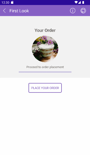
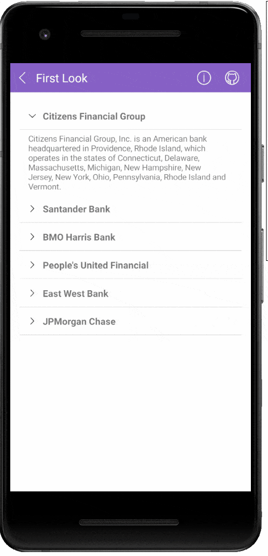
Prepare for an exhilarating update in R2 2023 as Telerik UI for .NET MAUI unveils a series of exciting enhancements. I am thrilled to introduce six brand-new controls: Calendar, PDF Viewer, Chat, SlideView, RichTextEditor and TreeView, each designed to empower your app development journey. In addition, we have taken steps to refine and enrich our powerful DataGrid control, unlocking even more possibilities. Let’s have a sneak peek at the most interesting stuff we have for you in this release.
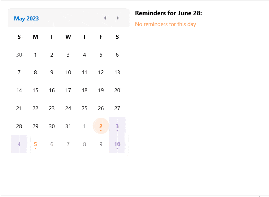
Calendar
The new addition to the UI for .NET MAUI family is the Calendar component. It allows you to select single or multiple dates by navigating easily between decades, years and months. The control is culture-aware by providing globalization support. It also provides support for scrolling and navigation, blackout dates and much more.
Here is a list of the main features of the control:
- Different display modes: Calendar features year, month, decade and century display modes.
- Date Ranges: Restrict the visible/selectable dates in the Calendar by utilizing MinDate and MaxDate properties.
- Different selection modes: The component provides different types of selection—Single, Multiple, Range or disabling the selection.
- Buttons for navigation in the current view: You can easily navigate in the current view by using the buttons in the calendar header.
- Hide the names of the display days in month view.
- Format the header text for the corresponding view.
- Templates support: For customizing the days, months, years and decades in the corresponding views.
- Commands support: For navigating in the current view or between the views.
- Styling API: You can style the Calendar border, header border and text, navigation buttons and the content of the corresponding view.
For more information on getting started with the Telerik UI for .NET MAUI Calendar control, visit the documentation.
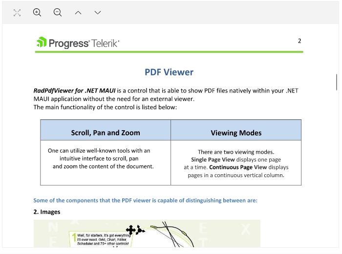
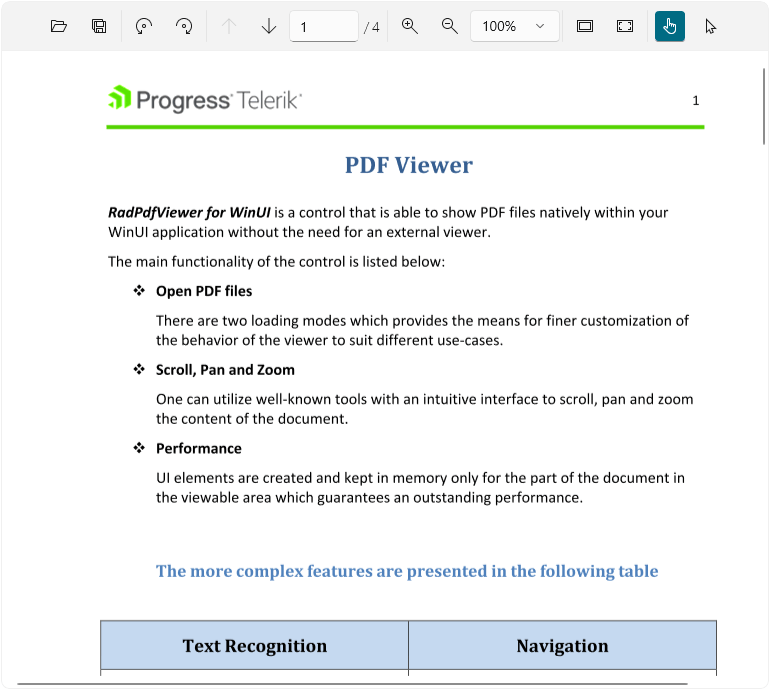
PDF Viewer Component
One of the highly requested components for our UI for .NET MAUI suite was the PDF viewer. I am happy to share that it is now available with our latest release. This component empowers the users of your application to directly open and view PDF documents within their mobile or desktop app, eliminating the need for any external software installation or switching between different applications. You can visualize PDF documents that include images, shapes, different colors, ordered and bulleted lists and more.
Here are some of the key features to look for:
- Various document source options: You can load the PDF document from a stream, from a file added as an embedded resource or a file located on the device, etc.
- Zooming functionality: The component provides an option for zooming in and zooming out the content of the document.
- Commands support: The PDF Viewer component offers support for a variety of commands, such as ZoomIn, ZoomOut, NavigateTo (NextPage, PreviousPage, Page) and FitToWidth.
- Single page and Continuous Scrolling support: You can choose between two layout modes that allow the document to be scrolled in the viewer.
- Flexible styling API: You can easily style the toolbar per your requirements.
For more information on getting started with the PDF Viewer control, visit the documentation.
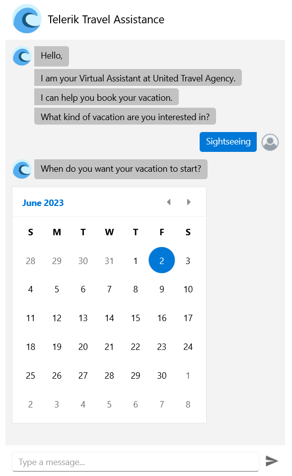
Chat Component (Conversational UI)
The Chat control in Telerik UI for .NET MAUI empowers you to build contemporary chat experiences in your .NET MAUI apps. It smoothly integrates with popular chatbot frameworks and effortlessly facilitates peer-to-peer conversations.

The component offers a diverse range of customizable message formats like cards, pickers and suggestions. It also enables you to effortlessly replace forms with an instinctive conversational UI. You can modify messages and cards to include text, images and other elements or incorporate details such as message timestamps, sender/recipient names, avatars and much more.
For more information on getting started with the Telerik UI for .NET MAUI Chat control, visit the documentation.
SlideView Component
The new SlideView component provides a visually appealing and interactive way to present information or showcase visual content. Whether your goal is to create an image gallery or improve navigation within your .NET MAUI application, the SlideView component offers a comprehensive set of features and customizable options to fulfill your requirements.

Here are some of the key features to look for:
- Item Template: Allows you to present the data in the views in the most suitable way for your scenario.
- Control Template support: You can change the appearance of the SlideView component through a Control Template.
- Customizable indicators and slide buttons: The SlideView allows you to customize the appearance of the indicators and slide buttons.
- Commands support
- UI virtualization
For more information on getting started with the Telerik UI for .NET MAUI SlideView control, visit the documentation.
Rich Text Editor Component
The Telerik UI for .NET MAUI RichTextEditor control empowers users to generate rich textual content using a comprehensive array of tools. These tools simplify the creation, editing and formatting of text, paragraphs, lists, hyperlinks and various other elements.
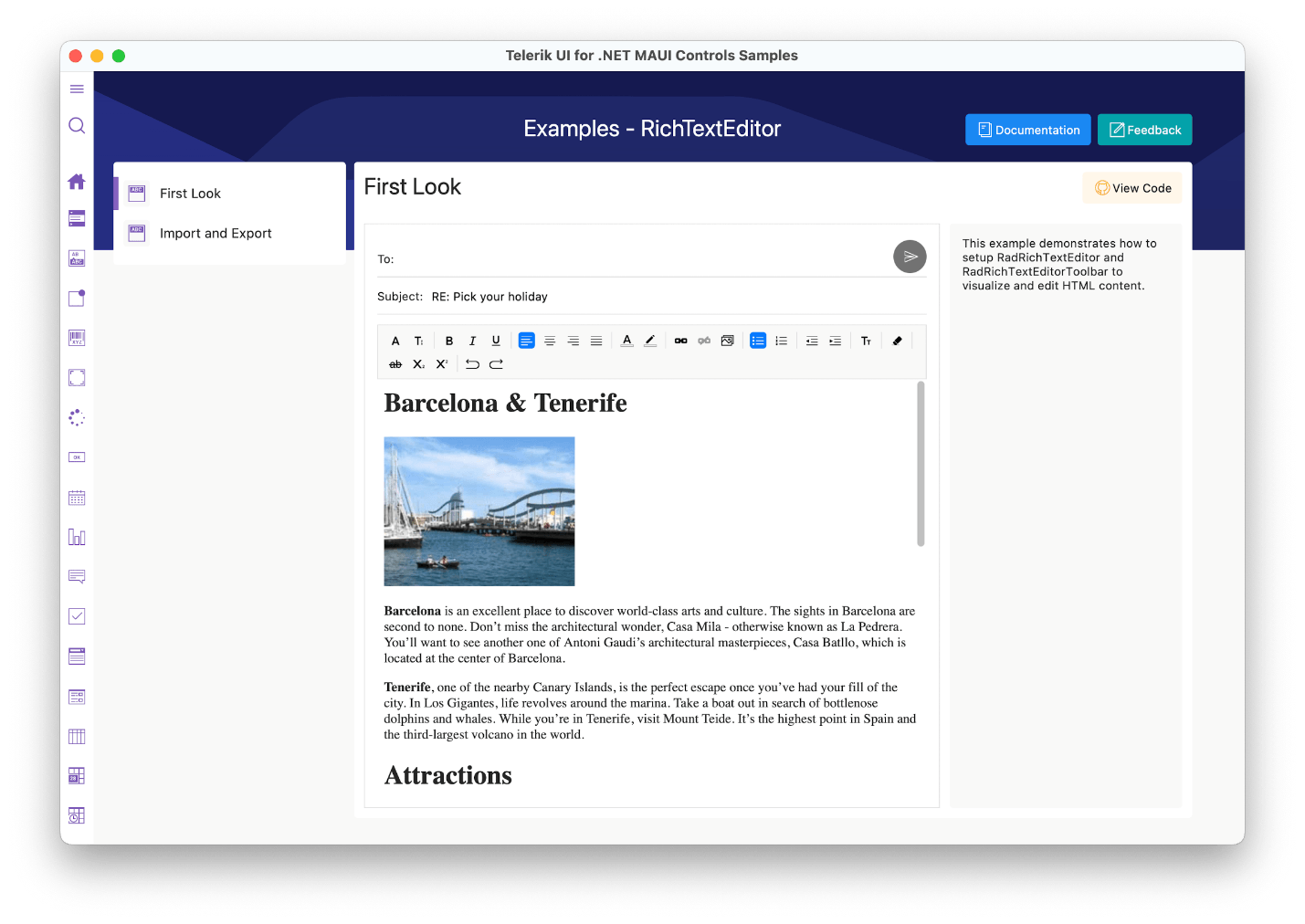
The Telerik UI for .NET MAUI RichTextEditor control comes with a multitude of editing capabilities, including:
- Text formatting, such as bold, italic, underline and strikethrough
- Font manipulations, such as size, family and color
- Text selection
- Hyperlink manipulations such as creating, editing and removing hyperlinks
- Read-only state that does not allow text editing
- Copy/Paste/Undo/Redo editing actions
It also has an integrated ToolBar, which effortlessly connects to the commonly used commands provided by the control.
For more information on getting started, visit the Telerik UI for .NET MAUI RichTextEditor control documentation.
TreeView
The new TreeView component in UI for .NET MAUI allows you to visually represent hierarchical data in a collapsible and expandable tree structure. It provides users with an intuitive way to navigate and explore complex information, such as folder structures, organizational charts or category hierarchies.
Here are some of the key features to look for:
- Hierarchical navigation
- Expand/Collapse items
- Commands support
- CheckBox support
- UI virtualization
- Single and multiple selection modes
- Empty template support
- Flexible styling API
For more information on getting started, visit the Telerik UI for .NET MAUI TreeView control documentation.
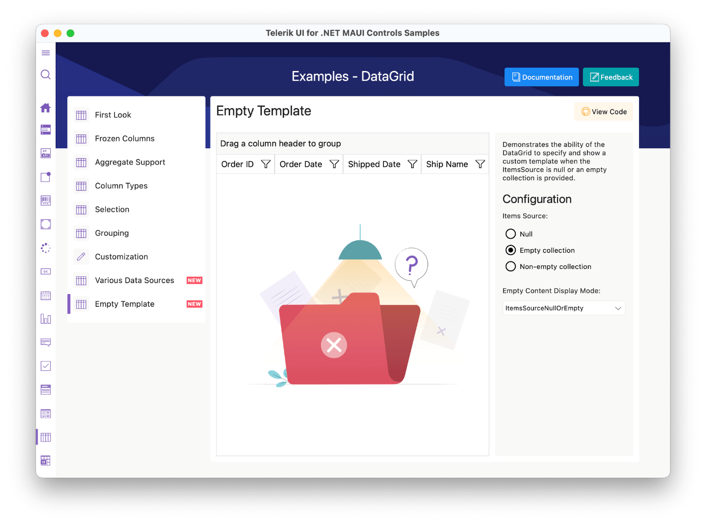
DataGrid Empty Template Support
The Telerik UI for .NET MAUI DataGrid control introduces the Empty Template functionality. This feature enables you to inform your end users when the control has no data to display.
DataGrid DataTable support
You can bind your .NET MAUI DataGrid to a DataTable and have access to all the cool features. You can add, remove, select, edit item(s) and update DataGrid’s ItemsSource. You can also perform commands and operations like filtering, sorting, grouping and selection.
.NET 6 & .NET 8 Support
As you may be aware, Microsoft officially discontinued .NET 6 support for .NET MAUI back in May. We are announcing that our plans align with this change, and we will be ending our support for .NET MAUI in .NET 6 in November—this should give you extra time to get off .NET 6 and onto .NET 7/8.
This transition marks an exciting milestone as we prepare to welcome the arrival of .NET 8, which will bring a host of new features and enhancements. Rest assured that during this period, we are actively working to ensure a seamless transition and guarantee an official and robust support system for .NET 8, which we will be ready to launch alongside its official release.
Check out the Detailed Release Notes
To get an overview of all the latest components, features and improvements we’ve made, check out the release notes for the product: Telerik UI for .NET MAUI (Release Notes).
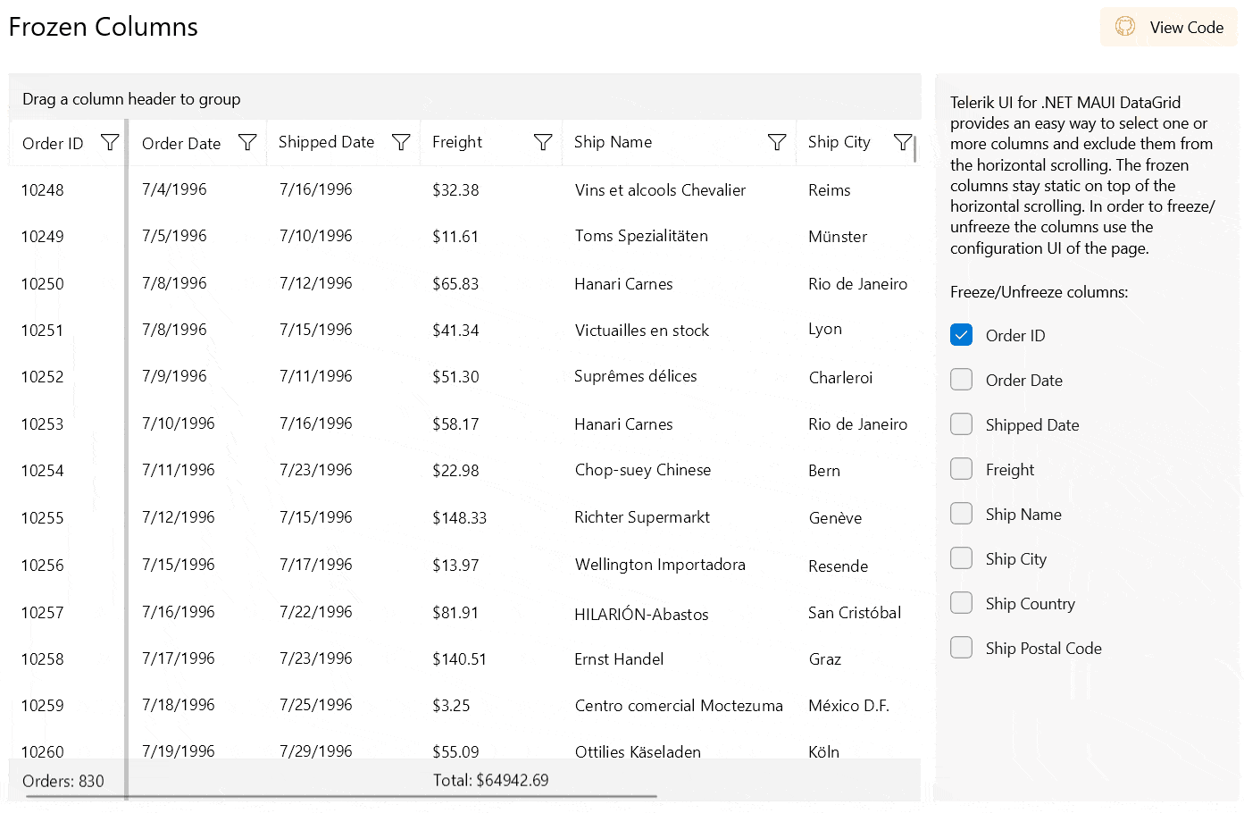
Telerik UI for WPF
RadSlideView and RadPipsPager components
RadSlideView is a flexible navigation control that allows you to slide between different views, thus providing an interactive navigation. With it, you can build a gallery display to show your images and content efficiently.
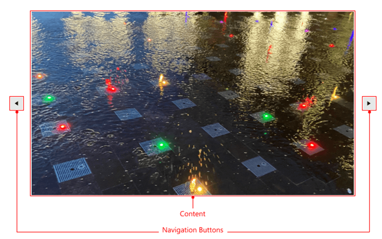
RadPipsPager lets the user navigate a linearly paginated collection using glyphs also known as pips.
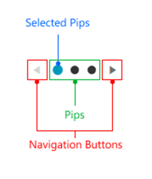
The two controls work seamlessly with one another to enhance the navigation experience in your applications.
.gif?sfvrsn=307bf102_1)
They also share some of their main features:
- Navigation: The controls allow you to navigate through the data either in a loop or from end to end.
- Orientation: They can be oriented vertically or horizontally.
- Customizing navigation buttons: The navigation buttons can be easily customized.
You can find more information about the new components in their respective documentation sections:
Windows 11 Compact Theme
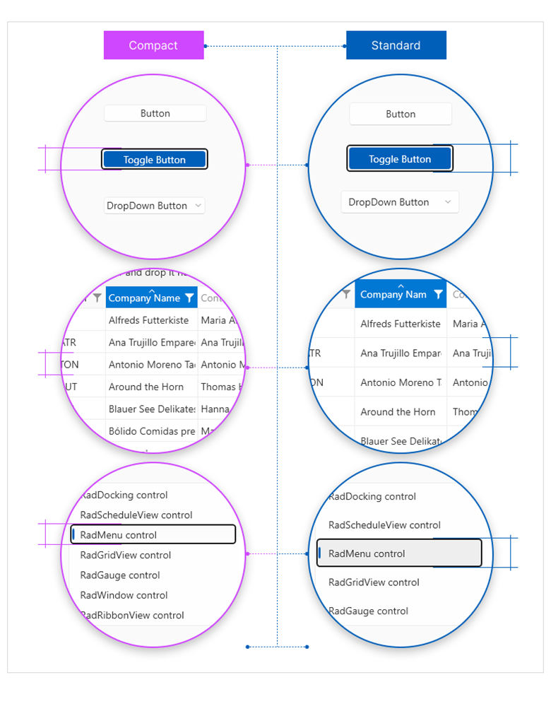
Get ready to elevate your app’s aesthetics and create a masterpiece with the most innovative addition to the R2 2023 Release—a new, high-density (or compact) layout option for the Windows 11 theme. Designed for information rich UI and similar specialized scenarios, this new theme mode brings a stunning and sleek look to your WPF apps.
While functionality and behavior have not changed and remain consistent across the two size and density options, the default heights and offsets have been updated for all controls to support both density options.
For more information on getting started with our latest theme, visit the Telerik UI for WPF theme documentation.
RadDocking: Move Panes Between Multiple Docking Instances
No more moving pane restrictions between docking instances. Users can now create a group of dockings in which moving and docking panes are not limited, no matter if dockings are nested or side by side. This enables powerful UI rearrangement abilities in applications with multiple dockings in a single view.
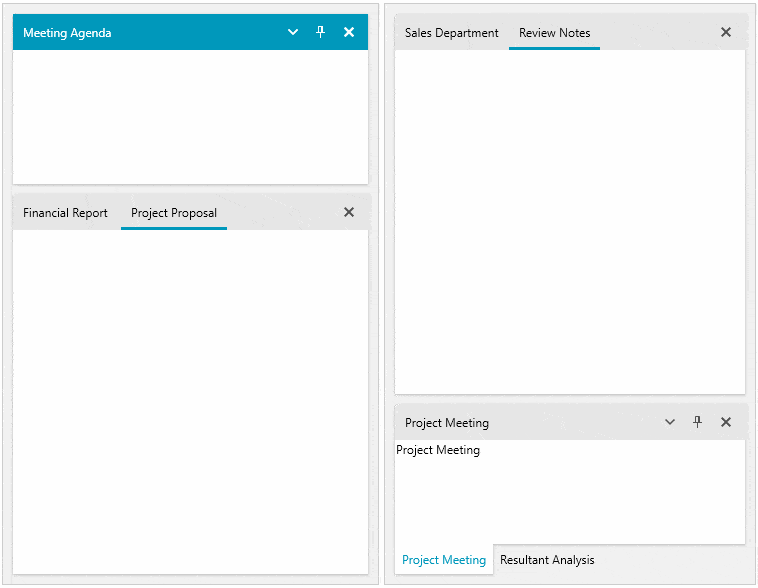
For more information on getting started with this powerful feature, visit the Telerik UI for WPF RadDocking documentation.
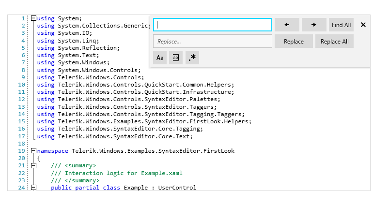
SyntaxEditor: Search UI Enhancements
To better cover well-known scenarios in text or code editing from VisualStudio or NotePad++, we added more search options in the search panel. MatchCase, MatchWholeWord and Regex settings will give your users the powerful search experience they expect.
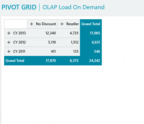
RadPivotGrid LocalDataSourceProvider Hierarchies
The LocalDataSourceProvider now allows you to display nested properties of the objects in its ItemsSource in a hierarchy similar to how DateTime properties are visualized in the RadPivotFieldList.
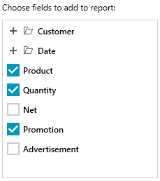
Nested properties can be utilized to create a report in the same manner as non-nested ones.
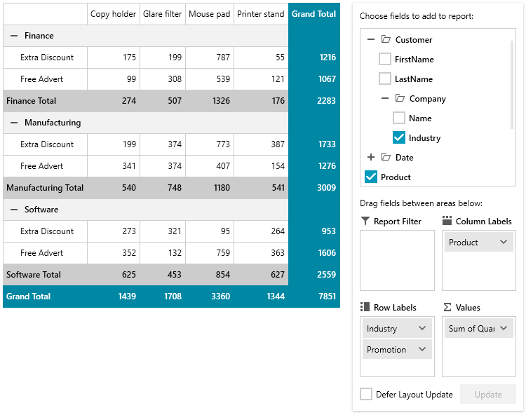
You can enable this functionality by setting the new EnableHierarchy property of the LocalDataSourceProvider to True. Then you will be able to provide a nested property path as the PropertyName of a group description.
<pivot:LocalDataSourceProvider x:Key="dataProvider" EnableHierarchy="True">
       <pivot:LocalDataSourceProvider.RowGroupDescriptions>
              <pivot:PropertyGroupDescription PropertyName="Customer.Company.Industry" />
              <pivot:PropertyGroupDescription PropertyName="Promotion" />
      </pivot:LocalDataSourceProvider.RowGroupDescriptions>
</pivot:LocalDataSourceProvider>
To see this in action, check out the PivotFieldList demo in the WPF Examples application.
Here is also a list of other popular features we updated for you in this release:
- TreeView: Ability to perform selection on mouse up
- GridView: ExactMatch functionality in search-as-you-type feature
- PropertyGrid: Allow searching for property fields that are not expanded initially
Support for .NET 8 Preview
We are excited to announce that we are extending our support to include the preview versions of .NET 8. While .NET 8 is still in the preview phase, we understand the eagerness to explore its capabilities. We have thoroughly tested our components and have made sure they are compatible with the latest preview releases.
Telerik UI for WinForms
The R2 2023 release comes with a brand-new Heat Map control, a dark Visual Studio 2022 theme, modernized Scheduler appointments, LineNumbering in the RichTextEditor and a ton of other improvements.
Heat Map
RadHeatMap is here to help you visualize numeric data in a meaningful and straightforward way. It uses a two-dimensional layout with indicative colors to represent data. Each entity is represented by a colored rectangle and the applied color maps to the magnitude of its numeric value. At a glimpse, you can spot trends and easily compare different data items.
The component comes with many features like intuitive API, databinding, unbound mode, different colorizers, labels, selection, tooltips and screentips, and custom painting.
For more information on getting started with the HeatMap control, visit the WinForms HeatMap documentation.
Visual Studio 2022 Dark Theme
Yet another member of our family of dark themes is coming. We are expanding this collection because we know that many of you are fans of the dark side. As its name suggests, the theme is inspired by Visual Studio 2022 and its dark mode.
For more information on getting started with our latest theme, visit the Telerik UI for WinForms themes documentation.
Scheduler Appointment Styles
We’ve always strived to create modern components and designs. It was about time for the RadScheduler look to completely change. New appointment styles are coming to RadScheduler—they are fresh, bold and modern. The styles vary from one theme to another, matching its general look and feel.
Line Numbering in RichTextEditor
RadRichTextEditor has a new handy feature—line numbers. The numbers are displayed at the beginning of each line and, if needed, can work independently in different paragraphs, sections or pages. They are quite popular in legal documents, scripts or medical records.
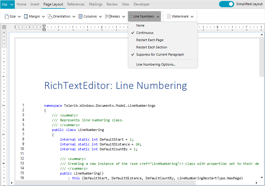
For more information on getting started with this powerful feature, visit the WinForms Line Numbering in RichTextEditor documentation.
Support for .NET 8 Preview
.NET 8 is still in preview but it’s getting increasingly stable. We’ve also played with this new runtime and so far, could not isolate issues with the components. If you are adventurous enough or want to experiment, Telerik UI for WinForms has you covered.
Other Improvements
Besides the highlights above, the 2023 R2 release comes with plenty of other enhancements. I will name just a few that will improve your Telerik UI for WinForms experience:
- Major performance gains in our Visual Studio extensions. Now we are using new APIs allowing us to offload the UI thread. This is an ongoing effort, so expect more in this regard with our next releases.
- We’ve decided to update our distribution with assemblies that are digitally signed. So, if you need those, now you can download them straight from your Telerik account.
- Many fixes and improvements related to importing, printing and copying documents inside the RadRichTextEditor control.
Telerik UI for WinUI
New TimeBar Component
RadTimeBar is a time-bound DataVisualization control. Its chief purpose is to allow lightweight scrolling and navigation through large periods of time. Additionally, the control exposes intuitive API which allows for both declarative and programmatic manipulation of the control.
The component provides the following features:
- Intervals: The control allows you to define the available intervals that will be visualized when you zoom in/out on the control.
- Selection: A time interval can be easily selected via the mouse or by setting a couple of properties of the control.
- Special slots: This feature can be used to highlight different time intervals in the control.
- Custom intervals and formats: The intervals can be customized by implementing a couple of interfaces. This way you can modify the intervals and the date-time formats used to define the appearance of the periods.
- Localization: As all controls in the suite, the RadTimeBar supports several languages. The strings that are localized are the date labels (month, week, etc.).
For more information on getting started, visit the Telerik UI for WinUI TimeBar control documentation.
Telerik UI for Xamarin
In the R2 2023 release, our main focus revolved around Telerik UI for .NET MAUI. However, we are delighted to share that we fulfilled one of the most highly requested features for our Xamarin’s DataGrid component.
Xamarin DataGrid Enchantment: Empty Template Support
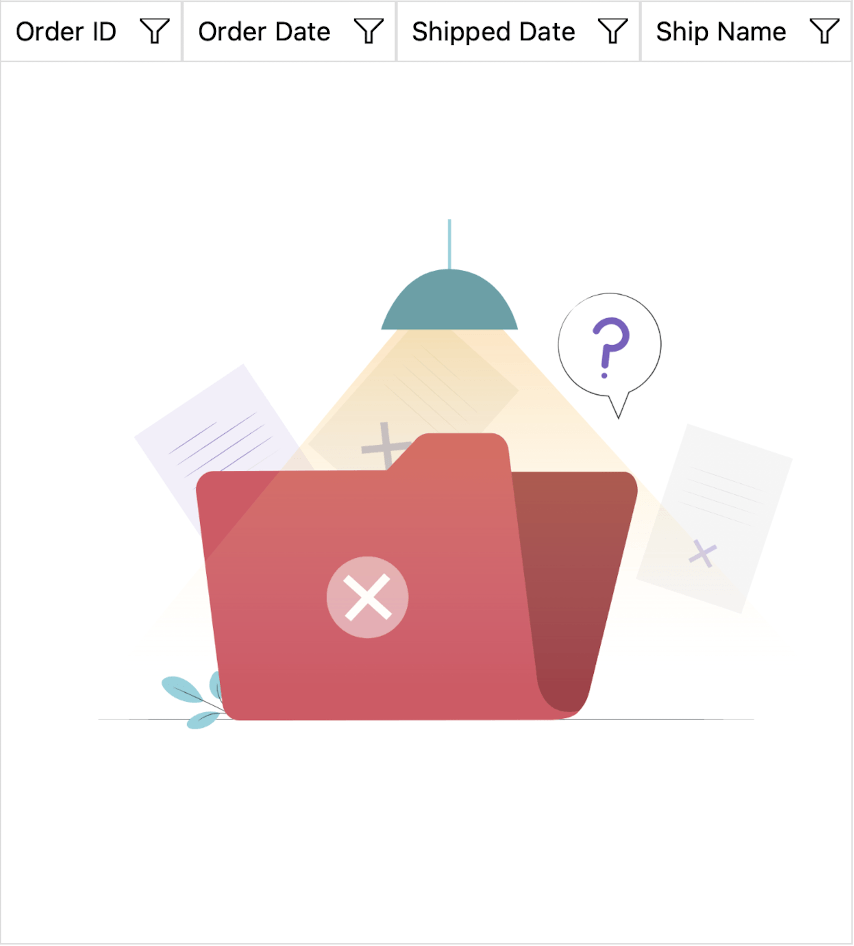
This powerful addition allows you to effectively communicate with end-users when the DataGrid control contains no data to display. By utilizing the Empty Template feature, you can provide informative and visually appealing messages (or even images!), enhancing the user experience and ensuring clarity.
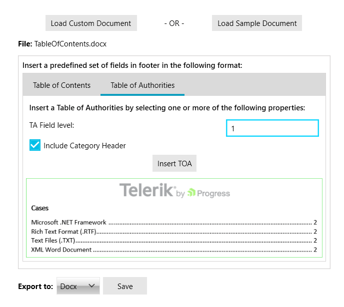
Telerik Document Processing Libraries
With the highly anticipated R2 2023 release, we are thrilled to present a plethora of enhancements that span the entire suite. Let’s dive into the highlights of the Telerik Document Processing Libraries, where exciting improvements await:
New PDFProcessing Improvements: Multiple Image-Related Enhancements
In the latest update, the PDF Processing library introduces a valuable addition: an image compression setting. This setting empowers you to define the desired compression level when exporting images. You now have the flexibility to choose between Default, None and FlateDecode compression options, ensuring optimal output quality.
Moreover, we are pleased to announce a new default implementation for the ImageUtils’ JpegImageConverter and ImagePropertiesResolver, leveraging the powerful capabilities of the SkiaSharp library.
New SpreadStreamProcessing Improvements: Support for Importing Rich Text as Plain Text
Now, you have the ability to import rich text and seamlessly extract it as plain text, eliminating any formatting elements. This enhancement simplifies your data processing workflows, allowing you to focus solely on the textual content. Say goodbye to complex formatting concerns and embrace the ease of extracting and working with plain text using the SpreadStreamProcessing library.
Document Processing Libraries: Fixes and Quality Improvements
In the R2 2023 release, the Document Processing team prioritized an extensive range of bug fixes, aiming to deliver a higher level of quality for the library and enhance overall performance. There were 20+ bug fixes in the PDF Processing library alone.
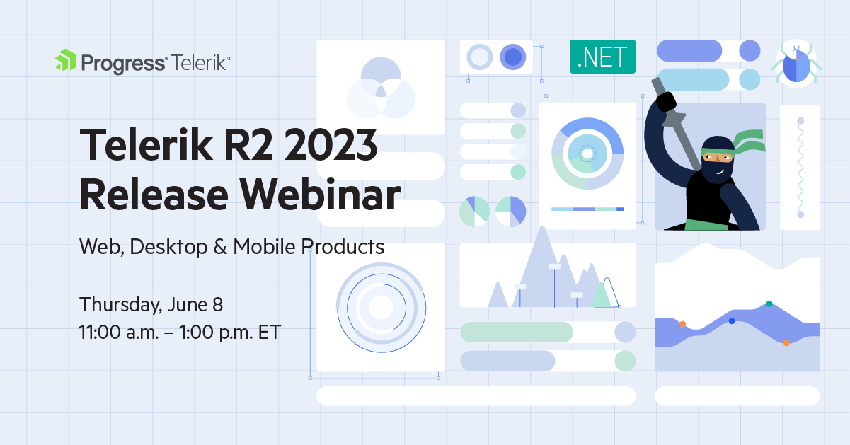
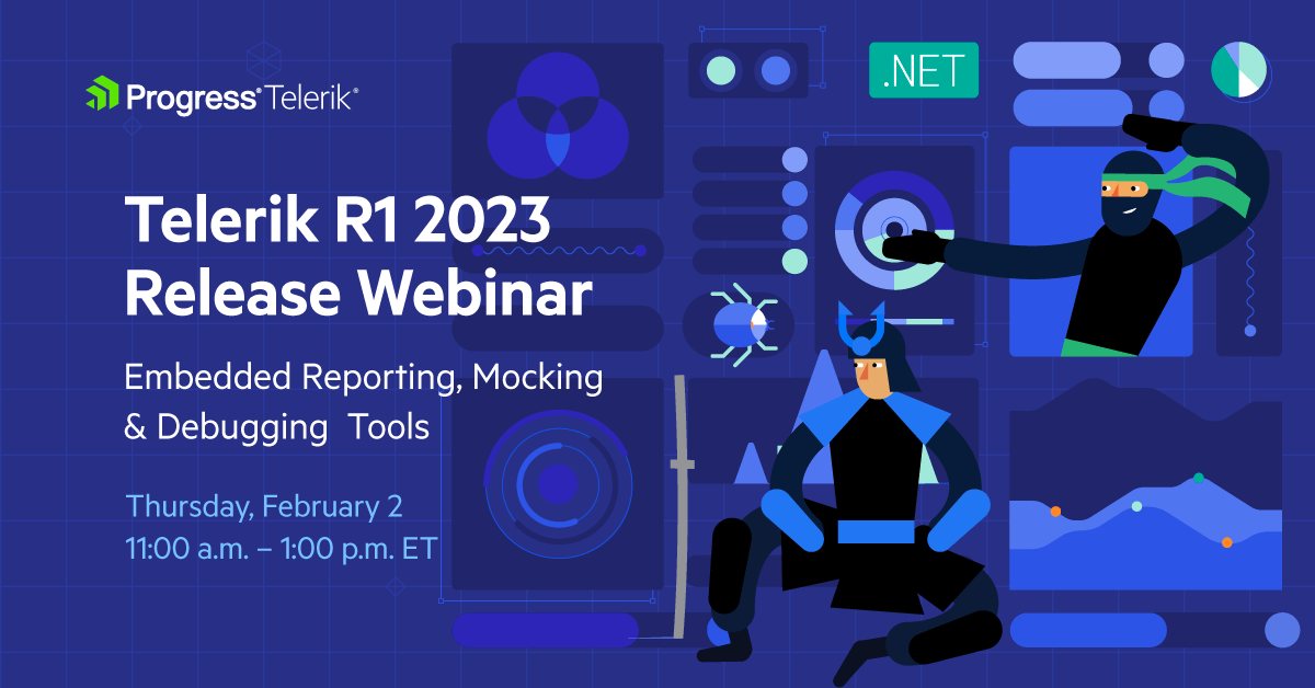
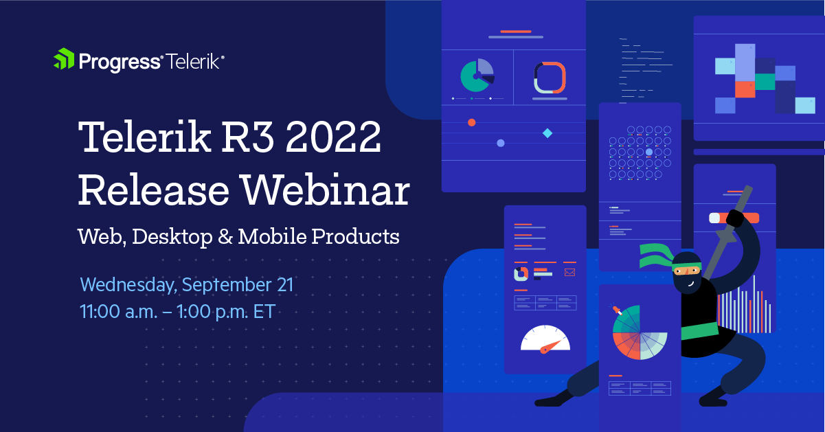
Join Us for Release Webinar (and More)
Progress Telerik .NET Web, Desktop & Mobile Products R2 2023 Release Webinar | June 8
Discover all updates across Telerik UI for Blazor, UI for ASP.NET Core, UI for ASP.NET MVC, UI for ASP.NET AJAX, UI for WPF, UI for WinForms, UI for WinUI, UI for .NET MAUI and UI for Xamarin and ThemeBuilder.
Join Us on Twitch
Join the Livestream Release Party on release day, June 7, 11 a.m. – 12:30 p.m. ET to hear the release news and hang out with dev friends.
The live webinars and Twitch sessions are a great opportunity for you to ask questions before and during the webinars. We’ll be waiting to hear from you on Twitter—just use the #heyTelerik and #heyKendoUI hashtags. Another great option is the live chat during our release session on CodeItLive, our Twitch channel.
 ]]>
]]>


 ]]>
]]>


 ]]>
]]>


 ]]>
]]>


 ]]>
]]>


.png?sfvrsn=dbc4df24_1 "WPF Windows 11 Theme (3)")
.gif?sfvrsn=ec513f3d_1 "WPF Windows 11 Theme (2)")
.png?sfvrsn=2d972561_1 "WPF Windows 11 Theme (4)")
.png?sfvrsn=d5cffb26_1 "WPF Windows 11 Theme (5)")
.png?sfvrsn=f2175d1c_1 "WPF Windows 11 Theme (6)")


 ]]>
]]>

 ]]>
]]>


 ]]>
]]>


 ]]>
]]>


 ]]>
]]>


 ]]>
]]> ]]>
]]> ]]>
]]>


 ]]>
]]>


 ]]>
]]>