<?xml version="1.0" encoding="UTF-8"?>
<?xml-stylesheet type="text/xsl" media="screen" href="/~files/atom-premium.xsl"?>
                                                                                                                                                                                                                                                                                                                                                                                                                                                                                                                                             
<feed xmlns="http://www.w3.org/2005/Atom" xmlns:feedpress="https://feed.press/xmlns" xmlns:media="http://search.yahoo.com/mrss/" xmlns:podcast="https://podcastindex.org/namespace/1.0">
  <feedpress:locale>en</feedpress:locale>
  <link rel="hub" href="https://feedpress.superfeedr.com/"/>
  <logo>https://static.feedpress.com/logo/telerik-blogs-mobile-net-maui-6185107a1dcff.jpg</logo>
  <title type="text">Telerik Blogs | Mobile| .NET MAUI</title>
  <subtitle type="text">The official blog of Progress Telerik - expert articles and tutorials for developers.</subtitle>
  <id>uuid:01f05a43-a039-4a21-948c-eccae577da7d;id=216</id>
  <updated>2026-08-26T17:11:16Z</updated>
  <link rel="alternate" href="https://www.telerik.com/"/>
  <link rel="self" type="application/atom+xml" href="https://feeds.telerik.com/blogs/mobile-net-maui"/>
  <entry>
    <id>urn:uuid:11e0f437-8d92-4dc9-a2b6-a4030526b9ad</id>
    <title type="text">Skeleton in .NET MAUI: What It Is and How to Use It</title>
    <summary type="text">A skeleton allows us to indicate to users that an app or page is loading. This improves the user experience, providing feedback that the app isn’t broken.</summary>
    <published>2026-08-24T15:23:04Z</published>
    <updated>2026-08-26T17:11:16Z</updated>
    <author>
      <name>Leomaris Reyes </name>
    </author>
    <link rel="alternate" href="https://feeds.telerik.com/link/23059/17427494/skeleton-net-maui-what-and-how-to-use-it"/>
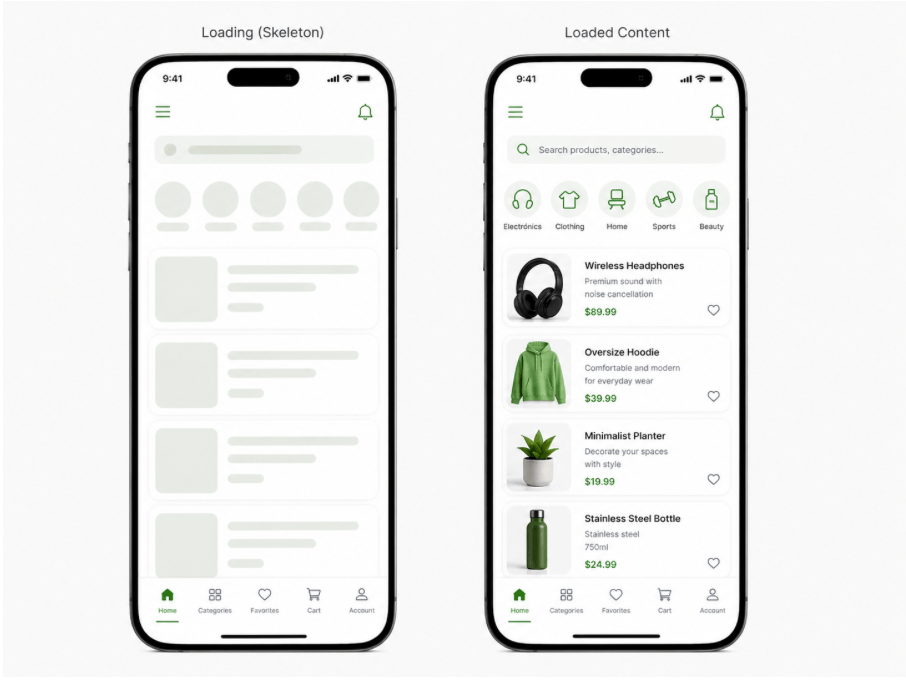
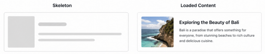
    <content type="text"><![CDATA[<p><span class="featured">A skeleton allows us to indicate to users that an app or page is loading. This improves the user experience, providing feedback that the app isn&rsquo;t broken.</span></p><p>Let&rsquo;s face it: as users, we tend to be impatient when an application doesn&rsquo;t respond quickly. It&rsquo;s very easy to assume that the app has frozen or isn&rsquo;t working when it doesn&rsquo;t give us any kind of feedback.</p><p>Imagine you have an application with a menu that displays a list connected to a backend. If the backend takes time to respond and we don&rsquo;t indicate to the user that data is loading, they will most likely think: &ldquo;This app doesn&rsquo;t work.&rdquo;</p><p>As developers, it&rsquo;s important to prevent this from happening. There are different ways to visually communicate that data is loading, and one of my favorites is using skeletons. These allow us to gently indicate to the user that the app is performing an action, even if the content isn&rsquo;t ready yet.</p><p>In this article, we&rsquo;ll learn what a Skeleton is, in which scenarios it is most useful, and how to implement the Skeleton component designed by Progress Telerik UI for .NET MAUI.</p><h2 id="what-is-a-skeleton">What Is a Skeleton?</h2><p><img src="https://www.telerik.com/sfimages/default-source/blogs/2026/2026-08/00_skeleton_sample.png?sfvrsn=b89cf7f6_2" alt="Skeleton sample" /><br /><span style="font-size:11px;">Image generated using AI for illustrative purposes</span></p><p>A skeleton is a visual element used to indicate that content is loading. Basically, it appears on the screen as blocks (usually gray) placed in the same positions where the actual elements will be displayed once the data is available and the effect disappears.</p><p>Its purpose is to give users context while the information is loading by showing the structure that the content will have. It also typically includes a subtle animation that communicates the app is still working, even if all that&rsquo;s visible are gray blocks or rectangles.</p><p>This way, instead of showing empty spaces, a traditional loader or, even worse, nothing at all, a skeleton keeps the interface clear and lets the user know that the application is working fine.</p><h2 id="✅-when-should-you-use-skeletons">✅ When Should You Use Skeletons?</h2><p>It&rsquo;s important to see skeletons not just as a visual element to &ldquo;entertain&rdquo; users, but as a tool that allows your app to handle loading states in a smoother and more intentional way.</p><p>Let&rsquo;s look at some scenarios where skeletons are especially useful:</p><h3 id="when-waiting-for-api-responses">When Waiting for API Responses</h3><p>No matter how optimized your app is, it still depends on backend response times. Skeletons help bridge that gap by showing structure while data is loading. Ideally, you should display the skeleton only while the request is in progress and replace it immediately once the data is available.</p><h3 id="screens-with-heavy-images">Screens with Heavy Images</h3><p>When loading images that may take time, skeletons are extremely useful to indicate that content is coming, instead of leaving empty or broken-looking spaces.</p><h2 id="❌-when-are-skeletons-not-recommended">❌ When Are Skeletons NOT Recommended?</h2><h3 id="when-data-is-not-actually-loading">When Data Is Not Actually Loading</h3><p>Avoid using skeletons just for visual purposes. If there&rsquo;s no real loading happening, then you don&rsquo;t need them.</p><h3 id="for-instant-loads">For Instant Loads</h3><p>If the content appears immediately, adding a skeleton only adds unnecessary complexity and can even hurt the experience.</p><h3 id="very-simple-screens">Very Simple Screens</h3><p>On screens with minimal content, a skeleton might be overkill. A simple layout or even a simple loading indicator could be enough.</p><h2 id="meet-the-telerik-skeleton-">Meet the Telerik Skeleton </h2><p>Did you know that Progress Telerik provides a <strong><a href="https://www.telerik.com/maui-ui/skeleton">Skeleton component for .NET MAUI</a></strong>? Oh yeahh! </p><p>Now that you&rsquo;ve seen how powerful using one can be, let&rsquo;s quickly go through how to implement it and highlight some of its most important benefits.</p><p>Before we dive in, let&rsquo;s make sure your environment is ready. Just keep these two key points in mind:</p><ul><li><strong>Create a Telerik account</strong>: If you don&rsquo;t have a <a href="https://www.telerik.com/account/">Telerik account</a> yet, you can create one for free. You&rsquo;ll get access to a trial license that allows you to explore not only the Skeleton component, but the full set of UI controls available for .NET MAUI.</li><li><strong>Install Telerik UI for .NET MAUI</strong>: This is a one-time setup, so you won&rsquo;t need to repeat it for each component. If you haven&rsquo;t installed it yet, I&rsquo;ve included an article that walks you through the process step by step for both <a href="https://www.telerik.com/maui-ui/documentation/get-started/first-steps-vs">Visual Studio</a> and <a href="https://www.telerik.com/maui-ui/documentation/get-started/first-steps-vs-code">Visual Studio Code</a>.</li></ul><h3 id="adding-the-namespace">Adding the Namespace</h3><pre><code>xmlns:telerik="http://schemas.telerik.com/2022/xaml/maui"
</code></pre><h3 id="registering-the-component">Registering the Component</h3><p>Go to your <strong>MauiProgram.cs</strong> file and, inside the CreateMauiApp method, register the Telerik controls using the <strong>UseTelerik()</strong> extension method.</p><pre class=" language-csharp"><code class="prism  language-csharp">using Telerik.Maui.Controls.Compatibility;
public static class MauiProgram
{

    public static MauiApp CreateMauiApp()
    {
    var builder = MauiApp.CreateBuilder();
    builder
    .UseTelerik()
    .UseMauiApp&lt;App&gt;()
    .ConfigureFonts(fonts =&gt;
    {
    fonts.AddFont("OpenSans-Regular.ttf", "OpenSansRegular");
    });
    return builder.Build();
    
    }
}
</code></pre><h3 id="how-to-use-it">How to Use It?</h3><p>Using it is very simple. You just have to add a tag like the following:</p><pre class=" language-xml"><code class="prism  language-xml">&lt;telerik:RadSkeleton x:Name="skeleton"/&gt;
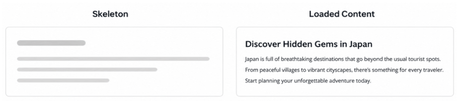
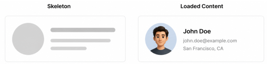
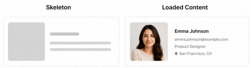
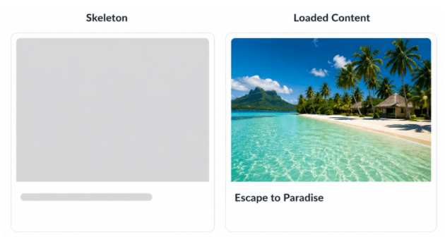
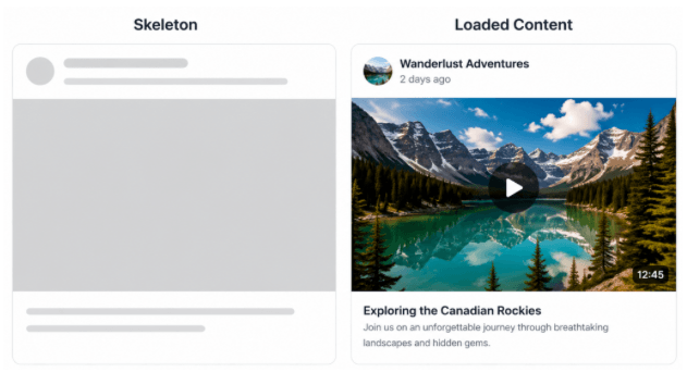
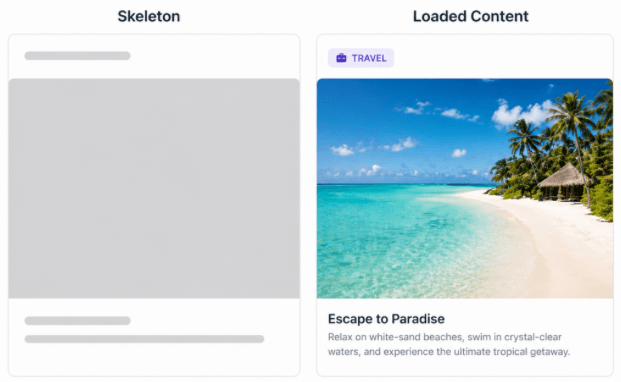
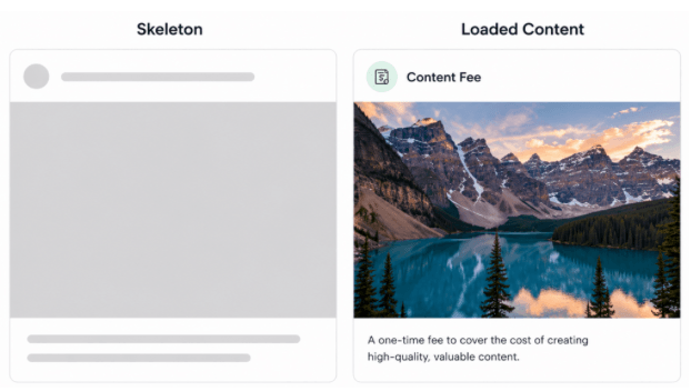
</code></pre><h3 id="skeleton-types-in-the-telerik-ui-for-.net-maui-library">Skeleton Types in the Telerik UI for .NET MAUI Library</h3><p>Typically, when creating a skeleton, you need to build the structure from scratch. However, the Telerik UI for .NET MAUI Skeleton component comes with predefined structures (anatomies), which helps you save both time and code. (Honestly, this is gold. A huge win!)</p><p>This control offers several built-in structures that you can use to represent different types of content:</p><p>➖ <strong>Article:</strong> Displays a layout with a small image placeholder on the left and multiple text lines on the right, simulating a title and description.</p><p><img src="https://www.telerik.com/sfimages/default-source/blogs/2026/2026-08/01_article_skeleton_type.png?sfvrsn=62c04b72_2" alt="Article skeleton sample" /></p><p>➖ <strong>Text:</strong> A simple text structure composed of multiple lines, typically used to represent titles and paragraphs.</p><p><img src="https://www.telerik.com/sfimages/default-source/blogs/2026/2026-08/02_text_skeleton_type.png?sfvrsn=844034a1_2" alt="Text skeleton sample" /></p><p>➖ <strong>PersonalCircle:</strong> Shows a circular avatar placeholder with text lines next to it, commonly used for user profiles or list items with avatars.</p><p><img src="https://www.telerik.com/sfimages/default-source/blogs/2026/2026-08/03_personalcircle_skeleton_type.png?sfvrsn=72d71c48_2" alt="Personal circle skeleton sample" /></p><p>➖ <strong>PersonaSquare:</strong> Similar to PersonaCircle, but uses a square (with rounded corners) instead of a circular avatar.</p><p><img src="https://www.telerik.com/sfimages/default-source/blogs/2026/2026-08/04_personasquare_skeleton_type.png?sfvrsn=7d7748ae_2" alt="Personal square skeleton sample" /></p><p>➖ <strong>Image:</strong> Represents a large media placeholder with a single text line below, ideal for image-focused layouts.</p><p><img src="https://www.telerik.com/sfimages/default-source/blogs/2026/2026-08/05_image_skeleton_type.png?sfvrsn=2bd148cc_2" alt="Personal square skeleton sample" /></p><p>➖ <strong>Video:</strong> Simulates a video layout with a small avatar and text at the top, followed by a large media area and additional text lines below.</p><p><img src="https://www.telerik.com/sfimages/default-source/blogs/2026/2026-08/06_video_skeleton_type.png?sfvrsn=dae0aadc_2" alt="Video skeleton sample" /></p><p>➖ <strong>Card:</strong> Displays a card-style layout with a title at the top, a large image placeholder and text lines at the bottom.</p><p><img src="https://www.telerik.com/sfimages/default-source/blogs/2026/2026-08/07_card_skeleton_type.png?sfvrsn=5d4d50e4_2" alt="Card skeleton sample" /></p><p>➖ <strong>ContentFeed:</strong> Mimics a feed-style layout with a header (avatar + one line), a large content block and text lines below, similar to social media posts.</p><p><img src="https://www.telerik.com/sfimages/default-source/blogs/2026/2026-08/08_contentfeed_skeleton_type.png?sfvrsn=222eb4d7_2" alt="Content feed sample" /><br /><span style="font-size:11px;">The images of the Skeleton types were generated using AI for better understanding</span></p><p>To use any of these types, you just need to use the SkeletonType property as shown below:</p><pre class=" language-xml"><code class="prism  language-xml">&lt;telerik:RadSkeleton SkeletonType="Article" /&gt;
</code></pre><h2 id="-custom-skeleton-view"> Custom Skeleton View</h2><p>But &hellip; what if you want to create your own skeleton anatomy? </p><p>You can do that too!  Although the predefined types help you save time and effort, they don&rsquo;t always fit your design. That&rsquo;s why Progress Telerik allows you to create a fully custom one.</p><p>The idea is very simple: you define your own layout (just like your real UI, but without data) and assign it to the <strong>RadSkeleton</strong> using the LoadingViewTemplate property.</p><h3 id="️-implementation">️ Implementation</h3><p>First, define your RadSkeleton and assign a custom template to it:</p><pre class=" language-xml"><code class="prism  language-xml">    &lt;telerik:RadSkeleton LoadingViewTemplate="{StaticResource CustomSkeletonView}"  
    Grid.Row="1" 
    x:Name="skeleton"&gt; 
    
    &lt;!-- Your real content goes here --&gt;
    
    &lt;/telerik:RadSkeleton&gt;
</code></pre><p>Then, create the DataTemplate that will represent your skeleton:</p><pre class=" language-xml"><code class="prism  language-xml">&lt;DataTemplate x:Key="CustomSkeletonView"&gt;
&lt;Grid RowDefinitions="40, 100, 200"
RowSpacing="10"
Padding="10"&gt;

    &lt;HorizontalStackLayout Spacing="10"&gt;
    &lt;BoxView WidthRequest="40" HeightRequest="40" CornerRadius="20"/&gt;
    &lt;BoxView WidthRequest="40" HeightRequest="40" CornerRadius="20"/&gt;
    &lt;BoxView WidthRequest="40" HeightRequest="40" CornerRadius="20"/&gt;
    &lt;BoxView WidthRequest="40" HeightRequest="40" CornerRadius="20"/&gt;
    &lt;/HorizontalStackLayout&gt;
    &lt;BoxView WidthRequest="200"
    HeightRequest="100"
    HorizontalOptions="Start"
    Grid.Row="1"
    CornerRadius="12"/&gt;
    
    &lt;Grid Grid.Row="2"
    ColumnDefinitions="40, *"
    ColumnSpacing="10"&gt;
    &lt;BoxView HeightRequest="40"
    WidthRequest="40"
    CornerRadius="20"
    Grid.Column="0"/&gt;
    
    &lt;VerticalStackLayout Spacing="10" Grid.Column="1"&gt;
    &lt;BoxView HeightRequest="20" WidthRequest="120" CornerRadius="6"/&gt;
    &lt;BoxView HeightRequest="20" WidthRequest="180" CornerRadius="6"/&gt;
    &lt;/VerticalStackLayout&gt;
    &lt;/Grid&gt;
&lt;/Grid&gt;
&lt;/DataTemplate&gt;
</code></pre><p>Done!!! We made it!  Did you like it?</p><h2 id="conclusion">Conclusion</h2><p>I hope this article helped you understand what a skeleton is and how it can improve the user experience in your .NET MAUI applications. </p><p>From understanding when to use it, to exploring the different types provided by Progress Telerik and finally implementing it in your UI, you&rsquo;re now ready to apply this knowledge in your own apps. I invite you to explore more about the Telerik Skeleton for .NET MAUI in the following articles:</p><ul><li><a href="https://www.telerik.com/maui-ui/skeleton">https://www.telerik.com/maui-ui/skeleton</a></li><li><a href="https://www.telerik.com/maui-ui/documentation/controls/skeleton/overview">https://www.telerik.com/maui-ui/documentation/controls/skeleton/overview</a></li></ul><p>If you have any questions or would like me to dive deeper into a specific part, feel free to leave a comment, I&rsquo;ll be happy to help!</p><p>See you in the next article! &zwj;♀️</p><h3>Ready to Try Telerik UI for .NET MAUI?</h3><p>Give the Skeleton component plus <a target="_blank" href="https://www.telerik.com/maui-ui">70 other .NET MAUI components</a> a try, free for 30 days.</p><p><a href="https://www.telerik.com/try/ui-for-maui" target="_blank" class="Btn">Try Telerik UI for .NET MAUI</a></p><img src="https://feeds.telerik.com/link/23059/17427494.gif" height="1" width="1"/>]]></content>
  </entry>
  <entry>
    <id>urn:uuid:0cad5621-adf3-4d3d-b318-ced20113c4f5</id>
    <title type="text">Building an Onboarding and Registration UI in .NET MAUI</title>
    <summary type="text">See how to use LinearGradientBrush and RadialGradientBrush, structure grid layouts and create a dynamic form using the Telerik DataForm in .NET MAUI.</summary>
    <published>2026-08-10T18:11:16Z</published>
    <updated>2026-08-26T17:11:16Z</updated>
    <author>
      <name>Leomaris Reyes </name>
    </author>
    <link rel="alternate" href="https://feeds.telerik.com/link/23059/17411672/building-onboarding-registration-ui-net-maui"/>
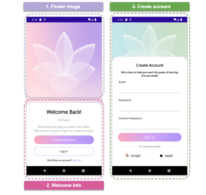
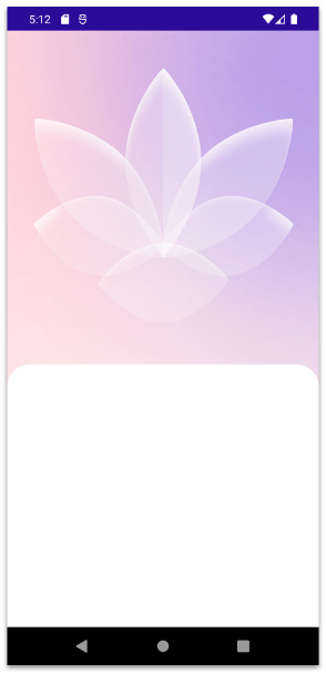
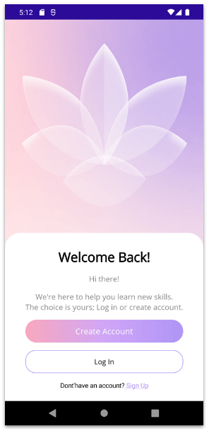
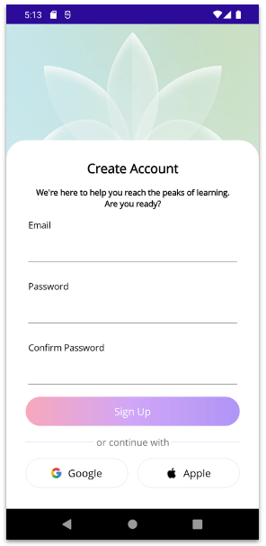
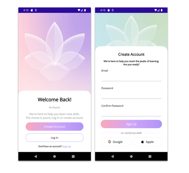
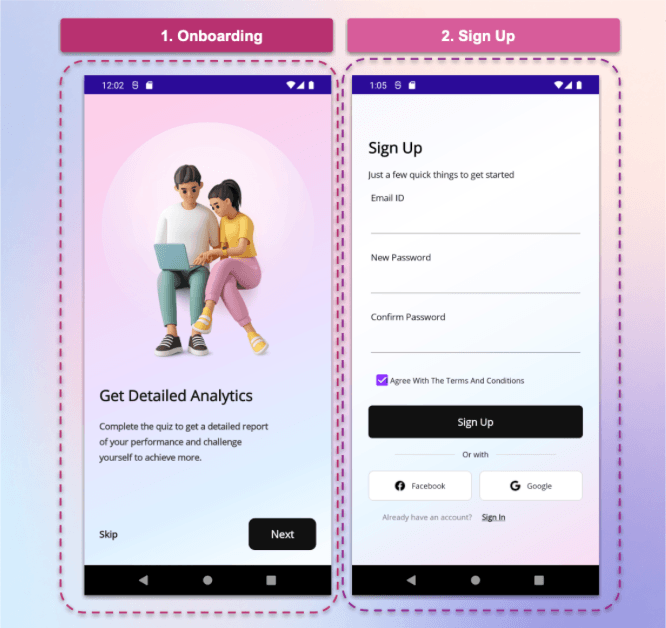
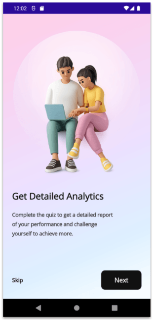
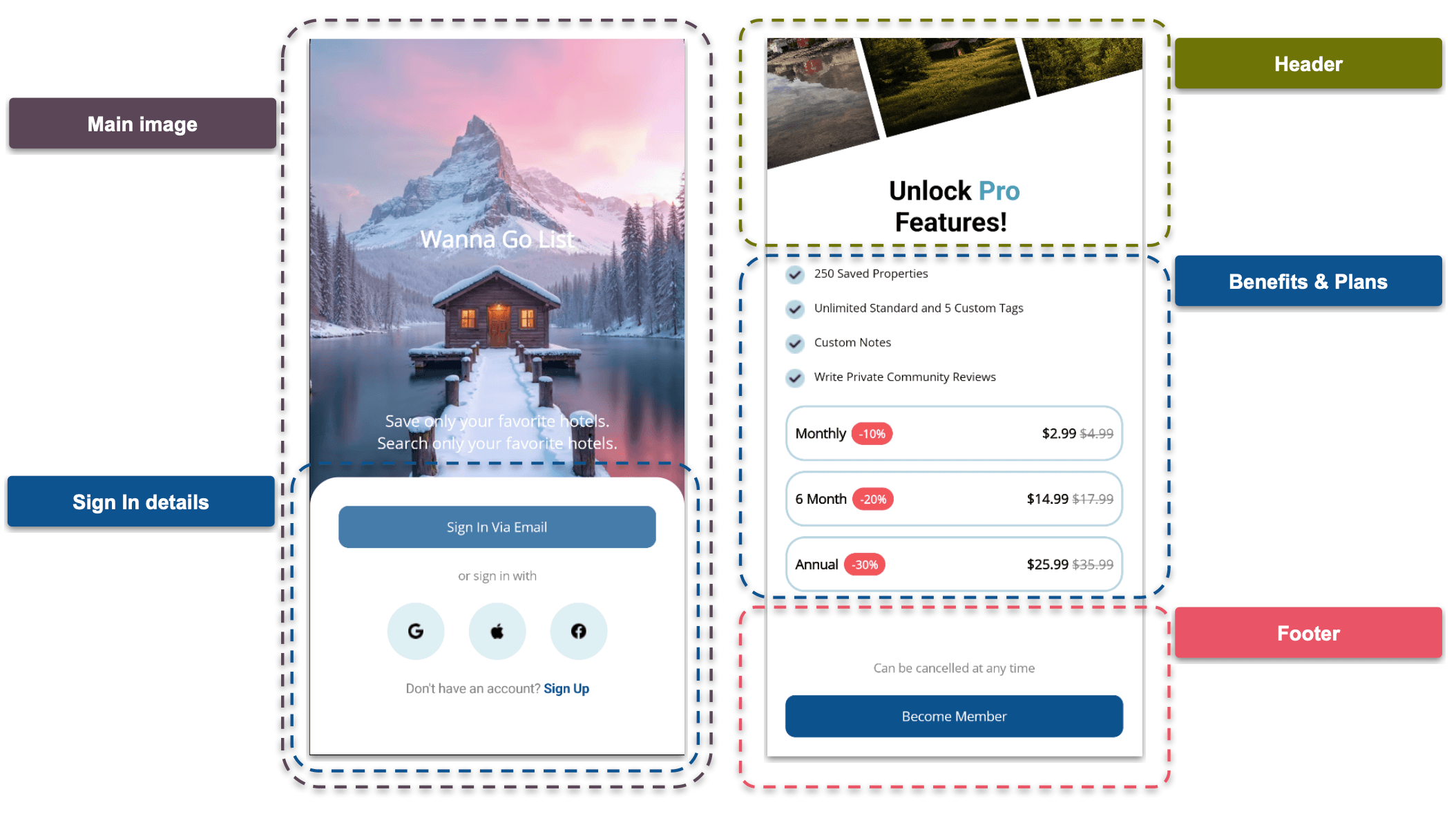
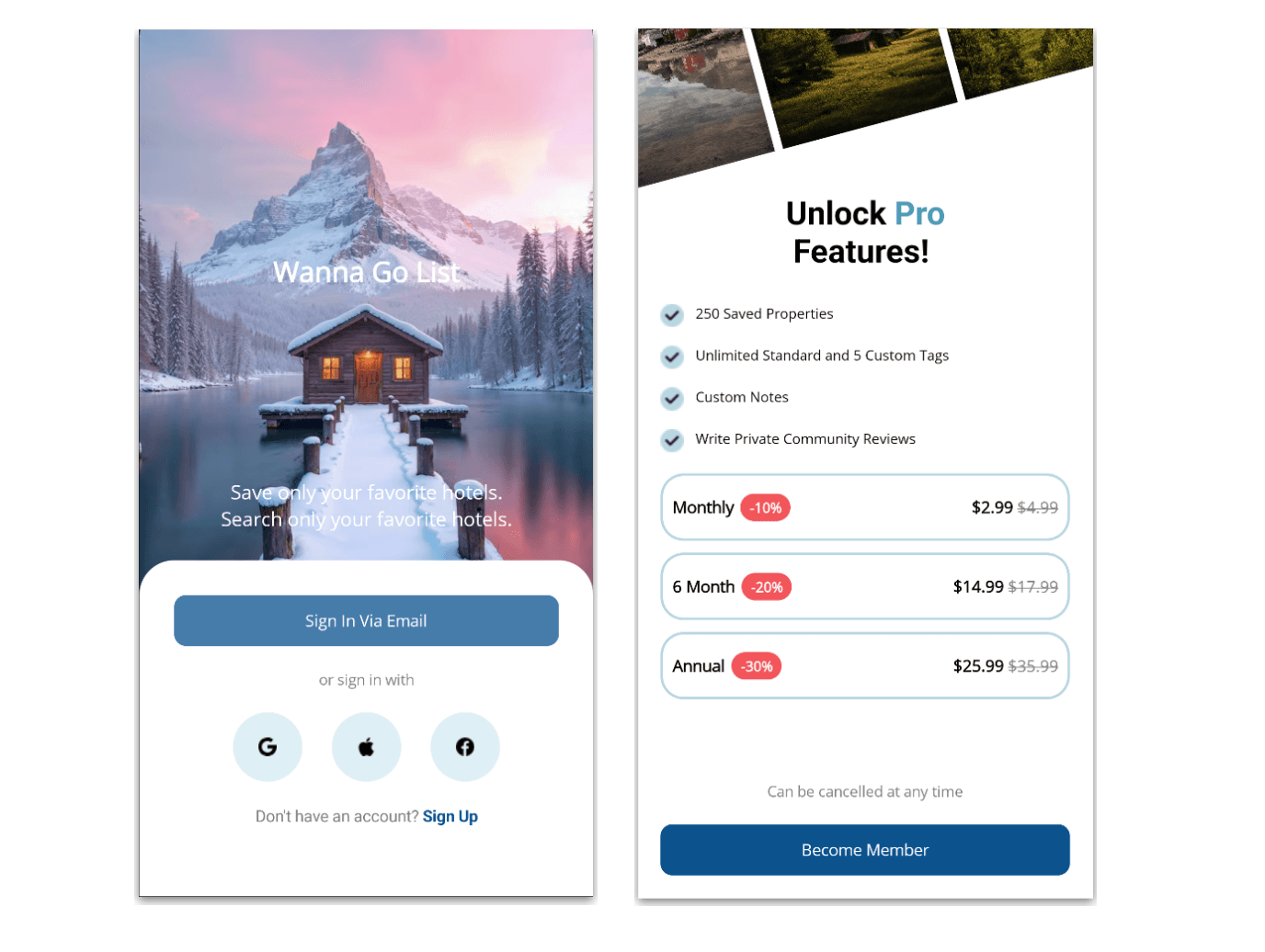
    <content type="text"><![CDATA[<p><span class="featured">See how to use LinearGradientBrush and RadialGradientBrush, structure grid layouts and create a dynamic form using the Telerik DataForm in .NET MAUI.</span></p><p>Have you ever seen apps with super fresh screens with gradients that make you think: &ldquo;OMG, where do I get that image to use as a background in my apps?&rdquo; </p><p>Well, today you won&rsquo;t just see a UI like that &hellip; you&rsquo;ll learn how to create it from scratch. This UI is inspired by a design from <a target="_blank" href="https://dribbble.com/shots/22753453-Sign-In-Sign-Up-Form-Mobile-App">Dribbble</a>, and we&rsquo;ll recreate it step by step.</p><p>Here&rsquo;s where it gets interesting: we&rsquo;ll build that super modern gradient using <code>LinearGradientBrush</code> in .NET MAUI, without relying on external images, achieving that clean look directly from code.</p><p>From there, we&rsquo;ll put together the entire experience: an onboarding screen with a clean and modern design, along with a registration form using the Progress Telerik UI for <a target="_blank" href="https://www.telerik.com/maui-ui/dataform">.NET MAUI DataForm</a>.</p><p>The best part is that you&rsquo;ll understand every step of the process, from the background gradient to the structure of the form and how to use the components, so you can easily adapt it to your own projects.</p><p>So let&rsquo;s get started, and you&rsquo;ll see how simple and fast it&rsquo;s to build a UI like this. </p><h2 id="how-will-the-explanation-work">How Will the Explanation Work?</h2><p>So you can understand everything 100%, I&rsquo;ll explain how the process will work:</p><p>➖ <strong>Visual diagram:</strong> Before we start, you&rsquo;ll see a diagram with a screenshot of the design we want to achieve. This design will be divided into screens, each identified with a name and a color. Each one will be explained individually.</p><p>➖ <strong>Code explanation per block:</strong> In addition to the written explanation, each screen includes a set of blocks with the exact code snippets you need to implement and achieve the final result.</p><p>➖ <strong>Step-by-step visual progress:</strong> Each explanation will have its corresponding screenshot, so you can see the progress as we build the UI.</p><p>⚠️ For this design, we took inspiration from an original Dribbble UI, but made some adaptations and adjustments to align it with the goals of this article.</p><h2 id="-environment-setup"> Environment Setup</h2><p>You&rsquo;ll learn how to take advantage of some of the powerful Telerik UI for .NET MAUI components in this post. If you don&rsquo;t have the .NET MAUI library installed yet, visit the <a target="_blank" href="https://www.telerik.com/maui-ui/documentation/get-started/quickstart">quick start page</a>, which explains step-by-step how to install Telerik UI for .NET MAUI, download the license key, configure the Telerik package source and install the Telerik MCP server (if needed).</p><h2 id="breaking-down-the-design">Breaking Down the Design</h2><p>To make this easier to follow, I&rsquo;ve divided the design into clear blocks. We&rsquo;ll build each part one at a time, in the order you see below.</p><p><img sf-image-responsive="true" src="https://www.telerik.com/sfimages/default-source/blogs/2026/2026-08/01_visual_structure.png?sfvrsn=9e86635b_2" title="01_visual_structure" alt="Visual structure of 1. Onboarding and 2. Signup" sf-size="362110" /></p><h2 id="onboarding">1. Onboarding</h2><p>Oh yeahh! We&rsquo;ve reached the first screen!  This is an onboarding screen, and I really like it because it&rsquo;s perfect for practicing XAML while building a modern UI.</p><p>One of the highlights here is the gradient background. When we see something like this, it&rsquo;s easy to think we need an image to achieve it, but that&rsquo;s not the case. We&rsquo;ll build it from scratch using <code>LinearGradientBrush</code> from .NET MAUI, giving you full control to customize and experiment with gradients directly from code, without relying on external assets.</p><p>On top of that, this screen helps us structure a real layout by combining key UI elements: a centered image, a title with a description, and simple actions like a button and a &ldquo;Skip&rdquo; option.</p><h3 id="adding-the-gradient">Adding the Gradient</h3><p>To get started with the code, the first thing we&rsquo;ll create is the gradient that will be used as the background for the entire page. We&rsquo;ll assign it directly as the background of the <code>ContentPage</code>.</p><p>Using <code>LinearGradientBrush</code>, add the following code block right before defining the main layout. Keep in mind that you can tweak each variation of the gradient using <code>GradientStop</code>.</p><pre class=" language-xml"><code class="prism  language-xml">&lt;?xml version="1.0" encoding="utf-8" ?&gt; 
&lt;ContentPage xmlns="http://schemas.microsoft.com/dotnet/2021/maui" xmlns:x="http://schemas.microsoft.com/winfx/2009/xaml" 
x:Class="TicketSampleApp.Pages.FormsUI.FormIntroPage" 
Title="FormIntroPage"&gt; 
&lt;ContentPage.Background&gt; 
    &lt;LinearGradientBrush StartPoint="0,0" EndPoint="0.8,1"&gt; 
    &lt;GradientStop Color="#FFCFE8" Offset="0.00" /&gt; 
    &lt;GradientStop Color="#F7D5F3" Offset="0.28" /&gt; 
    &lt;GradientStop Color="#ECE1FF" Offset="0.55" /&gt; 
    &lt;GradientStop Color="#DDF0FF" Offset="0.82" /&gt; 
    &lt;GradientStop Color="#F7FCFF" Offset="1.00" /&gt; 
    &lt;/LinearGradientBrush&gt; 
    &lt;/ContentPage.Background&gt;
 
&lt;!-- Add your Grid here --&gt;
 
&lt;/ContentPage&gt;
</code></pre><p>✍️ If you want to learn more about <a target="_blank" href="https://learn.microsoft.com/en-us/dotnet/maui/user-interface/brushes/lineargradient?view=net-maui-10.0">LinearGradientBrush, I recommend checking out the MS Learn article</a>.</p><h3 id="main-layout">Main Layout</h3><p>Now let&rsquo;s continue with one of the most important components in a .xaml file: the main layout. For this screen, we&rsquo;ll add a <strong>Grid</strong> with two columns and five rows:</p><pre class=" language-xml"><code class="prism  language-xml">&lt;Grid 
    Padding="24" 
    RowDefinitions="420,Auto,Auto,*,Auto" 
    ColumnDefinitions="*,Auto"&gt; 
    &lt;!-- Add the remaining code here --&gt;  
&lt;/Grid&gt;
</code></pre><p>Keep in mind that this <strong>Grid</strong> will contain all the elements of your page, so it should be placed inside the <strong>ContentPage</strong>, exactly where the previous code block says: &ldquo;Add your Grid here.&rdquo;</p><h3 id="the-halo">The Halo</h3><p>As you may notice, the main image has a kind of &ldquo;halo&rdquo; behind it, almost like a soft circle. In this case, we enhanced that effect using a <strong>RadialGradientBrush</strong>. </p><p>This code block should be placed right at the beginning of the <strong>Grid</strong>, before adding the image and the rest of the elements.</p><pre class=" language-xml"><code class="prism  language-xml">&lt;!-- Halo --&gt; 
&lt;Ellipse 
    Grid.Row="0" 
    Grid.ColumnSpan="2" 
    WidthRequest="340" 
    HeightRequest="340" 
    HorizontalOptions="Center" 
    VerticalOptions="Center" 
    Opacity="0.65" 
    Margin="0,-40,0,0"&gt; 
    &lt;Ellipse.Fill&gt; 
    &lt;RadialGradientBrush Center="0.5,0.32" Radius="0.75"&gt; 
    &lt;GradientStop Color="#FFFFFF" Offset="0.0" /&gt; 
    &lt;GradientStop Color="#FFFFFF" Offset="0.2" /&gt; 
    &lt;GradientStop Color="#FFF6FB" Offset="0.4" /&gt; 
    &lt;GradientStop Color="#F3E3F8" Offset="0.65" /&gt; 
    &lt;GradientStop Color="Transparent" Offset="1.0" /&gt; 
    &lt;/RadialGradientBrush&gt; 
    &lt;/Ellipse.Fill&gt; 
&lt;/Ellipse&gt;
</code></pre><p>✍️ If you want to learn more about <a target="_blank" href="https://learn.microsoft.com/en-us/dotnet/maui/user-interface/brushes/radialgradient?view=net-maui-10.0">RadialGradientBrush, check out the MS Learn article</a>.</p><h3 id="main-images-labels-and-button">Main Images, Labels and Button</h3><p>Now we&rsquo;ll continue by adding the remaining elements of the screen: the main image, labels and the button.</p><pre class=" language-xml"><code class="prism  language-xml">&lt;!-- Image --&gt; 
&lt;Image 
    Grid.Row="0" 
    Grid.ColumnSpan="2" 
    Source="onboarding_cartoon" 
    HeightRequest="450" 
    Aspect="AspectFit" 
    HorizontalOptions="Center" 
    VerticalOptions="Center" /&gt;
 
&lt;!-- Title --&gt; 
&lt;Label 
    Grid.Row="1" 
    Grid.ColumnSpan="2" 
    Text="Get Detailed Analytics" 
    FontSize="24" 
    FontAttributes="Bold" 
    TextColor="#111111" 
    Margin="0,20,0,0" /&gt;
 
&lt;!-- Description --&gt; 
&lt;Label 
    Grid.Row="2" 
    Grid.ColumnSpan="2" 
    Text="Complete the quiz to get a detailed report&amp;#10;of your performance and challenge&amp;#10;yourself to achieve more." 
    FontSize="14" 
    FontAttributes="Bold" 
    TextColor="#333333" 
    LineHeight="1.3" 
    Margin="0,24,0,0" /&gt;
     
&lt;!-- Skip --&gt; 
&lt;Label 
    Grid.Row="4" 
    Grid.Column="0"  
    Text="Skip" 
    FontAttributes="Bold" 
    FontSize="15" 
    VerticalOptions="Center" 
    HorizontalOptions="Start" /&gt; 

&lt;!-- Button --&gt; 
&lt;Button 
    Grid.Row="4" 
    Grid.Column="1" 
    Text="Next" 
    FontSize="17" 
    FontAttributes="Bold" 
    TextColor="White" 
    BackgroundColor="#111111" 
    CornerRadius="10" 
    Padding="35,14" 
    HorizontalOptions="End" /&gt;
</code></pre><p>Once the layout and components are in place, the result should look like this:</p><p><img src="https://www.telerik.com/sfimages/default-source/blogs/2026/2026-08/02_onboarding_page.png?sfvrsn=cbc8612c_2" alt="1. Onboarding Page" /></p><h2 id="sign-up">2. Sign Up</h2><p>For our second screen, we&rsquo;ll also add a gradient. As you can see, it&rsquo;s not exactly the same as the one on the previous screen, so we&rsquo;ll create a new one with different color variations, applying it in the same way we did before, directly in the <strong>ContentPage.</strong></p><pre class=" language-xml"><code class="prism  language-xml">&lt;ContentPage xmlns="http://schemas.microsoft.com/dotnet/2021/maui"
xmlns:x="http://schemas.microsoft.com/winfx/2009/xaml"
x:Class="TicketSampleApp.Pages.FormsUI.SignUpPage"
xmlns:telerik="clr-namespace:Telerik.Maui.Controls;assembly=Telerik.Maui.Controls"
Title="SignUpPage"&gt; 
    &lt;ContentPage.Background&gt; 
    &lt;LinearGradientBrush StartPoint="0,0" EndPoint="1,1"&gt; 
    &lt;GradientStop Color="#F8F7FF" Offset="0.00" /&gt; 
    &lt;GradientStop Color="#FFFFFF" Offset="0.28" /&gt; 
    &lt;GradientStop Color="#F9FBFF" Offset="0.50" /&gt; 
    &lt;GradientStop Color="#EAF7FF" Offset="0.72" /&gt; 
    &lt;GradientStop Color="#F8DDF2" Offset="1.00" /&gt; 
    &lt;/LinearGradientBrush&gt; 
    &lt;/ContentPage.Background&gt; 

&lt;!-- Add your Grid here --&gt;  

&lt;/ContentPage&gt;
</code></pre><h3 id="main-layout-of-sign-up">Main Layout of Sign Up</h3><p>Just like in the previous page, we&rsquo;ll use a Grid. In this case, it will have eight rows and two columns. Inside this <strong>Grid</strong>, we&rsquo;ll add all the remaining elements.</p><pre class=" language-xml"><code class="prism  language-xml">&lt;Grid 
    Padding="26" RowDefinitions="Auto,Auto,Auto,Auto,Auto,Auto,Auto,Auto" 
    ColumnDefinitions="*,*" 
    ColumnSpacing="12" 
    VerticalOptions="Center" 
    RowSpacing="18"&gt; 

    &lt;!-- Add the remaining code here --&gt; 

&lt;/Grid&gt;
</code></pre><h3 id="title--description">Title &amp; Description</h3><pre class=" language-xml"><code class="prism  language-xml">&lt;Label 
Grid.Row="0" 
Grid.ColumnSpan="2" 
Text="Sign Up" 
FontSize="24" 
FontAttributes="Bold" /&gt;
 
&lt;Label 
Grid.Row="1" 
Grid.ColumnSpan="2" 
Text="Just a few quick things to get started" 
FontSize="14" /&gt;
</code></pre><h2 id="lets-add-the-form">Let&rsquo;s Add the Form!</h2><p>One of my favorite moments has arrived  (because yes, I absolutely love this component). For our form, we&rsquo;ll use the <strong>Telerik UI for .NET MAUI DataForm</strong>!</p><p>To use it, don&rsquo;t forget to follow the instructions in the <strong>&ldquo; Environment Setup&rdquo;</strong> section explained earlier. Additionally, you&rsquo;ll just need to add the following namespace to your XAML:</p><pre class=" language-xml"><code class="prism  language-xml">xmlns:telerik="clr-namespace:Telerik.Maui.Controls;assembly=Telerik.Maui.Controls"
</code></pre><h3 id="creating-the-model">Creating the Model</h3><p>To display the fields in our form, we&rsquo;ll create a model where we define everything we need, such as the email and password. This is also where we specify whether each field is required, its display name and the data type.</p><p>The data type is especially important, for example, for password fields. It masks the input, showing <code>***</code> as you type.</p><p>Additionally, the Telerik DataForm uses these attributes to automatically generate and validate the UI, which means we don&rsquo;t need to manually create each input field or handle basic validation logic.</p><p>Our model should look like this:</p><pre class=" language-csharp"><code class="prism  language-csharp">public class SignUp : NotifyPropertyChangedBase
{ 
    private string email; 
    private string password; 
    private string confirmPassword;
     
    [Required] 
    [Display(Name = "Email ID")] 
    public string Email 
    { 
    get =&gt; email; 
    set =&gt; UpdateValue(ref email, value); 
    }
     
    [Required] 
    [Display(Name = "New Password")] 
    [DataType(DataType.Password)]
     
    public string Password 
    { 
    get =&gt; password;  
    set =&gt; UpdateValue(ref password, value); 
    }
     
    [Required] 
    [Display(Name = "Confirm Password")] 
    [DataType(DataType.Password)]
     
    public string ConfirmPassword 
    { 
    get =&gt; confirmPassword; 
    set =&gt; UpdateValue(ref confirmPassword, value); 
    } 
}
</code></pre><p>Now, go to your XAML page and set the <code>BindingContext</code> from the code-behind. For this article, we&rsquo;ll keep the example simple and assign a new instance of our SignUp model directly in the page constructor:</p><pre class=" language-csharp"><code class="prism  language-csharp">public SignUpPage() 
{ 
    InitializeComponent(); 
    this.BindingContext = new Models.SignUp(); 
}
</code></pre><p>This allows the DataForm to read the model properties and generate the corresponding fields based on the attributes we defined earlier.</p><h3 id="adding-it-in-xaml">Adding It in XAML</h3><p>Finally, we can add it to our XAML. Simply include something like the following:</p><pre class=" language-xml"><code class="prism  language-xml">&lt;telerik:RadDataForm 
    Grid.Row="2" 
    Grid.ColumnSpan="2" 
    x:Name="dataForm" 
    AutomationId="dataForm" /&gt;
</code></pre><p>At this point, the DataForm will automatically generate the form fields based on the model we defined earlier.</p><h3 id="terms--conditions-and-button">Terms &amp; Conditions and Button</h3><pre class=" language-xml"><code class="prism  language-xml">&lt;CheckBox 
Grid.Row="3" 
Grid.Column="0" 
IsChecked="True" 
Color="#8A2BFF" 
HorizontalOptions="Start" 
VerticalOptions="Center" /&gt;
 
&lt;Label 
Grid.Row="3" 
Grid.ColumnSpan="2" 
Text="I Agree With The Terms And Conditions" 
FontSize="12" 
VerticalOptions="Center" 
Margin="28,0,0,0" /&gt; 

&lt;Button 
Grid.Row="4" 
Grid.ColumnSpan="2" 
Text="Sign Up" 
FontSize="16" 
FontAttributes="Bold" 
TextColor="White" 
BackgroundColor="#111111" 
CornerRadius="6"  
HeightRequest="52" /&gt;
</code></pre><h3 id="social-networks">Social Networks</h3><pre class=" language-xml"><code class="prism  language-xml">&lt;HorizontalStackLayout 
Grid.Row="5" 
Grid.ColumnSpan="2" 
Spacing="12" 
HorizontalOptions="Center" 
VerticalOptions="Center"&gt; 

    &lt;BoxView 
    HeightRequest="1" 
    WidthRequest="95" 
    Color="#D8D8D8" 
    VerticalOptions="Center" /&gt;
     
    &lt;Label 
    Text="Or with" 
    FontSize="12" 
    VerticalOptions="Center" /&gt;
     
    &lt;BoxView 
    HeightRequest="1" 
    WidthRequest="95" 
    Color="#D8D8D8" 
    VerticalOptions="Center" /&gt; 
    
&lt;/HorizontalStackLayout&gt; 

&lt;Button 
Grid.Row="6" 
Grid.Column="0" 
Text="Facebook" 
FontSize="12" 
TextColor="#111111" 
BackgroundColor="White" 
BorderColor="#DDDDDD" 
BorderWidth="1" 
CornerRadius="8" 
HeightRequest="48" 
ImageSource="facebook.png" 
ContentLayout="Left,10" /&gt; 

&lt;Button 
Grid.Row="6" 
Grid.Column="1" 
Text="Google" 
FontSize="12" 
TextColor="#111111" 
BackgroundColor="White" 
BorderColor="#DDDDDD" 
BorderWidth="1"  
CornerRadius="8" 
HeightRequest="48" 
ImageSource="google.png" 
ContentLayout="Left,10" /&gt;
 
&lt;Label 
Grid.Row="7" 
Grid.Column="0" 
Text="Already have an account?" 
FontSize="12" 
TextColor="#777777" 
HorizontalOptions="End" /&gt; 

&lt;Label 
Grid.Row="7" 
Grid.Column="1" 
Text="Sign In" 
FontSize="12" 
FontAttributes="Bold" 
TextColor="#111111" 
TextDecorations="Underline" 
HorizontalOptions="Start" 
Margin="4,0,0,0" /&gt;
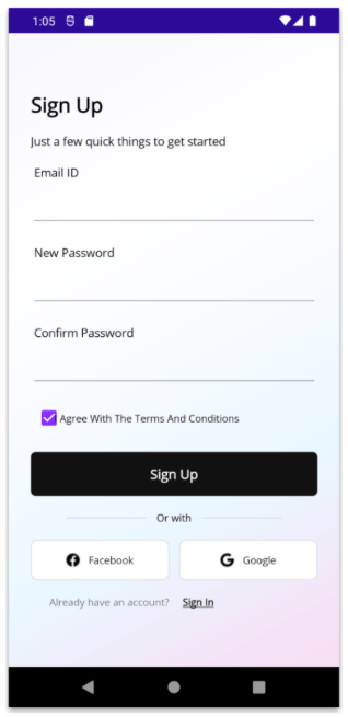
</code></pre><p>Once the layout and components are in place, the result should look like this:</p><p><img sf-image-responsive="true" src="https://www.telerik.com/sfimages/default-source/blogs/2026/2026-08/03_-signup_screen.png?sfvrsn=9d87fe8f_2" title="03_ signup_screen" alt="2. SignUp Page" /></p><h2 id="conclusion">Conclusion</h2><p>I hope this article helps you understand how to recreate a modern UI from scratch using .NET MAUI.  From building custom gradients with <strong>LinearGradientBrush</strong> and <strong>RadialGradientBrush</strong>, to structuring layouts with Grid, and creating a dynamic form using the <strong>Telerik DataForm,</strong> you now have a solid foundation to build clean and modern interfaces.</p><p>The best part is that these are concepts you can easily reuse and adapt to your own projects to create more polished and visually appealing apps. </p><p>If you have any questions or would like me to dive deeper into a specific part, feel free to leave a comment. I&rsquo;ll be happy to help!</p><p>See you in the next article! &zwj;♀️</p><hr /><blockquote><p>Remember, you can try Telerik UI for .NET MAUI free for 30 days.</p><br /><p><a target="_blank" href="https://www.telerik.com/try/ui-for-maui" class="Btn">Try Now</a></p></blockquote><img src="https://feeds.telerik.com/link/23059/17411672.gif" height="1" width="1"/>]]></content>
  </entry>
  <entry>
    <id>urn:uuid:159397c1-5f5f-46d3-bd06-07c7be55ec21</id>
    <title type="text">4 Rating Card UI Ideas in .NET MAUI</title>
    <summary type="text">Enable users to provide feedback rating with these four variations of rating cards for your .NET MAUI app.</summary>
    <published>2026-08-03T15:33:09Z</published>
    <updated>2026-08-26T17:11:16Z</updated>
    <author>
      <name>Leomaris Reyes </name>
    </author>
    <link rel="alternate" href="https://feeds.telerik.com/link/23059/17403337/4-rating-card-ui-ideas-net-maui"/>
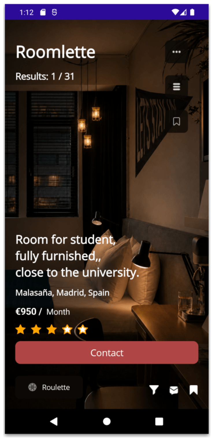
    <content type="text"><![CDATA[<p><span class="featured">Enable users to provide feedback rating with these four variations of rating cards for your .NET MAUI app.</span></p><p>When we talk about feedback, we often think of the negative kind, like critiques or complaints. It makes sense, since they&rsquo;re the ones that stand out the most, even if just one out of 1,000 is negative. But that&rsquo;s not the full story.</p><p>There are also users who are enjoying your app, who are having a great experience &hellip; but simply don&rsquo;t say it. And many times, it&rsquo;s not because they don&rsquo;t want to, but because they don&rsquo;t have a way to do it. We&rsquo;re not giving them the space or the tools to express how they feel.</p><p>That&rsquo;s why it&rsquo;s key to add touchpoints in our apps where users can rate what they use from a specific module to the entire app through a rating and even a comment.</p><p>So, in this article, I&rsquo;m bringing you four rating UI ideas that we&rsquo;ll be building in .NET MAUI. </p><h2 id="-environment-setup"> Environment Setup</h2><p>You&rsquo;ll learn how to take advantage of some of the powerful Progress Telerik UI for .NET MAUI components in this post. If you don&rsquo;t have the .NET MAUI library installed yet, visit the <a target="_blank" href="https://www.telerik.com/maui-ui/documentation/get-started/quickstart">quick start page</a>, which explains step-by-step how to install Telerik UI for .NET MAUI, download the license key, configure the Telerik package source and install the Telerik MCP server (if needed).</p><h2 id="let’s-start">Let&rsquo;s Start!</h2><p>Basically, we&rsquo;ll be building four different UI ideas, all focused on collecting user ratings. To achieve this, we&rsquo;ll use two key Telerik components: .NET MAUI Rating and .NET MAUI ProgressBar.</p><p>We&rsquo;ll create one .xaml page for each UI. After completing the Environment Setup in your project, remember that each .xaml page must include the required namespace for the Rating control and, when needed, the ProgressBar control. (Not all screens will use the ProgressBar.)</p><p>Your namespace should look like this:</p><pre class=" language-csharp"><code class="prism  language-csharp">xmlns:telerik="clr-namespace:Telerik.Maui.Controls;assembly=Telerik.Maui.Controls"
</code></pre><h2 id="creating-the-example-structure">Creating the Example Structure</h2><p>Each of the four cards we&rsquo;ll build can be implemented in different ways, such as a <strong>Popup</strong> or a <strong>BottomSheet</strong>, depending on what best fits your app&rsquo;s needs.</p><p>For this example, we&rsquo;ll define a reusable Border with shadows that will act as the base container for each card.</p><pre class=" language-xml"><code class="prism  language-xml">&lt;Border 
BackgroundColor="White" 
StrokeThickness="0" 
StrokeShape="RoundRectangle 28" 
VerticalOptions="Center" 
HorizontalOptions="Center" 
WidthRequest="360" 
HeightRequest="520"&gt;
  
&lt;Border.Shadow&gt; 
    &lt;Shadow 
    Brush="#000000" 
    Opacity="0.15" 
    Radius="20" 
    Offset="0,10" /&gt; 
&lt;/Border.Shadow&gt;
 
    &lt;!-- Add the layout here --&gt;

&lt;/Border&gt;
</code></pre><h2 id="friendly-star-ui">1. Friendly Star UI</h2><p>This design is inspired by a <a target="_blank" href="https://dribbble.com/shots/23169802-Rating-Dialog-UI">Dribbble</a> concept and has a friendly, soft and playful style. This first UI is perfect for apps that want to ask for feedback in a warm and simple way, without making the rating experience feel too formal or intrusive.</p><p><img title="Friendly Star UI" src="https://www.telerik.com/sfimages/default-source/blogs/2026/2026-07/1-friendlystarui.png?sfvrsn=14a6d635_2" width="350" /></p><h3 id="starting-with-the-code">Starting with the Code</h3><p>Inside the previously defined Border, we&rsquo;ll create a grid with five rows, as shown below:</p><pre class=" language-xml"><code class="prism  language-xml">&lt;Grid RowDefinitions="140,Auto,Auto,Auto,Auto,*"&gt;
 
    &lt;!-- Add all UI elements here --&gt; 

&lt;/Grid&gt;
</code></pre><h3 id="header-with-rounded-image">Header with Rounded Image</h3><pre class=" language-xml"><code class="prism  language-xml">&lt;Image 
    Grid.Row="0" 
    Source="yellowbg.png" 
    Aspect="Fill" 
    HorizontalOptions="Fill" 
    VerticalOptions="Fill" 
    HeightRequest="160" /&gt;
 
&lt;Image 
    Grid.Row="0" 
    Source="star.png" 
    WidthRequest="140" 
    HeightRequest="140" 
    HorizontalOptions="Center" 
    VerticalOptions="End" 
    TranslationY="70" /&gt;
</code></pre><h3 id="rating-side">Rating Side</h3><p>Next, we&rsquo;ll add a simple text that says &ldquo;How Would You Rate Our App Experience?&rdquo; Additionally, we&rsquo;ll use the Telerik <strong>.NET MAUI Rating control</strong>.</p><p>I really love this control because it allows you to fully customize the colors of selected and unselected items. It&rsquo;s also not limited to stars, you can use different shapes or elements to represent the rating. I definitely encourage you to explore the .<a target="_blank" href="https://www.telerik.com/maui-ui/rating">NET MAUI Rating control</a>. You&rsquo;re going to love it!</p><pre class=" language-xml"><code class="prism  language-xml">&lt;Label 
    Grid.Row="1" 
    Text="How Would You Rate Our&amp;#10;App Experience?" 
    FontSize="20" 
    TextColor="#313A45" 
    HorizontalTextAlignment="Center" 
    Margin="30,80,30,0" /&gt;
 
&lt;telerik:RadShapeRating 
    Grid.Row="2" 
    Value="3" 
    ItemsCount="5" 
    SelectedItemStroke="#FFC44C" 
    SelectedItemFill="#FFC44C" 
    ItemFill="#D1D3DB" 
    ItemStroke ="#D1D3DB" 
    HeightRequest="28" 
    HorizontalOptions="Center" 
    Margin="0,32,0,0" /&gt;
</code></pre><p><strong>Submit button and footer text</strong></p><pre class=" language-xml"><code class="prism  language-xml">&lt;Button 
    Grid.Row="3" 
    Text="Submit" 
    HeightRequest="35" 
    CornerRadius="29" 
    FontSize="15" 
    FontAttributes="Bold" 
    TextColor="White" 
    BackgroundColor="#0A8DF2" 
    Margin="38,54,38,0" /&gt;
 
&lt;Label 
    Grid.Row="4" 
    Text="No, Thanks!" 
    FontSize="15" 
    TextColor="#A7A7A7" 
    HorizontalOptions="Center" 
    Margin="0,24,0,0" /&gt;
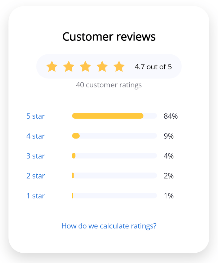
</code></pre><h2 id="rating-summary-ui">2. Rating Summary UI</h2><p>Next, we&rsquo;ll continue with another <a target="_blank" href="https://dribbble.com/shots/12005607-Ratings-Card-UI-Design">Dribbble-inspired</a> UI. This one focuses on a <strong>rating summary</strong>, which is especially useful when you want to get a quick, overall view of what&rsquo;s happening with your app&rsquo;s feedback.</p><p><img src="https://www.telerik.com/sfimages/default-source/blogs/2026/2026-07/2-ratingsummaryui.png?sfvrsn=c17c58a6_2" title="Rating Summary UI" width="350" /></p><p>In addition to the Telerik Rating control, we&rsquo;ll also incorporate the <a target="_blank" href="https://www.telerik.com/maui-ui/progressbar">Telerik ProgressBar</a>, which will help us visually represent the distribution of ratings across each level.</p><p>To show different ways of building layouts and working with components, we&rsquo;ll use a slightly different approach compared to the previous example. This time, we&rsquo;ll start with a <strong>VerticalStackLayout</strong> as our main container.</p><pre class=" language-xml"><code class="prism  language-xml">&lt;VerticalStackLayout Spacing="18" VerticalOptions="Center" Margin="32"&gt; 
    &lt;! -- Add all the elements here -- &gt;  
&lt;/VerticalStackLayout&gt;
</code></pre><h3 id="customers-reviews-and-rounded-rating-bar">Customers Reviews and Rounded Rating Bar</h3><p>Along with the text, we&rsquo;ll use a HorizontalStackLayout to organize the elements, and we&rsquo;ll also add the RadShapeRating control.</p><pre class=" language-xml"><code class="prism  language-xml">&lt;Label 
    Text="Customer reviews" 
    FontSize="20" 
    FontAttributes="Bold" 
    HorizontalTextAlignment="Center" /&gt;
 
&lt;Border 
    BackgroundColor="#F8F9FF" 
    StrokeThickness="0" 
    StrokeShape="RoundRectangle 24" 
    Padding="18,12" 
    HorizontalOptions="Center"&gt;
 
    &lt;HorizontalStackLayout Spacing="18"&gt; 
    &lt;telerik:RadShapeRating 
    Value="5" 
    ItemsCount="5" 
    HeightRequest="20" 
    SelectedItemStroke="#FFC44C" 
    SelectedItemFill="#FFC44C" 
    ItemFill="#D1D3DB" 
    ItemStroke ="#D1D3DB" /&gt;
     
    &lt;Label 
    Text="4.7 out of 5" 
    FontSize="13" 
    VerticalOptions="Center" /&gt; 
    &lt;/HorizontalStackLayout&gt; 
&lt;/Border&gt;

&lt;Label Text="40 customer ratings" 
    FontSize="13" 
    TextColor="#7A7A85" 
    HorizontalTextAlignment="Center" 
    Margin="0,-16,0,20" /&gt;
</code></pre><h3 id="adding-the-rating-breakdown-by-star">Adding the Rating Breakdown by Star</h3><p>Now, we&rsquo;ll add the remaining elements of the screen, including the <strong>ProgressBar</strong> component from Progress Telerik for each rating level.</p><p>To make it easier to understand, especially if you&rsquo;re just getting started in .NET MAUI, I&rsquo;ve kept this example very simple. However, you can make it much cleaner and more reusable by using styles or by generating these items from a list.</p><pre class=" language-xml"><code class="prism  language-xml">&lt;Grid ColumnDefinitions="70,*,50" ColumnSpacing="12"&gt; 
    &lt;Label Text="5 star" FontSize="13" TextColor="#3478D9" /&gt; 
    &lt;telerik:RadLinearProgressBar 
    Grid.Column="1" 
    Value="84" 
    HeightRequest="10" 
    ProgressFill="#FFC83D" 
    ProgressCornerRadius="15" 
    TrackCornerRadius="15" 
    TrackFill="#F5F7FF" /&gt; 
    &lt;Label Grid.Column="2" Text="84%" FontSize="13"/&gt; 
&lt;/Grid&gt;

&lt;Grid ColumnDefinitions="70,*,50" ColumnSpacing="12"&gt; 
&lt;Label Text="4 star" FontSize="13" TextColor="#3478D9" /&gt; 
    &lt;telerik:RadLinearProgressBar 
    Grid.Column="1" 
    Value="9" 
    HeightRequest="10" 
    ProgressCornerRadius="15" 
    TrackCornerRadius="15" 
    ProgressFill="#FFC83D" 
    TrackFill="#F5F7FF" /&gt; 
&lt;Label Grid.Column="2" Text="9%" FontSize="13" /&gt; 
&lt;/Grid&gt;

&lt;Grid ColumnDefinitions="70,*,50" ColumnSpacing="12"&gt; 
&lt;Label Text="3 star" FontSize="13" TextColor="#3478D9" /&gt; 
    &lt;telerik:RadLinearProgressBar 
    Grid.Column="1" 
    Value="4" 
    HeightRequest="10" 
    ProgressCornerRadius="15" 
    TrackCornerRadius="15" 
    ProgressFill="#FFC83D" 
    TrackFill="#F5F7FF" /&gt; 
    &lt;Label Grid.Column="2" Text="4%" FontSize="13" /&gt; 
&lt;/Grid&gt; 
&lt;Grid ColumnDefinitions="70,*,50" ColumnSpacing="12"&gt; 
&lt;Label Text="2 star" FontSize="13" TextColor="#3478D9" /&gt; 
    &lt;telerik:RadLinearProgressBar 
    Grid.Column="1" 
    Value="2" 
    HeightRequest="10" 
    ProgressFill="#FFC83D" 
    ProgressCornerRadius="15" 
    TrackCornerRadius="15" 
    TrackFill="#F5F7FF" /&gt; 
&lt;Label Grid.Column="2" Text="2%" FontSize="13" /&gt; 
&lt;/Grid&gt; 
&lt;Grid ColumnDefinitions="70,*,50" ColumnSpacing="12"&gt; 

&lt;Label Text="1 star" FontSize="13" TextColor="#3478D9" /&gt; 
&lt;telerik:RadLinearProgressBar 
    Grid.Column="1" 
    Value="1" 
    HeightRequest="10" 
    ProgressFill="#FFC83D" 
    ProgressCornerRadius="15" 
    TrackCornerRadius="15" 
    TrackFill="#F5F7FF" /&gt; 
    &lt;Label Grid.Column="2" Text="1%" FontSize="13" /&gt; 
&lt;/Grid&gt;  
&lt;Label 
    Text="How do we calculate ratings?" 
    FontSize="13" 
    TextColor="#3478D9" 
    HorizontalTextAlignment="Center" 
    Margin="0,18,0,0" /&gt;
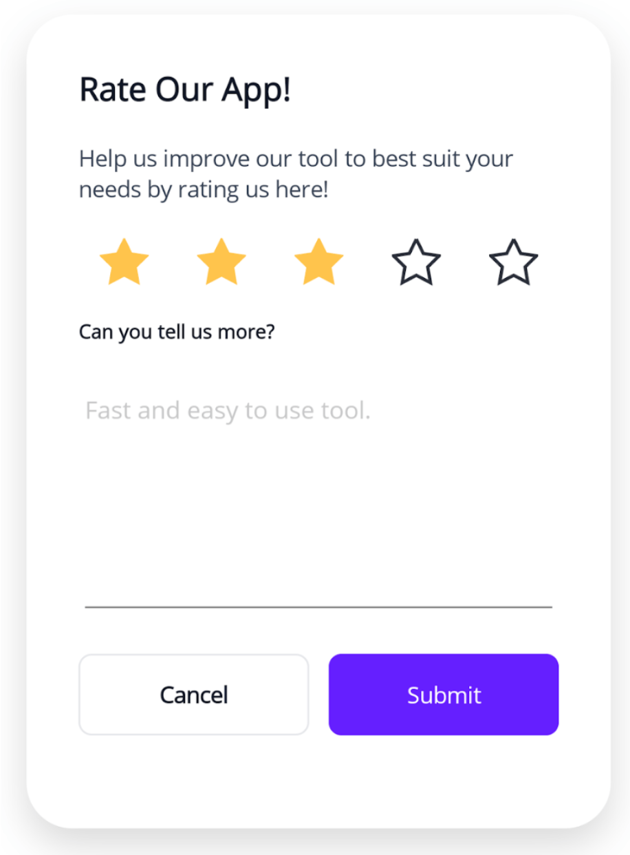
</code></pre><h2 id="detailed-feedback-ui">3. Detailed Feedback UI</h2><p>Our third screen is a rating UI that also asks users to leave a comment about their score. It was inspired by a <a target="_blank" href="https://dribbble.com/shots/25493936-Ratings-Review-UI-Modal">Dribbble design</a>, and for this example, we modified it slightly.</p><p><img src="https://www.telerik.com/sfimages/default-source/blogs/2026/2026-07/3-detailedfeedbackui.png?sfvrsn=7b728b3e_2" title="Detailed Feedback UI" width="350" /></p><p>For this card, our main layout will be a <strong>Grid</strong>:</p><pre class=" language-xml"><code class="prism  language-xml">&lt;Grid RowDefinitions="Auto,Auto,Auto,Auto,150,Auto" ColumnDefinitions="*,*" RowSpacing="20" ColumnSpacing="12" Padding="32"&gt; 
    &lt;! -- Add all the elements here -- &gt; 
&lt;/Grid&gt;
</code></pre><p>Adding the Label and <strong>Telerik Rating Control:</strong></p><pre class=" language-xml"><code class="prism  language-xml">&lt;Label
    Grid.Row="0"
    Grid.Column="0"
    Grid.ColumnSpan="2"
    Text="Rate Our App!"
    FontSize="20"
    FontAttributes="Bold" /&gt;

&lt;Label 
    Grid.Row="1" 
    Grid.ColumnSpan="2" 
    Text="Help us improve our tool to best suit your needs by rating us here!" 
    FontSize="14"/&gt;
 
&lt;telerik:RadShapeRating 
    Grid.Row="2" 
    Grid.ColumnSpan="2" 
    Value="3" 
    ItemsCount="5" 
    HeightRequest="30" 
    ItemsSpacing="30" 
    SelectedItemStroke="#FFC44C" 
    SelectedItemFill="#FFC44C" 
    ItemStroke ="#2a2f39"
    HorizontalOptions="Center" /&gt;
    
&lt;Label 
    Grid.Row="3" 
    Grid.ColumnSpan="2" 
    Text="Can you tell us more?" 
    FontSize="12" 
    FontAttributes="Bold" /&gt;
 
&lt;Editor 
    Grid.Row="4" 
    Grid.ColumnSpan="2" 
    Placeholder="Fast and easy to use tool." 
    FontSize="15"
    BackgroundColor="White" /&gt;

&lt;Button 
    Grid.Row="5" 
    Grid.Column="0" 
    Text="Cancel" 
    FontAttributes="Bold" 
    HeightRequest="50" 
    CornerRadius="8" 
    BackgroundColor="White" 
    TextColor="#111827" 
    BorderColor="#E5E7EB" 
    BorderWidth="1" /&gt; 
    
&lt;Button 
    Grid.Row="5" 
    Grid.Column="1" 
    Text="Submit" 
    HeightRequest="50" 
    CornerRadius="8" 
    BackgroundColor="#651FFF" 
    TextColor="White" /&gt;
</code></pre><h2 id="multi-criteria-rating-ui">4. Multi-Criteria Rating UI</h2><p>We&rsquo;ve reached our final UI!!  And I&rsquo;m sure you&rsquo;ve learned a lot along the way!</p><p>This final design takes things a step further by allowing users to rate multiple criteria or categories, along with leaving a comment. Just like the previous examples, it was inspired by a <a target="_blank" href="https://dribbble.com/shots/25938656-Feedback-Ratings-Card-UI">Dribbble</a> design.</p><p><img src="https://www.telerik.com/sfimages/default-source/blogs/2026/2026-07/4-multicriteriaratingui.png?sfvrsn=c3ad3f6b_2" title="Multi-Criteria Rating UI" width="350" /></p><p>For this card, our main layout will also be a <strong>Grid</strong>:</p><pre class=" language-xml"><code class="prism  language-xml">&lt;Grid RowDefinitions="Auto,Auto,Auto,Auto,Auto,Auto,Auto,Auto,Auto,Auto,Auto,80,Auto" 
    ColumnDefinitions="*,*" 
    RowSpacing="14" 
    Padding="15" 
    ColumnSpacing="14"&gt;
 
    &lt;! -- Add all the elements here -- &gt; 

&lt;/Grid&gt;
</code></pre><p>And let&rsquo;s add all the remaining elements:</p><pre class=" language-xml"><code class="prism  language-xml">&lt;Label
    Grid.Row="0"
    Grid.Column="0"
    Grid.ColumnSpan="2"
    Text="Rate Our App!"
    FontSize="22"
    FontAttributes="Bold" /&gt;

&lt;Label
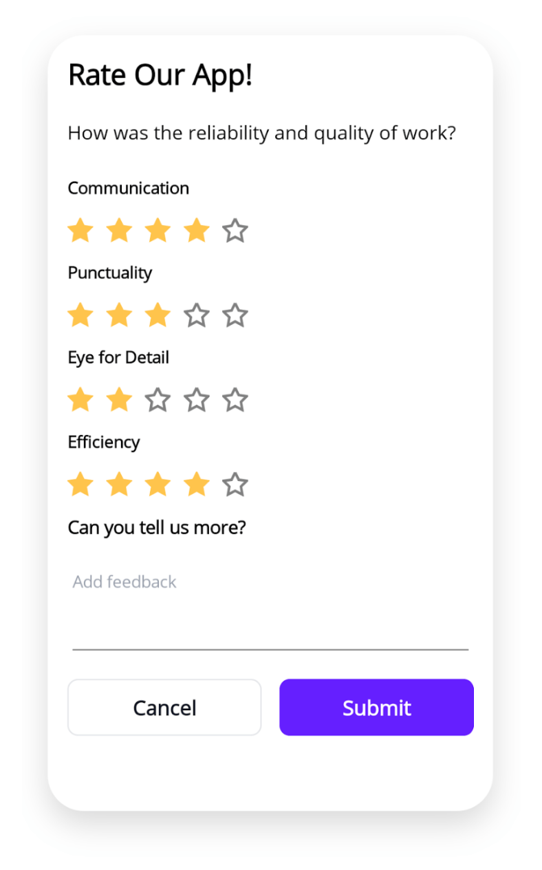
    Grid.Row="1"
    Grid.ColumnSpan="2"
    Text="How was the reliability and quality of work?"
    FontSize="15"
    Margin="0,6,0,10" /&gt;
    
&lt;Label
    Grid.Row="2"
    Grid.ColumnSpan="2"
    Text="Communication"
    FontSize="13"
    FontAttributes="Bold" /&gt;

&lt;telerik:RadShapeRating
    Grid.Row="3"
    Grid.ColumnSpan="2"
    Value="4"
    ItemsCount="5"
    HeightRequest="20"
    SelectedItemStroke="#FFC44C"
    SelectedItemFill="#FFC44C"
    HorizontalOptions="Start" /&gt;

&lt;Label
Grid.Row="4"
Grid.ColumnSpan="2"
Text="Punctuality"
FontSize="13"
FontAttributes="Bold" /&gt;

&lt;telerik:RadShapeRating
Grid.Row="5"
Grid.ColumnSpan="2" 
Value="3"
ItemsCount="5"
HeightRequest="20"
SelectedItemStroke="#FFC44C"
SelectedItemFill="#FFC44C"
HorizontalOptions="Start" /&gt;

&lt;Label
    Grid.Row="6"
    Grid.ColumnSpan="2"
    Text="Eye for Detail"
    FontSize="13"
    FontAttributes="Bold" /&gt;
    
&lt;telerik:RadShapeRating
    Grid.Row="7"
    Grid.ColumnSpan="2"
    Value="2"
    ItemsCount="5"
    HeightRequest="20"
    SelectedItemStroke="#FFC44C"
    SelectedItemFill="#FFC44C"
    HorizontalOptions="Start" /&gt;
    
&lt;Label
    Grid.Row="8"
    Grid.ColumnSpan="2"
    Text="Efficiency"
    FontSize="13"
    FontAttributes="Bold" /&gt;

&lt;telerik:RadShapeRating
    Grid.Row="9"
    Grid.ColumnSpan="2"
    Value="4"
    ItemsCount="5"
    HeightRequest="20"
    SelectedItemStroke="#FFC44C"
    SelectedItemFill="#FFC44C"
    HorizontalOptions="Start" /&gt;

&lt;Label
    Grid.Row="10"
    Grid.ColumnSpan="2"
    Text="Can you tell us more?"
    FontSize="14"
    FontAttributes="Bold" /&gt;

&lt;Editor 
Grid.Row="11"
Grid.ColumnSpan="2"
Placeholder="Add feedback"
FontSize="13"
PlaceholderColor="#9CA3AF"
BackgroundColor="White" /&gt;

&lt;Button
    Grid.Row="12"
    Grid.Column="0"
    Text="Cancel"
    HeightRequest="20"
    CornerRadius="8" 
    FontSize="16"
    FontAttributes="Bold"
    BackgroundColor="White"
    TextColor="#111827"
    BorderColor="#E5E7EB"
    BorderWidth="1" /&gt;

&lt;Button
    Grid.Row="12"
    Grid.Column="1"
    Text="Submit"
    HeightRequest="20"
    CornerRadius="8"
    FontSize="16"
    FontAttributes="Bold"
    BackgroundColor="#651FFF"
    TextColor="White" /&gt;
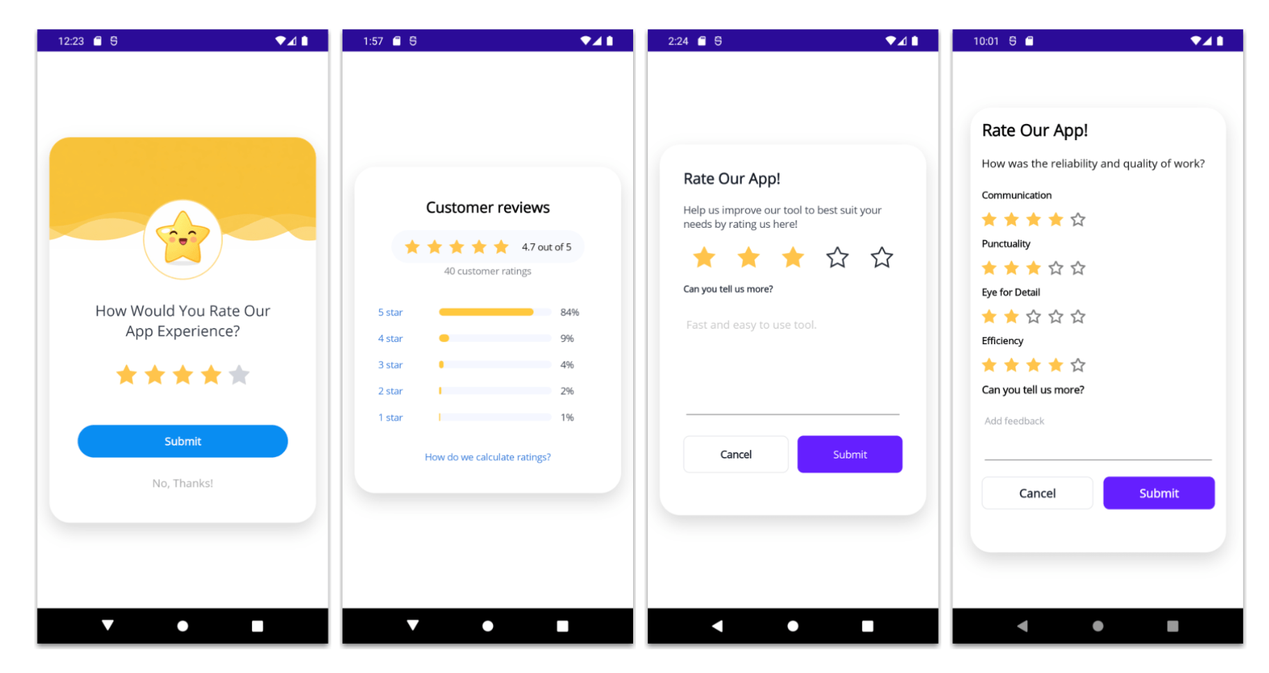
</code></pre><p>✍️ If you want to make it even more engaging, you can use a list to avoid repeating each category with its rating and even add some styling!</p><h2 id="conclusion">Conclusion</h2><p>All set!  We&rsquo;ve now built all four rating UI interfaces. Below, you can see how each one looks:</p><p><img src="https://www.telerik.com/sfimages/default-source/blogs/2026/2026-07/5-alluiexamples.png?sfvrsn=4d64b92_2" title="Multi-Criteria Rating UI" /></p><p>I hope these four rating UI ideas inspire you to create more interactive and useful feedback experiences in your .NET MAUI apps! </p><p>Remember, ratings are not only about collecting numbers. They&rsquo;re also a great way to understand how users feel and what you can keep improving.</p><p>If you have any questions or would like me to explain any part in more detail, feel free to leave a comment, I&rsquo;ll be happy to help!  See you in the next article! &zwj;♀️</p><p>Remember, Telerik UI for .NET MAUI comes with a free 30-day trial, so you can experiment with these examples yourself!</p><p><a href="https://www.telerik.com/try/ui-for-maui" target="_blank" class="Btn">Try Now</a></p><img src="https://feeds.telerik.com/link/23059/17403337.gif" height="1" width="1"/>]]></content>
  </entry>
  <entry>
    <id>urn:uuid:0b4fd80d-abe7-433e-9d53-bda4cd0e9961</id>
    <title type="text">Top Common Handlers in .NET MAUI</title>
    <summary type="text">Connect your .NET MAUI cross-platform controls with corresponding platform-specific controls using handlers. Here are some example use cases where handlers are most useful.</summary>
    <published>2026-07-27T15:52:15Z</published>
    <updated>2026-08-26T17:11:16Z</updated>
    <author>
      <name>Héctor Pérez </name>
    </author>
    <link rel="alternate" href="https://feeds.telerik.com/link/23059/17388205/top-common-handlers-net-maui"/>
    <content type="text"><![CDATA[<p><span class="featured">Connect your .NET MAUI cross-platform controls with corresponding platform-specific controls using handlers. Here are some example use cases where handlers are most useful.</span></p><p>Handlers in .NET MAUI are the way to connect cross-platform controls with their native views on each platform. They offer a clean, decoupled and high-performance design. In this article we will analyze some scenarios where they are especially useful to solve certain problems. Let&rsquo;s go!</p><h2 id="understanding-handlers-in-.net-maui">Understanding Handlers in .NET MAUI</h2><p>A handler in .NET MAUI is a special class that maps a cross-platform control to its native control. When we create the user interface in XAML, we use these cross-platform controls to build interfaces inside content pages, which are translated to native controls. For example, a .NET MAUI <code>Entry</code> control is mapped to an Android <code>AppCompatEditText</code> control, an iOS / Mac Catalyst <code>UITextField</code> control and a <code>TextBox</code> control on Windows.</p><p>At this point, you may wonder about the usefulness of handlers in your projects. The answer is that you can use them to customize controls and solve a range of problems: changing the default appearance of controls that cannot be done from XAML controls, accessing the properties of each native control, allowing you to change behavior to perform validations, etc.</p><p>Handlers can be used to:</p><ul><li>Remove or modify elements of a control (like an underline, border, etc.)</li><li>Add functionality to a control (such as search capabilities)</li><li>Create custom controls</li></ul><p>Knowing about handlers is going a step further in your technical skills in .NET MAUI, so I highly recommend learning about them in depth.</p><h3 id="ways-to-customize-handlers-in-.net-maui">Ways to Customize Handlers in .NET MAUI</h3><p>In .NET MAUI, there are several ways to customize a handler, including:</p><ul><li><code>Mapper.AppendToMapping()</code>: To perform customizations after the default mapping</li><li><code>CommandMapper.AppendToMapping()</code>: To intercept actions</li><li><code>HandlerChanged</code>: For a specific instance</li></ul><p>In the above list you may have noticed the term <strong>Mapping</strong>, which refers to a dictionary of configurations that define how a control is rendered.</p><p>The way we connect to the handler will define which instances in the application we will affect through the handler. Let&rsquo;s do some practical exercises to better understand them, solving common but simple problems in customizing native controls.</p><p>For these demonstrations, I created a new project using the <strong>.NET MAUI App</strong> template without sample content. Next, I created a folder called <code>Handlers</code> and inside a static class called <code>HandlerCustomizations</code>:</p><pre class=" language-csharp"><code class="prism  language-csharp"><span class="token keyword">public</span> <span class="token keyword">static</span> <span class="token keyword">class</span> <span class="token class-name">HandlerCustomizations</span>
<span class="token punctuation">{</span>
    <span class="token keyword">public</span> <span class="token keyword">static</span> <span class="token keyword">void</span> <span class="token function">RegisterHandlers</span><span class="token punctuation">(</span><span class="token punctuation">)</span>
    <span class="token punctuation">{</span>
        
    <span class="token punctuation">}</span>
<span class="token punctuation">}</span>
</code></pre><p>Finally, you need to register the new class in <code>Program.cs</code> as follows:</p><pre class=" language-csharp"><code class="prism  language-csharp"><span class="token keyword">public</span> <span class="token keyword">static</span> <span class="token keyword">class</span> <span class="token class-name">MauiProgram</span>
<span class="token punctuation">{</span>
    <span class="token keyword">public</span> <span class="token keyword">static</span> MauiApp <span class="token function">CreateMauiApp</span><span class="token punctuation">(</span><span class="token punctuation">)</span>
    <span class="token punctuation">{</span>
        <span class="token keyword">var</span> builder <span class="token operator">=</span> MauiApp<span class="token punctuation">.</span><span class="token function">CreateBuilder</span><span class="token punctuation">(</span><span class="token punctuation">)</span><span class="token punctuation">;</span>
        builder
            <span class="token punctuation">.</span><span class="token generic-method function">UseMauiApp<span class="token punctuation">&lt;</span>App<span class="token punctuation">&gt;</span></span><span class="token punctuation">(</span><span class="token punctuation">)</span>
            <span class="token punctuation">.</span><span class="token function">ConfigureMauiHandlers</span><span class="token punctuation">(</span>_ <span class="token operator">=</span><span class="token operator">&gt;</span>
            <span class="token punctuation">{</span>                
                HandlerCustomizations<span class="token punctuation">.</span><span class="token function">RegisterHandlers</span><span class="token punctuation">(</span><span class="token punctuation">)</span><span class="token punctuation">;</span>
            <span class="token punctuation">}</span><span class="token punctuation">)</span>
            <span class="token punctuation">.</span><span class="token punctuation">.</span><span class="token punctuation">.</span>
    <span class="token punctuation">}</span>
<span class="token punctuation">}</span>
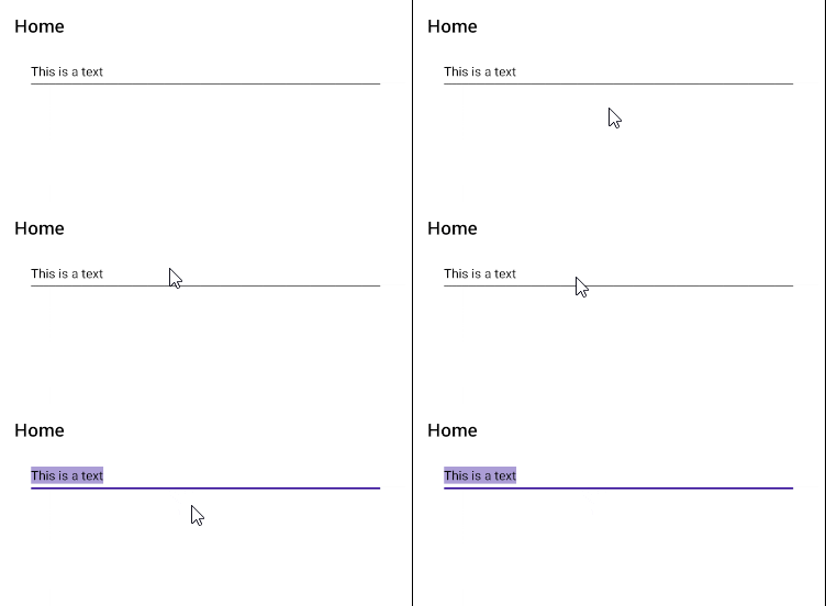
</code></pre><p>With the above ready, we are now prepared to analyze common use cases for handlers.</p><h3 id="removing-underline-or-border-from-an-entry">Removing Underline or Border from an Entry</h3><p>Let&rsquo;s start with the most used handler across the .NET MAUI ecosystem. The problem is that .NET MAUI does not currently expose a property that allows removing the default lines on each native platform. For example, on Android a line appears under the text, on iOS a gray rectangle is shown and on Windows a border.</p><p>The handler code looks like the following:</p><pre class=" language-csharp"><code class="prism  language-csharp">        Microsoft<span class="token punctuation">.</span>Maui<span class="token punctuation">.</span>Handlers<span class="token punctuation">.</span>EntryHandler<span class="token punctuation">.</span>Mapper<span class="token punctuation">.</span><span class="token function">AppendToMapping</span><span class="token punctuation">(</span><span class="token string">"BorderlessEntry"</span><span class="token punctuation">,</span> <span class="token punctuation">(</span>handler<span class="token punctuation">,</span> view<span class="token punctuation">)</span> <span class="token operator">=</span><span class="token operator">&gt;</span>
        <span class="token punctuation">{</span>
<span class="token preprocessor property">#<span class="token directive keyword">if</span> ANDROID</span>
            handler<span class="token punctuation">.</span>PlatformView<span class="token punctuation">.</span>BackgroundTintList <span class="token operator">=</span>
                Android<span class="token punctuation">.</span>Content<span class="token punctuation">.</span>Res<span class="token punctuation">.</span>ColorStateList<span class="token punctuation">.</span><span class="token function">ValueOf</span><span class="token punctuation">(</span>Android<span class="token punctuation">.</span>Graphics<span class="token punctuation">.</span>Color<span class="token punctuation">.</span>Transparent<span class="token punctuation">)</span><span class="token punctuation">;</span>
<span class="token preprocessor property">#<span class="token directive keyword">elif</span> IOS || MACCATALYST</span>
            handler<span class="token punctuation">.</span>PlatformView<span class="token punctuation">.</span>BorderStyle <span class="token operator">=</span> UIKit<span class="token punctuation">.</span>UITextBorderStyle<span class="token punctuation">.</span>None<span class="token punctuation">;</span>
<span class="token preprocessor property">#<span class="token directive keyword">elif</span> WINDOWS</span>
            handler<span class="token punctuation">.</span>PlatformView<span class="token punctuation">.</span>BorderThickness <span class="token operator">=</span> <span class="token keyword">new</span> <span class="token class-name">Microsoft<span class="token punctuation">.</span>UI<span class="token punctuation">.</span>Xaml<span class="token punctuation">.</span>Thickness</span><span class="token punctuation">(</span><span class="token number">0</span><span class="token punctuation">)</span><span class="token punctuation">;</span>
<span class="token preprocessor property">#<span class="token directive keyword">endif</span></span>
        <span class="token punctuation">}</span><span class="token punctuation">)</span><span class="token punctuation">;</span>
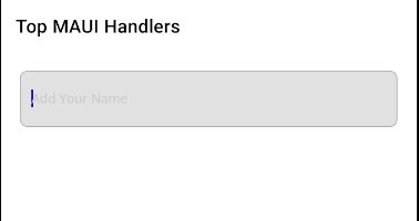
</code></pre><p>In the code above, we access the control mapper <code>Entry</code>, which is the configuration dictionary, and add an extra customization called <code>BorderlessEntry</code>. You can also notice a callback that handles two parameters: <code>handler</code>, which is the access to the native control, and <code>view</code>, which is the <code>Entry</code> of .NET MAUI.</p><p>In each conditional compilation directive, a different behavior is specified according to the platform, using <code>handler.PlatformView</code>, and the native properties of each control. In the case of Android, we change the border color to transparent using <code>BackgroundTintList</code>. On iOS, the border is completely removed using the native property <code>BorderStyle</code>. And on Windows, <code>BorderThickness</code> is used to indicate a border thickness of zero.</p><p><img src="https://www.telerik.com/sfimages/default-source/blogs/2026/2026-06/borderless-entry-control-ios-android.png?sfvrsn=fd6bc41a_2" alt="Borderless input control displayed on iOS and Android" /></p><p>In the image above you can see the Entry control used without an underline on Android, which allows combining with other controls to improve the visual appearance.</p><h3 id="modifying-properties-of-a-button">Modifying Properties of a Button</h3><p>Sometimes applications require a controlled visual style for buttons. For example, on Android the normal behavior is to add elevation and a ripple effect to all buttons. In .NET MAUI, there is no way to control these values natively directly on the control, so we can choose to use a handler again:</p><pre class=" language-csharp"><code class="prism  language-csharp">Microsoft<span class="token punctuation">.</span>Maui<span class="token punctuation">.</span>Handlers<span class="token punctuation">.</span>ButtonHandler<span class="token punctuation">.</span>Mapper<span class="token punctuation">.</span><span class="token function">AppendToMapping</span><span class="token punctuation">(</span>
    <span class="token function">nameof</span><span class="token punctuation">(</span>Microsoft<span class="token punctuation">.</span>Maui<span class="token punctuation">.</span>IButton<span class="token punctuation">.</span>Background<span class="token punctuation">)</span><span class="token punctuation">,</span> <span class="token punctuation">(</span>handler<span class="token punctuation">,</span> view<span class="token punctuation">)</span> <span class="token operator">=</span><span class="token operator">&gt;</span>
<span class="token punctuation">{</span>
<span class="token preprocessor property">#<span class="token directive keyword">if</span> ANDROID</span>
    handler<span class="token punctuation">.</span>PlatformView<span class="token punctuation">.</span>StateListAnimator <span class="token operator">=</span> <span class="token keyword">null</span><span class="token punctuation">;</span>
    handler<span class="token punctuation">.</span>PlatformView<span class="token punctuation">.</span>Elevation <span class="token operator">=</span> <span class="token number">0</span><span class="token punctuation">;</span>

    <span class="token keyword">var</span> rippleColor <span class="token operator">=</span> Android<span class="token punctuation">.</span>Graphics<span class="token punctuation">.</span>Color<span class="token punctuation">.</span><span class="token function">Argb</span><span class="token punctuation">(</span><span class="token number">80</span><span class="token punctuation">,</span> <span class="token number">255</span><span class="token punctuation">,</span> <span class="token number">0</span><span class="token punctuation">,</span> <span class="token number">0</span><span class="token punctuation">)</span><span class="token punctuation">;</span>
    <span class="token keyword">var</span> colorStateList <span class="token operator">=</span> Android<span class="token punctuation">.</span>Content<span class="token punctuation">.</span>Res<span class="token punctuation">.</span>ColorStateList<span class="token punctuation">.</span><span class="token function">ValueOf</span><span class="token punctuation">(</span>rippleColor<span class="token punctuation">)</span><span class="token punctuation">;</span>

    <span class="token keyword">if</span> <span class="token punctuation">(</span>handler<span class="token punctuation">.</span>PlatformView<span class="token punctuation">.</span>Background
                        <span class="token keyword">is</span> Android<span class="token punctuation">.</span>Graphics<span class="token punctuation">.</span>Drawables<span class="token punctuation">.</span>RippleDrawable rippleDrawable<span class="token punctuation">)</span>
        rippleDrawable<span class="token punctuation">.</span><span class="token function">SetColor</span><span class="token punctuation">(</span>colorStateList<span class="token punctuation">)</span><span class="token punctuation">;</span>
<span class="token preprocessor property">#<span class="token directive keyword">elif</span> IOS || MACCATALYST</span>
            handler<span class="token punctuation">.</span>PlatformView<span class="token punctuation">.</span>Alpha <span class="token operator">=</span> <span class="token number">1.0f</span><span class="token punctuation">;</span>
            handler<span class="token punctuation">.</span>PlatformView<span class="token punctuation">.</span>AdjustsImageWhenHighlighted <span class="token operator">=</span> <span class="token keyword">true</span><span class="token punctuation">;</span>
<span class="token preprocessor property">#<span class="token directive keyword">endif</span></span>
<span class="token punctuation">}</span><span class="token punctuation">)</span><span class="token punctuation">;</span>
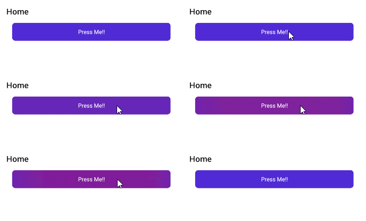
</code></pre><p>In the code above, these Android properties are modified:</p><ul><li><code>StateListAnimator</code>: Removes the elevation animation when pressed</li><li><code>rippleDrawable.SetColor</code>: Overrides the ripple effect color</li></ul><p>When running the application, we can see a customized ripple effect according to the defined ink color:</p><p><img src="https://www.telerik.com/sfimages/default-source/blogs/2026/2026-06/native-button-ripple-handler.gif?sfvrsn=62fb21a7_2" alt="Native button with customized ripple effect" /></p><p>The previous handler demonstrates how to change default control effects using native properties.</p><h3 id="select-all-text-when-receiving-focus-in-an-entry">Select All Text When Receiving Focus in an Entry</h3><p>The following handler, which proves extremely useful, allows users to select all text in a <code>Entry</code> control when focusing, to then perform actions such as deleting the text, copying it, etc.</p><pre class=" language-csharp"><code class="prism  language-csharp">Microsoft<span class="token punctuation">.</span>Maui<span class="token punctuation">.</span>Handlers<span class="token punctuation">.</span>EntryHandler<span class="token punctuation">.</span>Mapper<span class="token punctuation">.</span><span class="token function">AppendToMapping</span><span class="token punctuation">(</span>
    <span class="token string">"SelectAllOnFocus"</span><span class="token punctuation">,</span> <span class="token punctuation">(</span>handler<span class="token punctuation">,</span> view<span class="token punctuation">)</span> <span class="token operator">=</span><span class="token operator">&gt;</span>
    <span class="token punctuation">{</span>
<span class="token preprocessor property">#<span class="token directive keyword">if</span> ANDROID        </span>
        handler<span class="token punctuation">.</span>PlatformView<span class="token punctuation">.</span>FocusChange <span class="token operator">+</span><span class="token operator">=</span> <span class="token punctuation">(</span>_<span class="token punctuation">,</span> e<span class="token punctuation">)</span> <span class="token operator">=</span><span class="token operator">&gt;</span>
        <span class="token punctuation">{</span>
            <span class="token keyword">if</span> <span class="token punctuation">(</span>e<span class="token punctuation">.</span>HasFocus<span class="token punctuation">)</span>
                handler<span class="token punctuation">.</span>PlatformView<span class="token punctuation">.</span><span class="token function">Post</span><span class="token punctuation">(</span>handler<span class="token punctuation">.</span>PlatformView<span class="token punctuation">.</span>SelectAll<span class="token punctuation">)</span><span class="token punctuation">;</span>
        <span class="token punctuation">}</span><span class="token punctuation">;</span>
<span class="token preprocessor property">#<span class="token directive keyword">elif</span> IOS || MACCATALYST        </span>
        handler<span class="token punctuation">.</span>PlatformView<span class="token punctuation">.</span>EditingDidBegin <span class="token operator">+</span><span class="token operator">=</span> <span class="token punctuation">(</span>_<span class="token punctuation">,</span> _<span class="token punctuation">)</span> <span class="token operator">=</span><span class="token operator">&gt;</span>
            Microsoft<span class="token punctuation">.</span>Maui<span class="token punctuation">.</span>ApplicationModel<span class="token punctuation">.</span>MainThread<span class="token punctuation">.</span><span class="token function">BeginInvokeOnMainThread</span><span class="token punctuation">(</span>
                <span class="token punctuation">(</span><span class="token punctuation">)</span> <span class="token operator">=</span><span class="token operator">&gt;</span> handler<span class="token punctuation">.</span>PlatformView<span class="token punctuation">.</span><span class="token function">SelectAll</span><span class="token punctuation">(</span><span class="token keyword">null</span><span class="token punctuation">)</span><span class="token punctuation">)</span><span class="token punctuation">;</span>
<span class="token preprocessor property">#<span class="token directive keyword">endif</span></span>
    <span class="token punctuation">}</span><span class="token punctuation">)</span><span class="token punctuation">;</span>
</code></pre><p>The method <code>Post</code> on Android allows queuing the select-all action so the text selection is not overwritten. On the other hand on iOS the method <code>SelectAll</code> is invoked to carry out the selection, in the subscription to the <code>EditingDidBegin</code> event. This is because there is no <code>FocusChange</code> event similar to Android&rsquo;s.</p><p><img src="https://www.telerik.com/sfimages/default-source/blogs/2026/2026-06/autoselect-entry-on-focus.gif?sfvrsn=c0bf4d33_2" alt="Text inside input automatically selected when focused." /></p><h3 id="disabling-the-keyboard-of-an-entry-control">Disabling the Keyboard of an Entry Control</h3><p>The following useful .NET MAUI handler is the one that allows disabling the keyboard of an Entry control. Disabling keyboards is essential when creating applications where we will have a custom keyboard, such as a calculator app or a PIN input, and we want to show text input controls without the on-screen keyboard appearing.</p><p>To implement it, we will do it as follows:</p><pre class=" language-csharp"><code class="prism  language-csharp">Microsoft<span class="token punctuation">.</span>Maui<span class="token punctuation">.</span>Handlers<span class="token punctuation">.</span>EntryHandler<span class="token punctuation">.</span>Mapper<span class="token punctuation">.</span><span class="token function">AppendToMapping</span><span class="token punctuation">(</span>
    <span class="token string">"DisableKeyboard"</span><span class="token punctuation">,</span> <span class="token punctuation">(</span>handler<span class="token punctuation">,</span> view<span class="token punctuation">)</span> <span class="token operator">=</span><span class="token operator">&gt;</span>
    <span class="token punctuation">{</span>
        <span class="token keyword">if</span> <span class="token punctuation">(</span>view<span class="token punctuation">.</span>AutomationId <span class="token operator">!=</span> <span class="token string">"no-keyboard"</span><span class="token punctuation">)</span> <span class="token keyword">return</span><span class="token punctuation">;</span>

<span class="token preprocessor property">#<span class="token directive keyword">if</span> ANDROID        </span>
        handler<span class="token punctuation">.</span>PlatformView<span class="token punctuation">.</span>ShowSoftInputOnFocus <span class="token operator">=</span> <span class="token keyword">false</span><span class="token punctuation">;</span>
<span class="token preprocessor property">#<span class="token directive keyword">elif</span> IOS || MACCATALYST        </span>
        handler<span class="token punctuation">.</span>PlatformView<span class="token punctuation">.</span>InputView <span class="token operator">=</span> <span class="token keyword">new</span> <span class="token class-name">UIKit<span class="token punctuation">.</span>UIView</span><span class="token punctuation">(</span><span class="token punctuation">)</span><span class="token punctuation">;</span>
<span class="token preprocessor property">#<span class="token directive keyword">endif</span></span>
    <span class="token punctuation">}</span><span class="token punctuation">)</span><span class="token punctuation">;</span>
</code></pre><p>In the previous code, in the Android section the property <code>ShowSoftInputOnFocus</code> with a false value prevents the keyboard from appearing when focusing the field, while on the iOS side, <code>InputView</code> replaces the keyboard with an empty view, preventing the keyboard from appearing.</p><h3 id="datepickertimepicker-text-alignment">DatePicker/TimePicker: Text Alignment</h3><p>A common case that users want in mobile applications is to center the text in the <code>DatePicker</code> and <code>TimePicker</code> controls, which is not possible to do natively from XAML code in .NET MAUI.</p><p>To achieve this, we can once again resort to handlers. On this occasion, the code used will be the following:</p><pre class=" language-csharp"><code class="prism  language-csharp">Microsoft<span class="token punctuation">.</span>Maui<span class="token punctuation">.</span>Handlers<span class="token punctuation">.</span>DatePickerHandler<span class="token punctuation">.</span>Mapper<span class="token punctuation">.</span><span class="token function">AppendToMapping</span><span class="token punctuation">(</span>
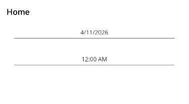
    <span class="token string">"CenterDateText"</span><span class="token punctuation">,</span> <span class="token punctuation">(</span>handler<span class="token punctuation">,</span> view<span class="token punctuation">)</span> <span class="token operator">=</span><span class="token operator">&gt;</span>
    <span class="token punctuation">{</span>
<span class="token preprocessor property">#<span class="token directive keyword">if</span> ANDROID</span>
        handler<span class="token punctuation">.</span>PlatformView<span class="token punctuation">.</span>Gravity <span class="token operator">=</span> Android<span class="token punctuation">.</span>Views<span class="token punctuation">.</span>GravityFlags<span class="token punctuation">.</span>Center<span class="token punctuation">;</span>
<span class="token preprocessor property">#<span class="token directive keyword">elif</span> IOS || MACCATALYST                    </span>
        handler<span class="token punctuation">.</span>PlatformView<span class="token punctuation">.</span>TextAlignment <span class="token operator">=</span> UIKit<span class="token punctuation">.</span>UITextAlignment<span class="token punctuation">.</span>Center<span class="token punctuation">;</span>
<span class="token preprocessor property">#<span class="token directive keyword">endif</span></span>
    <span class="token punctuation">}</span><span class="token punctuation">)</span><span class="token punctuation">;</span>

Microsoft<span class="token punctuation">.</span>Maui<span class="token punctuation">.</span>Handlers<span class="token punctuation">.</span>TimePickerHandler<span class="token punctuation">.</span>Mapper<span class="token punctuation">.</span><span class="token function">AppendToMapping</span><span class="token punctuation">(</span>
    <span class="token string">"CenterTimeText"</span><span class="token punctuation">,</span> <span class="token punctuation">(</span>handler<span class="token punctuation">,</span> view<span class="token punctuation">)</span> <span class="token operator">=</span><span class="token operator">&gt;</span>
    <span class="token punctuation">{</span>
<span class="token preprocessor property">#<span class="token directive keyword">if</span> ANDROID</span>
        handler<span class="token punctuation">.</span>PlatformView<span class="token punctuation">.</span>Gravity <span class="token operator">=</span> Android<span class="token punctuation">.</span>Views<span class="token punctuation">.</span>GravityFlags<span class="token punctuation">.</span>Center<span class="token punctuation">;</span>
<span class="token preprocessor property">#<span class="token directive keyword">elif</span> IOS || MACCATALYST</span>
        handler<span class="token punctuation">.</span>PlatformView<span class="token punctuation">.</span>TextAlignment <span class="token operator">=</span> UIKit<span class="token punctuation">.</span>UITextAlignment<span class="token punctuation">.</span>Center<span class="token punctuation">;</span>
<span class="token preprocessor property">#<span class="token directive keyword">endif</span></span>
    <span class="token punctuation">}</span><span class="token punctuation">)</span><span class="token punctuation">;</span>
</code></pre><p>In the handler, the property <code>Gravity</code> is used on Android for both <code>DatePicker</code> and <code>TimePicker</code>, which allows aligning the text to the position we need. In the case of iOS, the <code>TextAlignment</code> property is used, which allows the same result:</p><p><img src="https://www.telerik.com/sfimages/default-source/blogs/2026/2026-06/centered-text-datepicker-timepicker.png?sfvrsn=9b7a92de_2" alt="Centered text within DatePicker and TimePicker controls" /></p><p>Without a doubt, it is a small handler that can solve a common visual problem.</p><h3 id="entry-with-native-validation">Entry with Native Validation</h3><p>Let&rsquo;s move on to a more complex case related to the usefulness of handlers. Imagine a scenario where you need to apply some kind of validation to all controls in the application. To achieve this, you can combine the use of events like <code>TextChanged</code> on Android and <code>EditingChanged</code> on iOS:</p><pre class=" language-csharp"><code class="prism  language-csharp">Microsoft<span class="token punctuation">.</span>Maui<span class="token punctuation">.</span>Handlers<span class="token punctuation">.</span>EntryHandler<span class="token punctuation">.</span>Mapper<span class="token punctuation">.</span><span class="token function">AppendToMapping</span><span class="token punctuation">(</span>
    <span class="token string">"NativeEmailValidation"</span><span class="token punctuation">,</span> <span class="token punctuation">(</span>handler<span class="token punctuation">,</span> view<span class="token punctuation">)</span> <span class="token operator">=</span><span class="token operator">&gt;</span>
    <span class="token punctuation">{</span>                    
<span class="token preprocessor property">#<span class="token directive keyword">if</span> ANDROID</span>
        handler<span class="token punctuation">.</span>PlatformView<span class="token punctuation">.</span>TextChanged <span class="token operator">+</span><span class="token operator">=</span> <span class="token punctuation">(</span>_<span class="token punctuation">,</span> e<span class="token punctuation">)</span> <span class="token operator">=</span><span class="token operator">&gt;</span>
        <span class="token punctuation">{</span>
            <span class="token keyword">var</span> text <span class="token operator">=</span> e<span class="token punctuation">.</span>Text<span class="token operator">?</span><span class="token punctuation">.</span><span class="token function">ToString</span><span class="token punctuation">(</span><span class="token punctuation">)</span> <span class="token operator">?</span><span class="token operator">?</span> <span class="token keyword">string</span><span class="token punctuation">.</span>Empty<span class="token punctuation">;</span>
            <span class="token keyword">var</span> isValid <span class="token operator">=</span> System<span class="token punctuation">.</span>Text<span class="token punctuation">.</span>RegularExpressions<span class="token punctuation">.</span>Regex<span class="token punctuation">.</span><span class="token function">IsMatch</span><span class="token punctuation">(</span>
                text<span class="token punctuation">,</span> <span class="token string">@"^[^@\s]+@[^@\s]+\.[^@\s]+$"</span><span class="token punctuation">)</span><span class="token punctuation">;</span>

            handler<span class="token punctuation">.</span>PlatformView<span class="token punctuation">.</span>Error <span class="token operator">=</span>
                <span class="token punctuation">(</span>isValid <span class="token operator">||</span> text<span class="token punctuation">.</span>Length <span class="token operator">==</span> <span class="token number">0</span><span class="token punctuation">)</span> <span class="token operator">?</span> <span class="token keyword">null</span> <span class="token punctuation">:</span> <span class="token string">"Invalid Email"</span><span class="token punctuation">;</span>
        <span class="token punctuation">}</span><span class="token punctuation">;</span>
<span class="token preprocessor property">#<span class="token directive keyword">elif</span> IOS || MACCATALYST</span>
                    handler<span class="token punctuation">.</span>PlatformView<span class="token punctuation">.</span>EditingChanged <span class="token operator">+</span><span class="token operator">=</span> <span class="token punctuation">(</span>_<span class="token punctuation">,</span> _<span class="token punctuation">)</span> <span class="token operator">=</span><span class="token operator">&gt;</span>
                    <span class="token punctuation">{</span>
                        <span class="token keyword">var</span> text <span class="token operator">=</span> handler<span class="token punctuation">.</span>PlatformView<span class="token punctuation">.</span>Text <span class="token operator">?</span><span class="token operator">?</span> <span class="token keyword">string</span><span class="token punctuation">.</span>Empty<span class="token punctuation">;</span>
                        <span class="token keyword">var</span> isValid <span class="token operator">=</span> System<span class="token punctuation">.</span>Text<span class="token punctuation">.</span>RegularExpressions<span class="token punctuation">.</span>Regex<span class="token punctuation">.</span><span class="token function">IsMatch</span><span class="token punctuation">(</span>
                            text<span class="token punctuation">,</span> <span class="token string">@"^[^@\s]+@[^@\s]+\.[^@\s]+$"</span><span class="token punctuation">)</span><span class="token punctuation">;</span>

                        handler<span class="token punctuation">.</span>PlatformView<span class="token punctuation">.</span>Layer<span class="token punctuation">.</span>CornerRadius <span class="token operator">=</span> <span class="token number">4f</span><span class="token punctuation">;</span>
                        handler<span class="token punctuation">.</span>PlatformView<span class="token punctuation">.</span>Layer<span class="token punctuation">.</span>BorderColor <span class="token operator">=</span> <span class="token punctuation">(</span>isValid <span class="token operator">||</span> text<span class="token punctuation">.</span>Length <span class="token operator">==</span> <span class="token number">0</span><span class="token punctuation">)</span>
                            <span class="token operator">?</span> UIKit<span class="token punctuation">.</span>UIColor<span class="token punctuation">.</span>Clear<span class="token punctuation">.</span>CGColor
                            <span class="token punctuation">:</span> UIKit<span class="token punctuation">.</span>UIColor<span class="token punctuation">.</span>SystemRed<span class="token punctuation">.</span>CGColor<span class="token punctuation">;</span>
                        handler<span class="token punctuation">.</span>PlatformView<span class="token punctuation">.</span>Layer<span class="token punctuation">.</span>BorderWidth <span class="token operator">=</span>
                            <span class="token punctuation">(</span>isValid <span class="token operator">||</span> text<span class="token punctuation">.</span>Length <span class="token operator">==</span> <span class="token number">0</span><span class="token punctuation">)</span> <span class="token operator">?</span> <span class="token number">0f</span> <span class="token punctuation">:</span> <span class="token number">1f</span><span class="token punctuation">;</span>
                    <span class="token punctuation">}</span><span class="token punctuation">;</span>
<span class="token preprocessor property">#<span class="token directive keyword">endif</span></span>
    <span class="token punctuation">}</span><span class="token punctuation">)</span><span class="token punctuation">;</span>
</code></pre><p>Within the lambda expression that handles the text change, a regular expression validation is performed. In this example, an email address is validated to be correctly written, but any other validation can be carried out.</p><p>Finally, in the Android case, the <code>Error</code> property is used to indicate there is an error, while on iOS the control is colored in a more customized way:</p><p><img src="https://www.telerik.com/sfimages/default-source/blogs/2026/2026-06/email-validation-handler.gif?sfvrsn=7d4c7c23_2" alt="Server handler validating an email address input" /></p><p>The above approach leads us to imagine scenarios with more complexity and related to events, such as saving to a database after editing a text, preventing prohibited words from a dictionary, etc.</p><h2 id="conclusion">Conclusion</h2><p>Throughout this article, you have been able to see the usefulness of handlers in real, everyday scenarios. They are a controlled way to modify native properties of controls without having to wrestle with native classes on each platform.</p><p>As a final point, in my experience, if you need a higher degree of customization and want something that has been tested across all platforms, I recommend that instead of creating handlers you use prebuilt controls that have the capabilities you need, such as those from the Progress Telerik UI for <a target="_blank" href="https://www.telerik.com/maui-ui">.NET MAUI suite of controls</a>, which include the functionalities mentioned in the article and many more, without the need to create custom handlers. See you in the next article!</p><img src="https://feeds.telerik.com/link/23059/17388205.gif" height="1" width="1"/>]]></content>
  </entry>
  <entry>
    <id>urn:uuid:1b45ff15-d8c7-41f1-8f78-ea820cb4b515</id>
    <title type="text">Building a Healthcare UI with .NET MAUI</title>
    <summary type="text">You’ve probably seen a healthcare interface when you were scheduling a recent doctor’s appointment. Let’s see how to build one in .NET MAUI!</summary>
    <published>2026-07-20T21:05:40Z</published>
    <updated>2026-08-26T17:11:16Z</updated>
    <author>
      <name>Leomaris Reyes </name>
    </author>
    <link rel="alternate" href="https://feeds.telerik.com/link/23059/17383624/building-healthcare-ui-net-maui"/>
    <content type="text"><![CDATA[<p><p><span class="featured">You&rsquo;ve probably seen a healthcare interface when you were scheduling a recent doctor&rsquo;s appointment. Let&rsquo;s see how to build one in .NET MAUI!</span></p><p>One of the biggest challenges when creating app interfaces is when design elements step a bit outside the conventional. These kinds of designs push us to think differently and get more creative when translating them into code. </p><p>In this article, I&rsquo;m bringing you a healthcare UI inspired by <a target="_blank" href="https://dribbble.com/shots/26097286-Online-Doctor-Appointment-App">this Dribbble doctor appointment UI design</a>. I have to admit, it&rsquo;s one of my favorites!  It gives us the perfect opportunity to apply some cool tricks that make our design look impressive and truly out of the box.</p><p>We&rsquo;ll be using some Progress Telerik <a target="_blank" href="https://www.telerik.com/maui-ui">UI for .NET MAUI components</a>, along with a CollectionView, but this time, we&rsquo;ll simulate different columns to achieve the layout we want. Plus, we&rsquo;ll rely on three properties that will become our best friends in this UI: <code>Rotation</code>, <code>TranslationY</code> and <code>TranslationX</code>.</p><p>So grab your cup of coffee or hot chocolate ☕ and let&rsquo;s build this together! ✨</p><h2 id="how-will-the-explanation-work">How Will the Explanation Work?</h2><p>So you can understand where we&rsquo;re headed, I&rsquo;ll explain how the process will work:</p><p>➖ <strong>Visual diagram:</strong> Before we start, you&rsquo;ll see a diagram with a screenshot of the design we want to achieve. This design will be divided into blocks, each identified with a name and a color. Each block will be explained individually.</p><p>➖ <strong>Code explanation per block:</strong> In addition to the text explanation, each block will include the exact code snippet you need to write to achieve the result.</p><p>➖ <strong>Step-by-step visual progress:</strong> Each explanation will have its corresponding screenshot, so you can see the progress as we build the UI.</p><p>⚠️ For this design, we took inspiration from an original Dribbble UI but made some adaptations and adjustments to align it with the goals of this article.</p><h2 id="-environment-setup"> Environment Setup</h2><p>You&rsquo;ll learn how to take advantage of some of the powerful Telerik UI for .NET MAUI components in this post. If you don&rsquo;t have the .NET MAUI library installed yet, visit the <a target="_blank" href="https://www.telerik.com/maui-ui/documentation/get-started/quickstart">quick start page</a>, which explains step-by-step how to install Telerik UI for .NET MAUI, download the license key, configure the Telerik package source and install the Telerik MCP server (if needed).</p><h2 id="breaking-down-the-design-into-blocks">Breaking Down the Design into Blocks</h2><p>To make this easier to follow, I&rsquo;ve divided the design into clear blocks. We&rsquo;ll build each part one at a time, in the order you see below.</p><p><img src="https://www.telerik.com/sfimages/default-source/blogs/2026/2026-07/01_design_structure.png?sfvrsn=27fe3f27_2" title="Visual structure" alt="" /></p><p>Alright, now that we&rsquo;ve broken our UI into clear blocks, it&rsquo;s time to bring everything to life with some code!  Let&rsquo;s start building each section step by step.</p><h2 id="block-1-intro">Block 1. Intro</h2><p><img src="https://www.telerik.com/sfimages/default-source/blogs/2026/2026-07/02_intro_block.png?sfvrsn=cc68d631_2" title="1. Intro Block" width="300" alt="" /></p><p>This first block is one of my favorites, as it brings a unique touch to the UI. It plays with the way the information is presented and introduces a slightly different style for the Get Started button. Since this block represents a full page, we&rsquo;ll break this explanation down into the following steps:</p><h3 id="creating-the-main-page-with-a-background-image">Creating the Main Page with a Background Image</h3><p>Let&rsquo;s start by creating a page called <strong>DoctorIntroPage.xaml</strong>. This page will contain a Grid as the main layout. The grid will have only one row, which will allow us to play with the overlapping effect between the background image and the rest of the elements. Right there, you&rsquo;ll also see exactly where the background image is added.</p><pre class=" language-xml"><code class="prism  language-xml">&lt;Grid RowDefinitions="*"&gt; 
    &lt;!-- Main image --&gt;
    &lt;Image Grid.Row="0" Source="doctor.jpg" Aspect="AspectFill" Margin="0,40,0,0"/&gt;
    
    &lt;!-- Add the rest of the code for the first block -- &gt;
&lt;/Grid&gt;
</code></pre><h3 id="creating-the-cards-and-the-get-started-button">Creating the Cards and the Get Started Button</h3><p>To continue with these elements, we&rsquo;ll add another Grid. This one will contain three rows and two columns:</p><pre class=" language-xml"><code class="prism  language-xml">&lt;Grid Grid.Row="0" RowDefinitions="auto,*,auto,auto" ColumnDefinitions="*,*" Padding="20,40,20,30"&gt; 
    &lt;!-- Add the rotated cards here -- &gt; 
    &lt;!-- Add the Get Started button here -- &gt; 
&lt;/Grid&gt;
</code></pre><blockquote><p>⚠️ Add the previous code exactly in the comment above that says <code>&lt;!-- Add the rest of the code for the first block --&gt;</code>.</p></blockquote><h3 id="rotated-cards">Rotated Cards</h3><p>Now, to add the cards, we&rsquo;ll use one of my favorite Telerik controls: <strong>Telerik Border for .NET MAUI.</strong> Make sure you follow the steps indicated in the Environment Setup section at the beginning of the article. After that, you just need to add the corresponding namespace:</p><pre class=" language-xml"><code class="prism  language-xml">xmlns:telerik="clr-namespace:Telerik.Maui.Controls;assembly=Telerik.Maui.Controls"
</code></pre><p>To achieve the card effect, I mainly relied on the <code>Rotation</code> property. One card uses a value of 50, while the other uses -12, creating the effect of opposite rotations between them. In addition, I used the <code>TranslationX</code> and <code>TranslationY</code> properties to position the cards and make the overlapping effect more noticeable. In code, it would look like this:</p><pre class=" language-xml"><code class="prism  language-xml">&lt;telerik:RadBorder Grid.Row="1" Grid.Column="0" 
    BackgroundColor="#f4f5fe" 
    CornerRadius="20" 
    HeightRequest="190" 
    WidthRequest="190" 
    TranslationX="20" 
    Rotation="5"&gt; 
&lt;Grid RowDefinitions="auto,*,auto" ColumnDefinitions="*,auto" Padding="15"&gt; 
    &lt;telerik:RadButton Grid.Row="0" Grid.Column="1" ImageSource="cardiogram" BackgroundColor="Black" HeightRequest="60" WidthRequest="60" CornerRadius="30"/&gt; 
    &lt;Label Grid.Row="1" Grid.Column="0" Text="Strengthen" FontAttributes="Bold" FontSize="16"/&gt; 
    &lt;Label Grid.Row="2" Grid.Column="0" Text="Support your heart with care and healthy lifestyle." FontSize="11" /&gt; 
&lt;/Grid&gt; 
&lt;/telerik:RadBorder&gt; 
&lt;telerik:RadBorder Grid.Row="1" Grid.Column="1" 
    BackgroundColor="#3d7ff5" 
    CornerRadius="20" 
    HeightRequest="190" 
    WidthRequest="190" 
    TranslationY="90" 
    TranslationX="-10" 
    Opacity="0.8" 
    Rotation="-12"&gt; 
    &lt;Grid RowDefinitions="auto,*,auto" ColumnDefinitions="auto,*" Padding="15"&gt; 
    &lt;telerik:RadButton Grid.Row="0" Grid.Column="0" ImageSource="stethoscope" BackgroundColor="White" HeightRequest="60" WidthRequest="60" CornerRadius="30"/&gt; 
    &lt;Label Grid.Row="1" Grid.Column="0" Grid.ColumnSpan="2" TextColor="White" Text="Safeguard" FontAttributes="Bold" HorizontalTextAlignment="End" FontSize="16" /&gt; 
    &lt;Label Grid.Row="2" Grid.Column="0" Grid.ColumnSpan="2" TextColor="White" Text="Reduce risks with regular check-ups and early ditention." HorizontalTextAlignment="Start" FontSize="11" /&gt; 
    &lt;/Grid&gt; 
&lt;/telerik:RadBorder&gt;
</code></pre><h3 id="finally-let’s-add-the-get-started-button">Finally, Let&rsquo;s Add the Get Started Button</h3><p>To achieve this, we&rsquo;ll use a Telerik Border as a container to create a rounded black background behind the button. Inside it, we&rsquo;ll place a <a target="_blank" href="https://www.telerik.com/maui-ui/documentation/controls/button/overview">Telerik RadButton</a>.</p><p>Since we&rsquo;ve already added the namespace for RadBorder, you&rsquo;re all set, there&rsquo;s no need to add anything else to use RadButton.</p><pre class=" language-xml"><code class="prism  language-xml">&lt;telerik:RadBorder Grid.Row="2" Grid.Column="0" Grid.ColumnSpan="2" 
    BackgroundColor="Black" 
    Opacity="0.9" 
    CornerRadius="50" 
    HeightRequest="70" &gt; 
    &lt;Grid ColumnDefinitions="*,auto" Padding="15,5"&gt; 
    &lt;Label Grid.Column="0" Text="Get Started" FontSize="15" TextColor="White" VerticalTextAlignment="Center" /&gt; 
    &lt;telerik:RadButton Grid.Column="1" ImageSource="uprightarrow" BackgroundColor="#3d7ff5" HeightRequest="50" WidthRequest="50" CornerRadius="25" HorizontalOptions="End" Margin="10"/&gt; 
    &lt;/Grid&gt; 
&lt;/telerik:RadBorder&gt;
</code></pre><p>We&rsquo;ve finished this first block, and we already have our first page created!  Now, let&rsquo;s move on to the second block and keep building!</p><h2 id="block-2-header">Block 2. Header</h2><p><img src="https://www.telerik.com/sfimages/default-source/blogs/2026/2026-07/03_header_block.png?sfvrsn=e290109b_2" title="2. Header Block" width="300" alt="" /></p><p>We&rsquo;ve finished this first section, and our first page is already up and running!  Now, let&rsquo;s move on to the second section.</p><p>This time, we&rsquo;re going to create a page called <strong>DoctorDetailsPage.xaml</strong>. Set the background color of this page to #f4f5fe and let&rsquo;s define the main layout using a Grid. This Grid will have five rows and three columns, as shown below:</p><pre class=" language-xml"><code class="prism  language-xml">&lt;Grid RowDefinitions="auto,auto,auto,auto,auto,*" 
    ColumnDefinitions="*,auto,auto" 
    Padding="20,30,20,0"&gt; 
    &lt;!-- Add the header block here -- &gt; 
    &lt;!-- Add the appointment block here -- &gt; 
    &lt;!-- Add the available doctors block here -- &gt; 
&lt;/Grid&gt;
</code></pre><p>Now, within the Grid, let&rsquo;s add the name and email:</p><pre class=" language-xml"><code class="prism  language-xml">&lt;Label Grid.Row="0" Grid.Column="0" Text="Ronalds S." FontSize="24" FontAttributes="Bold" /&gt;

&lt;Label Grid.Row="1" Grid.Column="0" Text="ronalds@gmail.com" FontSize="14"/&gt;
</code></pre><p>Next, we&rsquo;ll add a <strong>Telerik RadBorder</strong> control (remember to include the corresponding namespace, just like we did on the previous page). Inside it, we&rsquo;ll place an image along with a rounded button:</p><pre class=" language-xml"><code class="prism  language-xml">&lt;telerik:RadBorder Grid.Row="0" Grid.RowSpan="2" Grid.Column="1" Grid.ColumnSpan="2" 
    Margin="0,0,0,40" 
    BackgroundColor="White" 
    CornerRadius="120" 
    VerticalOptions="Start"&gt; 
    &lt;HorizontalStackLayout&gt; 
    &lt;telerik:RadButton ImageSource="plus" BackgroundColor="#ebecfb" HeightRequest="60" WidthRequest="60" CornerRadius="30" Margin="5,2,0,1"/&gt; 
    &lt;Image Source="doctoravatar" HeightRequest="60" WidthRequest="60" Aspect="AspectFill" Margin="5,2"/&gt; 
    &lt;/HorizontalStackLayout&gt; 
&lt;/telerik:RadBorder&gt;
</code></pre><h2 id="block-3-appointment">Block 3. Appointment</h2><p><img src="https://www.telerik.com/sfimages/default-source/blogs/2026/2026-07/04_appointment_block.png?sfvrsn=596533c1_2" title="3. Appointment Block" width="300" alt="" /></p><p>The Appointment block contains different elements, which are achieved by adding a few Label controls along with a Telerik RadBorder, as shown below:</p><pre class=" language-xml"><code class="prism  language-xml">&lt;Label Grid.Row="2" Grid.Column="0" Text="Today" FontSize="14" /&gt; 
&lt;Label Grid.Row="3" Grid.Column="0" Text="Appointment" FontAttributes="Bold" FontSize="16" /&gt; 
&lt;Label Grid.Row="2" Grid.Column="2" Text="See all" HorizontalTextAlignment="End" TextColor="#3d7ff5" FontSize="14" /&gt;
 
&lt;telerik:RadBorder Grid.Row="4" Grid.Column="0" Grid.ColumnSpan="3" 
    BackgroundColor="#3d7ff5" 
    CornerRadius="120" 
    Margin="0,10,0,0" 
    HeightRequest="80" AutomationProperties.IsInAccessibleTree="True"&gt; 
    &lt;Grid ColumnDefinitions="auto,*" RowDefinitions="auto,auto,auto" VerticalOptions="Center"&gt; 
    &lt;Image Grid.Column="0" Grid.Row="0" Grid.RowSpan="3" Source="doctorjose" HeightRequest="80" WidthRequest="80" Aspect="AspectFill" Margin="5,2"/&gt; 
    &lt;Label Grid.Column="1" Grid.Row="0" Text="March 21, 10:00 AM" FontSize="10" TextColor="White" VerticalTextAlignment="End" /&gt; 
    &lt;Label Grid.Column="1" Grid.Row="1" Text="Dr. Suzanne Holroyd" FontSize="16" FontAttributes="Bold" TextColor="White"/&gt; 
    &lt;Label Grid.Column="1" Grid.Row="2" Text="Pulmonology" FontSize="10" TextColor="White" VerticalTextAlignment="Start" /&gt; 
    &lt;/Grid&gt;
&lt;/telerik:RadBorder&gt;
</code></pre><h2 id="block-4-available-doctors">Block 4. Available Doctors</h2><p><img src="https://www.telerik.com/sfimages/default-source/blogs/2026/2026-07/05_available_doctors_block.png?sfvrsn=8c87ac81_2" title="4. Available Doctors Block" width="300" alt="" /></p><p>For our final block, we&rsquo;ll also use a Telerik RadBorder to simulate a white background with rounded top corners. Inside it, we&rsquo;ll add a Grid with two rows and three columns. Within this layout, we&rsquo;ll include the title label, two rounded buttons and, finally, a CollectionView.</p><pre class=" language-xml"><code class="prism  language-xml">&lt;telerik:RadBorder Grid.Row="5" Grid.Column="0" Grid.ColumnSpan="3" 
VerticalOptions="Fill" 
BackgroundColor="White" 
CornerRadius="30,30,0,0" 
Margin="-20,20,-20,0"&gt;

&lt;Grid RowDefinitions="auto,*" ColumnDefinitions="*,auto,auto" Padding="20,30,0,0"&gt; 
    &lt;Label Grid.Row="0" Grid.Column="0" Text="Select &amp;#10;Visit Type" FontSize="15" VerticalTextAlignment="End" FontAttributes="Bold"/&gt; 
    &lt;telerik:RadButton Grid.Row="0" Grid.Column="1" ImageSource="search" BackgroundColor="#ebecfb" HeightRequest="50" WidthRequest="50" CornerRadius="25" Margin="0,0,5,0" /&gt; 
    &lt;telerik:RadButton Grid.Row="0" Grid.Column="2" ImageSource="filter" BackgroundColor="#ebecfb" HeightRequest="50" WidthRequest="50" CornerRadius="25" /&gt;
    &lt;CollectionView Grid.Row="1" Grid.Column="0" Grid.ColumnSpan="3" 
    ItemsSource="{Binding specialists}"&gt; 
    &lt;CollectionView.ItemsLayout&gt; 
    &lt;GridItemsLayout Orientation="Horizontal" HorizontalItemSpacing="15" Span="2"/&gt; 
    &lt;/CollectionView.ItemsLayout&gt; 
    &lt;CollectionView.ItemTemplate&gt; 
    &lt;DataTemplate&gt; 
    &lt;telerik:RadBorder BackgroundColor="{Binding bgColor}" 
    CornerRadius="20" 
    HeightRequest="150" 
    WidthRequest="150"&gt; 
    &lt;Grid RowDefinitions="auto,auto,*,*" ColumnDefinitions="*,auto" Padding="15"&gt; 
    &lt;telerik:RadButton Grid.Row="0" Grid.Column="1" Grid.RowSpan="2" ImageSource="rightupblack" BackgroundColor="{Binding btnColor}" HeightRequest="50" WidthRequest="50" CornerRadius="25"/&gt; 
    &lt;Label Grid.Row="0" Grid.Column="0" Text="{Binding Price}" FontAttributes="Bold" FontSize="16" TextColor="{Binding txColor}"/&gt; 
    &lt;Label Grid.Row="1" Grid.Column="0" Text="Per visit" FontAttributes="Bold" FontSize="10" TextColor="{Binding txColor}"/&gt; 
    &lt;Label Grid.Row="2" Grid.Column="0" Grid.ColumnSpan="2" Text="{Binding category}" TextColor="{Binding txColor}" FontAttributes="Bold" FontSize="12" VerticalTextAlignment="End"/&gt; 
    &lt;Label Grid.Row="3" Grid.Column="0" Grid.ColumnSpan="2" Text="{Binding description}" TextColor="{Binding txColor}" FontAttributes="Bold" FontSize="10"/&gt; 
    &lt;/Grid&gt; 
    &lt;/telerik:RadBorder&gt; 
    &lt;/DataTemplate&gt; 
    &lt;/CollectionView.ItemTemplate&gt; 
    &lt;/CollectionView&gt; 
&lt;/Grid&gt; 
&lt;/telerik:RadBorder&gt;
</code></pre><p>✍️ Yes! You might notice something different in the <strong>CollectionView</strong>.  Instead of a traditional list, the items are displayed in multiple columns. This is achieved by using a <strong>GridItemsLayout</strong> and setting the <code>Span</code> property, which allows us to organize the results into columns.</p><p>And that&rsquo;s it&mdash;we&rsquo;re all done!  Below, you can see the final result of both screens.</p><p><img src="https://www.telerik.com/sfimages/default-source/blogs/2026/2026-07/06_complete_design_demo.png?sfvrsn=14317b2f_2" title="Complete design results" alt="" /></p><hr /><h2 id="conclusion">Conclusion</h2><p>And that&rsquo;s it!  In this article, we explored how to build a doctor&rsquo;s office app UI using .NET MAUI with XAML. We walked through how to structure the UI into blocks, create designs using grids, apply overlapping effects and enhance the experience using Telerik components like RadBorder and RadButton.</p><p>I hope this article helps you take these ideas and apply them to your own projects! </p><p>If you have any questions or would like me to dive deeper into a specific part, feel free to leave a comment&mdash;I&rsquo;ll be happy to help! &nbsp;See you in the next article! &zwj;♀️</p><p>Remember, Telerik UI for .NET MAUI comes with a free 30-day trial. So you can play around in the meantime! </p><p><a href="https://www.telerik.com/try/ui-for-maui" target="_blank" class="Btn">Try Now</a></p></p><img src="https://feeds.telerik.com/link/23059/17383624.gif" height="1" width="1"/>]]></content>
  </entry>
  <entry>
    <id>urn:uuid:7d534c7b-328a-47e2-b23c-45a268c89b19</id>
    <title type="text">Goodbye ValueConverters, Hello C# Expressions in .NET MAUI</title>
    <summary type="text">C# Expressions mean you can now skip the Converters and add logic directly in your XAML using C#. This is great news for .MET MAUI developers!</summary>
    <published>2026-07-13T15:27:52Z</published>
    <updated>2026-08-26T17:11:16Z</updated>
    <author>
      <name>Leomaris Reyes </name>
    </author>
    <link rel="alternate" href="https://feeds.telerik.com/link/23059/17379570/goodbye-valueconverters-hello-csharp-expressions-net-maui"/>
    <content type="text"><![CDATA[<p><span class="featured">C# Expressions mean you can now skip the Converters and add logic directly in your XAML using C#. This is great news for .MET MAUI developers!</span></p><p>Improving and optimizing your code should be your top priority every single day. As a .NET MAUI developer, I know Converters are very familiar to you. They&rsquo;ve helped us transform data and adapt it to the UI. However, we can all agree that sometimes they made our code a bit more verbose than necessary.</p><p>But here&rsquo;s some <strong>BIG news </strong> &hellip; and honestly, one of the most impactful changes in recent times. The Microsoft team, always thinking about developer experience, now allows us to say goodbye to Converters and start using C# Expressions instead! </p><p>What does this mean? You can now add logic directly in your XAML using C#: perform math operations, use string interpolation, boolean logic and much more. In this article, we&rsquo;ll walk through before-and-after scenarios so you can clearly see how much code you can save, not to mention how much more readable and team-friendly your code will become.</p><p>Grab your coffee ☕ and let&rsquo;s get started!</p><h2 id="lets-start">Let&rsquo;s Start!</h2><p>Today, we&rsquo;ll dive directly into the code to explore the differences and how we can use them moving forward. Each example will be broken down into subtopics so you can clearly understand the before and after. </p><h2 id="case-1-simple-property-binding">Case 1: Simple Property Binding</h2><p>When we need to connect the value of a property with the UI, we typically use Bindings followed by the property name. For example, if we want to display values from properties like <code>FullName</code> or <code>Company</code>, we would write something like this:</p><pre class=" language-xml"><code class="prism  language-xml">&lt;Label Text="{Binding FullName}" /&gt;

&lt;Label Text="{Binding Company}" /&gt;
</code></pre><h3 id="applying-c-expressions">Applying C# Expressions</h3><p>Now, what if I told you that you can achieve the same result <strong>without using Bindings</strong>? </p><p>With C# Expressions, you can do it in two different ways:</p><p><strong> Implicit syntax</strong></p><pre class=" language-xml"><code class="prism  language-xml">&lt;Label Text="{FullName}" /&gt;

&lt;Label Text="{Company}" /&gt;
</code></pre><p><strong> Explicit syntax</strong></p><p>You can also use the <code>= prefix</code> to make it more explicit that you&rsquo;re using a C# expression.</p><pre class=" language-xml"><code class="prism  language-xml">&lt;Label Text="{= FullName}" /&gt;

&lt;Label Text="{= Company}" /&gt;
</code></pre><p>There is no functional difference between the implicit and explicit approaches; both achieve the same result. You can use whichever style you feel more comfortable with or that best fits your team&rsquo;s coding standards.</p><h2 id="case-2-string-interpolation">Case 2: String Interpolation</h2><p>We&rsquo;re used to formatting strings using <code>StringFormat</code>. For example, if we want to display a price like &ldquo;Total: $28 USD,&rdquo; we first need to define the Binding with the property, and then apply the format using <code>StringFormat='Total: ${0} USD'</code>.</p><p>If we need to include more properties in the format, we must keep adding placeholders, which can make the expression more complex and harder to read as it grows.</p><pre class=" language-xml"><code class="prism  language-xml">&lt;Label Text="{Binding Price, StringFormat='Total: ${0} USD'}" FontSize="18" TextColor="Green" /&gt;
</code></pre><h3 id="applying-c-expressions-1">Applying C# Expressions</h3><p>With C# Expressions, you can do it directly.  Notice how much simpler and more readable the same expression becomes compared to the previous approach:</p><pre class=" language-xml"><code class="prism  language-xml">&lt;Label Text="{=$'Total: ${Price} USD'}" FontSize="18" TextColor="Green" /&gt;
</code></pre><h2 id="case-3-multi-root-expressions-calculations">Case 3: Multi-root Expressions (Calculations)</h2><p>I&rsquo;m speechless  &hellip; you can now perform calculations directly in XAML.</p><p>Before seeing how this works now, let&rsquo;s look at how we&rsquo;ve traditionally handled this scenario. To achieve this before, we usually needed to create a computed property in the ViewModel, something like:</p><pre class=" language-csharp"><code class="prism  language-csharp">public decimal Subtotal =&gt; UnitPrice * ItemsCount;
</code></pre><p>And then bind it in XAML:</p><pre class=" language-xml"><code class="prism  language-xml">&lt;Label Text="{Binding Subtotal, StringFormat='Subtotal: ${0:F2}'}" 
    FontSize="20" 
    FontAttributes="Bold" /&gt;
</code></pre><h3 id="now-with-c-expressions">Now with C# Expressions</h3><p>One of the most exciting improvements is that we can now perform calculations directly in XAML.</p><p>For example, if we want to display the subtotal of a purchase based on the unit price and the number of items, we no longer need a computed property or a converter for that. We can write the expression exactly where we need it:</p><pre class=" language-xml"><code class="prism  language-xml">&lt;Label Text="{=$'Subtotal: ${UnitPrice * ItemsCount:F2}'}" 
    FontSize="20" 
    FontAttributes="Bold" /&gt;
</code></pre><h2 id="case-4-boolean-negations">Case 4: Boolean Negations</h2><p>In case you still had any doubts about saying goodbye to Converters &hellip; </p><p>Before, inverting a boolean value was not that straightforward. If you wanted to show or hide an element based on the opposite value of a property, you couldn&rsquo;t do it directly in XAML. This required creating a converter, registering it in the resources, and then applying it in the binding. A process that, for such a small piece of logic, ended up being unnecessarily complex.</p><p>For example, let&rsquo;s look at this scenario where we want to display a message when the user is not logged in:</p><pre class=" language-xml"><code class="prism  language-xml">&lt;Label Text="Please log in to continue" 
    IsVisible="{Binding IsLoggedIn, Converter={StaticResource BooleanInvertConverter}}" 
    TextColor="Red" 
    FontSize="16" /&gt;
</code></pre><p>And also:</p><pre class=" language-xml"><code class="prism  language-xml">&lt;local:BooleanInvertConverter x:Key="BooleanInvertConverter" /&gt;

public class BooleanInvertConverter : IValueConverter 
{ 
    public object Convert(object value, Type targetType, object parameter, CultureInfo culture)C
=&gt; !(bool)value;

    public object ConvertBack(object value, Type targetType, object parameter, CultureInfo culture) 
=&gt; !(bool)value; 
}
</code></pre><h3 id="now-with-c-expressions-1">Now with C# Expressions</h3><p>Look how simple this becomes with just this small piece of code:</p><pre class=" language-xml"><code class="prism  language-xml">&lt;Label Text="Please log in to continue" 
    IsVisible="{=!IsLoggedIn}" 
    TextColor="Red" 
    FontSize="16" /&gt;
</code></pre><p>Just one line. No converters, no extra classes, no additional setup. </p><p>And of course, you can also work with boolean expressions without negation, like this:</p><pre class=" language-xml"><code class="prism  language-xml">&lt;Switch IsToggled="{HasAccount}" /&gt;
</code></pre><h2 id="case-5-lambda-event-handlers">Case 5: Lambda Event Handlers</h2><p>Traditionally, to handle events in .NET MAUI, we needed to create methods in the code-behind or define Commands in the ViewModel. This meant more code, more structure and, in many cases, more complexity than necessary.</p><p>But before we see how this looks now, let&rsquo;s take a look at how we&rsquo;ve been doing it so far:</p><pre class=" language-xml"><code class="prism  language-xml">&lt;Button Text="{Binding ClickCount, StringFormat='Clicked {0} times'}" 
    Command="{Binding IncrementCommand}" 
    BackgroundColor="DarkOrange" 
    TextColor="White" /&gt;
</code></pre><p>In the view model:</p><pre class=" language-csharp"><code class="prism  language-csharp">public ICommand IncrementCommand { get; } 
public int ClickCount { get; set; }
 
public MainViewModel()
{ 
IncrementCommand = new Command(() =&gt;
{ 
    ClickCount++; 
}); 
}
</code></pre><h3 id="now-with-c-expressions-2">Now with C# Expressions</h3><p>Thanks to C# Expressions, we can also use lambda expressions directly in XAML to handle events.  This allows us to execute logic inline, exactly where we need it, making the code more direct, cleaner and much easier to read for simple interactions.</p><pre class=" language-xml"><code class="prism  language-xml">&lt;Button Text="{=$'Clicked {ClickCount} times'}" 
    Clicked="{(s, e) =&gt; ClickCount++}" 
    BackgroundColor="DarkOrange" 
    TextColor="White" /&gt;
</code></pre><h2 id="conclusion">Conclusion</h2><p>And that&rsquo;s it!  In this article, we explored how C# Expressions are changing the way we build .NET MAUI apps. From simple bindings, string formatting and calculations, to boolean logic and even event handling&hellip; we saw how we can now write less code, make it more direct, and achieve things that previously required much more setup and effort.</p><p>I hope this article helps you start simplifying your own code and encourages you to take advantage of this more modern and expressive approach in your .NET MAUI applications.</p><p>If you have any questions or would like me to dive deeper into any of these scenarios, feel free to leave a comment, I&rsquo;ll be happy to help you! </p><p>See you in the next article! &zwj;♀️</p><h2 id="reference">Reference</h2><p>I used a video by Gerald Versluis as a reference for creating this article:</p><div data-sf-ec-immutable="" class="-sf-relative" contenteditable="false" style="width:560px;height:315px;"><div data-sf-disable-link-event=""><iframe width="560" height="315" src="https://www.youtube.com/embed/xPI8hLpyc5k?si=WhgcqoTyB5pV51fa" title="Gerald Versluis | RIP Converters, XAML C# Expressions are here" frameborder="0" allow="accelerometer; autoplay; clipboard-write; encrypted-media; gyroscope; picture-in-picture; web-share"></iframe></div></div><img src="https://feeds.telerik.com/link/23059/17379570.gif" height="1" width="1"/>]]></content>
  </entry>
  <entry>
    <id>urn:uuid:3688cfa4-c260-412e-918e-9889e5046f2a</id>
    <title type="text">Available Now in .NET 11 for .NET MAUI</title>
    <summary type="text">Explore the .NET 11 updates available now in .NET MAUI, including map enhancements, long press recognition, animation improvements and more.</summary>
    <published>2026-07-08T15:35:21Z</published>
    <updated>2026-08-26T17:11:16Z</updated>
    <author>
      <name>Leomaris Reyes </name>
    </author>
    <link rel="alternate" href="https://feeds.telerik.com/link/23059/17374971/available-now-net-11-net-maui"/>
    <content type="text"><![CDATA[<p><span class="featured">Explore the .NET 11 updates available now in .NET MAUI, including map enhancements, long press recognition, animation improvements and more.</span></p><p>Oh yeahhh!!  .NET 11 for .NET MAUI is here!</p><p>And, as always, my recommendation is to stay up to date with every new release. What changed? What&rsquo;s new? What has been improved? Keeping up with these updates helps us build better apps and keeps our code inline with the latest recommendations from the Microsoft team.</p><p>For .NET 11, the team&rsquo;s main focus has been improving the overall quality of .NET MAUI, making it faster and easier for us as developers, to build amazing applications. In this article, you&rsquo;ll discover some of my favorite improvements that Microsoft has introduced for .NET MAUI in .NET 11!</p><h2 id="maps-improvements">1. Maps Improvements</h2><p>This is one of my favorite updates in .NET 11!  Let&rsquo;s start by exploring the <strong><a target="_blank" href="https://learn.microsoft.com/es-es/dotnet/api/microsoft.maui.controls.maps.map?view=net-maui-10.0">Map</a></strong> control, which has received some really nice improvements. Here are some of the highlights!</p><h3 id="pin-clustering">Pin Clustering</h3><p><img src="https://www.telerik.com/sfimages/default-source/blogs/2026/2026-07/01_improvement_map.png?sfvrsn=9f323c91_2" title=".NET MAUI 11 Map Improvement: Pin Clustering" alt="Illustrated maps. Without clustering the pins, they are everywhere. With clustering enabled, blue circles have numbers for how many pins are in that area" /><br /><span style="font-size:11px;">For educational purposes, this image was generated with AI</span></p><p>Imagine you&rsquo;re building a restaurant app where users can view nearby restaurants on a map. You may have <strong>300, 400 or even more locations</strong> to display. If the user opens the map while zoomed out, it could look something like this: </p><p>This quickly becomes overwhelming because many pins overlap, making it difficult to select a specific location.</p><p>With <strong>.NET 11,</strong> you can simply use this property:</p><pre class=" language-xml"><code class="prism  language-xml">IsClusteringEnabled="True"
</code></pre><p>And with that, .NET MAUI will automatically group nearby pins into clusters. So instead of displaying multiple overlapping pins like , users will see something like (5), indicating that five locations are grouped together.</p><p>As users zoom in, those clusters gradually split into individual pins, creating a much cleaner experience and making it much easier to interact with the map.</p><p>Using it in .NET MAUI is incredibly simple:</p><pre class=" language-xml"><code class="prism  language-xml">&lt;maps:Map IsClusteringEnabled="True"

    ClusterClicked="OnClusterClicked" /&gt;
</code></pre><h3 id="custom-location-markers">Custom Location Markers</h3><p><img src="https://www.telerik.com/sfimages/default-source/blogs/2026/2026-07/02_improvement_map.png?sfvrsn=74e1d38_2" title=".NET MAUI 11 Map Improvement: Custom Location Markers" alt="Illustrated maps showing custom location markers for hospitals and pharmacies, instead of the simple pin" /><br /><span style="font-size:11px;">For educational purposes, this image was generated with AI</span></p><p>Yay!!  Another great addition is the ability to <strong>customize your map markers</strong>.</p><p>Instead of using the default pin for every location, you can now display a custom image for each marker, making your maps much more intuitive and visually appealing.</p><p>For example, imagine you&rsquo;re building a healthcare app. You could use one icon for <strong>hospitals</strong> and a different one for <strong>pharmacies</strong>, allowing users to quickly identify each type of location without even reading the labels.</p><p>This is possible by simply setting the <strong>ImageSource</strong> property on the pin.</p><p>Here&rsquo;s what it looks like in code:</p><pre class=" language-csharp"><code class="prism  language-csharp">var pin = new Pin
{ 
    Label = "Custom pin", 
    Location = new Location(18.4861, -69.9312), 
    ImageSource = ImageSource.FromFile("hospitals.png") 
};
</code></pre><h3 id="json-map-style-android">JSON Map Style (Android)</h3><p>Google Maps allows you to customize the map using a JSON file. This means you can change colors, switch between light and dark mode, customize labels and much more.</p><p>Previously, this was much more complicated in .NET MAUI. Now, all you have to do is assign your JSON file to the <strong>MapStyle</strong> property, and you&rsquo;re done! </p><h2 id="cancel-animations-with-cancellationtoken">2. Cancel Animations with CancellationToken</h2><p>This improvement may seem small, but it&rsquo;s actually a very useful one, especially when you have multiple animations running at the same time.</p><p>Before .NET 11, if you started an animation and later wanted to stop it, your only option was to do something like this:</p><pre class=" language-csharp"><code class="prism  language-csharp">image.CancelAnimations();
</code></pre><p>However, there was a small problem.  This method <strong>canceled every animation</strong> running on that control.</p><p>Imagine your image is running two animations simultaneously: a rotation animation and a fade animation. If you only wanted to stop the rotation while keeping the fade animation running, that simply wasn&rsquo;t possible.</p><p>Starting with .NET 11, the animation methods now optionally accept a <strong>CancellationToken</strong>. This means you can cancel a specific animation without affecting the others.</p><p>For example:</p><pre class=" language-csharp"><code class="prism  language-csharp">var cts = new CancellationTokenSource();

await image.FadeToAsync( 
opacity: 0, 
cancellationToken: cts.Token);
</code></pre><p>And when you want to stop that animation:</p><pre class=" language-csharp"><code class="prism  language-csharp">cts.Cancel();
</code></pre><p>That&rsquo;s it! Only the animation associated with that <strong>CancellationToken</strong> will be canceled, while any other animations on the same control will continue running normally.</p><h3 id="methods-without-async-are-now-obsolete">Methods Without Async Are Now Obsolete</h3><p>Another important change is that animation methods without the <strong>Async</strong> suffix have now been marked as obsolete. Methods such as <strong>FadeTo(), RotateTo() and ScaleTo()</strong> are now marked as <strong>[Obsolete].</strong> Instead, Microsoft recommends using their asynchronous counterparts:</p><ul><li>await FadeToAsync(&hellip;);</li><li>await RotateToAsync(&hellip;);</li><li>await ScaleToAsync(&hellip;);</li></ul><p>Of course, these methods also support the new <strong>CancellationToken</strong>, giving you much greater control over your animations.</p><h2 id="longpressgesturerecognizer">3. LongPressGestureRecognizer</h2><p>Have you noticed that some actions in mobile apps are only triggered when you press and hold a control for some seconds? Thanks to <strong>.NET 11</strong>, .NET MAUI now includes the <strong>LongPressGestureRecognizer</strong>, making it easy to detect this gesture.</p><p>It provides several useful features:</p><ul><li>Detects long-press gestures</li><li>Configurable press duration</li><li>Movement threshold to cancel the gesture if the finger moves too far</li><li>Gesture state tracking through GestureState</li><li>Support for Command and CommandParameter</li></ul><p>Using it is as simple as this:</p><pre class=" language-xml"><code class="prism  language-xml">&lt;Image Source="flower.png"&gt; 
&lt;Image.GestureRecognizers&gt; 
&lt;LongPressGestureRecognizer 
    Duration="500" 
    LongPressed="OnLongPressed"/&gt; 
    &lt;/Image.GestureRecognizers&gt; 
&lt;/Image&gt;
</code></pre><p>The event:</p><pre class=" language-csharp"><code class="prism  language-csharp">void OnLongPressed(object sender, LongPressGestureRecognizerEventArgs e) 
{ 
    if (e.State == GestureState.Completed) 
    { 
    // Your code goes here 
    } 
}
</code></pre><h2 id="we-can-finally-use-gradients-in-boxview">4. We Can Finally Use Gradients in BoxView!</h2><p>BoxView is a super useful control that gives us a lot of flexibility when building UI. However, before .NET 11, it had one important limitation: <strong>it could only display a solid color.</strong> So, if you wanted a gradient, you had to rely on other controls or custom solutions.</p><p>With .NET 11, BoxView now includes the Fill property, which is of type Brush. This means you can finally apply gradients directly to a BoxView! And don&rsquo;t worry, if you only need a solid color, you can continue using the BackgroundColor property as before.</p><p>Here&rsquo;s a simple example:</p><pre class=" language-xml"><code class="prism  language-xml">&lt;BoxView HeightRequest="260"&gt; 
    &lt;BoxView.Fill&gt; 
    &lt;LinearGradientBrush&gt; 
    ... 
    &lt;/LinearGradientBrush&gt; 
    &lt;/BoxView.Fill&gt; 
&lt;/BoxView&gt;
</code></pre><h2 id="trimmable-css">5. Trimmable CSS</h2><p>I don&rsquo;t know if you knew this, but .NET MAUI has supported CSS for quite some time. The problem was that even if your application didn&rsquo;t use CSS, .NET MAUI still had to include all the infrastructure required to support it, increasing the final size of your app.</p><p>With .NET 11, that&rsquo;s no longer the case. If your application doesn&rsquo;t use CSS stylesheets, the CSS infrastructure is automatically removed during the publishing process. In short, if you don&rsquo;t use CSS, your application becomes smaller <strong>without you having to do anything</strong>.</p><h2 id="material-3-on-android">6. Material 3 on Android</h2><p>Previously, some .NET MAUI controls on Android were not fully aligned with Material 3. Starting with .NET 11 Preview 4, several Android handlers now use <strong>Material 3</strong> by default. This applies to controls such as:</p><ul><li>ImageButton</li><li>DatePicker</li><li>Entry</li><li>Slider</li></ul><p>In short, it was common to find controls that didn&rsquo;t fully follow Android&rsquo;s modern design guidelines. With .NET 11, that changes. These controls are now much more aligned with Material 3, resulting in a more modern, consistent look that feels fully integrated with the Android ecosystem. </p><p><img src="https://www.telerik.com/sfimages/default-source/blogs/2026/2026-07/03_improvement_material_controls.png?sfvrsn=9620bef2_2" title=".NET MAUI 11 Material 3 on Android" alt="Material 3 on Android in dark and light mode on .NET MAUI now in >NET 11" /><br /><span style="font-size:11px;">Image obtained from the official documentation</span></p><h2 id="conclusion">Conclusion</h2><p>And that&rsquo;s it! I hope this article helps you discover some of the exciting new features coming to .NET MAUI with .NET 11.</p><p>Throughout this article, we explored some of my favorite improvements, including the new LongPressGestureRecognizer, Map enhancements, BoxView gradients, animation improvements and Android Material 3 support.</p><p>Of course, these are just a few of my favorites! I encourage you to explore the article &ldquo;<a target="_blank" href="https://learn.microsoft.com/en-us/dotnet/maui/whats-new/dotnet-11?view=net-maui-10.0">What&rsquo;s new in .NET MAUI for .NET 11</a>&rdquo; from the official documentation to discover even more improvements and enhancements included in this release.</p><p>I also encourage you to keep experimenting with these new features and continue learning something new every day. </p><p>See you in the next article! &zwj;♀️</p><aside><hr data-sf-ec-immutable="" /><div class="row"><div class="col-4 u-normal-full u-small-mb0"><h4 class="u-fs20 u-fw5 u-lh125 u-mb0">What&rsquo;s New for Blazor in .NET 11 Preview Releases 1 and 2</h4></div><div class="col-8"><p class="u-fs16 u-mb0">Tour the <a target="_blank" href="https://www.telerik.com/blogs/whats-new-blazor-net-11-preview-releases-1-2">notable Blazor changes and new features in .NET 11 Previews 1 and 2</a> for an early glimpse into what&rsquo;s coming for Blazor in .NET 11.</p></div></div></aside><img src="https://feeds.telerik.com/link/23059/17374971.gif" height="1" width="1"/>]]></content>
  </entry>
  <entry>
    <id>urn:uuid:679fe682-4514-4e7a-94ff-ef3f94efed17</id>
    <title type="text">Replicating a Travel App in .NET MAUI</title>
    <summary type="text">Practice thoughtful planning before you begin coding with this .NET MAUI travel app. We’ll divide the design into blocks and code each one.</summary>
    <published>2026-07-01T16:48:23Z</published>
    <updated>2026-08-26T17:11:16Z</updated>
    <author>
      <name>Leomaris Reyes </name>
    </author>
    <link rel="alternate" href="https://feeds.telerik.com/link/23059/17371196/replicating-travel-app-net-maui"/>
    <content type="text"><![CDATA[<p><span class="featured">Practice thoughtful planning before you begin coding with this .NET MAUI travel app. We&rsquo;ll divide the design into blocks and code each one.</span></p><p>Take note of this: always&mdash;always&mdash;absolutely always&mdash;when you start developing an app, take a moment to step back and analyze what you truly need. That way, you avoid writing the same code two, three or even N times.</p><p>Once you begin, aim to keep your code as clean and optimized as possible. Remember that every component you choose is a decision that shapes the quality of your app from the layout you select (where everything begins) to the components you use and the reasoning behind them. And of course, becoming more comfortable with XAML every day is key. With creativity and a willingness to think outside the box, anything can be achieved in a UI.</p><p>With practice, this process becomes easier, as experience gives you the insight needed to make faster and more confident decisions. That&rsquo;s why in this article we will replicate a travel UI from scratch, inspired by a design obtained from <a target="_blank" href="https://dribbble.com/shots/26145161-Travel-app-design">Dribbble</a>.</p><p><strong>How will the explanation work?</strong></p><p>So you can understand everything 100%, I&rsquo;ll explain how the process will work:</p><p>➖<strong>Visual diagram:</strong> Before we start, you&rsquo;ll see a diagram with a screenshot of the design we want to achieve. This design will be divided into blocks, each identified with a name and a color. Each block will be explained individually.</p><p>➖<strong>Code explanation per block:</strong> In addition to the text explanation, each block will include the exact code snippet you need to write to achieve the result.</p><p>➖<strong>Step-by-step visual progress:</strong> Each explanation will have its corresponding screenshot, so you can see the progress as we build the UI.</p><p>⚠️ For the purposes of these articles, there will be some changes to the original user interface.</p><h2 id="-environment-setup"> Environment Setup</h2><p>You&rsquo;ll learn how to take advantage of some of the powerful components provided in the Progress Telerik UI for <a target="_blank" href="https://www.telerik.com/maui-ui">.NET MAUI component library</a>. Before we dive in, let&rsquo;s get your environment ready, just keep these two key points in mind:</p><ol><li><p><strong>If you don&rsquo;t have a <a target="_blank" href="https://www.telerik.com/account/">Telerik account</a> yet, you can create one for free.</strong> You&rsquo;ll get access to a trial license so you can explore not only RadBorder and RadButton, but all the Telerik controls for .NET MAUI.</p></li><li><p><strong>You need to install Telerik UI for .NET MAUI.</strong> This is a one-time setup, meaning you don&rsquo;t need to do it for every component you use. (If you don&rsquo;t have it installed yet, I&rsquo;ve included an article where it is explained step by step how to set it up in both <a target="_blank" href="https://www.telerik.com/maui-ui/documentation/get-started/first-steps-vs">Visual Studio</a> and <a target="_blank" href="https://www.telerik.com/maui-ui/documentation/get-started/first-steps-vs-code">Visual Studio Code</a>.)</p></li></ol><h2 id="breaking-down-the-design-into-blocks">Breaking Down the Design into Blocks</h2><p>To make this easier to follow, I&rsquo;ve divided the design into clear blocks. We&rsquo;ll build each part one at a time, in the order you see below.</p><p><img src="https://www.telerik.com/sfimages/default-source/blogs/2026/2026-06/01_visual_structure.png?sfvrsn=6c886051_2" title="Visual structure" alt=".NET MAUI travel app structure" /></p><p>Alright, we&rsquo;ve now divided our UI into blocks. Grab a cup of coffee (or hot chocolate), and let&rsquo;s start writing some code! </p><h2 id="main-image">1. Main Image</h2><p><img src="https://www.telerik.com/sfimages/default-source/blogs/2026/2026-06/02_main_image_block.png?sfvrsn=308faa3_2" title="Main imagen block" alt=".NET MAUI travel app main image" /></p><p>When starting to build a UI, the first thing you should evaluate is which layout best fits your needs. In this case, we need a flexible layout that allows us to create overlapping effects both for positioning text on top of the image and for building the overlapping effect in the second block.</p><p>For this, we&rsquo;ll use a Grid, structured as follows:</p><pre class=" language-xml"><code class="prism  language-xml">&lt;Grid RowDefinitions="auto,*"&gt;  
    &lt;!-- Place here the remaining elements that belong to the first block--&gt; 
    &lt;!-- Insert here the code for the next block --&gt;     
&lt;/Grid&gt;
</code></pre><p>Now, let&rsquo;s add the main image along with the two text elements displayed on top of it. Place this code in the section indicated by the comment: <code>&lt;!-- Place here the remaining elements that belong to the first block --&gt;</code>.</p><pre class=" language-xml"><code class="prism  language-xml">&lt;Image Grid.Row="0" Source="homebg" Aspect="Fill" HeightRequest="500"/&gt; 

&lt;Label Grid.Row="0" Text="Wanna Go List" TextColor="White" FontSize="24" FontAttributes="Bold" 
    TranslationY="-40" 
    HorizontalTextAlignment="Center" 
    VerticalTextAlignment="Center"/&gt; 

&lt;Label Grid.Row="0" Text="Save only your favorite hotels.&amp;#10;Search only your favorite hotels." 
    TextColor="White" FontSize="17" TranslationY="-65" 
    HorizontalTextAlignment="Center" 
    VerticalTextAlignment="End"/&gt;
</code></pre><p>✍️ To help create the overlapping effect across the Grid areas, I used the <code>TranslationY</code> property to position the element exactly where needed.</p><h2 id="sign-in-details">2. Sign-in Details</h2><p><img src="https://www.telerik.com/sfimages/default-source/blogs/2026/2026-06/03_sign_in_details_block.png?sfvrsn=d4b404c0_2" title="Sign In details block" alt=".NET MAUI travel app sign in" /></p><p>For this second block, we&rsquo;ll work with several elements, all contained within a white background with rounded top corners. This is where Telerik RadBorder plays a key role.</p><p>Inside this container, we&rsquo;ll include:</p><ul><li>Rounded and rectangular buttons (using Telerik RadButton)</li><li>Simple labels and styled text (using FormattedText)</li></ul><h3 id="white-background-with-rounded-corners">White Background with Rounded Corners</h3><p>To get started with RadBorder, add the corresponding namespace:</p><pre class=" language-xml"><code class="prism  language-xml">xmlns:telerik="clr-namespace:Telerik.Maui.Controls;assembly=Telerik.Maui.Controls"
</code></pre><p>Once that&rsquo;s set up, add the component as shown below.</p><pre class=" language-xml"><code class="prism  language-xml">&lt;telerik:RadBorder Grid.Row="1" 
    BackgroundColor="White" 
    VerticalOptions="Fill" 
    Margin="0,-40,0,0" 
    CornerRadius="30" 
    Padding="30"&gt; 
    &lt;!-- Add the Grid here-- &gt; 
&lt;/telerik:RadBorder&gt;
</code></pre><p>Inside the RadBorder, we&rsquo;ll use a Grid to structure the content. This Grid will consist of four rows and three columns, with a spacing of 20 between elements to maintain a clean and well-organized layout.</p><pre class=" language-xml"><code class="prism  language-xml">&lt;Grid RowDefinitions="auto,auto,auto,auto" ColumnDefinitions="*,*,*" RowSpacing="20"&gt; 
    &lt;!-- Add all remaining elements for the second block here --&gt; 
&lt;/Grid&gt;
</code></pre><p>Finally, let&rsquo;s add all the remaining elements inside the Grid. Here are a few key points to keep in mind:</p><p>➖ For the buttons, we&rsquo;ll use Telerik RadButton. Since you already added the namespace earlier, there&rsquo;s no need to include it again.</p><p>➖ To achieve a rounded button, simply set the <code>WidthRequest</code> and <code>HeightRequest</code> to the same value, and define the <code>CornerRadius</code> as half of that value.</p><p>➖ For the label with multiple colors, instead of using several separate labels, we&rsquo;ll use <code>FormattedText</code>. This helps keep the code cleaner and more efficient.</p><pre class=" language-xml"><code class="prism  language-xml">&lt;telerik:RadButton Grid.Row="0" Grid.Column="0" Grid.ColumnSpan="3" Text="Sign In Via Email" TextColor="White" BackgroundColor="#0c538f" CornerRadius="8"/&gt;

&lt;Label Grid.Row="1" Grid.Column="0" Grid.ColumnSpan="3" Text="or sign in with" FontSize="13" HorizontalTextAlignment="Center" TextColor="Grey"/&gt;

&lt;telerik:RadButton Grid.Row="2" Grid.Column="0" ImageSource="google" BackgroundColor="#def0f5" HeightRequest="60" WidthRequest="60" CornerRadius="30" HorizontalOptions="End"/&gt;
 
&lt;telerik:RadButton Grid.Row="2" Grid.Column="1" ImageSource="apple" BackgroundColor="#def0f5" HeightRequest="60" WidthRequest="60" CornerRadius="30"/&gt;
 
&lt;telerik:RadButton Grid.Row="2" Grid.Column="2" ImageSource="facebook" BackgroundColor="#def0f5" HeightRequest="60" WidthRequest="60" CornerRadius="30" HorizontalOptions="Start"/&gt;
 
&lt;Label Grid.Row="3" Grid.Column="0" Grid.ColumnSpan="3" HorizontalTextAlignment="Center"&gt;

&lt;Label.FormattedText&gt; 
    &lt;FormattedString&gt; 
    &lt;Span Text="Don't have an account? " TextColor="Grey"/&gt; 
    &lt;Span Text="Sign Up" FontAttributes="Bold" TextColor="#0c538f"/&gt; 
    &lt;/FormattedString&gt; 
    &lt;/Label.FormattedText&gt; 
&lt;/Label&gt;
</code></pre><h2 id="header">3. Header</h2><p><img src="https://www.telerik.com/sfimages/default-source/blogs/2026/2026-06/04_header_block.png?sfvrsn=77918cc2_2" title="Header block" alt=".NET MAUI travel app header" /></p><p>Woohoo!!!  Our first screen is ready.  Now, in this third block, we&rsquo;ll start building the second screen packed with some really interesting elements!</p><p>Let&rsquo;s begin with the main layout. We&rsquo;ll create a three row Grid where we&rsquo;ll position the header image, a VerticalStackLayout to hold the plans and benefits and the footer.</p><pre class=" language-xml"><code class="prism  language-xml">&lt;Grid RowDefinitions="auto,*,auto,auto" RowSpacing="20" Padding="20,0"&gt; 
    &lt;!-- Add the header image code here --&gt; 
    &lt;!-- Add the VerticalStackLayout here &rarr; 
    &lt;!-- Add the footer code here --&gt; 
&lt;/Grid&gt;
</code></pre><p>To get started, we&rsquo;ll focus on placing the header image and the primary label.</p><h3 id="header-image">Header Image</h3><p>You can either use an image that already has a diagonal effect or take a regular image and create that effect through code. For this demo, I used a regular image and rotated it to show you how it works. This effect comes from combining <code>Rotation</code>, <code>TranslationY</code>, and <code>TranslationX</code> properties, along with adjusting the width and height.</p><pre class=" language-xml"><code class="prism  language-xml">&lt;Image Grid.Row="0" Source="header" HeightRequest="370" WidthRequest="500" Aspect="AspectFit" 
    Rotation="-15" 
    TranslationX="-20" 
    TranslationY="-300"/&gt;
</code></pre><h3 id="main-label">Main Label</h3><p>Before adding the label itself, we&rsquo;ll set up the layout that will contain it. Add a VerticalStackLayout, and inside it place a Label with FormattedText. This allows you to apply different colors, sizes and styles within a single label, keeping your UI clean and flexible.</p><pre class=" language-xml"><code class="prism  language-xml">&lt;VerticalStackLayout Grid.Row="0" Margin="0,140,0,0"&gt; 
&lt;Label HorizontalTextAlignment="Center" FontSize="28" CharacterSpacing="18"&gt; 
&lt;Label.FormattedText&gt; 
    &lt;FormattedString&gt; 
    &lt;Span Text="Unlock " FontAttributes="Bold"/&gt; 
    &lt;Span Text="Pro&amp;#10;" FontAttributes="Bold" TextColor="#4b9db4"/&gt; 
    &lt;Span Text="Features! " FontAttributes="Bold"/&gt; 
    &lt;/FormattedString&gt; 
&lt;/Label.FormattedText&gt; 
&lt;/Label&gt;
 
&lt;!-- Add the Benefits code block here --&gt; 
&lt;!-- Add the Plans code block here --&gt;
 
&lt;/VerticalStackLayout&gt;
</code></pre><h2 id="benefits--plans">4. Benefits &amp; Plans</h2><p><img src="https://www.telerik.com/sfimages/default-source/blogs/2026/2026-06/05_benefits_and_plans.png?sfvrsn=897d8827_2" title="Benefits and plans block" alt=".NET MAUI travel app benefits and plans" /></p><p>For this block, we&rsquo;ll also use Telerik RadBorder, so make sure to include the same namespace used on the previous page here as well. This section is composed of the following elements:</p><p>➖ <strong>Benefits:</strong> We&rsquo;ll use a CollectionView so the information can be loaded from a flexible list, instead of adding each item manually in XAML. Each item will include a checkmark image and a label with the benefit name.</p><pre class=" language-xml"><code class="prism  language-xml">&lt;CollectionView.ItemTemplate&gt; 
&lt;DataTemplate&gt; 
    &lt;HorizontalStackLayout Spacing="10" Padding="0,8"&gt; 
    &lt;Image Source="check" HeightRequest="20" WidthRequest="20"/&gt; 
    &lt;Label Text="{Binding Description}" FontSize="12"/&gt; 
    &lt;/HorizontalStackLayout&gt; 
    &lt;/DataTemplate&gt; 
&lt;/CollectionView.ItemTemplate&gt; 
&lt;/CollectionView
</code></pre><p>➖<strong>Plans:</strong> We&rsquo;ll also use a CollectionView for the plan selector. Each item will be displayed inside a box with rounded blue borders and will contain the plan name, the discount, the current price and the previous price.</p><pre class=" language-xml"><code class="prism  language-xml">&lt;CollectionView VerticalScrollBarVisibility="Never" 
ItemsSource="{Binding plans}"&gt; 
    &lt;CollectionView.ItemTemplate&gt; 
    &lt;DataTemplate&gt; 
    &lt;telerik:RadBorder Grid.Row="1" 
    BorderColor="#b9d7e1" 
    BorderThickness="2" 
    CornerRadius="20" 
    Margin="0,10,0,0" 
    Padding="10,15"&gt; 
    &lt;Grid ColumnDefinitions="auto,auto,*,auto" VerticalOptions="Center"&gt; 
    &lt;Label Grid.Column="0" Text="{Binding Name}" FontSize="14" FontAttributes="Bold" VerticalTextAlignment="Center" /&gt;
     
    &lt;telerik:RadBorder Grid.Column="1" 
    BackgroundColor="#F2555A" 
    BorderThickness="2" 
    CornerRadius="50" 
    Padding="10,6"&gt;
    
    &lt;Label 
    Text="{Binding Discount}" 
    TextColor="White" 
    FontAttributes="Bold" 
    FontSize="12" 
    HorizontalTextAlignment="Center" 
    VerticalTextAlignment="Center" /&gt; 
    &lt;/telerik:RadBorder&gt;
     
    &lt;Label Grid.Column="2" Text="{Binding Price} " FontSize="14" VerticalTextAlignment="Center" HorizontalTextAlignment="End" FontAttributes="Bold"/&gt;
    
    &lt;Label Grid.Column="3" Text="{Binding OldPrice}" VerticalTextAlignment="Center" TextDecorations="Strikethrough" FontSize="14" TextColor="Gray"/&gt; 
    &lt;/Grid&gt; 
    &lt;/telerik:RadBorder&gt; 
    &lt;/DataTemplate&gt; 
    &lt;/CollectionView.ItemTemplate&gt; 
&lt;/CollectionView&gt;
</code></pre><h2 id="footer">5. Footer</h2><p><img src="https://www.telerik.com/sfimages/default-source/blogs/2026/2026-06/06_footer.png?sfvrsn=c66819db_2" title="Footer block" alt=".NET MAUI travel app footer" /></p><p>Oh yeah! We&rsquo;ve reached the final block, the footer. This section includes a centered label and a button (using Telerik RadButton). To add it, go to the main Grid of this screen and locate the comment <code>&lt;!-- Add the footer code here --&gt;</code>.</p><p>Then, place the following code in that section:</p><pre class=" language-xml"><code class="prism  language-xml">&lt;Label Grid.Row="1" Text="Can be cancelled at any time" FontSize="13" TextColor="Grey" VerticalOptions="End" HorizontalTextAlignment="Center"/&gt;

&lt;telerik:RadButton Grid.Row="2" Text="Become Member" BackgroundColor="#0c538f" CornerRadius="10" VerticalOptions="End"/&gt;
</code></pre><p>And that&rsquo;s it&mdash;we&rsquo;re all done!  Below, you can see the final result of both screens.</p><p><img src="https://www.telerik.com/sfimages/default-source/blogs/2026/2026-06/07_final_results.png?sfvrsn=ed18f275_2" title="Final results" alt=".NET MAUI travel app final result" /></p><h2 id="conclusion">Conclusion</h2><p>And that&rsquo;s it!  In this article, we explored how to build a travel UI using .NET MAUI with XAML, inspired by a modern design.</p><p>I hope this guide helps you take these ideas and practices and apply them to your own UI implementations, especially when working with layouts, overlapping elements, and Telerik components.</p><p>If you have any questions or would like me to dive deeper into a specific part, feel free to leave a comment, I&rsquo;ll be happy to help! </p><p>See you in the next article! &zwj;♀️</p><p>Remember, Telerik UI for .NET MAUI comes with a free 30-day trial. See what you can create:</p><p><a target="_blank" href="https://www.telerik.com/try/ui-for-maui" class="Btn">Try Now</a></p><img src="https://feeds.telerik.com/link/23059/17371196.gif" height="1" width="1"/>]]></content>
  </entry>
  <entry>
    <id>urn:uuid:80b15211-473c-45fd-8937-2de83c237f13</id>
    <title type="text">Replicating a Ticket Screen in .NET MAUI</title>
    <summary type="text">Travel! It’s one of our favorite things, and here is how to build a flight ticket screen in .NET MAUI.</summary>
    <published>2026-06-22T17:00:48Z</published>
    <updated>2026-08-26T17:11:16Z</updated>
    <author>
      <name>Leomaris Reyes </name>
    </author>
    <link rel="alternate" href="https://feeds.telerik.com/link/23059/17365403/replicating-ticket-screen-net-maui"/>
    <content type="text"><![CDATA[<p><span class="featured">Travel! It&rsquo;s one of our favorite things, and here is how to build a flight ticket screen in .NET MAUI.</span></p><p>I dare to say that one of the most loved hobbies, and one of the reasons we want vacations to arrive quickly, is traveling.  Guilty as charged, haha.</p><p>But personally, beyond the trip itself, I really enjoy being involved in the whole experience&mdash;from packing my bags to having my flight ticket in an app. But you know what&rsquo;s the most fun part? Besides having my ticket in an app, I can also combine my passion for traveling with my profession, by programming and replicating an app that brings these two things together.</p><p>For this reason, in this article you will continue strengthening your UI skills in .NET MAUI. Get it out of your head that you can&rsquo;t build beautiful and creative UIs, because you absolutely can.  Today we will replicate a ticket UI inspired by a <a target="_blank" href="https://dribbble.com/shots/17661430-Ticket-App-Mobile-application-concept">Dribbble</a> design, which will allow us to practice using several .NET MAUI components such as <strong>Shapes, Grid, Label</strong>, and especially a super special component: the <a target="_blank" href="https://www.telerik.com/maui-ui/border">.NET MAUI Border</a> from Progress Telerik UI. All of this in a very simple way. We&rsquo;ll break it down step by step!</p><p><strong>How will the explanation work?</strong></p><p>So you can understand everything 100%, I&rsquo;ll explain how the process will work:</p><p>➖<strong>Visual diagram:</strong> Before we start, you&rsquo;ll see a diagram with a screenshot of the design we want to achieve. This design will be divided into blocks, each identified with a name and a color. Each block will be explained individually.</p><p>➖<strong>Code explanation per block:</strong> In addition to the text explanation, each block will include the exact code snippet you need to write to achieve the result.</p><p>➖<strong>Step-by-step visual progress:</strong> Each explanation will have its corresponding screenshot, so you can see the progress as we build the UI.</p><p>⚠️ For the purposes of these articles, there will be some changes to the original user interface.</p><h2 id="breaking-down-the-dribbble-design-into-blocks">Breaking Down the Dribbble Design into Blocks</h2><p>To make this easier to follow, I&rsquo;ve divided the original design into clear blocks. We&rsquo;ll build each part one at a time, in the order you see below.</p><p><img src="https://www.telerik.com/sfimages/default-source/blogs/2026/2026-06/00_visual_structure.png?sfvrsn=a4b7e5c4_2" title="Visual structure" alt="Visual structure of ticket app. Main border, passenger info, perforated edges" /></p><h2 id="main-border-block">1. Main Border Block</h2><p><img src="https://www.telerik.com/sfimages/default-source/blogs/2026/2026-06/01_first_block_design.png?sfvrsn=3bc792c5_2" title="First block design" alt="First block design - blue background" /></p><p>Let&rsquo;s start building the first block. This block is the most important one, since it contains all the elements of the remaining blocks.</p><p>To replicate the element in this block, we need a control that allows us to add a background color and apply rounded corners.</p><p>We will use the <a target="_blank" href="https://www.telerik.com/maui-ui/border">RadBorder</a> control from Progress Telerik. This control makes it easy to manage border color, thickness and even apply different corner radius values for each side. It&rsquo;s super useful!</p><p><strong>To use it, keep the following in mind:</strong></p><ol><li><p><strong>If you don&rsquo;t have a Telerik account yet, you can create one <a target="_blank" href="https://www.telerik.com/account/">for free</a></strong>. You&rsquo;ll get access to a trial license so you can explore not only RadBorder, but all the Telerik UI for .NET MAUI controls.</p></li><li><p><strong>You need to install Telerik UI for .NET MAUI.</strong> This is a one-time setup, meaning you don&rsquo;t need to do it for every component you use. (If you don&rsquo;t have it installed yet, I&rsquo;ve included an article where it is explained step by step how to set it up in both <a target="_blank" href="https://www.telerik.com/maui-ui/documentation/get-started/first-steps-vs">Visual Studio</a> and <a target="_blank" href="https://www.telerik.com/maui-ui/documentation/get-started/first-steps-vs-code">Visual Studio Code</a>).</p></li></ol><p>Once you have these two points ready, go to your XAML and follow these steps:</p><ol><li>Add the following namespace:</li></ol><pre class=" language-xml"><code class="prism  language-xml">xmlns:telerik="clr-namespace:Telerik.Maui.Controls;assembly=Telerik.Maui.Controls"
</code></pre><ol start="2"><li>Add a RadBorder to serve as the main container. Configure it with a background color of #29b7fc, a CornerRadius of 30, and apply Padding and Margin to control internal and external spacing, respectively.</li></ol><pre class=" language-xml"><code class="prism  language-xml">&lt;telerik:RadBorder VerticalOptions="Fill" 
    BackgroundColor="#29b7fc" 
    CornerRadius="30" 
    Padding="30" 
    Margin="20"&gt; 
    
&lt;!-- Please add the code for the following block here. --&gt;     

&lt;/telerik:RadBorder&gt;
</code></pre><h2 id="passenger-information-block">2. Passenger Information Block</h2><p><img src="https://www.telerik.com/sfimages/default-source/blogs/2026/2026-06/02_second_block_design.png?sfvrsn=8856c19b_2" title="Second block design" alt="Second block design: passenger info" /></p><p>This second block contains approximately 95% of the remaining UI design. This is where we will display the ticket details, such as the airline name, origin and destination (from, to), gate and the customer&rsquo;s name.</p><p>We will start by adding a Grid. This will allow us, in the next block, to apply the rounded side cut effect that makes the design resemble a ticket.</p><p>⚠️ <strong>Note:</strong> This Grid must be added exactly on the line in the previous code block that says:</p><pre class=" language-xml"><code class="prism  language-xml">&lt;!-- Please add the code for the following block here. --&gt;

&lt;Grid RowDefinitions="auto,auto" 
    ColumnDefinitions="*,*"&gt;" 
    &lt;!-- Add the border here --&gt; 
&lt;/Grid&gt;
</code></pre><p>Now, add a border with a white background. We will continue using the Telerik <strong>RadBorder</strong> control to maintain design consistency.</p><pre class=" language-xml"><code class="prism  language-xml">    &lt;telerik:RadBorder Grid.Row="0" Grid.Column="0" 
    Grid.ColumnSpan="2" 
    BackgroundColor="White" 
    VerticalOptions="Fill" 
    CornerRadius="30" 
    Padding="30"&gt; 

    &lt;!-- Add the Grid here --&gt; 
    
    &lt;/telerik:RadBorder&gt; 
    
    &lt;!-- Add the circles here --&gt;
</code></pre><p>Inside this RadBorder, we will add another Grid to organize all the ticket information.</p><p>This Grid will have three columns and fourteen rows, giving us the structure needed to properly arrange each element in the UI.</p><pre class=" language-xml"><code class="prism  language-xml">&lt;Grid ColumnDefinitions="*,auto,*" 
    RowDefinitions="auto,auto,auto,auto,auto,auto,auto,auto,auto,auto,auto,auto,auto,auto" 
    RowSpacing="20"&gt;
 
    &lt;!--Add all the information here -- &gt; 

&lt;/Grid&gt;
</code></pre><p>Finally, let&rsquo;s add all the passenger information. For the first section, we will use a HorizontalStackLayout, while the remaining structure will be built using Label elements, Line elements and a sample image to represent the barcode.</p><pre class=" language-xml"><code class="prism  language-xml">&lt;HorizontalStackLayout Grid.Column="0" 
    Grid.ColumnSpan="3" Grid.Row="0" 
    Spacing="20" 
    VerticalOptions="Center"&gt; 
    &lt;Image Source="arrowlogo.png" 
    HeightRequest="40" 
    Aspect="AspectFill" 
    WidthRequest="40" /&gt; 
    &lt;Label Text="United Airlines" FontSize="15" FontAttributes="Bold" VerticalTextAlignment="Center"/&gt; 
&lt;/HorizontalStackLayout&gt;
 
&lt;Line Grid.Row="1" Stroke="LightGrey" StrokeThickness="0.6" X2="800" HorizontalOptions="Center"/&gt;
 
&lt;Image Grid.Row="2" Grid.Column="1" Source="airplane" HeightRequest="13" WidthRequest="13"/&gt; 

&lt;Label Grid.Row="2" Grid.Column="0" Text="From" FontSize="10" TextColor="Gray"/&gt;

&lt;Label Grid.Row="3" Grid.Column="0" Text="LAX" FontSize="16" FontAttributes="Bold" /&gt;

&lt;Label Grid.Row="4" Grid.Column="0" Text="Los Angeles, USA &amp;#10;5:05, Mon 16 Aug&amp;#10;Terminal 1" FontSize="10" TextColor="Gray" /&gt;

&lt;Label Grid.Row="2" Grid.Column="2" Text="NYC" HorizontalTextAlignment="End" FontSize="10" TextColor="Gray" /&gt;

&lt;Label Grid.Row="3" Grid.Column="2" Text="LAX" HorizontalTextAlignment="End" FontSize="16" FontAttributes="Bold"/&gt;

&lt;Label Grid.Row="4" Grid.Column="2" Text="New York, USA&amp;#10;10:55, Mon. 15 Aug&amp;#10;Terminal 1" HorizontalTextAlignment="End" FontSize="10" TextColor="Gray" /&gt;
 
&lt;Line Grid.Row="5" Stroke="LightGrey" StrokeThickness="0.6" X2="800" HorizontalOptions="Center"/&gt; 

&lt;Label Grid.Row="6" Grid.Column="0" Text="Gate" FontSize="10" TextColor="Gray" /&gt;

&lt;Label Grid.Row="7" Grid.Column="0" Text="C2" FontSize="15" FontAttributes="Bold"/&gt;
 
&lt;Label Grid.Row="6" Grid.Column="2" Text="Seat Place" FontSize="10" TextColor="Gray"/&gt;

&lt;Label Grid.Row="7" Grid.Column="2" Text="B2" FontSize="15" FontAttributes="Bold" /&gt;
 
&lt;Line Grid.Row="8" Stroke="LightGrey" StrokeThickness="0.6" X2="800" HorizontalOptions="Center" /&gt;
 
&lt;Label Grid.Row="9" Grid.Column="0" Text="Full Name" FontSize="10" TextColor="Gray" /&gt;

&lt;Label Grid.Row="10" Grid.Column="0" Text="Tom Smith" FontSize="15" FontAttributes="Bold"/&gt; 

&lt;Label Grid.Row="9" Grid.Column="2" Text="Class" FontSize="10" TextColor="Gray"/&gt;

&lt;Label Grid.Row="10" Grid.Column="2" Text="Economy" FontSize="15" FontAttributes="Bold" /&gt;
 
&lt;Line Grid.Row="11" Stroke="LightGrey" StrokeThickness="0.6" X2="800" HorizontalOptions="Center" /&gt; 

&lt;Label Grid.Row="12" Grid.Column="0" Text="Booking Code" FontSize="15" FontAttributes="Bold"/&gt;

&lt;Label Grid.Row="12" Grid.Column="2" Text="G1540D4" FontSize="15" FontAttributes="Bold" /&gt; 

&lt;Image Grid.Row="13" Grid.Column="0" Grid.ColumnSpan="3" Source="barcodesample" Aspect="Fill"/&gt;
</code></pre><h2 id="perforated-edges-block">3. Perforated Edges Block</h2><p><img src="https://www.telerik.com/sfimages/default-source/blogs/2026/2026-06/03_third_block_design.png?sfvrsn=a6c89f1e_2" title="Third block design" alt="Third block design - perforated edges" /></p><p>Now, we are adding the finishing touch to this UI: simulating the ticket side cutouts on the white background Border. To achieve this, we will use the Ellipse shape from .NET MAUI.</p><p>We will add two Ellipse elements, one on each side, to recreate the visual effect of a ticket.</p><pre class=" language-xml"><code class="prism  language-xml">&lt;Ellipse Grid.Row="0" Grid.Column="0" 
    HeightRequest="60" 
    TranslationX="-130" 
    TranslationY="130" 
    Fill="#29b7fc"/&gt;
 
&lt;Ellipse Grid.Row="0" Grid.Column="1" 
    HeightRequest="60" 
    TranslationX="130" 
    TranslationY="130" 
    Fill="#29b7fc"/&gt;
</code></pre><p>⚠️ Please note: this code must be placed exactly in one of the sections of the second block where it says: <code>&lt;!-- Add the circles here --&gt;</code>.</p><h2 id="conclusion">Conclusion</h2><p>And that&rsquo;s it!  In this article, we explored how to build a ticket screen using .NET MAUI with XAML, recreating a modern and visually appealing boarding pass design.</p><p>I hope this guide helps you understand how to approach similar UI challenges and inspires you to recreate more complex designs in your own .NET MAUI applications.</p><p>If you have any questions or would like me to explore a specific part in more detail, feel free to leave a comment&mdash;I&rsquo;ll be happy to help! </p><p>See you in the next article! &zwj;♀️</p><p>If you want to learn more about Ellipse in .NET MAUI, I invite you to read the <a target="_blank" href="https://learn.microsoft.com/en-us/dotnet/maui/user-interface/controls/shapes/ellipse?view=net-maui-10.0">Microsoft Learn article</a>. It is a very useful element for creating creative UI designs.</p><h3 id="additional-resources">Additional Resources</h3><p>I invite you to learn more about the Telerik RadBorder.</p><ul><li><a target="_blank" href="https://www.telerik.com/maui-ui/border">Here you can explore the main features and benefits of the product.</a></li><li><a target="_blank" href="https://www.telerik.com/maui-ui/documentation/controls/border/getting-started">Here you can review its technical implementation.</a></li><li>And, don&rsquo;t forget: You can <a target="_blank" href="https://www.telerik.com/try/ui-for-maui"><strong>try Telerik UI for .NET MAUI free for 30 days</strong></a>. </li></ul><img src="https://feeds.telerik.com/link/23059/17365403.gif" height="1" width="1"/>]]></content>
  </entry>
  <entry>
    <id>urn:uuid:edd3110a-7b4d-4f43-8db1-b9001b1e73be</id>
    <title type="text">Creating Localized .NET MAUI Applications</title>
    <summary type="text">Reach more people with your apps: Learn how to localize .NET MAUI applications, including XAML text elements, view models and prebuilt Telerik controls for .NET MAUI.</summary>
    <published>2026-06-17T20:17:33Z</published>
    <updated>2026-08-26T17:11:16Z</updated>
    <author>
      <name>Héctor Pérez </name>
    </author>
    <link rel="alternate" href="https://feeds.telerik.com/link/23059/17362859/creating-localized-net-maui-applications"/>
    <content type="text"><![CDATA[<p><span class="featured">Reach more people with your apps: Learn how to localize .NET MAUI applications, including XAML text elements, view models and prebuilt Telerik controls for .NET MAUI.</span></p><p>Making our mobile applications accessible to users who speak a different language than us can make a huge difference in their usage. Fortunately, .NET MAUI offers the power to deliver multi-language applications thanks to the use of resources files.</p><p>Likewise, prebuilt controls such as those from Progress <a href="https://www.telerik.com/maui-ui">Telerik UI for .NET MAUI</a> can be adapted to support localization, allowing you to build and deliver native language experiences quickly. Let&rsquo;s see how to do it!</p><h2 id="understanding-localization-in-.net-maui-apps">Understanding Localization in .NET MAUI Apps</h2><p>Localization is the process of enabling an application to support different languages and cultures; that is, it&rsquo;s not only about translating text strings to other languages, but also adapting date formats, numbers, etc.</p><p>There are some key elements for localizing applications, the first of which are the resource files <strong>.resx</strong>, which are XML files composed of key-value pairs for each language.</p><p>Likewise, we have the class <code>CultureInfo</code>, which represents the user&rsquo;s cultural information. Finally, the class <code>ResourceManager</code> is a class that allows us at runtime to retrieve localized strings according to the language selected on the user&rsquo;s device.</p><h2 id="creating-a-sample-app-to-localize">Creating a Sample App to Localize</h2><p>To show you in a practical way how to integrate localization into your own projects, let&rsquo;s create a test project. To do so, create a new .NET MAUI project without example content, and follow the <a href="https://www.telerik.com/maui-ui/documentation/get-started/first-steps-vs#step-1-set-up-your-net-maui-application">installation guide to add Telerik controls for .NET MAUI</a> to the project.</p><p>Also install the NuGet package <code>CommunityToolkit.Mvvm</code> to create viewmodels cleanly. Once the project has been configured, create a data model to represent a <code>Product</code>:</p><pre class=" language-csharp"><code class="prism  language-csharp"><span class="token keyword">public</span> <span class="token keyword">class</span> <span class="token class-name">Product</span>
<span class="token punctuation">{</span>
    <span class="token keyword">public</span> <span class="token keyword">string</span> Name <span class="token punctuation">{</span> <span class="token keyword">get</span><span class="token punctuation">;</span> <span class="token keyword">set</span><span class="token punctuation">;</span> <span class="token punctuation">}</span> <span class="token operator">=</span> <span class="token keyword">string</span><span class="token punctuation">.</span>Empty<span class="token punctuation">;</span>
    <span class="token keyword">public</span> <span class="token keyword">string</span> Category <span class="token punctuation">{</span> <span class="token keyword">get</span><span class="token punctuation">;</span> <span class="token keyword">set</span><span class="token punctuation">;</span> <span class="token punctuation">}</span> <span class="token operator">=</span> <span class="token keyword">string</span><span class="token punctuation">.</span>Empty<span class="token punctuation">;</span>
    <span class="token keyword">public</span> <span class="token keyword">decimal</span> Price <span class="token punctuation">{</span> <span class="token keyword">get</span><span class="token punctuation">;</span> <span class="token keyword">set</span><span class="token punctuation">;</span> <span class="token punctuation">}</span>
    <span class="token keyword">public</span> DateTime CreatedDate <span class="token punctuation">{</span> <span class="token keyword">get</span><span class="token punctuation">;</span> <span class="token keyword">set</span><span class="token punctuation">;</span> <span class="token punctuation">}</span>
<span class="token punctuation">}</span>
</code></pre><p>Next, let&rsquo;s create a viewmodel that will display information in the UI for a set of fictitious products:</p><pre class=" language-csharp"><code class="prism  language-csharp"><span class="token keyword">public</span> <span class="token keyword">partial</span> <span class="token keyword">class</span> <span class="token class-name">MainViewModel</span> <span class="token punctuation">:</span> ObservableObject
<span class="token punctuation">{</span>
    <span class="token punctuation">[</span>ObservableProperty<span class="token punctuation">]</span>
    <span class="token keyword">private</span> ObservableCollection<span class="token operator">&lt;</span>Product<span class="token operator">&gt;</span> products <span class="token operator">=</span> <span class="token punctuation">[</span><span class="token punctuation">]</span><span class="token punctuation">;</span>

    <span class="token punctuation">[</span>ObservableProperty<span class="token punctuation">]</span>
    <span class="token keyword">private</span> DateTime<span class="token operator">?</span> selectedDate<span class="token punctuation">;</span>

    <span class="token keyword">public</span> <span class="token function">MainViewModel</span><span class="token punctuation">(</span><span class="token punctuation">)</span>
    <span class="token punctuation">{</span>
        SelectedDate <span class="token operator">=</span> DateTime<span class="token punctuation">.</span>Now<span class="token punctuation">;</span>
        <span class="token function">LoadProducts</span><span class="token punctuation">(</span><span class="token punctuation">)</span><span class="token punctuation">;</span>
    <span class="token punctuation">}</span>

    <span class="token keyword">private</span> <span class="token keyword">void</span> <span class="token function">LoadProducts</span><span class="token punctuation">(</span><span class="token punctuation">)</span>
    <span class="token punctuation">{</span>
        Products <span class="token operator">=</span>
        <span class="token punctuation">[</span>
            <span class="token keyword">new</span> <span class="token class-name">Product</span>
            <span class="token punctuation">{</span>
                Name <span class="token operator">=</span> <span class="token string">"Laptop Pro 15"</span><span class="token punctuation">,</span>
                Category <span class="token operator">=</span> <span class="token string">"Electronics"</span><span class="token punctuation">,</span>
                Price <span class="token operator">=</span> <span class="token number">1299</span><span class="token punctuation">.</span>99m<span class="token punctuation">,</span>
                CreatedDate <span class="token operator">=</span> <span class="token keyword">new</span> <span class="token class-name">DateTime</span><span class="token punctuation">(</span><span class="token number">2026</span><span class="token punctuation">,</span> <span class="token number">1</span><span class="token punctuation">,</span> <span class="token number">15</span><span class="token punctuation">)</span>
            <span class="token punctuation">}</span><span class="token punctuation">,</span>
            <span class="token keyword">new</span> <span class="token class-name">Product</span>
            <span class="token punctuation">{</span>
                Name <span class="token operator">=</span> <span class="token string">"Running Shoes"</span><span class="token punctuation">,</span>
                Category <span class="token operator">=</span> <span class="token string">"Clothing"</span><span class="token punctuation">,</span>
                Price <span class="token operator">=</span> <span class="token number">89</span><span class="token punctuation">.</span>95m<span class="token punctuation">,</span>
                CreatedDate <span class="token operator">=</span> <span class="token keyword">new</span> <span class="token class-name">DateTime</span><span class="token punctuation">(</span><span class="token number">2026</span><span class="token punctuation">,</span> <span class="token number">2</span><span class="token punctuation">,</span> <span class="token number">20</span><span class="token punctuation">)</span>
            <span class="token punctuation">}</span><span class="token punctuation">,</span>
            <span class="token keyword">new</span> <span class="token class-name">Product</span>
            <span class="token punctuation">{</span>
                Name <span class="token operator">=</span> <span class="token string">"Organic Coffee Beans"</span><span class="token punctuation">,</span>
                Category <span class="token operator">=</span> <span class="token string">"Food"</span><span class="token punctuation">,</span>
                Price <span class="token operator">=</span> <span class="token number">24</span><span class="token punctuation">.</span>50m<span class="token punctuation">,</span>
                CreatedDate <span class="token operator">=</span> <span class="token keyword">new</span> <span class="token class-name">DateTime</span><span class="token punctuation">(</span><span class="token number">2026</span><span class="token punctuation">,</span> <span class="token number">3</span><span class="token punctuation">,</span> <span class="token number">10</span><span class="token punctuation">)</span>
            <span class="token punctuation">}</span><span class="token punctuation">,</span>
            <span class="token keyword">new</span> <span class="token class-name">Product</span>
            <span class="token punctuation">{</span>
                Name <span class="token operator">=</span> <span class="token string">"Wireless Mouse"</span><span class="token punctuation">,</span>
                Category <span class="token operator">=</span> <span class="token string">"Electronics"</span><span class="token punctuation">,</span>
                Price <span class="token operator">=</span> <span class="token number">45</span><span class="token punctuation">.</span>00m<span class="token punctuation">,</span>
                CreatedDate <span class="token operator">=</span> <span class="token keyword">new</span> <span class="token class-name">DateTime</span><span class="token punctuation">(</span><span class="token number">2025</span><span class="token punctuation">,</span> <span class="token number">12</span><span class="token punctuation">,</span> <span class="token number">5</span><span class="token punctuation">)</span>
            <span class="token punctuation">}</span><span class="token punctuation">,</span>
            <span class="token keyword">new</span> <span class="token class-name">Product</span>
            <span class="token punctuation">{</span>
                Name <span class="token operator">=</span> <span class="token string">"Winter Jacket"</span><span class="token punctuation">,</span>
                Category <span class="token operator">=</span> <span class="token string">"Clothing"</span><span class="token punctuation">,</span>
                Price <span class="token operator">=</span> <span class="token number">159</span><span class="token punctuation">.</span>99m<span class="token punctuation">,</span>
                CreatedDate <span class="token operator">=</span> <span class="token keyword">new</span> <span class="token class-name">DateTime</span><span class="token punctuation">(</span><span class="token number">2026</span><span class="token punctuation">,</span> <span class="token number">1</span><span class="token punctuation">,</span> <span class="token number">28</span><span class="token punctuation">)</span>
            <span class="token punctuation">}</span>
        <span class="token punctuation">]</span><span class="token punctuation">;</span>
    <span class="token punctuation">}</span>
<span class="token punctuation">}</span>
</code></pre><p>In the code above, you can notice that hard-coded strings in English are used to display information to users only in that language. Now, let&rsquo;s create an example UI, using a <a href="https://www.telerik.com/maui-ui/datepicker">.NET MAUI RadDatePicker</a> (which is an enhanced DatePicker) and a <a href="https://www.telerik.com/maui-ui/datagrid">MAUI RadDataGrid</a> to easily display data tables:</p><pre class=" language-xml"><code class="prism  language-xml"><span class="token tag"><span class="token tag"><span class="token punctuation">&lt;</span>Grid</span>
 <span class="token attr-name">Padding</span><span class="token attr-value"><span class="token punctuation">=</span><span class="token punctuation">"</span>16<span class="token punctuation">"</span></span>
 <span class="token attr-name">RowDefinitions</span><span class="token attr-value"><span class="token punctuation">=</span><span class="token punctuation">"</span>Auto,Auto,*<span class="token punctuation">"</span></span>
 <span class="token attr-name">RowSpacing</span><span class="token attr-value"><span class="token punctuation">=</span><span class="token punctuation">"</span>12<span class="token punctuation">"</span></span><span class="token punctuation">&gt;</span></span>
 <span class="token comment">&lt;!--  Welcome message  --&gt;</span>
 <span class="token tag"><span class="token tag"><span class="token punctuation">&lt;</span>Label</span>
     <span class="token attr-name">FontAttributes</span><span class="token attr-value"><span class="token punctuation">=</span><span class="token punctuation">"</span>Bold<span class="token punctuation">"</span></span>
     <span class="token attr-name">FontSize</span><span class="token attr-value"><span class="token punctuation">=</span><span class="token punctuation">"</span>20<span class="token punctuation">"</span></span>
     <span class="token attr-name">HorizontalOptions</span><span class="token attr-value"><span class="token punctuation">=</span><span class="token punctuation">"</span>Center<span class="token punctuation">"</span></span>
     <span class="token attr-name">Text</span><span class="token attr-value"><span class="token punctuation">=</span><span class="token punctuation">"</span>Welcome to the app<span class="token punctuation">"</span></span> <span class="token punctuation">/&gt;</span></span>
 <span class="token comment">&lt;!--  Date picker  --&gt;</span>
 <span class="token tag"><span class="token tag"><span class="token punctuation">&lt;</span>HorizontalStackLayout</span>
     <span class="token attr-name">Grid.Row</span><span class="token attr-value"><span class="token punctuation">=</span><span class="token punctuation">"</span>1<span class="token punctuation">"</span></span>
     <span class="token attr-name">HorizontalOptions</span><span class="token attr-value"><span class="token punctuation">=</span><span class="token punctuation">"</span>Center<span class="token punctuation">"</span></span>
     <span class="token attr-name">Spacing</span><span class="token attr-value"><span class="token punctuation">=</span><span class="token punctuation">"</span>10<span class="token punctuation">"</span></span><span class="token punctuation">&gt;</span></span>
     <span class="token tag"><span class="token tag"><span class="token punctuation">&lt;</span>Label</span>
         <span class="token attr-name">FontSize</span><span class="token attr-value"><span class="token punctuation">=</span><span class="token punctuation">"</span>16<span class="token punctuation">"</span></span>
         <span class="token attr-name">Text</span><span class="token attr-value"><span class="token punctuation">=</span><span class="token punctuation">"</span>Created Date<span class="token punctuation">"</span></span>
         <span class="token attr-name">VerticalOptions</span><span class="token attr-value"><span class="token punctuation">=</span><span class="token punctuation">"</span>Center<span class="token punctuation">"</span></span> <span class="token punctuation">/&gt;</span></span>
     <span class="token tag"><span class="token tag"><span class="token punctuation">&lt;</span><span class="token namespace">telerik:</span>RadDatePicker</span>
         <span class="token attr-name">Date</span><span class="token attr-value"><span class="token punctuation">=</span><span class="token punctuation">"</span>{Binding SelectedDate}<span class="token punctuation">"</span></span>         
         <span class="token attr-name">WidthRequest</span><span class="token attr-value"><span class="token punctuation">=</span><span class="token punctuation">"</span>250<span class="token punctuation">"</span></span> <span class="token punctuation">/&gt;</span></span>
 <span class="token tag"><span class="token tag"><span class="token punctuation">&lt;/</span>HorizontalStackLayout</span><span class="token punctuation">&gt;</span></span>
 <span class="token comment">&lt;!--  Product grid  --&gt;</span>
 <span class="token tag"><span class="token tag"><span class="token punctuation">&lt;</span><span class="token namespace">telerik:</span>RadDataGrid</span>
     <span class="token attr-name">Grid.Row</span><span class="token attr-value"><span class="token punctuation">=</span><span class="token punctuation">"</span>2<span class="token punctuation">"</span></span>
     <span class="token attr-name">AutoGenerateColumns</span><span class="token attr-value"><span class="token punctuation">=</span><span class="token punctuation">"</span>False<span class="token punctuation">"</span></span>
     <span class="token attr-name">ItemsSource</span><span class="token attr-value"><span class="token punctuation">=</span><span class="token punctuation">"</span>{Binding Products}<span class="token punctuation">"</span></span>
     <span class="token attr-name">UserFilterMode</span><span class="token attr-value"><span class="token punctuation">=</span><span class="token punctuation">"</span>Auto<span class="token punctuation">"</span></span>
     <span class="token attr-name">UserGroupMode</span><span class="token attr-value"><span class="token punctuation">=</span><span class="token punctuation">"</span>Auto<span class="token punctuation">"</span></span>
     <span class="token attr-name">UserSortMode</span><span class="token attr-value"><span class="token punctuation">=</span><span class="token punctuation">"</span>Auto<span class="token punctuation">"</span></span><span class="token punctuation">&gt;</span></span>
     <span class="token tag"><span class="token tag"><span class="token punctuation">&lt;</span><span class="token namespace">telerik:</span>RadDataGrid.Columns</span><span class="token punctuation">&gt;</span></span>
         <span class="token tag"><span class="token tag"><span class="token punctuation">&lt;</span><span class="token namespace">telerik:</span>DataGridTextColumn</span> <span class="token attr-name">HeaderText</span><span class="token attr-value"><span class="token punctuation">=</span><span class="token punctuation">"</span>Product Name<span class="token punctuation">"</span></span> <span class="token attr-name">PropertyName</span><span class="token attr-value"><span class="token punctuation">=</span><span class="token punctuation">"</span>Name<span class="token punctuation">"</span></span> <span class="token punctuation">/&gt;</span></span>
         <span class="token tag"><span class="token tag"><span class="token punctuation">&lt;</span><span class="token namespace">telerik:</span>DataGridTextColumn</span> <span class="token attr-name">HeaderText</span><span class="token attr-value"><span class="token punctuation">=</span><span class="token punctuation">"</span>Category<span class="token punctuation">"</span></span> <span class="token attr-name">PropertyName</span><span class="token attr-value"><span class="token punctuation">=</span><span class="token punctuation">"</span>Category<span class="token punctuation">"</span></span> <span class="token punctuation">/&gt;</span></span>
         <span class="token tag"><span class="token tag"><span class="token punctuation">&lt;</span><span class="token namespace">telerik:</span>DataGridNumericalColumn</span>
             <span class="token attr-name">CellContentFormat</span><span class="token attr-value"><span class="token punctuation">=</span><span class="token punctuation">"</span>{}{0:C}<span class="token punctuation">"</span></span>
             <span class="token attr-name">HeaderText</span><span class="token attr-value"><span class="token punctuation">=</span><span class="token punctuation">"</span>Price<span class="token punctuation">"</span></span>
             <span class="token attr-name">PropertyName</span><span class="token attr-value"><span class="token punctuation">=</span><span class="token punctuation">"</span>Price<span class="token punctuation">"</span></span> <span class="token punctuation">/&gt;</span></span>
         <span class="token tag"><span class="token tag"><span class="token punctuation">&lt;</span><span class="token namespace">telerik:</span>DataGridDateColumn</span>
             <span class="token attr-name">CellContentFormat</span><span class="token attr-value"><span class="token punctuation">=</span><span class="token punctuation">"</span>{}{0:d}<span class="token punctuation">"</span></span>
             <span class="token attr-name">HeaderText</span><span class="token attr-value"><span class="token punctuation">=</span><span class="token punctuation">"</span>Created Date<span class="token punctuation">"</span></span>
             <span class="token attr-name">PropertyName</span><span class="token attr-value"><span class="token punctuation">=</span><span class="token punctuation">"</span>CreatedDate<span class="token punctuation">"</span></span> <span class="token punctuation">/&gt;</span></span>
     <span class="token tag"><span class="token tag"><span class="token punctuation">&lt;/</span><span class="token namespace">telerik:</span>RadDataGrid.Columns</span><span class="token punctuation">&gt;</span></span>
 <span class="token tag"><span class="token tag"><span class="token punctuation">&lt;/</span><span class="token namespace">telerik:</span>RadDataGrid</span><span class="token punctuation">&gt;</span></span>
<span class="token tag"><span class="token tag"><span class="token punctuation">&lt;/</span>Grid</span><span class="token punctuation">&gt;</span></span>
</code></pre><p>Don&rsquo;t forget to register both <code>MainPage</code> and <code>MainPageViewModel</code> in the dependency container:</p><pre class=" language-csharp"><code class="prism  language-csharp"><span class="token keyword">public</span> <span class="token keyword">static</span> <span class="token keyword">class</span> <span class="token class-name">MauiProgram</span>
<span class="token punctuation">{</span>
    <span class="token keyword">public</span> <span class="token keyword">static</span> MauiApp <span class="token function">CreateMauiApp</span><span class="token punctuation">(</span><span class="token punctuation">)</span>
    <span class="token punctuation">{</span>
        <span class="token keyword">var</span> builder <span class="token operator">=</span> MauiApp<span class="token punctuation">.</span><span class="token function">CreateBuilder</span><span class="token punctuation">(</span><span class="token punctuation">)</span><span class="token punctuation">;</span>       
        <span class="token punctuation">.</span><span class="token punctuation">.</span><span class="token punctuation">.</span>
        builder<span class="token punctuation">.</span>Services<span class="token punctuation">.</span><span class="token generic-method function">AddTransient<span class="token punctuation">&lt;</span>MainPage<span class="token punctuation">&gt;</span></span><span class="token punctuation">(</span><span class="token punctuation">)</span><span class="token punctuation">;</span>
        builder<span class="token punctuation">.</span>Services<span class="token punctuation">.</span><span class="token generic-method function">AddTransient<span class="token punctuation">&lt;</span>MainViewModel<span class="token punctuation">&gt;</span></span><span class="token punctuation">(</span><span class="token punctuation">)</span><span class="token punctuation">;</span>
<span class="token punctuation">.</span><span class="token punctuation">.</span><span class="token punctuation">.</span>
        <span class="token keyword">return</span> builder<span class="token punctuation">.</span><span class="token function">Build</span><span class="token punctuation">(</span><span class="token punctuation">)</span><span class="token punctuation">;</span>
    <span class="token punctuation">}</span>
<span class="token punctuation">}</span>
</code></pre><p>Finally, let&rsquo;s inject the view model into the page&rsquo;s code-behind, while assigning the injected reference to <code>BindingContext</code>:</p><pre class=" language-csharp"><code class="prism  language-csharp"><span class="token keyword">public</span> <span class="token keyword">partial</span> <span class="token keyword">class</span> <span class="token class-name">MainPage</span> <span class="token punctuation">:</span> ContentPage
<span class="token punctuation">{</span>
    <span class="token keyword">public</span> <span class="token function">MainPage</span><span class="token punctuation">(</span>MainViewModel viewModel<span class="token punctuation">)</span>
    <span class="token punctuation">{</span>
        <span class="token function">InitializeComponent</span><span class="token punctuation">(</span><span class="token punctuation">)</span><span class="token punctuation">;</span>
        BindingContext <span class="token operator">=</span> viewModel<span class="token punctuation">;</span>
    <span class="token punctuation">}</span>
<span class="token punctuation">}</span>
</code></pre><p>After implementing the above changes, we will have a UI like the following:</p><p><img src="https://www.telerik.com/sfimages/default-source/blogs/2026/2026-06/base-app-product-grid-english.png?sfvrsn=287ffbd9_2" alt="Product grid in base app with English labels" /></p><p>As we anticipated, all the UI content is in English. Some text chunks we might want to internationalize could be the page title, the welcome message, column headers, product categories, etc. Let&rsquo;s see how to achieve it.</p><h2 id="creating-resource-files-to-localize-a-.net-maui-app">Creating Resource Files to Localize a .NET MAUI App</h2><p>Localization of .NET applications is based on resource files. To create these files, you must start by creating a file with the extension <code>.resx</code>, which will contain the strings in the original language.</p><p>In our example, we are going to create a new folder <code>Resources/Strings</code>, and inside create a file named <code>AppStrings.resx</code>. You can achieve this using the context menu on the created folder, selecting <strong>Add</strong> | <strong>New Item</strong>. Then, in the search box enter the term <strong>resources</strong>, which will filter the template for the resource file:</p><p><img src="https://www.telerik.com/sfimages/default-source/blogs/2026/2026-06/selecting-resource-template.png?sfvrsn=943723e7_2" alt="Selecting the appropriate template for a resource file" /></p><p>Once you have created the file, you can open it and start adding the application&rsquo;s strings in their original language, using the <strong>+</strong> button. This will open a new window where you can enter information such as the string key, the data type, the value and optionally comments:</p><p><img src="https://www.telerik.com/sfimages/default-source/blogs/2026/2026-06/adding-localization-string.png?sfvrsn=68f8fbaf_2" alt="Developer adding a new localization string in editor" /></p><p>Another way to add strings more quickly is to paste them in the format: <strong>Key name</strong> + <strong>tab</strong> + <strong>value</strong>. For example, you can copy and paste the following content, and paste it directly into the resource editor, which will create a series of rows in the file:</p><pre class=" language-text"><code class="prism  language-text">LanguageLabelLanguage
ProductNameProduct Name
CategoryCategory
PricePrice
CreatedDateCreated Date
SelectLanguageSelect a language
ElectronicsElectronics
ClothingClothing
FoodFood
FilterProductsFilter Products
WelcomeWelcome to the localized app
</code></pre><p>After having the base file, the next step is to create an additional resource file for each translation you want to perform. For the example, I will create a new file in <code>Resources/Strings</code> called <code>AppStrings.es.resx</code>. You can notice that each new file must be named the same as the main one, adding the ISO code of the language you want to translate to.</p><p>When you open the file, you will see that a new column has been added, where you can enter the information of the file, as in the following example:</p><p><img src="https://www.telerik.com/sfimages/default-source/blogs/2026/2026-06/resx-translation-strings.png?sfvrsn=9ced7f57_2" alt="Resx files showing original and translated string values" /></p><p>With the resource files created, it is time to connect the strings with the UI.</p><h2 id="localizing-elements-in-the-ui">Localizing Elements in the UI</h2><p>With the strings correctly localized, let&rsquo;s go to the UI page. There, you need to add a namespace for the path where the localized files are located, similar to this:</p><pre class=" language-xml"><code class="prism  language-xml"><span class="token tag"><span class="token tag"><span class="token punctuation">&lt;</span>ContentPage</span>
    <span class="token attr-name">...</span>
    <span class="token attr-name"><span class="token namespace">xmlns:</span>resx</span><span class="token attr-value"><span class="token punctuation">=</span><span class="token punctuation">"</span>clr-namespace:MauiLocalizedApps.Resources.Strings<span class="token punctuation">"</span></span><span class="token punctuation">&gt;</span></span>
</code></pre><p>Then, on each element you want to localize you must use the markup extension <code>x:Static</code>, using the key of the resource you want to replace. This is an example of the Label control corresponding to the localized welcome message:</p><pre class=" language-xml"><code class="prism  language-xml"><span class="token tag"><span class="token tag"><span class="token punctuation">&lt;</span>Label</span>
<span class="token attr-name">...</span>
    <span class="token attr-name">Text</span><span class="token attr-value"><span class="token punctuation">=</span><span class="token punctuation">"</span>{x:Static resx:AppStrings.Welcome}<span class="token punctuation">"</span></span> <span class="token punctuation">/&gt;</span></span>
</code></pre><p>Other strings we will replace will be the creation date and the welcome one, as shown below:</p><pre class=" language-xml"><code class="prism  language-xml"><span class="token tag"><span class="token tag"><span class="token punctuation">&lt;</span>ContentPage</span> <span class="token attr-name">...</span>
    <span class="token attr-name">Title</span><span class="token attr-value"><span class="token punctuation">=</span><span class="token punctuation">"</span>{x:Static resx:AppStrings.AppTitle}<span class="token punctuation">"</span></span><span class="token punctuation">&gt;</span></span>

 <span class="token tag"><span class="token tag"><span class="token punctuation">&lt;</span>Grid</span>
     <span class="token attr-name">Padding</span><span class="token attr-value"><span class="token punctuation">=</span><span class="token punctuation">"</span>16<span class="token punctuation">"</span></span>
     <span class="token attr-name">RowDefinitions</span><span class="token attr-value"><span class="token punctuation">=</span><span class="token punctuation">"</span>Auto,Auto,*<span class="token punctuation">"</span></span>
     <span class="token attr-name">RowSpacing</span><span class="token attr-value"><span class="token punctuation">=</span><span class="token punctuation">"</span>12<span class="token punctuation">"</span></span><span class="token punctuation">&gt;</span></span>
     <span class="token comment">&lt;!--  Welcome message  --&gt;</span>
     <span class="token tag"><span class="token tag"><span class="token punctuation">&lt;</span>Label</span>
         <span class="token attr-name">FontAttributes</span><span class="token attr-value"><span class="token punctuation">=</span><span class="token punctuation">"</span>Bold<span class="token punctuation">"</span></span>
         <span class="token attr-name">FontSize</span><span class="token attr-value"><span class="token punctuation">=</span><span class="token punctuation">"</span>20<span class="token punctuation">"</span></span>
         <span class="token attr-name">HorizontalOptions</span><span class="token attr-value"><span class="token punctuation">=</span><span class="token punctuation">"</span>Center<span class="token punctuation">"</span></span>
         <span class="token attr-name">Text</span><span class="token attr-value"><span class="token punctuation">=</span><span class="token punctuation">"</span>{x:Static resx:AppStrings.Welcome}<span class="token punctuation">"</span></span> <span class="token punctuation">/&gt;</span></span>
     <span class="token comment">&lt;!--  Date picker  --&gt;</span>
     <span class="token tag"><span class="token tag"><span class="token punctuation">&lt;</span>HorizontalStackLayout</span>
         <span class="token attr-name">Grid.Row</span><span class="token attr-value"><span class="token punctuation">=</span><span class="token punctuation">"</span>1<span class="token punctuation">"</span></span>
         <span class="token attr-name">HorizontalOptions</span><span class="token attr-value"><span class="token punctuation">=</span><span class="token punctuation">"</span>Center<span class="token punctuation">"</span></span>
         <span class="token attr-name">Spacing</span><span class="token attr-value"><span class="token punctuation">=</span><span class="token punctuation">"</span>10<span class="token punctuation">"</span></span><span class="token punctuation">&gt;</span></span>
         <span class="token tag"><span class="token tag"><span class="token punctuation">&lt;</span>Label</span>
             <span class="token attr-name">FontSize</span><span class="token attr-value"><span class="token punctuation">=</span><span class="token punctuation">"</span>16<span class="token punctuation">"</span></span>
             <span class="token attr-name">Text</span><span class="token attr-value"><span class="token punctuation">=</span><span class="token punctuation">"</span>{x:Static resx:AppStrings.CreatedDate}<span class="token punctuation">"</span></span>
             <span class="token attr-name">VerticalOptions</span><span class="token attr-value"><span class="token punctuation">=</span><span class="token punctuation">"</span>Center<span class="token punctuation">"</span></span> <span class="token punctuation">/&gt;</span></span>
         <span class="token tag"><span class="token tag"><span class="token punctuation">&lt;</span><span class="token namespace">telerik:</span>RadDatePicker</span> <span class="token attr-name">Date</span><span class="token attr-value"><span class="token punctuation">=</span><span class="token punctuation">"</span>{Binding SelectedDate}<span class="token punctuation">"</span></span> <span class="token attr-name">WidthRequest</span><span class="token attr-value"><span class="token punctuation">=</span><span class="token punctuation">"</span>250<span class="token punctuation">"</span></span> <span class="token punctuation">/&gt;</span></span>
     <span class="token tag"><span class="token tag"><span class="token punctuation">&lt;/</span>HorizontalStackLayout</span><span class="token punctuation">&gt;</span></span>
     ...
<span class="token tag"><span class="token tag"><span class="token punctuation">&lt;/</span>Grid</span><span class="token punctuation">&gt;</span></span>     
</code></pre><p>After applying the changes and changing the device language to Spanish, we get the following result:</p><p><img src="https://www.telerik.com/sfimages/default-source/blogs/2026/2026-06/xaml-spanish-localized-strings.png?sfvrsn=7b00648d_2" alt="Screenshot of XAML file with Spanish localized strings" /></p><p>Now, let&rsquo;s see how to localize the view model strings.</p><h2 id="localizing-data-strings-from-the-viewmodel">Localizing Data Strings from the viewmodel</h2><p>In addition to localizing elements in the XAML file, we can also load translated strings that are found in the view model. For example, suppose we want to translate the names of the categories shown in the DataGrid.</p><p>To achieve this, we can use the static class that is created when we create a resource file, which takes the same name as the created file. In our case it is called <code>AppStrings</code>, and we will use it as follows:</p><pre class=" language-csharp"><code class="prism  language-csharp"><span class="token keyword">private</span> <span class="token keyword">void</span> <span class="token function">LoadProducts</span><span class="token punctuation">(</span><span class="token punctuation">)</span>
<span class="token punctuation">{</span>
    Products <span class="token operator">=</span>
    <span class="token punctuation">[</span>
        <span class="token keyword">new</span> <span class="token class-name">Product</span>
        <span class="token punctuation">{</span>
            <span class="token punctuation">.</span><span class="token punctuation">.</span><span class="token punctuation">.</span>
            Category <span class="token operator">=</span> AppStrings<span class="token punctuation">.</span>Electronics
        <span class="token punctuation">}</span><span class="token punctuation">,</span>
        <span class="token keyword">new</span> <span class="token class-name">Product</span>
        <span class="token punctuation">{</span>
            <span class="token punctuation">.</span><span class="token punctuation">.</span><span class="token punctuation">.</span>
            Category <span class="token operator">=</span> AppStrings<span class="token punctuation">.</span>Clothing<span class="token punctuation">,</span>
        <span class="token punctuation">}</span><span class="token punctuation">,</span>
        <span class="token punctuation">.</span><span class="token punctuation">.</span><span class="token punctuation">.</span>
    <span class="token punctuation">]</span><span class="token punctuation">;</span>
<span class="token punctuation">}</span>
</code></pre><p>With the previous changes, we have seen how to display translated strings to the user found in XAML files and view models:</p><p><img src="https://www.telerik.com/sfimages/default-source/blogs/2026/2026-06/localized-viewmodel-text.png?sfvrsn=f3f493dc_2" alt="Localized text rendered from view models in interface" /></p><p>However, we still have strings in the graphical controls that have not been localized. Let&rsquo;s see how to translate them.</p><h2 id="localizing-internal-strings-of-telerik-controls-for-.net-maui">Localizing Internal Strings of Telerik Controls for .NET MAUI</h2><p>In case you also want to localize the strings of Telerik controls, such as those that show options in the DataGrid, you can see all the keys used in the controls on the <a href="https://www.telerik.com/maui-ui/documentation/globalization-localization">.NET MAUI globalization and localization</a> page. On that page you will find links for each control and their respective strings.</p><p>For example, to localize the .NET MAUI DataGrid, we must copy a series of keys that start with <code>DataGrid_...</code>, such as <code>DataGrid_DistinctValues_SelectAll</code>, <code>DataGrid_Filter_ApplyFilter</code>, <code>DataGrid_Filter_ResetFilter</code>, etc. These are the keys that I will add to the file <code>AppStrings.resx</code>.</p><p>After doing this, you must create a class that inherits from <code>TelerikLocalizationManager</code>, like the one shown below:</p><pre class=" language-csharp"><code class="prism  language-csharp"><span class="token keyword">internal</span> <span class="token keyword">class</span> <span class="token class-name">CustomLocalizationManager</span> <span class="token punctuation">:</span> TelerikLocalizationManager
<span class="token punctuation">{</span>
    <span class="token keyword">public</span> <span class="token keyword">override</span> <span class="token keyword">string</span> <span class="token function">GetString</span><span class="token punctuation">(</span><span class="token keyword">string</span> key<span class="token punctuation">)</span>
    <span class="token punctuation">{</span>
        <span class="token keyword">string</span><span class="token operator">?</span> localizedValue <span class="token operator">=</span> AppStrings<span class="token punctuation">.</span>ResourceManager<span class="token punctuation">.</span><span class="token function">GetString</span><span class="token punctuation">(</span>
            key<span class="token punctuation">,</span> CultureInfo<span class="token punctuation">.</span>CurrentUICulture<span class="token punctuation">)</span><span class="token punctuation">;</span>

        <span class="token keyword">if</span> <span class="token punctuation">(</span><span class="token operator">!</span><span class="token keyword">string</span><span class="token punctuation">.</span><span class="token function">IsNullOrEmpty</span><span class="token punctuation">(</span>localizedValue<span class="token punctuation">)</span><span class="token punctuation">)</span>
        <span class="token punctuation">{</span>
            <span class="token keyword">return</span> localizedValue<span class="token punctuation">;</span>
        <span class="token punctuation">}</span>

        <span class="token keyword">return</span> <span class="token keyword">base</span><span class="token punctuation">.</span><span class="token function">GetString</span><span class="token punctuation">(</span>key<span class="token punctuation">)</span><span class="token punctuation">;</span>
    <span class="token punctuation">}</span>
<span class="token punctuation">}</span>
</code></pre><p>In the code above, we use the <code>GetString</code> method to attempt to retrieve a key and its translated value in the device&rsquo;s language. If a translated string is found it is returned; otherwise the original value is returned.</p><p>Finally, you must register the created manager in <code>MauiProgram.cs</code> as follows:</p><pre class=" language-csharp"><code class="prism  language-csharp"><span class="token keyword">public</span> <span class="token keyword">static</span> MauiApp <span class="token function">CreateMauiApp</span><span class="token punctuation">(</span><span class="token punctuation">)</span>
<span class="token punctuation">{</span>
    <span class="token keyword">var</span> builder <span class="token operator">=</span> MauiApp<span class="token punctuation">.</span><span class="token function">CreateBuilder</span><span class="token punctuation">(</span><span class="token punctuation">)</span><span class="token punctuation">;</span>
    <span class="token punctuation">.</span><span class="token punctuation">.</span><span class="token punctuation">.</span>
    TelerikLocalizationManager<span class="token punctuation">.</span>Manager <span class="token operator">=</span> <span class="token keyword">new</span> <span class="token class-name">CustomLocalizationManager</span><span class="token punctuation">(</span><span class="token punctuation">)</span><span class="token punctuation">;</span>
    <span class="token punctuation">.</span><span class="token punctuation">.</span><span class="token punctuation">.</span>
    <span class="token keyword">return</span> builder<span class="token punctuation">.</span><span class="token function">Build</span><span class="token punctuation">(</span><span class="token punctuation">)</span><span class="token punctuation">;</span>
<span class="token punctuation">}</span>
</code></pre><p>When running the app, we will get the following result:</p><p><img src="https://www.telerik.com/sfimages/default-source/blogs/2026/2026-06/telerik-datagrid-spanish-strings.gif?sfvrsn=cd4718ff_2" alt="Telerik DataGrid displaying Spanish localization strings" /></p><p>In the image above you can see how the DataGrid options are displayed translated into Spanish. With this, we have finished localizing the strings in our application.</p><h2 id="conclusion">Conclusion</h2><p>Throughout this article you&rsquo;ve seen how to localize .NET MAUI applications. You&rsquo;ve seen how to translate text elements found in XAML files, view models and even prebuilt Telerik controls for .NET MAUI. Now it&rsquo;s your time to reach more people with your apps by using localization through resource files.</p><blockquote><p>Try out Telerik UI for .NET MAUI free for 30 days.</p><p>&nbsp;</p><p><a target="_blank" href="https://www.telerik.com/try/ui-for-maui" class="Btn">Try Now</a></p></blockquote><img src="https://feeds.telerik.com/link/23059/17362859.gif" height="1" width="1"/>]]></content>
  </entry>
  <entry>
    <id>urn:uuid:95c1b59f-0f37-46a9-a08b-2560c179c4bf</id>
    <title type="text">Getting Contact Information with .NET MAUI</title>
    <summary type="text">Let users easily pull contact info (like name, number, email) from one app and save it to their device’s contact list in .NET MAUI.</summary>
    <published>2026-06-08T17:06:18Z</published>
    <updated>2026-08-26T17:11:16Z</updated>
    <author>
      <name>Leomaris Reyes </name>
    </author>
    <link rel="alternate" href="https://feeds.telerik.com/link/23059/17356406/getting-contact-information-net-maui"/>
    <content type="text"><![CDATA[<p><span class="featured">Let users easily pull contact info (like name, number, email) from one app and save it to their device&rsquo;s contact list in .NET MAUI.</span></p><p>Let&rsquo;s be honest, the only &ldquo;accessory&rdquo; you take with you everywhere&mdash;no matter the activity you&rsquo;re doing or the type of event it is, and something that never bothers you to carry&mdash;is your mobile device. </p><p>OK &hellip; and what does this mean? It means that a large part of the things you need to do in your day-to-day life are covered by your phone: from super basic operations like calculating amounts and saving contacts, to talking with your friends or even ordering food.</p><p>Now, think about this: imagine you have an application with a form where you need to enter contact information&mdash;the same information you already saved on your phone when creating that contact. Having to type everything again can feel tedious, right?</p><p>This is where things get interesting. A simple action like saving a contact opens the door for multiple applications to obtain that information and work together with the data that already exists on the device. If your app could &ldquo;pull&rdquo; that information directly, without the user having to type it again, that would be a win! </p><p>So get excited, because in this article I&rsquo;ll show you how to obtain that contact information to use it in your .NET MAUI apps. </p><h2 id="what-do-i-need-before-i-start">What Do I Need Before I Start?</h2><p>Before we begin, it&rsquo;s important to configure a few platform-specific steps. Let&rsquo;s go through each one, step by step:</p><h3 id="android">Android</h3><p>To be able to read contacts, you must explicitly request the <code>READ_CONTACTS</code> permission. There are three different ways to add this permission on Android:</p><p><strong>Option 1: Add the permission directly in the AndroidManifest.xml</strong></p><p>Go to Platforms &rarr; Android, open the AndroidManifest.xml file, and add the following node:</p><pre class=" language-xml"><code class="prism  language-xml">&lt;uses-permission android:name="android.permission.READ_CONTACTS" /&gt;
</code></pre><p><strong>Option 2: Use the Android Manifest graphical editor</strong></p><p>Go to <strong>Platforms &rarr; Android,</strong> double-click the <strong>AndroidManifest.xml</strong> file, and locate the <strong>Required permissions</strong> section. Find the permission labeled <strong>READ_CONTACTS</strong> and simply check the option, as shown below.</p><p><img src="https://www.telerik.com/sfimages/default-source/blogs/2026/2026-05/01_readcontacts.png?sfvrsn=6ec6edc6_2" title="Read Contacts Permissions" alt="" /></p><p><strong>Option 3: Add the assembly-based permission</strong></p><p>Go to <strong>Platforms &rarr; Android &rarr; MainApplication.cs</strong> and add the permission as follows:</p><pre class=" language-csharp"><code class="prism  language-csharp">[assembly: UsesPermission(Android.Manifest.Permission.ReadContacts)]
</code></pre><h3 id="iosmac-catalyst">iOS/Mac Catalyst</h3><p>On <strong>iOS</strong> and <strong>Mac Catalyst</strong>, we also need a very similar configuration to be able to access contacts. Follow these steps:</p><p><strong>Step 1:</strong><br />Right-click on <strong>Platforms &rarr; iOS &rarr; Info.plist</strong> and on <strong>Platforms &rarr; MacCatalyst &rarr; Info.plist</strong> (yes, each configuration is done per platform) and open the file with the editor.</p><p><strong>Step 2:</strong><br />Once the file is open, add the <strong>NSContactsUsageDescription</strong> key along with its description. This step is mandatory to comply with Apple&rsquo;s guidelines. Keep in mind that this text must be very precise, as it will be the message shown to the user when the app requests permission to access their contacts.</p><pre class=" language-xml"><code class="prism  language-xml">&lt;key&gt;NSContactsUsageDescription&lt;/key&gt;
&lt;string&gt;This app needs access to your contacts to select a contact and retrieve its information.&lt;/string&gt;
</code></pre><h3 id="windows">Windows</h3><p>Contact picking is not supported on Windows.</p><h2 id="let’s-start">Let&rsquo;s Start!</h2><p>All set! We&rsquo;ve prepared the initial configuration to get started! </p><p>.NET MAUI provides the IContacts interface, which allows us to select and retrieve information from the contacts stored on the device.</p><p>This interface is part of the Microsoft.Maui.ApplicationModel.Communication namespace and is available through the Default property, which gives us access to the ready-to-use implementation provided by .NET MAUI.</p><h3 id="important-considerations-for-ios-and-macos">Important Considerations for iOS and macOS</h3><p>There is a namespace conflict because multiple classes named Contacts exist. As a result, if you write only <code>Contacts</code>, .NET doesn&rsquo;t know exactly which one you are referring to, and you might think there is an issue with your code when in reality you are just using the wrong class.</p><p><strong>What&rsquo;s the Solution?</strong></p><p>To avoid this conflict, you must tell .NET exactly where the class you want to use comes from. This is done by using the fully qualified name:</p><pre class=" language-csharp"><code class="prism  language-csharp">Microsoft.Maui.ApplicationModel.Communication.Contacts
</code></pre><p><strong>A Cleaner Solution</strong></p><p>There is also a cleaner way to handle this. Instead of writing the full name every time you use it, you can create an alias with a using directive, like this:</p><pre class=" language-csharp"><code class="prism  language-csharp">using Communication = Microsoft.Maui.ApplicationModel.Communication;
</code></pre><p>This gives the namespace a shorter name. Then, you can use that alias directly in your code:</p><pre class=" language-csharp"><code class="prism  language-csharp">var contact = await Communication.Contacts.Default.PickContactAsync();
</code></pre><h2 id="what-contact-information-can-we-retrieve-exactly">What Contact Information Can We Retrieve Exactly?</h2><p><img src="https://www.telerik.com/sfimages/default-source/blogs/2026/2026-05/02_contact.png?sfvrsn=23e5e456_2" title="Contacts" alt="" /></p><p>Let&rsquo;s take a look at the data that can be retrieved from a contact. The following are the available fields:</p><ul><li><strong>Id:</strong> The internal identifier of the contact on the device.</li><li><strong>NamePrefix:</strong> The name prefix (Mr., Mrs., Eng., Dr., etc.)</li><li><strong>GivenName:</strong> The contact&rsquo;s first name.</li><li><strong>MiddleName:</strong> The contact&rsquo;s middle name.</li><li><strong>FamilyName:</strong> The contact&rsquo;s last name.</li><li><strong>NameSuffix:</strong> The name suffix (if any), for example, Jr.</li><li><strong>Phones:</strong> The list of phone numbers associated with the contact.</li><li><strong>Emails:</strong> The list of email addresses associated with the contact.</li><li><strong>DisplayName:</strong> The full name displayed on the phone. For example: Eng. Maris Lopez.</li></ul><h2 id="getting-your-device-contact-list">Getting Your Device Contact List</h2><p>To retrieve the full list of contacts stored on your device, you can use the <code>GetAllAsync()</code> method. This method returns a collection containing all available contacts.</p><p>Below is an example showing how to retrieve them:</p><pre class=" language-csharp"><code class="prism  language-csharp">public async IAsyncEnumerable&lt;string&gt; GetContactNames() 
{ 
    var contacts = await Contacts.Default.GetAllAsync(); 
// No contacts 
if (contacts == null) 
    yield break;
 
foreach (var contact in contacts) 
    yield return contact.DisplayName; 
}
</code></pre><h3 id="but-how-can-i-select-a-specific-contact-">But How Can I Select a Specific Contact? </h3><p>To ask the user to select a specific contact from their device, we use the <code>PickContactAsync()</code> method. This method opens the system&rsquo;s contact list, where the user can simply choose a contact.</p><blockquote><p>⚠️ If the user does not select any contact or cancels the action, the method returns null.</p></blockquote><p>In the following example, you can see how to retrieve the different pieces of information from the selected contact:</p><pre class=" language-csharp"><code class="prism  language-csharp">private async void SelectContactButton_Clicked(object sender, EventArgs e) 
{ 
    try 
    { 
    var contact = await Contacts.Default.PickContactAsync(); 
    
    if (contact == null) 
    return; 
    string id = contact.Id; 
    string namePrefix = contact.NamePrefix; 
    string givenName = contact.GivenName; 
    string middleName = contact.MiddleName; 
    string familyName = contact.FamilyName; 
    string nameSuffix = contact.NameSuffix; 
    string displayName = contact.DisplayName; 
    List&lt;ContactPhone&gt; phones = contact.Phones; 
    List&lt;ContactEmail&gt; emails = contact.Emails; 
    }
    
    catch (Exception ex) 
    { 
    // Most likely permission denied 
    } 
}
</code></pre><h2 id="✍️-platform-differences-you-should-know">✍️ Platform Differences You Should Know</h2><h3 id="android-1">Android</h3><ul><li><code>GetAllAsync</code> does not support the <code>cancellationToken</code> parameter.</li></ul><h3 id="ios--mac-catalyst">iOS / Mac Catalyst</h3><ul><li><code>GetAllAsync</code> does not support the <code>cancellationToken</code> parameter.</li><li>The <code>DisplayName</code> property is not supported natively. Instead, its value is constructed using <code>GivenName FamilyName</code>.</li></ul><h2 id="conclusion">Conclusion</h2><p>And that&rsquo;s it!  In this article, you learned how to work with device contacts in .NET MAUI, from selecting a specific contact to retrieving the full contact list. You also explored key platform differences and important considerations to keep in mind when targeting Windows, Android, iOS and Mac Catalyst.</p><p>With this knowledge, you can now integrate contact access into your apps in a clear and reliable way, improving the user experience while handling platform-specific behaviors correctly.</p><p>See you in the next article! &zwj;♀️✨</p><h3 id="reference">Reference</h3><p>Code samples and explanations were based on the official documentation.</p><ul><li><a target="_blank" href="https://learn.microsoft.com/en-us/dotnet/maui/platform-integration/communication/contacts?view=net-maui-10.0&amp;tabs=macios">https://learn.microsoft.com/en-us/dotnet/maui/platform-integration/communication/contacts?view=net-maui-10.0&amp;tabs=macios</a></li></ul><aside><hr data-sf-ec-immutable="" /><div class="row"><div class="col-4 u-normal-full u-small-mb0"><h4 class="u-fs20 u-fw5 u-lh125 u-mb0">Share Functionality in Your .NET MAUI Apps</h4></div><div class="col-8"><p class="u-fs16 u-mb0"><a target="_blank" href="https://www.telerik.com https://www.telerik.com/blogs/share-functionality-net-maui-apps">Learn how to add share functionality to your .NET MAUI app</a> whether in iOS, Android or Windows.</p></div></div></aside><img src="https://feeds.telerik.com/link/23059/17356406.gif" height="1" width="1"/>]]></content>
  </entry>
  <entry>
    <id>urn:uuid:862be530-d5bf-4f83-a53d-21c09f5f4a84</id>
    <title type="text">5 Heart Animations Using .NET MAUI</title>
    <summary type="text">Try your hand at some simple, engaging animations in .NET MAUI. Here are five heart animations you can master today!</summary>
    <published>2026-06-02T16:28:18Z</published>
    <updated>2026-08-26T17:11:16Z</updated>
    <author>
      <name>Leomaris Reyes </name>
    </author>
    <link rel="alternate" href="https://feeds.telerik.com/link/23059/17352785/5-heart-animations-using-net-maui"/>
    <content type="text"><![CDATA[<p><span class="featured">Try your hand at some simple, engaging animations in .NET MAUI. Here are five heart animations you can master today!</span></p><p>I&rsquo;m a big fan of animations that capture the user&rsquo;s attention&mdash;the kind that don&rsquo;t just make an app look pretty, but also have the ability to guide users and clearly communicate what&rsquo;s happening. When used correctly, animations become a key part of design and usability. ✨</p><p>In .NET MAUI, we have simple yet very powerful animations that allow us to add that dynamic touch without unnecessary complexity. With just a few lines of code, we can transform common interactions into more natural and enjoyable experiences.</p><p>I genuinely love this article, because in it we&rsquo;ll learn how to create five super-creative animations that elevate our application and showcase the beautiful and powerful things we can achieve using the basic animations available in .NET MAUI </p><h2 id="heart-ecg-monitor">1. Heart ECG Monitor</h2><p><img src="https://www.telerik.com/sfimages/default-source/blogs/2026/2026-04/01-heartecgmonitor.gif?sfvrsn=fd1f81d3_2" title="Heart ECG Monitor Demo" alt="Heart ECG Monitor Demo" /></p><p><strong>OMG, can we do this in .NET MAUI??</strong> Yess!!!  (This is my favorite animation, hahaha).</p><p>Let&rsquo;s create an ECG monitor&ndash;style animation, where we can see the movement of the line. To achieve this, we&rsquo;ll work with both XAML and code-behind.</p><p><strong>Let&rsquo;s start with the XAML. </strong></p><p>The design includes a heart and some lines that simulate the monitor&rsquo;s movement. Both elements will be vertically aligned, so the layout that will contain our design is a <strong>VerticalStackLayout.</strong></p><p>Inside this layout, we&rsquo;ll add:</p><p>➖ An Image for the heart<br />➖ And a GraphicsView to draw and animate the monitor lines</p><pre class=" language-xml"><code class="prism  language-xml">&lt;VerticalStackLayout Padding="24" Spacing="16"
   
    &lt;!-- Heart --&gt; 
    &lt;Image x:Name="Heart" 
    Source="redheart" 
    WidthRequest="35" 
    HeightRequest="35" 
    HorizontalOptions="Center" /&gt;
    
    &lt;!-- ECG --&gt; 
    &lt;GraphicsView x:Name="Ecg" 
    HeightRequest="120" /&gt;

&lt;/VerticalStackLayout&gt;
</code></pre><p>Perfect! Now we&rsquo;ll continue with the code that brings the monitor and the heart to life. For the purpose of this example, we&rsquo;ll add everything directly in the code-behind. And how do we locate the code-behind?  For example, if your XAML file is called MainPage.xaml, the code-behind is in MainPage.xaml.cs.</p><h3 id="variable-declaration">Variable Declaration</h3><p>➖ <strong>WindowSize:</strong> This variable allows us to control how many heartbeats can be displayed on the screen at the same time. The higher this value is, the more heartbeats will be visible before they move out of view. As a result, a larger WindowSize makes the heartbeat appear slower on the monitor.</p><p>➖ <strong>Beat:</strong> We define an array to represent a complete heartbeat. Values close to zero represent the baseline, while higher values represent the peaks.</p><p>➖ <strong>_samples:</strong> This variable represents what should be displayed on the screen. Initially, we fill it with zeros to display a flat line.</p><p>➖ <strong>EcgDrawable:</strong> This holds the object responsible for drawing the monitor signal.</p><p>➖ <strong>_i:</strong> Finally, we have the index that will be used to iterate through the Beat array.</p><pre class=" language-csharp"><code class="prism  language-csharp">// Variables
 
const int WindowSize = 140; 
static readonly float[] Beat = 
    { 
    0,0,0, .12f,.25f,.12f, 0, -.25f,1f,-.35f, 0,0, .20f,.35f,.20f, 0,0,0,0 
};

readonly List&lt;float&gt; _samples = Enumerable.Repeat(0f, WindowSize).ToList(); 
readonly EcgDrawable _drawable; 
int _i;
</code></pre><h3 id="continuing-with-the-constructor">Continuing with the Constructor</h3><p>Once we have all the required variables defined, the next step is to connect the components and start the animation inside the constructor.</p><p>First, we create an instance of <code>EcgDrawable</code> and assign it to the <code>GraphicsView</code>. This allows the view to know how to render the ECG signal based on the provided samples.</p><p>Next, we configure a timer using the Dispatcher. This timer is responsible for updating the signal at a regular interval, which helps us achieve a smooth and continuous animation.</p><p>On each timer tick:</p><ul><li>The next value from the heartbeat pattern is added to the samples list.</li><li>The window size is preserved by removing the oldest value.</li><li>The <code>GraphicsView</code> is invalidated to force a redraw.</li></ul><p>Finally, we start the timer, and the heart monitor animation begins automatically.</p><p>In code, it looks like this:</p><pre class=" language-csharp"><code class="prism  language-csharp">public HeartAnimations() 
{ 
    InitializeComponent(); 
    _drawable = new EcgDrawable(_samples); 
    Ecg.Drawable = _drawable; 
    var t = Dispatcher.CreateTimer(); 
    t.Interval = TimeSpan.FromMilliseconds(16); 
    t.Tick += (_, __) =&gt; 
    { 
    _samples.Add(Beat[_i++ % Beat.Length]); 
    if (_samples.Count &gt; WindowSize) _samples.RemoveAt(0); 
    Ecg.Invalidate(); 
    }; 
    t.Start(); 
}
</code></pre><p>Finally, let&rsquo;s add the <code>EcgDrawable</code> class.</p><p>This class is responsible for <strong>visually rendering the ECG signal</strong> inside the GraphicsView component. It takes the list of values that represent the heart signal and transforms them into a continuous line, automatically calculating:</p><ul><li>The vertical position of the signal</li><li>The horizontal distribution of each point</li></ul><p>In code, this translates to the following:</p><pre class=" language-csharp"><code class="prism  language-csharp">class EcgDrawable(IReadOnlyList&lt;float&gt; samples) : IDrawable 
{ 
    public void Draw(ICanvas c, RectF r) 
    { 
    if (samples.Count &lt; 2) return; 
    c.StrokeColor = Colors.Red; 
    c.StrokeSize = 2; 
    var baseline = r.Top + r.Height * .55f; 
    var amp = r.Height * .35f; 
    var dx = r.Width / (samples.Count - 1); 
    var p = new PathF(); 
    p.MoveTo(r.Left, baseline - samples[0] * amp);  
    for (int i = 1; i &lt; samples.Count; i++) 
    p.LineTo(r.Left + i * dx, baseline - samples[i] * amp);
     
    c.DrawPath(p); 
    } 
}
</code></pre><p>And that&rsquo;s it!  We&rsquo;ve just finished building the Heart ECG Monitor animation. See? It wasn&rsquo;t that hard! I encourage you to try it out and experiment with it on your own.</p><p>Now, let&rsquo;s move on to the next animation! </p><h2 id="heart-ripple-pulse">2. Heart Ripple Pulse</h2><p><img src="https://www.telerik.com/sfimages/default-source/blogs/2026/2026-04/02-heartripple.gif?sfvrsn=bc351843_2" title="Heart Ripple Pulse" alt="Heart Ripple Pulse" /></p><p>This animation represents the heartbeat and the waves generated by that pulse.</p><p>Here, we combine several simple animations and use a Grid as the main container to overlay all the elements in the same space, making them feel like a single, unified animation.</p><p>We&rsquo;ll start with the XAML, where we will define:</p><p>➖ Two Border components in red color, representing the ripple waves.</p><p>➖ A heart image, which will act as the main element at the center.</p><pre class=" language-xml"><code class="prism  language-xml">&lt;Grid HorizontalOptions="Center" 
    VerticalOptions="Start" 
    Margin="0,100" 
    WidthRequest="140" 
    HeightRequest="140"&gt;
    
    &lt;Border x:Name="Ripple1" 
    Stroke="Red" 
    StrokeThickness="3" 
    Opacity="0" 
    Scale="0.2" 
    StrokeShape="RoundRectangle 999" /&gt;
     
    &lt;Border x:Name="Ripple2" 
    Stroke="Red" 
    StrokeThickness="3" 
    Opacity="0" 
    Scale="0.2" 
    StrokeShape="RoundRectangle 999" /&gt;
     
    &lt;Image x:Name="Heart" 
    Source="redheart.png" 
    WidthRequest="48" 
    HeightRequest="48" 
    HorizontalOptions="Center" 
    VerticalOptions="Center" /&gt;

&lt;/Grid&gt;
</code></pre><p>To bring our animation to life, we&rsquo;ll work with the OnAppearing and in a method called Loop.</p><p>➖ <strong>OnAppearing:</strong> To explore something different, this time we&rsquo;ll work with the <code>OnAppearing</code> method (✍️ please make sure to declare the <code>_running</code> bool variable).</p><p>When the screen appears, we call the <code>Loop</code> method, which is responsible for running the animation cycle.</p><pre class=" language-csharp"><code class="prism  language-csharp">protected override void OnAppearing() 
{ 
    base.OnAppearing(); 
    _running = true; 
    _ = Loop(); 
}
</code></pre><p>➖ <strong>Loop():</strong> This is where the magic happens. ✨ Inside this method:</p><ul><li>We trigger the <strong>heart pop,</strong> a subtle scale effect on the heart</li><li>We animate the <strong>two circular lines</strong> to create the ripple effect</li><li>We use a <strong>delay</strong> to give each animation enough time and make them clearly distinguishable</li></ul><p>Thanks to this approach, we achieve a smooth, easy-to-follow and well-synchronized animation.</p><p>In code, this would look like the following:</p><pre class=" language-csharp"><code class="prism  language-csharp">async Task Loop() 
{ 
    while (_running) 
    { 
    // Reset 
    Ripple1.Opacity = Ripple2.Opacity = 0; 
    Ripple1.Scale = Ripple2.Scale = 0.2; 
    Heart.Scale = 1;
     
    // Heart pop 
    _ = Heart.ScaleTo(1.12, 90, Easing.CubicOut)
    
    .ContinueWith(_ =&gt; MainThread.InvokeOnMainThreadAsync( 
    () =&gt; Heart.ScaleTo(1.0, 120, Easing.CubicInOut)));
    
    // Ripple 1 
    _ = Task.WhenAll( 
    Ripple1.FadeTo(0.45, 60, Easing.CubicOut), 
    Ripple1.ScaleTo(1.8, 700, Easing.CubicOut) 
    ).ContinueWith(_ =&gt; MainThread.InvokeOnMainThreadAsync( 
    () =&gt; Ripple1.FadeTo(0, 250, Easing.CubicIn)));

    // Ripple 2 
    await Task.Delay(120); 
    _ = Task.WhenAll( 
    Ripple2.FadeTo(0.35, 60, Easing.CubicOut), 
    Ripple2.ScaleTo(1.8, 700, Easing.CubicOut) 
    ).ContinueWith(_ =&gt; MainThread.InvokeOnMainThreadAsync( 
    () =&gt; Ripple2.FadeTo(0, 250, Easing.CubicIn)));
     
    await Task.Delay(650); 
    } 
}
</code></pre><p>And that&rsquo;s it! Let&rsquo;s keep going and jump into the next animation! </p><h2 id="blinking-heart">3. Blinking Heart</h2><p><img src="https://www.telerik.com/sfimages/default-source/blogs/2026/2026-04/03-blinkingheart.gif?sfvrsn=12221562_2" title="Blinking Heart" alt="Blinking Heart" /></p><p>In this animation, we&rsquo;ll make a heart blink in a subtle and elegant way. We&rsquo;ll start with the XAML. In this case, the structure is very simple, since we only need a single heart image, centered on the screen. From this single element, we&rsquo;ll build the entire animation.</p><pre class=" language-xml"><code class="prism  language-xml">&lt;Image x:Name="Heart"  
    Source="redheart.png"  
    WidthRequest="56"  
    HeightRequest="56"  
    HorizontalOptions="Center"  
    VerticalOptions="Center" /&gt;
</code></pre><p>We&rsquo;ll continue working with <code>OnAppearing</code> to start the animation, and additionally we&rsquo;ll create a method called <code>BlinkLoop()</code> to handle the animation logic. This one is composed of <code>FadeTo</code> and <code>ScaleTo</code> animations, which allow us to play with the icon&rsquo;s opacity and size, creating the blinking effect.</p><p>In code, it would look like the following:</p><pre class=" language-csharp"><code class="prism  language-csharp">protected override void OnAppearing() 
{ 
    base.OnAppearing(); 
    _running = true; 
    _ = BlinkLoop(); 
} 
async Task BlinkLoop() 
{

    while (_running) 
    { 
    await Task.WhenAll( 
    Heart.FadeTo(0.35, 220, Easing.CubicInOut), 
    Heart.ScaleTo(0.95, 220, Easing.CubicInOut) 
    ); 
    
    await Task.WhenAll( 
    Heart.FadeTo(1, 220, Easing.CubicInOut), 
    Heart.ScaleTo(1, 220, Easing.CubicInOut) 
    ); 
    } 
}
</code></pre><p>All set! Ready to move on to the next animation ✨</p><h2 id="rotating-heart">4. Rotating Heart</h2><p><img src="https://www.telerik.com/sfimages/default-source/blogs/2026/2026-04/04-rotateheart.gif?sfvrsn=59e48923_2" title="Rotate Heart" alt="Rotate Heart" /></p><p>Now we&rsquo;ll create an animation where our heart rotates. ❤️ This type of animation is very useful, for example, as a loading indicator in your screens.</p><p>To get started with the implementation, we&rsquo;ll begin by adding the Image in XAML, as shown below:</p><pre class=" language-xml"><code class="prism  language-xml">&lt;Image x:Name="Heart" 
    Source="redheart.png" 
    WidthRequest="64" 
    HeightRequest="64" 
    HorizontalOptions="Center" 
    VerticalOptions="Center" /&gt;
</code></pre><p>And in the code-behind, it&rsquo;s time to bring the heart to life! ❤️</p><p>We&rsquo;ll use the <code>OnAppearing</code> method, and for the animation (✍️ please make sure to declare the <code>_isRunning</code> bool variable), we&rsquo;ll rely on <code>RotateTo()</code>, as shown below:</p><pre class=" language-csharp"><code class="prism  language-csharp">protected override async void OnAppearing() 
{ 
    base.OnAppearing(); 
    _isRunning = true; 
    
    while (_isRunning) 
    { 
    await Heart.RotateTo(360, 4000, Easing.Linear); 
    Heart.Rotation = 0; 
    } 
}
</code></pre><p>Done! Let&rsquo;s bring the next animation to life ✨</p><h2 id="jumping-heart">5. Jumping Heart</h2><p><img src="https://www.telerik.com/sfimages/default-source/blogs/2026/2026-04/05-heartjumping.gif?sfvrsn=5be8d95b_2" title="Heart Jumping" alt="Heart Jumping" /></p><p>For our final animation, we&rsquo;ll make the heart jump up and down in a continuous loop.</p><p>This animation also works great as a loading indicator, adding a playful touch to your screen.</p><p>Let&rsquo;s start by adding the Image to the XAML:</p><pre class=" language-xml"><code class="prism  language-xml">&lt;Image x:Name="Heart" 
    Source="redheart.png" 
    WidthRequest="64" 
    HeightRequest="64" 
    HorizontalOptions="Center" 
    VerticalOptions="Center" /&gt;
</code></pre><p>In the code-behind, we&rsquo;ll create the animation by working with <code>TranslationTo</code> and the <code>TranslationY</code> methods, as shown below:</p><pre class=" language-csharp"><code class="prism  language-csharp">protected override async void OnAppearing() 
{ 
    base.OnAppearing(); 
    _isRunning = true; 
    Heart.TranslationY = -120;
 
    while (_isRunning)
    
    { 
    await Heart.TranslateTo(0, 0, 600, Easing.CubicOut); 
    await Heart.TranslateTo(0, -12, 120, Easing.CubicInOut); 
    await Heart.TranslateTo(0, 0, 120, Easing.CubicInOut); 
    await Heart.TranslateTo(0, -120, 450, Easing.CubicIn); 
    } 
}
</code></pre><p>And that&rsquo;s all&mdash;thanks for building this with me! </p><h2 id="conclusion">Conclusion</h2><p>And that&rsquo;s it!  We&rsquo;ve successfully created <strong>five awesome, ready-to-use animations</strong> with .NET MAUI. Each one was designed to be easy to implement, demonstrating just how powerful even the most basic animations can be when used correctly.</p><p>I hope this article has inspired you and sparked <strong>new ideas</strong> for incorporating animations into your current and future <strong>.NET MAUI projects ✨</strong></p><p>As always, if you have any questions or would like me to explore any of these animations in more detail, feel free to leave a comment &mdash; I&rsquo;d be happy to help! </p><p>See you in the next article! &zwj;♀️</p><aside><hr data-sf-ec-immutable="" /><div class="row"><div class="col-4 u-normal-full u-small-mb0"><h4 class="u-fs20 u-fw5 u-lh125 u-mb0">Building an Instagram-Style Like Animation in .NET MAUI</h4></div><div class="col-8"><p class="u-fs16 u-mb0">Learn how to make your .NET MAUI app a little more engaging with interactive animations. We&rsquo;ll see how to <a target="_blank" href="https://www.telerik.com/blogs/building-instagram-style-like-animation-net-maui">animate a heart for a like action</a>.</p></div></div></aside><img src="https://feeds.telerik.com/link/23059/17352785.gif" height="1" width="1"/>]]></content>
  </entry>
  <entry>
    <id>urn:uuid:6808d742-f423-4697-ad7b-0da3008181c4</id>
    <title type="text">Share Functionality in Your .NET MAUI Apps</title>
    <summary type="text">Learn how to add share functionality to your .NET MAUI app whether in iOS, Android or Windows.</summary>
    <published>2026-05-26T13:50:18Z</published>
    <updated>2026-08-26T17:11:16Z</updated>
    <author>
      <name>Leomaris Reyes </name>
    </author>
    <link rel="alternate" href="https://feeds.telerik.com/link/23059/17348725/share-functionality-net-maui-apps"/>
    <content type="text"><![CDATA[<p><span class="featured">Learn how to add share functionality to your .NET MAUI app whether in iOS, Android or Windows.</span></p><p>In recent years, many large companies have decided to rely on technology and move a big part&mdash;or even all&mdash;of their processes to mobile applications.</p><p>For example, not long ago, sending money from one bank account to another meant physically going to the bank and spending hours waiting in line. Today, that same process can be completed in just a few seconds using a mobile app. </p><p><strong>But&hellip; What happens next? </strong></p><p>How do we send a confirmation or receipt to the account owner so they can validate the transfer?</p><p>To solve this, applications usually include a <strong>share</strong> functionality, which allows users to send information through the familiar share sheet we all know&mdash;via WhatsApp, email, social media and more.</p><p>It&rsquo;s important to design the user experience from start to finish. It&rsquo;s not just about completing an action, but also about enabling users to easily share or confirm the result of that action.</p><p>In this article, you&rsquo;ll learn how to open the share sheet in your .NET MAUI apps, so you can share information quickly and effortlessly.</p><h2 id="what-is-ishare">What Is IShare?</h2><p>IShare is an interface that provides an API that allows you to share data such as links, files or text using the system&rsquo;s share functionality. When invoked, it opens a button sheet where the user can choose how and with whom they want to share that information.</p><p>The IShare interface is already available through the <code>Share.Default</code> property and is located in the Microsoft.Maui.ApplicationModel.DataTransfer namespace.</p><p>When the user interacts with this feature, they will see something like the following:</p><p><img sf-image-responsive="true" src="https://www.telerik.com/sfimages/default-source/blogs/2026/2026-05/share.png?sfvrsn=a83f43eb_2" height="500" style="max-width:100%;height:auto;" title=".NET MAUI share" width="1136" alt=".NET MAUI share in Android, iOS, Windows" sf-size="113426" /></p><p><span style="font-size:11px;">Image obtained from the official documentation.</span></p><h3 id="platform-settings">Platform Settings</h3><p>To implement the share functionality, some platforms require additional configuration. These are the supported platforms and their requirements:</p><ul><li><strong>Android and Windows:</strong> No setup is required.</li><li><strong>iOS / Mac Catalyst:</strong> To be able to access photos and videos, you need to add the appropriate permissions. To do this, go to:
        <ul><li>Platforms/iOS/Info.plist</li><li>And Platforms/MacCatalyst/Info.plist</li></ul></li></ul><p>Then add the permission keys along with their descriptions. Keep in mind that this description will be shown to the user when requesting permission, so it&rsquo;s important to use clear and user-friendly text. Below is an example of how the configuration should look:</p><pre><code>&lt;key&gt;NSPhotoLibraryAddUsageDescription&lt;/key&gt; 
&lt;string&gt;This app needs access to the photo gallery to save photos and videos.&lt;/string&gt; 

&lt;key&gt;NSPhotoLibraryUsageDescription&lt;/key&gt; 
&lt;string&gt;This app needs access to the photo gallery to save photos and videos.&lt;/string&gt;
</code></pre><h2 id="what-information-can-i-share-">What Information Can I Share? </h2><p>You can share text, links, files or even multiple files at the same time, depending on your needs. .NET MAUI provides different request types to handle each scenario.</p><p>Below are the most common use cases and how to implement them.</p><h3 id="-text"> Text</h3><p>To share plain text, you can use the <code>ShareTextRequest</code> class. This allows you to pass the text you want to share along with a title.</p><pre><code>public async Task ShareText(string text) 
{ 
    await Share.Default.RequestAsync(new ShareTextRequest 
    { 
    Text = text, 
    Title = "I&rsquo;m the title" 
    }); 
}
</code></pre><h3 id="-links"> Links</h3><p>You can also share a link by using the <code>Uri</code> property of <code>ShareTextRequest</code>. Simply provide the URI and a title.</p><pre><code>public async Task ShareUri(string uri, IShare share) 
{ 
    await share.RequestAsync(new ShareTextRequest 
    { 
    Uri = uri, 
    Title = "I&rsquo;m the title" 
    }); 
}
</code></pre><h3 id="-files"> Files</h3><p>.NET MAUI automatically detects the file type (MIME) and handles the sharing process accordingly. However, keep in mind that each operating system may decide whether a specific file type can be shared or not, depending on platform restrictions.</p><p>To share a single file, use the <code>ShareFileRequest</code> type, as shown below:</p><pre><code>public async Task ShareFile() 
{ 
    string fn = "MyFile.txt"; 
    string file = Path.Combine(FileSystem.CacheDirectory, fn); 
    File.WriteAllText(file, "This is a file"); 
    await Share.Default.RequestAsync(new ShareFileRequest 
    { 
    Title = "Share text file", 
    File = new ShareFile(file) 
    }); 
}
</code></pre><h3 id="️-multiple-files">️ Multiple Files</h3><p>Oh yeah!!  We also have the option to share multiple files using the <code>ShareFileRequest</code> type. Let&rsquo;s look at the following example:</p><pre><code>public async Task ShareMultipleFiles() 
{ 
    string file1 = Path.Combine(FileSystem.CacheDirectory, "File1.txt"); 
    string file2 = Path.Combine(FileSystem.CacheDirectory, "File2.txt");  
    File.WriteAllText(file1, "Hello 1"); 
    File.WriteAllText(file2, "Hello 2");
     
    await Share.Default.RequestAsync(new ShareMultipleFilesRequest 
    { 
    Title = "I&rsquo;m sharing multiple files", 
    Files = new List&lt;ShareFile&gt; { new ShareFile(file1), new ShareFile(file2) } 
    }); 
}
</code></pre><h2 id="android-control-file-locations">Android Control File Locations</h2><p>On Android, there are scenarios where a file is located in the app&rsquo;s private storage. In these cases, Android temporarily copies the file to the app cache and shares it using a FileProvider.</p><p>This behavior is very useful, but it&rsquo;s important to be careful. If it&rsquo;s not configured correctly, it can expose more information than intended, including data that should not be publicly accessible.</p><p>The good news is that this can be prevented by following the steps below.</p><h3 id="step-1-add-the-fileprovider-path-file">Step 1: Add the FileProvider Path File</h3><p>Inside the following folder:</p><pre><code>Platforms/Android/Resources/xml
</code></pre><p>And add a file with the exact name:</p><p><code>microsoft_maui_essentials_fileprovider_file_paths.xml</code></p><h3 id="step-2-what-will-this-file-contain">Step 2: What Will This File Contain?</h3><p>This file defines the allowed locations from which files can be shared.</p><p>Example configuration:</p><pre><code>&lt;?xml version="1.0" encoding="UTF-8" ?&gt; 
&lt;paths&gt; 
    &lt;external-path name="external_files" path="sharing-root" /&gt; 
    &lt;cache-path name="internal_cache" path="sharing-root" /&gt; 
    &lt;external-cache-path name="external_cache" path="sharing-root" /&gt; 
&lt;/paths&gt;
</code></pre><p><strong>What does each line mean?</strong></p><ul><li><strong><code>&lt;external-path&gt;:</code></strong> Allows sharing files from external storage. Useful when the file is stored in a location accessible to the user.</li><li><strong><code>&lt;cache-path&gt;:</code></strong> Allows sharing files from the app&rsquo;s internal cache. This is the most common and safest option, ideal for temporary files such as PDFs, images, or receipts.</li><li><strong><code>&lt;external-cache-path&gt;:</code></strong> Allows sharing files from the external cache. It is still a temporary location, but outside the internal storage.</li><li><strong>sharing-root:</strong> Is a folder that you define and that acts as a <strong>secure area for sharing files.</strong> Only files located inside this folder can be shared.</li></ul><h2 id="ipados-presentation-location">iPadOS Presentation Location</h2><p>When requesting a share or opening launcher on iPadOS, the system displays the action as a popover. To control where this popover appears on the screen and where its arrow points, you must specify a position using the <code>PresentationSourceBounds</code> property.</p><p>You can do it in the following way:</p><p><strong>Share</strong></p><pre><code>await Share.RequestAsync(new ShareFileRequest 
{ 
    Title = Title, 
    File = new ShareFile(file), 
    PresentationSourceBounds = 
    DeviceInfo.Platform == DevicePlatform.iOS &amp;&amp; 
    DeviceInfo.Idiom == DeviceIdiom.Tablet 
    ? new Rect(0, 20, 0, 0) 
    : Rect.Zero 
});
</code></pre><p><strong>Launcher</strong></p><pre><code>await Launcher.OpenAsync(new OpenFileRequest 
{ 
    File = new ReadOnlyFile(file), 
    PresentationSourceBounds = 
    DeviceInfo.Platform == DevicePlatform.iOS &amp;&amp; 
    DeviceInfo.Idiom == DeviceIdiom.Tablet 
    ? new Rect(0, 20, 0, 0) 
    : Rect.Zero 
})
</code></pre><h2 id="conclusion">Conclusion</h2><p>And that&rsquo;s it!  In this article, you learned how to implement share functionality in your .NET MAUI apps, allowing users to easily share text, links, files and even multiple files across platforms.</p><p>You also explored important platform-specific considerations, such as additional permissions on iOS and Mac Catalyst, secure file sharing on Android using FileProvider, and how to properly handle popover presentation on iPadOS to avoid unexpected issues.</p><p>With these concepts in mind, you now have a clearer understanding of how to create a complete and secure sharing experience, taking care of both user experience and platform requirements.</p><p>If you have any questions or would like me to cover more .NET MAUI topics, feel free to leave a comment&mdash;I&rsquo;d be happy to help! </p><p>See you in the next article! &zwj;♀️✨</p><h3 id="reference">Reference</h3><p>Sample codes and explanation was based on the official documentation:</p><ul><li><a target="_blank" href="https://learn.microsoft.com/en-us/dotnet/maui/platform-integration/data/share?view=net-maui-10.0&amp;tabs=android">https://learn.microsoft.com/en-us/dotnet/maui/platform-integration/data/share?view=net-maui-10.0&amp;tabs=android</a></li></ul><aside><hr data-sf-ec-immutable="" /><div class="row"><div class="col-4 u-normal-full u-small-mb0"><h4 class="u-fs20 u-fw5 u-lh125 u-mb0">Get Your .NET MAUI App Up More Quickly</h4></div><div class="col-8"><p class="u-fs16 u-mb0">Deliver native apps for every platform in half the time with 70+ customizable UI components, an AI Coding Assistant and unmatched productivity tools. <a href="https://www.telerik.com/maui-ui" target="_blank">Check out Progress Telerik UI for .NET MAUI</a>.</p></div></div></aside><img src="https://feeds.telerik.com/link/23059/17348725.gif" height="1" width="1"/>]]></content>
  </entry>
  <entry>
    <id>urn:uuid:b761f26f-90ec-497a-8858-043a53dedcdd</id>
    <title type="text">Installing and Basics of Telerik UI for .NET MAUI AI Coding Assistant</title>
    <summary type="text">Check out the Telerik UI for .NET MAUI AI Coding Assistant, the MCP server native to Telerik controls and MAUI.</summary>
    <published>2026-05-18T14:25:07Z</published>
    <updated>2026-08-26T17:11:16Z</updated>
    <author>
      <name>Héctor Pérez </name>
    </author>
    <link rel="alternate" href="https://feeds.telerik.com/link/23059/17343481/installing-basics-telerik-ui-net-maui-ai-coding-assistant"/>
    <content type="text"><![CDATA[<p><span class="featured">Check out the Telerik UI for .NET MAUI AI Coding Assistant, the MCP server native to Telerik controls and MAUI.</span></p><p>Code generation using artificial intelligence has improved impressively over the past few months. One of the features that has helped this growth are MCP servers, which allow connecting an AI to information sources quickly. From consulting Microsoft Learn documentation, to those that perform actions on a calendar, to MCP servers for retrieving information from databases, these servers help improve the accuracy of results by obtaining up-to-date and reliable information.</p><p>The team at Progress has released an <a target="_blank" href="https://www.telerik.com/maui-ui/documentation/ai/mcp-server">AI Coding Assistant for .NET MAUI</a>, which helps create and improve graphical interfaces, using the latest features of its UI controls reliably. Let&rsquo;s see it in action.</p><h2 id="what-is-telerik-ui-for-.net-maui-ai-coding-assistant-mcp-server">What Is Telerik UI for .NET MAUI AI Coding Assistant (MCP Server)?</h2><p>Telerik AI Coding Assistant for .NET MAUI is an MCP server that allows retrieving information provided directly by Progress, with the purpose of letting users learn about the use of a specific component or, alternatively, create high-quality graphical interfaces using the latest features and capabilities of the controls in the Telerik suite. Some available features are:</p><ul><li><strong>Prompt handling</strong>: Handles complex prompts</li><li><strong>Client compatibility</strong>: You can use it in different clients, such as VS Code, Cursor, etc.</li><li><strong>Code suggestions</strong>: It can suggest code and perform automatic rebuilds to check for errors</li><li><strong>Response focus</strong>: Focused on code generation</li></ul><p>The above features enable a variety of use cases, including:</p><ul><li><strong>Generation of complex interfaces</strong>: You can rely on the MCP server to generate dashboards, specific pages, etc., requesting the use of specific controls to be used</li><li><strong>Advanced Grid configuration</strong>: Specify which features you need to include in a DataGrid</li><li><strong>Better testing using mock data</strong>: Get a more robust preview by entering test data before connecting to a data source</li><li><strong>Modernization of graphical interfaces</strong>: Refactor your UI, improving it for modern times and better user experiences</li></ul><p>Let&rsquo;s see how to use it.</p><h2 id="installing-telerik-ui-for-.net-maui-ai-coding-assistant-mcp-server">Installing Telerik UI for .NET MAUI AI Coding Assistant (MCP Server)</h2><p>To be able to use Telerik MCP server for .NET MAUI, you must meet some prerequisites:</p><ol><li>A version of .NET equal or greater than 9</li><li>A client compatible with the MCP protocol, such as VS Code, Visual Studio 2026, Cursor, etc.</li><li>A Telerik account</li><li>An active Telerik license (including a trial account)</li><li>A .NET MAUI app that includes the Telerik UI for .NET MAUI controls</li></ol><h2 id="installing-a-license-key">Installing a License Key</h2><p>Before running any command, I recommend that you obtain a <strong>License Key</strong> so your account can be verified and you can use the MCP server. There are several ways to do this. For example, you can go to your <a target="_blank" href="https://www.telerik.com/account">Progress account</a>, where you select the <strong>License Keys</strong> option:</p><p><img src="https://www.telerik.com/sfimages/default-source/blogs/2026/2026-05/progress-dashboard-license-keys.png?sfvrsn=bf495214_2" alt="User dashboard showing download area for license keys." /></p><p>On the <strong>License Keys</strong> page, click the <strong>Download License Key</strong> button:</p><p><img src="https://www.telerik.com/sfimages/default-source/blogs/2026/2026-05/download-license-key-button.png?sfvrsn=de79abe1_2" alt="Download license key button on settings page" /></p><p>The downloaded file <strong>telerik-license.txt</strong> should be placed in <code>%AppData%\Telerik\telerik-license.txt</code> if you&rsquo;re using Windows, as in my case, or in <code>~/.telerik/telerik-license.txt</code> if you&rsquo;re on Linux. Now, it&rsquo;s time to install the MCP server.</p><h2 id="installing-the-mcp-server">Installing the MCP Server</h2><p>With a License Key on your machine, installing the server is quite simple. In my case I will run the command for <strong>.NET 10</strong>:</p><pre class=" language-text"><code class="prism  language-text">dnx Telerik.MAUI.MCP
</code></pre><p>Once the Telerik MCP for MAUI is installed, the next step is to configure your preferred editor. In the case of VS Code, you should first open the folder containing the .NET MAUI project you&rsquo;ll be working on.</p><p>Then, create a folder at the root named <code>.vscode</code>, inside which you should create a file <code>mcp.json</code>. This file must be replaced or adapted (if you already have previous MCP servers), adding the following entry valid for .NET 10:</p><pre class=" language-json"><code class="prism  language-json"><span class="token punctuation">{</span>
  <span class="token string">"servers"</span><span class="token punctuation">:</span> <span class="token punctuation">{</span>
    <span class="token string">"telerik-maui-assistant"</span><span class="token punctuation">:</span> <span class="token punctuation">{</span>
      <span class="token string">"type"</span><span class="token punctuation">:</span> <span class="token string">"stdio"</span><span class="token punctuation">,</span>
      <span class="token string">"command"</span><span class="token punctuation">:</span> <span class="token string">"dnx"</span><span class="token punctuation">,</span>
      <span class="token string">"args"</span><span class="token punctuation">:</span> <span class="token punctuation">[</span><span class="token string">"Telerik.MAUI.MCP"</span><span class="token punctuation">,</span> <span class="token string">"--yes"</span><span class="token punctuation">]</span><span class="token punctuation">,</span>
    <span class="token punctuation">}</span>
  <span class="token punctuation">}</span>
<span class="token punctuation">}</span>
</code></pre><p>Alternatively, to use it in Visual Studio, you must create the file <code>.mcp.json</code> at the solution level and add the following content inside:</p><pre class=" language-json"><code class="prism  language-json"><span class="token punctuation">{</span>
  <span class="token string">"servers"</span><span class="token punctuation">:</span> <span class="token punctuation">{</span>
    <span class="token string">"telerik-maui-assistant"</span><span class="token punctuation">:</span> <span class="token punctuation">{</span>
      <span class="token string">"type"</span><span class="token punctuation">:</span> <span class="token string">"stdio"</span><span class="token punctuation">,</span>
      <span class="token string">"command"</span><span class="token punctuation">:</span> <span class="token string">"dnx"</span><span class="token punctuation">,</span>
      <span class="token string">"args"</span><span class="token punctuation">:</span> <span class="token punctuation">[</span><span class="token string">"Telerik.MAUI.MCP"</span><span class="token punctuation">,</span> <span class="token string">"--yes"</span><span class="token punctuation">]</span><span class="token punctuation">,</span>
    <span class="token punctuation">}</span>
  <span class="token punctuation">}</span>
<span class="token punctuation">}</span>
</code></pre><p>Once done, you will be able to find the new MCP server as part of the tools in both VS Code and Visual Studio 2026:</p><p><strong>VS Code</strong></p><p><img src="https://www.telerik.com/sfimages/default-source/blogs/2026/2026-05/telerik-mcp-server-net-maui-vscode.png?sfvrsn=35a1a02c_2" alt="Telerik MCP server running for .NET MAUI in VS Code" /></p><p><strong>Visual Studio 2026</strong></p><p><img src="https://www.telerik.com/sfimages/default-source/blogs/2026/2026-05/telerik-mcp-setup-maui-vs2026.png?sfvrsn=32760bb7_2" alt="Telerik MCP server setup for .NET MAUI project" /></p><p>With the MCP server configured, we&rsquo;re ready to continue.</p><h2 id="testing-the-telerik-mcp-server-to-create-.net-maui-apps">Testing the Telerik MCP Server to Create .NET MAUI Apps</h2><p>As I mentioned before, the Telerik MCP server can help us perform different tasks.</p><p>For example, suppose you have a page you made using standard .NET MAUI controls, using code similar to the following:</p><pre class=" language-xml"><code class="prism  language-xml"><span class="token tag"><span class="token tag"><span class="token punctuation">&lt;</span>Grid</span> <span class="token attr-name">RowDefinitions</span><span class="token attr-value"><span class="token punctuation">=</span><span class="token punctuation">"</span>Auto,*<span class="token punctuation">"</span></span> <span class="token attr-name">Padding</span><span class="token attr-value"><span class="token punctuation">=</span><span class="token punctuation">"</span>16<span class="token punctuation">"</span></span><span class="token punctuation">&gt;</span></span>

    <span class="token comment">&lt;!-- Header --&gt;</span>
    <span class="token tag"><span class="token tag"><span class="token punctuation">&lt;</span>Label</span>
        <span class="token attr-name">Grid.Row</span><span class="token attr-value"><span class="token punctuation">=</span><span class="token punctuation">"</span>0<span class="token punctuation">"</span></span>
        <span class="token attr-name">Text</span><span class="token attr-value"><span class="token punctuation">=</span><span class="token punctuation">"</span>Product List<span class="token punctuation">"</span></span>
        <span class="token attr-name">FontSize</span><span class="token attr-value"><span class="token punctuation">=</span><span class="token punctuation">"</span>22<span class="token punctuation">"</span></span>
        <span class="token attr-name">FontAttributes</span><span class="token attr-value"><span class="token punctuation">=</span><span class="token punctuation">"</span>Bold<span class="token punctuation">"</span></span>
        <span class="token attr-name">Margin</span><span class="token attr-value"><span class="token punctuation">=</span><span class="token punctuation">"</span>0,0,0,12<span class="token punctuation">"</span></span> <span class="token punctuation">/&gt;</span></span>

    <span class="token comment">&lt;!-- Loading indicator --&gt;</span>
    <span class="token tag"><span class="token tag"><span class="token punctuation">&lt;</span>ActivityIndicator</span>
        <span class="token attr-name">Grid.Row</span><span class="token attr-value"><span class="token punctuation">=</span><span class="token punctuation">"</span>1<span class="token punctuation">"</span></span>
        <span class="token attr-name">IsRunning</span><span class="token attr-value"><span class="token punctuation">=</span><span class="token punctuation">"</span>{Binding IsBusy}<span class="token punctuation">"</span></span>
        <span class="token attr-name">IsVisible</span><span class="token attr-value"><span class="token punctuation">=</span><span class="token punctuation">"</span>{Binding IsBusy}<span class="token punctuation">"</span></span>
        <span class="token attr-name">HorizontalOptions</span><span class="token attr-value"><span class="token punctuation">=</span><span class="token punctuation">"</span>Center<span class="token punctuation">"</span></span>
        <span class="token attr-name">VerticalOptions</span><span class="token attr-value"><span class="token punctuation">=</span><span class="token punctuation">"</span>Center<span class="token punctuation">"</span></span> <span class="token punctuation">/&gt;</span></span>

    <span class="token comment">&lt;!-- CollectionView --&gt;</span>
    <span class="token tag"><span class="token tag"><span class="token punctuation">&lt;</span>CollectionView</span>
        <span class="token attr-name">Grid.Row</span><span class="token attr-value"><span class="token punctuation">=</span><span class="token punctuation">"</span>1<span class="token punctuation">"</span></span>
        <span class="token attr-name">ItemsSource</span><span class="token attr-value"><span class="token punctuation">=</span><span class="token punctuation">"</span>{Binding Products}<span class="token punctuation">"</span></span>
        <span class="token attr-name">SelectedItem</span><span class="token attr-value"><span class="token punctuation">=</span><span class="token punctuation">"</span>{Binding SelectedProduct}<span class="token punctuation">"</span></span>
        <span class="token attr-name">SelectionMode</span><span class="token attr-value"><span class="token punctuation">=</span><span class="token punctuation">"</span>Single<span class="token punctuation">"</span></span><span class="token punctuation">&gt;</span></span>

        <span class="token tag"><span class="token tag"><span class="token punctuation">&lt;</span>CollectionView.ItemTemplate</span><span class="token punctuation">&gt;</span></span>
            <span class="token tag"><span class="token tag"><span class="token punctuation">&lt;</span>DataTemplate</span> <span class="token attr-name"><span class="token namespace">x:</span>DataType</span><span class="token attr-value"><span class="token punctuation">=</span><span class="token punctuation">"</span>models:ProductModel<span class="token punctuation">"</span></span><span class="token punctuation">&gt;</span></span>
                <span class="token tag"><span class="token tag"><span class="token punctuation">&lt;</span>Border</span>
                    <span class="token attr-name">Margin</span><span class="token attr-value"><span class="token punctuation">=</span><span class="token punctuation">"</span>0,4<span class="token punctuation">"</span></span>
                    <span class="token attr-name">Padding</span><span class="token attr-value"><span class="token punctuation">=</span><span class="token punctuation">"</span>12<span class="token punctuation">"</span></span>
                    <span class="token attr-name">BackgroundColor</span><span class="token attr-value"><span class="token punctuation">=</span><span class="token punctuation">"</span>{AppThemeBinding Light=White, Dark=#1E1E1E}<span class="token punctuation">"</span></span>
                    <span class="token attr-name">StrokeShape</span><span class="token attr-value"><span class="token punctuation">=</span><span class="token punctuation">"</span>RoundRectangle 8<span class="token punctuation">"</span></span>
                    <span class="token attr-name">Stroke</span><span class="token attr-value"><span class="token punctuation">=</span><span class="token punctuation">"</span>#E0E0E0<span class="token punctuation">"</span></span><span class="token punctuation">&gt;</span></span>

                    <span class="token tag"><span class="token tag"><span class="token punctuation">&lt;</span>Grid</span> <span class="token attr-name">ColumnDefinitions</span><span class="token attr-value"><span class="token punctuation">=</span><span class="token punctuation">"</span>*,Auto<span class="token punctuation">"</span></span> <span class="token attr-name">RowDefinitions</span><span class="token attr-value"><span class="token punctuation">=</span><span class="token punctuation">"</span>Auto,Auto<span class="token punctuation">"</span></span><span class="token punctuation">&gt;</span></span>

                        <span class="token comment">&lt;!-- Product name --&gt;</span>
                        <span class="token tag"><span class="token tag"><span class="token punctuation">&lt;</span>Label</span>
                            <span class="token attr-name">Grid.Row</span><span class="token attr-value"><span class="token punctuation">=</span><span class="token punctuation">"</span>0<span class="token punctuation">"</span></span> <span class="token attr-name">Grid.Column</span><span class="token attr-value"><span class="token punctuation">=</span><span class="token punctuation">"</span>0<span class="token punctuation">"</span></span>
                            <span class="token attr-name">Text</span><span class="token attr-value"><span class="token punctuation">=</span><span class="token punctuation">"</span>{Binding Name}<span class="token punctuation">"</span></span>
                            <span class="token attr-name">FontSize</span><span class="token attr-value"><span class="token punctuation">=</span><span class="token punctuation">"</span>16<span class="token punctuation">"</span></span>
                            <span class="token attr-name">FontAttributes</span><span class="token attr-value"><span class="token punctuation">=</span><span class="token punctuation">"</span>Bold<span class="token punctuation">"</span></span> <span class="token punctuation">/&gt;</span></span>

                        <span class="token comment">&lt;!-- Price --&gt;</span>
                        <span class="token tag"><span class="token tag"><span class="token punctuation">&lt;</span>Label</span>
                            <span class="token attr-name">Grid.Row</span><span class="token attr-value"><span class="token punctuation">=</span><span class="token punctuation">"</span>0<span class="token punctuation">"</span></span> <span class="token attr-name">Grid.Column</span><span class="token attr-value"><span class="token punctuation">=</span><span class="token punctuation">"</span>1<span class="token punctuation">"</span></span>
                            <span class="token attr-name">Text</span><span class="token attr-value"><span class="token punctuation">=</span><span class="token punctuation">"</span>{Binding Price, StringFormat=<span class="token punctuation">'</span>${0:F2}<span class="token punctuation">'</span>}<span class="token punctuation">"</span></span>
                            <span class="token attr-name">FontSize</span><span class="token attr-value"><span class="token punctuation">=</span><span class="token punctuation">"</span>16<span class="token punctuation">"</span></span>
                            <span class="token attr-name">FontAttributes</span><span class="token attr-value"><span class="token punctuation">=</span><span class="token punctuation">"</span>Bold<span class="token punctuation">"</span></span>
                            <span class="token attr-name">TextColor</span><span class="token attr-value"><span class="token punctuation">=</span><span class="token punctuation">"</span>#512BD4<span class="token punctuation">"</span></span>
                            <span class="token attr-name">HorizontalOptions</span><span class="token attr-value"><span class="token punctuation">=</span><span class="token punctuation">"</span>End<span class="token punctuation">"</span></span> <span class="token punctuation">/&gt;</span></span>

                        <span class="token comment">&lt;!-- Category --&gt;</span>
                        <span class="token tag"><span class="token tag"><span class="token punctuation">&lt;</span>Label</span>
                            <span class="token attr-name">Grid.Row</span><span class="token attr-value"><span class="token punctuation">=</span><span class="token punctuation">"</span>1<span class="token punctuation">"</span></span> <span class="token attr-name">Grid.Column</span><span class="token attr-value"><span class="token punctuation">=</span><span class="token punctuation">"</span>0<span class="token punctuation">"</span></span>
                            <span class="token attr-name">Text</span><span class="token attr-value"><span class="token punctuation">=</span><span class="token punctuation">"</span>{Binding Category}<span class="token punctuation">"</span></span>
                            <span class="token attr-name">FontSize</span><span class="token attr-value"><span class="token punctuation">=</span><span class="token punctuation">"</span>13<span class="token punctuation">"</span></span>
                            <span class="token attr-name">TextColor</span><span class="token attr-value"><span class="token punctuation">=</span><span class="token punctuation">"</span>Gray<span class="token punctuation">"</span></span> <span class="token punctuation">/&gt;</span></span>

                        <span class="token comment">&lt;!-- In Stock badge --&gt;</span>
                        <span class="token tag"><span class="token tag"><span class="token punctuation">&lt;</span>Label</span>
                            <span class="token attr-name">Grid.Row</span><span class="token attr-value"><span class="token punctuation">=</span><span class="token punctuation">"</span>1<span class="token punctuation">"</span></span> <span class="token attr-name">Grid.Column</span><span class="token attr-value"><span class="token punctuation">=</span><span class="token punctuation">"</span>1<span class="token punctuation">"</span></span>
                            <span class="token attr-name">Text</span><span class="token attr-value"><span class="token punctuation">=</span><span class="token punctuation">"</span>{Binding InStock, Converter={StaticResource BoolToStockConverter}}<span class="token punctuation">"</span></span>
                            <span class="token attr-name">FontSize</span><span class="token attr-value"><span class="token punctuation">=</span><span class="token punctuation">"</span>12<span class="token punctuation">"</span></span>
                            <span class="token attr-name">TextColor</span><span class="token attr-value"><span class="token punctuation">=</span><span class="token punctuation">"</span>{Binding InStock, Converter={StaticResource BoolToStockColorConverter}}<span class="token punctuation">"</span></span>
                            <span class="token attr-name">HorizontalOptions</span><span class="token attr-value"><span class="token punctuation">=</span><span class="token punctuation">"</span>End<span class="token punctuation">"</span></span> <span class="token punctuation">/&gt;</span></span>
                    <span class="token tag"><span class="token tag"><span class="token punctuation">&lt;/</span>Grid</span><span class="token punctuation">&gt;</span></span>
                <span class="token tag"><span class="token tag"><span class="token punctuation">&lt;/</span>Border</span><span class="token punctuation">&gt;</span></span>
            <span class="token tag"><span class="token tag"><span class="token punctuation">&lt;/</span>DataTemplate</span><span class="token punctuation">&gt;</span></span>
        <span class="token tag"><span class="token tag"><span class="token punctuation">&lt;/</span>CollectionView.ItemTemplate</span><span class="token punctuation">&gt;</span></span>

    <span class="token tag"><span class="token tag"><span class="token punctuation">&lt;/</span>CollectionView</span><span class="token punctuation">&gt;</span></span>
<span class="token tag"><span class="token tag"><span class="token punctuation">&lt;/</span>Grid</span><span class="token punctuation">&gt;</span></span>
</code></pre><p>In the previous code there isn&rsquo;t much customization, because an unmodified <code>CollectionView</code> is being used:</p><p><img src="https://www.telerik.com/sfimages/default-source/blogs/2026/2026-05/dotnet-maui-collectionview-vertical-list.png?sfvrsn=95310cd6_2" alt="Native .NET MAUI CollectionView displaying a vertical list" /></p><p>Although it&rsquo;s true that we could customize it manually through a <code>DataTemplate</code>, most of the time what is required is a quick but robust implementation. Let&rsquo;s use the MCP server to modify the look and feel by giving the following instruction:</p><pre class=" language-text"><code class="prism  language-text">#telerik-maui-assistant  I need you to improve the ProductsPageTelerik page. Replace the CollectionView with a DataGrid. I need the page and its controls to look modern and interactive.
</code></pre><p>When running the instruction and having the Telerik MCP server selected, we will receive a request to run tools, whose information is obtained automatically based on the query made:</p><p><img src="https://www.telerik.com/sfimages/default-source/blogs/2026/2026-05/telerik-mcp-maui-permission-prompt.png?sfvrsn=2d8aa7cf_2" alt="Telerik MCP server permission dialog requesting tool execution" /></p><p>With the evolution of AI models, we can achieve that in a single call our instruction is executed, with the GitHub Copilot agent responsible for modifying the code, compiling and testing that everything works correctly. In just a few minutes, the replacement is very precise:</p><p><img src="https://www.telerik.com/sfimages/default-source/blogs/2026/2026-05/maui-datagrid-table.png?sfvrsn=ae2254d8_2" alt="Converted DataGrid showing tabular data with columns" /></p><p>Another thing we can do is use the Telerik <a target="_blank" href="https://www.telerik.com/maui-ui/documentation/ai/prompt-library">Prompt Library</a>, which contains a list of prompts for different use cases.</p><p>For example, suppose you&rsquo;d like to add paging to the component. To accomplish this, you can take the prompt <strong>DataGrid with Paging</strong> and adapt it to your use case, as follows:</p><pre class=" language-text"><code class="prism  language-text">#telerik-maui-assistant Modify the DataGrid to include pagination of 20 records per page.
</code></pre><p>Again, after a few calls to the MCP tool, the change is implemented in just a few minutes:</p><p><img src="https://www.telerik.com/sfimages/default-source/blogs/2026/2026-05/pagination-added-with-mcp.png?sfvrsn=d786983d_2" alt="Pagination feature added quickly using the MCP server" /></p><p>With the previous exercises, you have been able to verify the power of using the Telerik MCP server for .NET MAUI to create robust graphical interfaces in much less time.</p><h2 id="conclusion">Conclusion</h2><p>In this article you learned about the Telerik UI for .NET MAUI AI Coding Assistant, a powerful MCP server specialized in using Telerik controls to guide you and implement complex graphical interfaces using artificial intelligence.</p><p>Undoubtedly, having this assistant provides a competitive advantage by helping you reduce the time required to create graphical interfaces, while also allowing you to explore design alternatives.</p><hr /><p><strong>Remember:</strong> Telerik UI for .NET MAUI comes with a free 30-day trial. </p><p><a href="https://www.telerik.com/try/ui-for-maui" target="_blank" class="Btn">Try Now</a></p><img src="https://feeds.telerik.com/link/23059/17343481.gif" height="1" width="1"/>]]></content>
  </entry>
  <entry>
    <id>urn:uuid:6226fc64-e8ab-4f7f-9a05-3dfe380b4d93</id>
    <title type="text">How to Verify Network Connectivity in .NET MAUI</title>
    <summary type="text">Learn the key steps to checking network connectivity in the various platforms available to your .NET MAUI app.</summary>
    <published>2026-05-11T13:22:15Z</published>
    <updated>2026-08-26T17:11:16Z</updated>
    <author>
      <name>Leomaris Reyes </name>
    </author>
    <link rel="alternate" href="https://feeds.telerik.com/link/23059/17338393/how-to-verify-network-connectivity-net-maui"/>
    <content type="text"><![CDATA[<p><span class="featured">Learn the key steps to checking network connectivity in the various platforms available to your .NET MAUI app.</span></p><p>Identifying the connectivity of the devices running our mobile applications allows us to have much more precise control over the decisions we need to make within the app. From knowing whether the device has internet access, if the connection is limited, and if <strong>connection types such as Bluetooth, WiFi or Ethernet</strong> are active, all this information helps us provide a better user experience.</p><p>For example, we can decide whether to show an empty state when there is no internet connection, prevent certain actions or clearly inform the user about what is happening. This is especially important because, in many cases, the user loses connectivity and assumes the problem is with the application, when in reality it is a network issue.</p><p>Additionally, we can display different scenarios or behaviors depending on the type of connection available, such as when the device only has Bluetooth active or does not have internet access. That&rsquo;s why it&rsquo;s essential to know how to detect these connectivity states. The good news is that in .NET MAUI, we have the ability to do this in a very simple way. Let&rsquo;s take a look! </p><h2 id="first-platform-configuration">First, Platform Configuration</h2><p>Before starting with any implementation, it&rsquo;s important to verify whether you need to apply any platform-specific configuration. Some platforms may require additional setup, while others work out of the box.</p><p>For this, <strong>iOS/Mac Catalyst</strong> and <strong>Windows</strong> require no additional configuration.</p><p>For <strong>Android</strong>, to access connectivity information, you must add the <code>ACCESS_NETWORK_STATE</code> permission. There are three different ways to add this permission on Android:</p><h3 id="android-option-1-add-the-permission-directly-in-the-androidmanifest.xml">Android Option 1: Add the Permission Directly in the AndroidManifest.xml</h3><p>Go to Platforms &rarr; Android, open the AndroidManifest.xml file, and add the following node:</p><pre class=" language-xml"><code class="prism  language-xml">&lt;uses-permission android:name="android.permission.ACCESS_NETWORK_STATE" /&gt;
</code></pre><h3 id="android-option-2-use-the-android-manifest-graphical-editor">Android Option 2: Use the Android Manifest Graphical Editor</h3><p>Go to Platforms &rarr; Android, double-click the AndroidManifest.xml file, and locate the Required permissions section. Find the permission labeled <strong>ACCESS_NETWORK_STATE</strong> and simply check the option, as shown below.</p><p><img src="https://www.telerik.com/sfimages/default-source/blogs/2026/2026-05/02_permissions.png?sfvrsn=70ef6bff_2" title="Required permissions" alt="" /></p><h3 id="android-option-3-add-the-assembly-based-permission">Android Option 3: Add the Assembly-based Permission</h3><p>Go to Platforms &rarr; Android &rarr; MainApplication.cs and add the permission as follows:</p><pre class=" language-csharp"><code class="prism  language-csharp">[assembly: UsesPermission(Android.Manifest.Permission.AccessNetworkState)]
</code></pre><h2 id="network-accessibility-in-.net-maui">Network Accessibility in .NET MAUI</h2><p>To inspect the network accessibility on a device, .NET MAUI provides the IConnectivity interface. This is part of the Microsoft.Maui.Networking namespace and is available through the <code>Connectivity.Current</code> property.</p><p>One thing I really like about this API is that it doesn&rsquo;t simply return a boolean value indicating whether there is internet access or not. Instead, it provides much more detailed information, such as the scope of the current network (for example, Internet, ConstrainedInternet and others), as well as details about active connection profiles like Bluetooth, Cellular, WiFi and others. It also exposes an event that allows you to monitor changes in the device&rsquo;s connectivity state in real time.</p><p>Next, we&rsquo;ll take a closer look at each of these values to better understand what they mean and how you can use them in your applications.</p><h2 id="how-to-inspect-the-current-network-scope-">How to Inspect the Current Network Scope? </h2><p>Thanks to the .NET MAUI team, we can determine the scope of the current network in a much more precise way through the <code>NetworkAccess</code> property. This property provides different values that we can evaluate to obtain more detailed information about the device&rsquo;s connectivity state. These values are the following:</p><p><img src="https://www.telerik.com/sfimages/default-source/blogs/2026/2026-05/01_internet_connection.png?sfvrsn=f3b0f0be_2" title="Internet connection" alt="" /></p><p>➖ <strong>Internet:</strong> Indicates that the device has access to both the local network and the internet. This is the ideal state for making API calls or performing any action that requires a full internet connection.</p><p>➖ <strong>Local:</strong> The device has access only to the local network.</p><p>➖ <strong>None:</strong> No type of connectivity is available. In this state, it&rsquo;s ideal to inform the user that all or some actions within the app will not work correctly due to the lack of connectivity. This can be done through an empty state, an alert or any other approach that best fits the scenario you&rsquo;re working on.</p><p>➖ <strong>Unknown:</strong> It&rsquo;s not possible to determine the connectivity state. If this happens, while the correct information is being retrieved, it&rsquo;s recommended to inform the user in the same way as in the None state.</p><p>➖ <strong>ConstrainedInternet:</strong> Indicates that the device has limited internet access. This state usually appears when the device is connected to a network with a captive portal, meaning networks that require accepting terms or entering information before granting full internet access. This is common in places like airports, universities or hotels.</p><p>Thanks to all these states, as developers we can be much more specific in how we communicate connectivity issues to our users and better adapt the behavior of our applications.</p><p>For the code implementation, you can do something like what I show below:</p><pre class=" language-csharp"><code class="prism  language-csharp">NetworkAccess accessType = Connectivity.Current.NetworkAccess; 

if (accessType == NetworkAccess.Internet) 
{ 
    // Add the code that you need here 
}
</code></pre><h2 id="checking-active-connection-profiles">Checking Active Connection Profiles</h2><p>While NetworkAccess tells us how accessible the network is (internet, local, none, etc.), ConnectionProfiles allows us to know which type of connection the device is actively using at a given moment.</p><p>The types of connections we can detect are the following:</p><ul><li><strong>WiFi</strong></li><li><strong>Cellular</strong> (mobile data)</li><li><strong>Bluetooth</strong></li><li><strong>Ethernet</strong></li></ul><p>This information is extremely useful for making decisions within your application. For example:</p><ul><li>You can limit your app to download files <strong>only when the device is connected to a WiFi network</strong>.</li><li>Enable local features <strong>when only a Bluetooth connection is available</strong>.</li></ul><p>It&rsquo;s important to keep in mind that <strong>Connectivity.Current.ConnectionProfiles</strong> returns a collection (<code>IEnumerable&lt;ConnectionProfile&gt;</code>), because a device can have multiple connection types active at the same time. For instance, the device may be connected to WiFi while Bluetooth is enabled simultaneously.</p><p>In code, the implementation would look like the following:</p><pre class=" language-csharp"><code class="prism  language-csharp">IEnumerable&lt;ConnectionProfile&gt; profiles = Connectivity.Current.ConnectionProfiles;

if (profiles.Contains(ConnectionProfile.WiFi)) 
{ 
    // Add the code that you need here. 
}
</code></pre><h2 id="reacting-to-connectivity-changes">Reacting to Connectivity Changes</h2><p>We know that network conditions can change at any moment. For this reason, .NET MAUI provides the <code>ConnectivityChanged</code> event, which allows us to detect when network access or active connection profiles change. This makes it possible for our applications to react immediately to these changes, without breaking the app experience.</p><p>Let&rsquo;s take a look at an example based on the official documentation:</p><pre class=" language-csharp"><code class="prism  language-csharp">public class ConnectivityListener 
{ 
    public ConnectivityListener() 
    { 
    Connectivity.ConnectivityChanged += OnConnectivityChanged; 
    }
     
    void OnConnectivityChanged(object sender, ConnectivityChangedEventArgs e) 
    { 
    if (e.NetworkAccess != NetworkAccess.Internet) 
    { 
    Console.WriteLine("No internet connection available."); 
    return; 
    }
     
    if (e.ConnectionProfiles.Contains(ConnectionProfile.WiFi)) 
    { 
    Console.WriteLine("Connected via Wi-Fi."); 
    } 
    else if (e.ConnectionProfiles.Contains(ConnectionProfile.Cellular)) 
    { 
    Console.WriteLine("Using mobile data."); 
    } 
    } 
}
</code></pre><h2 id="⚠️-important-considerations">⚠️ Important Considerations</h2><p><strong>NetworkAccess.Internet:</strong> Due to how connectivity detection works on each platform, .NET MAUI can only detect that a network connection is available. It does not guarantee that the connection has real internet access. For example, a device may be connected to a WiFi network, but the router itself may not have an internet connection.</p><h2 id="conclusion">Conclusion</h2><p>And that&rsquo;s it!  In this article, you explored how to work with network connectivity in .NET MAUI using Connectivity. You learned how to determine the scope of the current network, detect active connection profiles such as WiFi, Cellular, Bluetooth and Ethernet, and react to connectivity changes in real time using the <code>ConnectivityChanged</code> event.</p><p>With this knowledge, you can now make better decisions in your apps, provide clearer feedback to users and build more resilient experiences that adapt to changing network conditions.</p><p>See you in the next article! &zwj;♀️✨</p><h3 id="references">References</h3><p>Code samples and explanations were based on the official documentation:</p><ul><li><a target="_blank" href="https://learn.microsoft.com/en-us/dotnet/maui/platform-integration/communication/networking?view=net-maui-10.0&amp;tabs=android">https://learn.microsoft.com/en-us/dotnet/maui/platform-integration/communication/networking?view=net-maui-10.0&amp;tabs=android</a></li></ul><aside><hr data-sf-ec-immutable="" /><div class="row"><div class="col-4 u-normal-full u-small-mb0"><h4 class="u-fs20 u-fw5 u-lh125 u-mb0">Get Your .NET MAUI App Up More Quickly</h4></div><div class="col-8"><p class="u-fs16 u-mb0">Deliver native apps for every platform in half the time with 70+ customizable UI components, an AI Coding Assistant and unmatched productivity tools. <a href="https://www.telerik.com/maui-ui" target="_blank">Check out Progress Telerik UI for .NET MAUI</a>.</p></div></div></aside><img src="https://feeds.telerik.com/link/23059/17338393.gif" height="1" width="1"/>]]></content>
  </entry>
</feed>