You have just finished building the next amazing app—it is going to change the world while making you rich. Thankfully, you have built the app with .NET MAUI—it is a modern cross-platform app meant to run seamlessly on iOS/iPadOS/Android/ Windows/macOS, all powered from a single shared codebase. You are getting excited with the promise of the app and everything seems to be working fine in device simulators.
You are targeting the Apple ecosystem first to reach your users—iPhones running iOS and iPads running iPadOS are ubiquitous among your user base. Apple device simulators have come a long way, but nothing beats testing your app on real hardware. There is also the developer zen when your code is running flawlessly on a device.
Perhaps you want to run the app on a few iPhones or iPads to gain more confidence before pushing your app to the App Store. Alternatively, you may be building an enterprise line-of-business app with no intention to going to the public App Store—you want private app distribution to select devices/users.
The end goal is you want to see your app running on iOS/iPadOS devices—you want to be the newest flower in Apple’s walled garden. You start exploring the wealth of documentation and guidance, but you will likely encounter some roadblocks. Instead of getting overwhelmed or wasting hours, how about learning from another developer’s experience—aka, a checklist of failure points, so you can be successful.
Ready? Let’s dive into some common concepts, pitfalls and workarounds—FAQ style.
Where Do I Even Start?
You are essentially trying to “publish” your .NET app for iOS—everything is well documented. Build the app and then deploy/distribute.
What Are the Steps?
Quite simple actually: Create certificate. Define app identifier. Generate Provisioning Profile. Sign the app package. Build. Deploy/Distribute.
Do I Need to Know Each Step Manually?
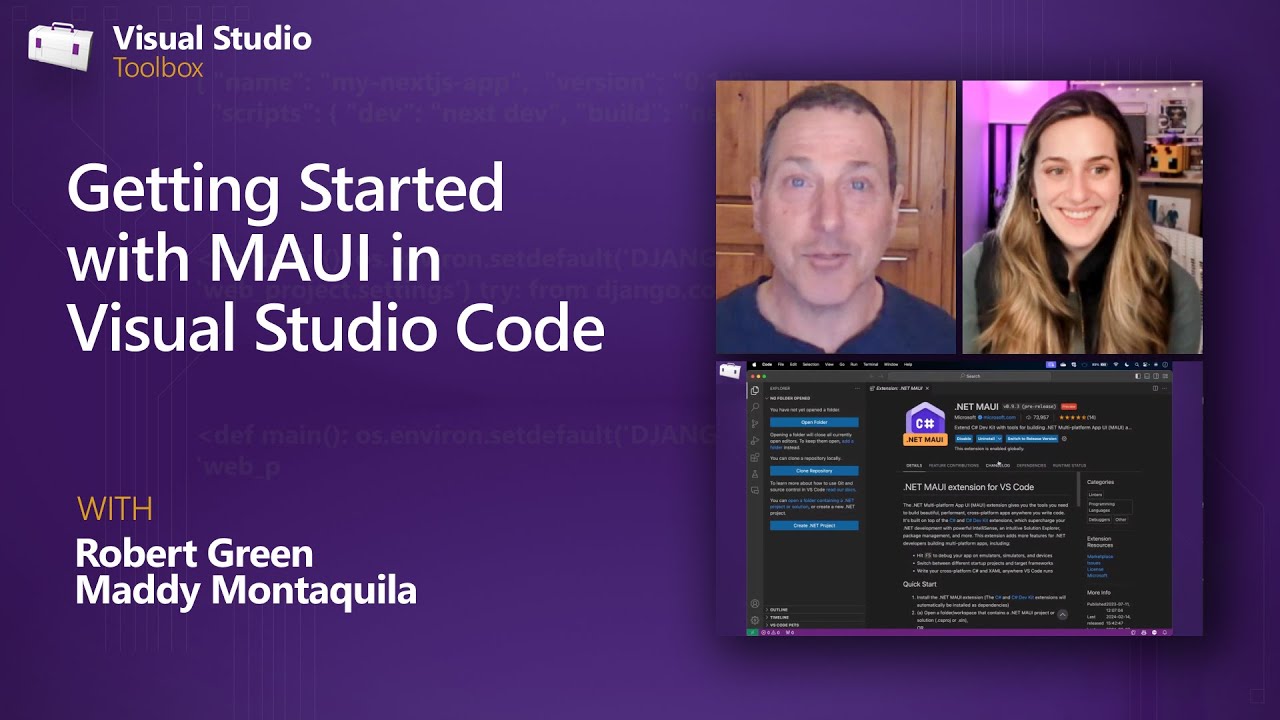
There is some help from IDEs like Visual Studio on Windows and Xcode on macOS—but if you run into issues, it helps to know what’s going on under the covers.
Do I Need a Mac to Target iOS/iPadOS?
Ah, the age-old question. The answer is yes and no. Every .NET MAUI app targeting iOS/iPadOS is a native app package that has to be built with Xcode running on a Mac—but it does not need to be a physical Mac on your desk. As long as Visual Studio/CLI tooling can reach a remote Mac running on the network or in the cloud, you should be fine. Again, if you run into any issues with certificates/profiles, it would help having login access to the macOS machine.
Do I Need to Pay Apple?
It depends. If you just want to do ad-hoc deployment to your iPhones/iPads, a free Apple Developer account with physical hardware will suffice. If you need to target the Apple App Store or do in-house enterprise distribution, you need to be enrolled in the Apple Developer Program or the Apple Developer Enterprise Program respectively.
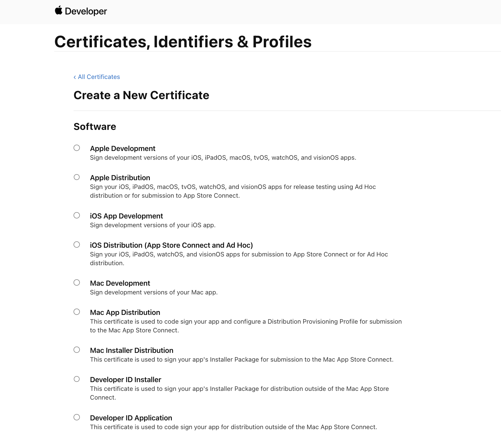
What Type of Certificate Should I Use?
New certificates can be created from the Apple Developer Portal using a local/remote signing authority. While there are a few certificate types, the newest and most flexible ones are marked as Apple Development/Distribution—just get those for the most bang for your buck.
Can I Create My Own Certificates?
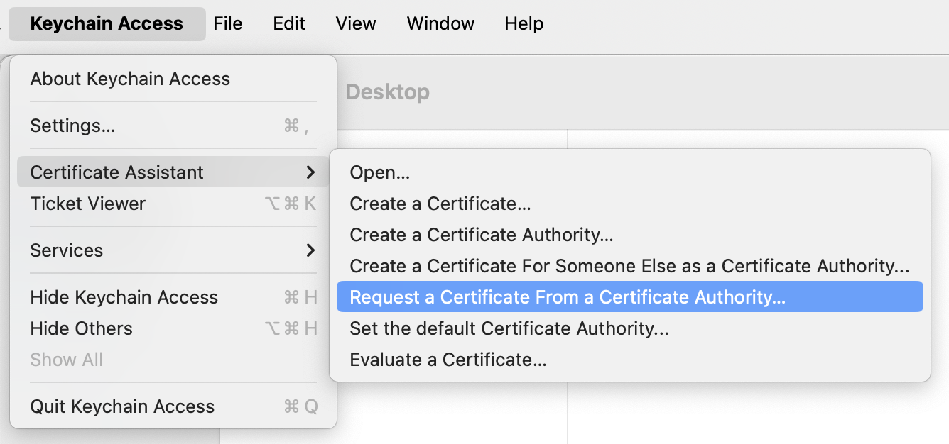
Yes. Open the Keychain Access app on macOS and hit CertificateAssistant -> Request a Certificate from a Certificate Authority. Download the Certificate Signing Request and use the file in Apple Developer Portal to create a new Certificate—you can then download and have the certificate installed in your Keychain.
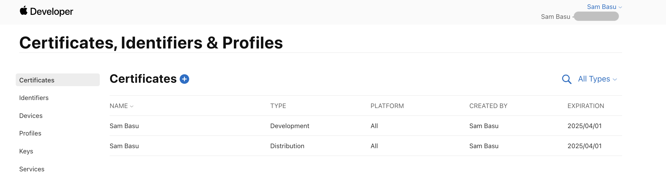
Can I See My Certificates?
If you have created the certificates correctly with the sigining authority, the Apple Developer Portal lists them all. You can also clean up and only keep the ones you need.
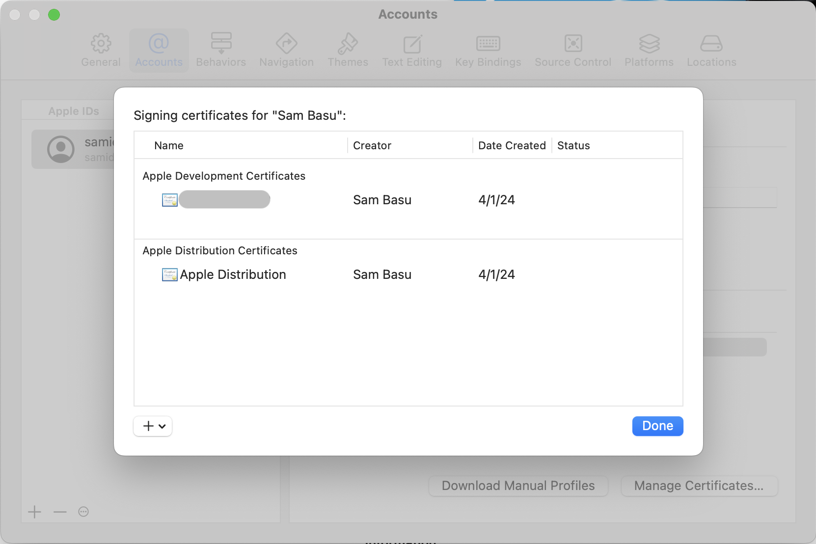
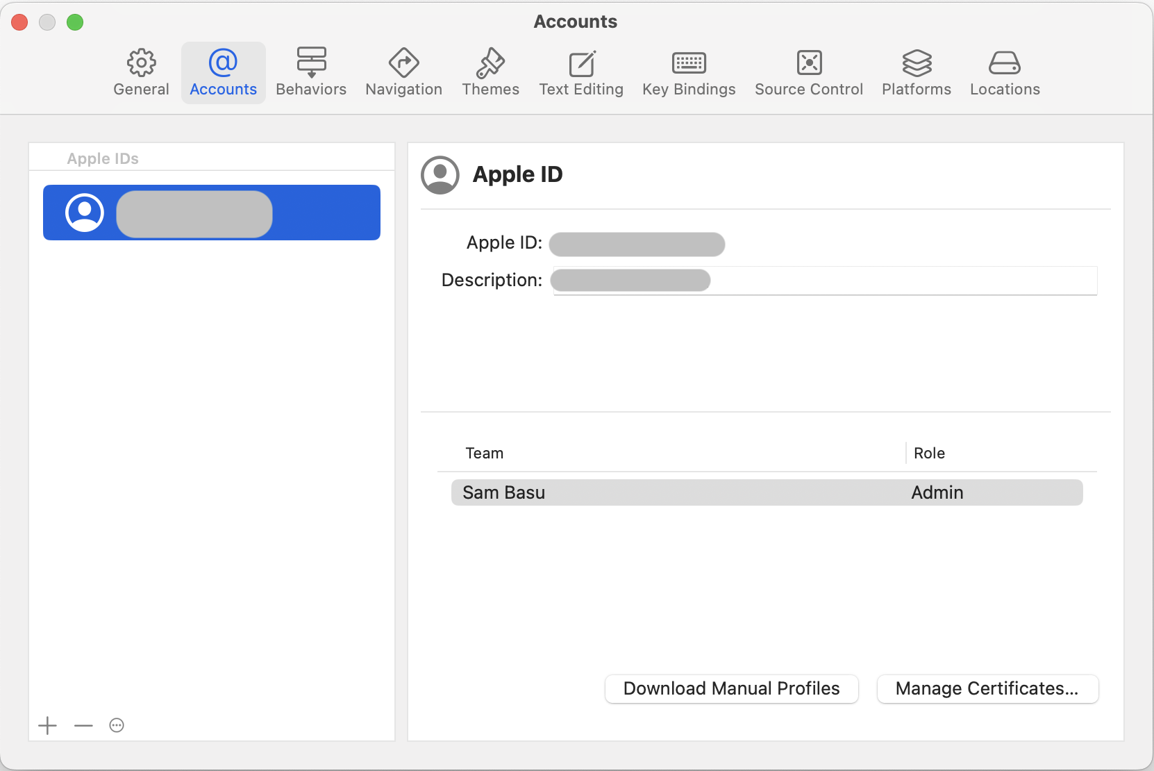
Can Xcode Create the Certificates?
Yeah, it is indeed easier. Fire up Xcode while logged in with your Apple Developer account, go into Settings > Accounts and hit the little plus (+) sign to create Apple Development/ Distribution certificates.
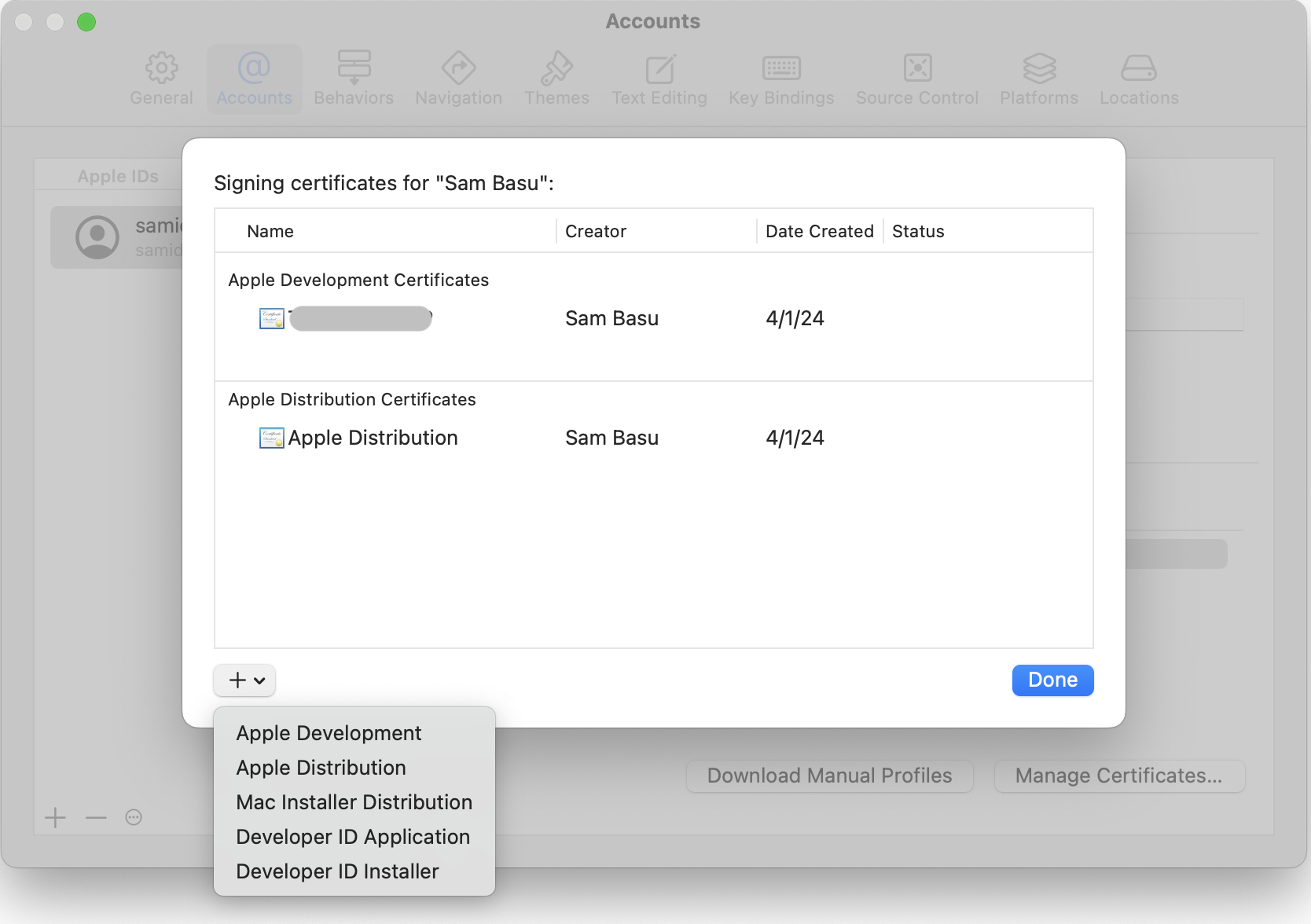
How Do I Know Which Certificates Are Being Used by Xcode?
Same place—Xcode lists the certificates in use. If you created them in the Apple Developer Portal, you’ll want to make sure Xcode picks them up.
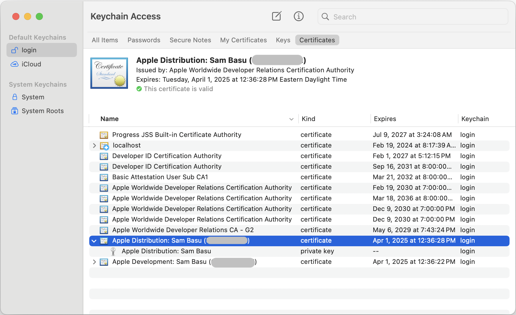
How Do I Know Certificates Are Installed Right?
All installed certificates show up in the Keychain Access app—you can search by name. Each certificate will also have a corresponding private key. If you don’t see everything right, cleanse and recreate/reinstall the certificates again.
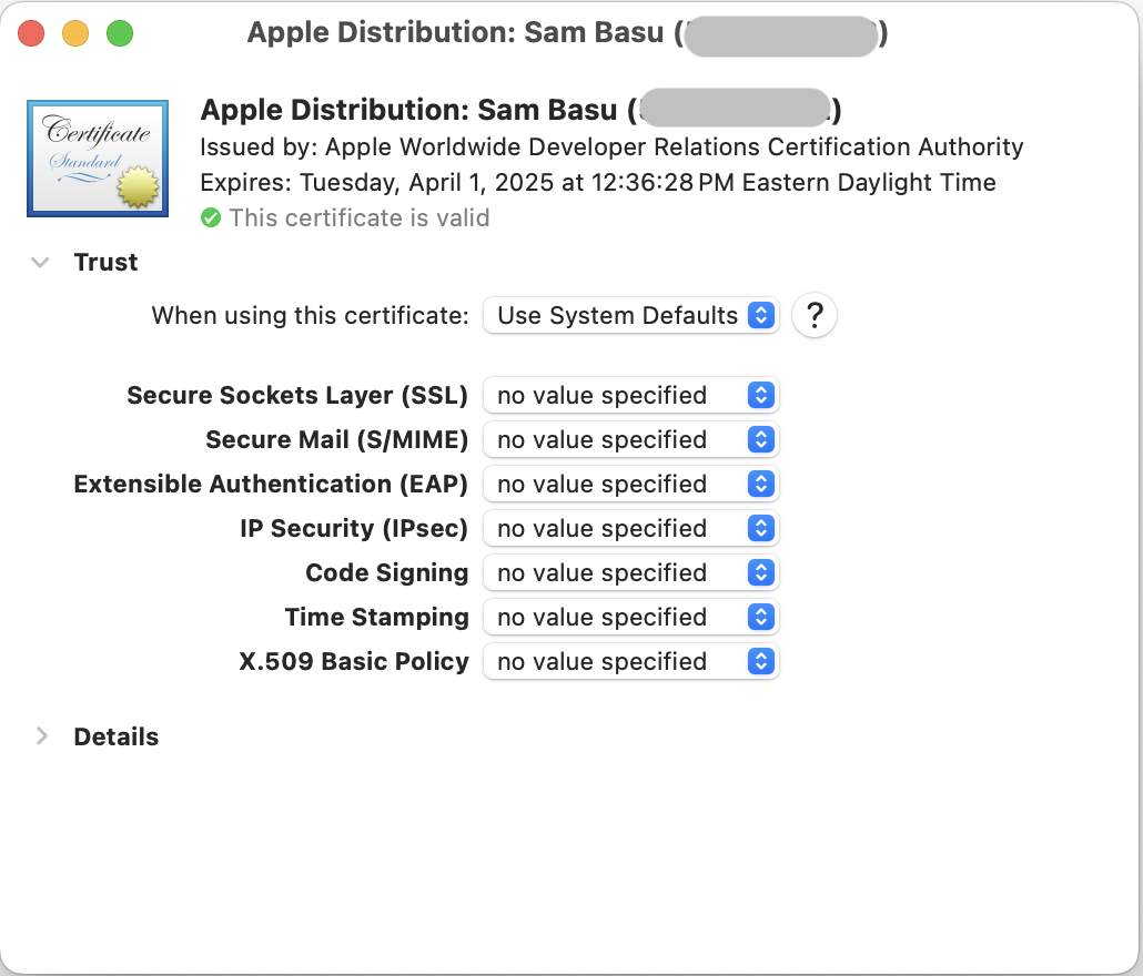
Is My Certificate Trusted?
Open up your certificate and you’ll see some trust settings. You may leave things at System Defaults, or change it to Always Trust especially for code signing. Oh, and you’ll want to make sure the certificates are valid—newly created certificates have a one-year lifespan.
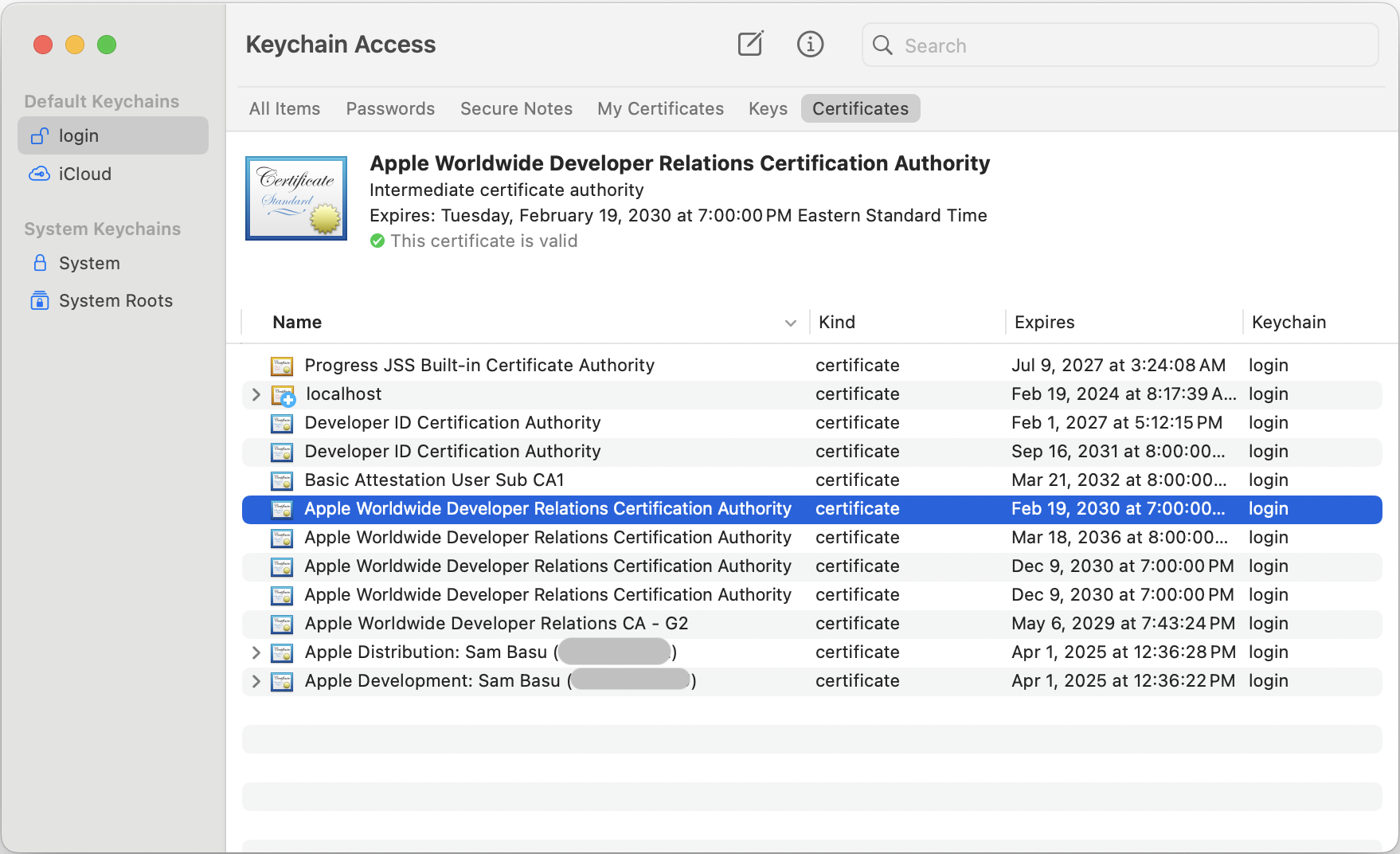
What Are Apple Certificates?
In addition to your own certificates, you’ll also need an Apple Worldwide Developer Relations generic certificate—this one has a public key and is used in the toolchain. Xcode should have installed this, but sometimes things are not in place. Without the Apple certificates, your certificates won’t be valid either. So, head over to the Apple certificate authority and get the generic worldwide certificate—the latest ones are G3/G4/G5, or just get them all.
Do All Certificates Need to Have the Same Trust?
OK, this is important and can be a trip-up when your app code signing fails. Your personal certificates and the Apple certificates must have the same trust level for code signing—either System Defaults or Always Trust.
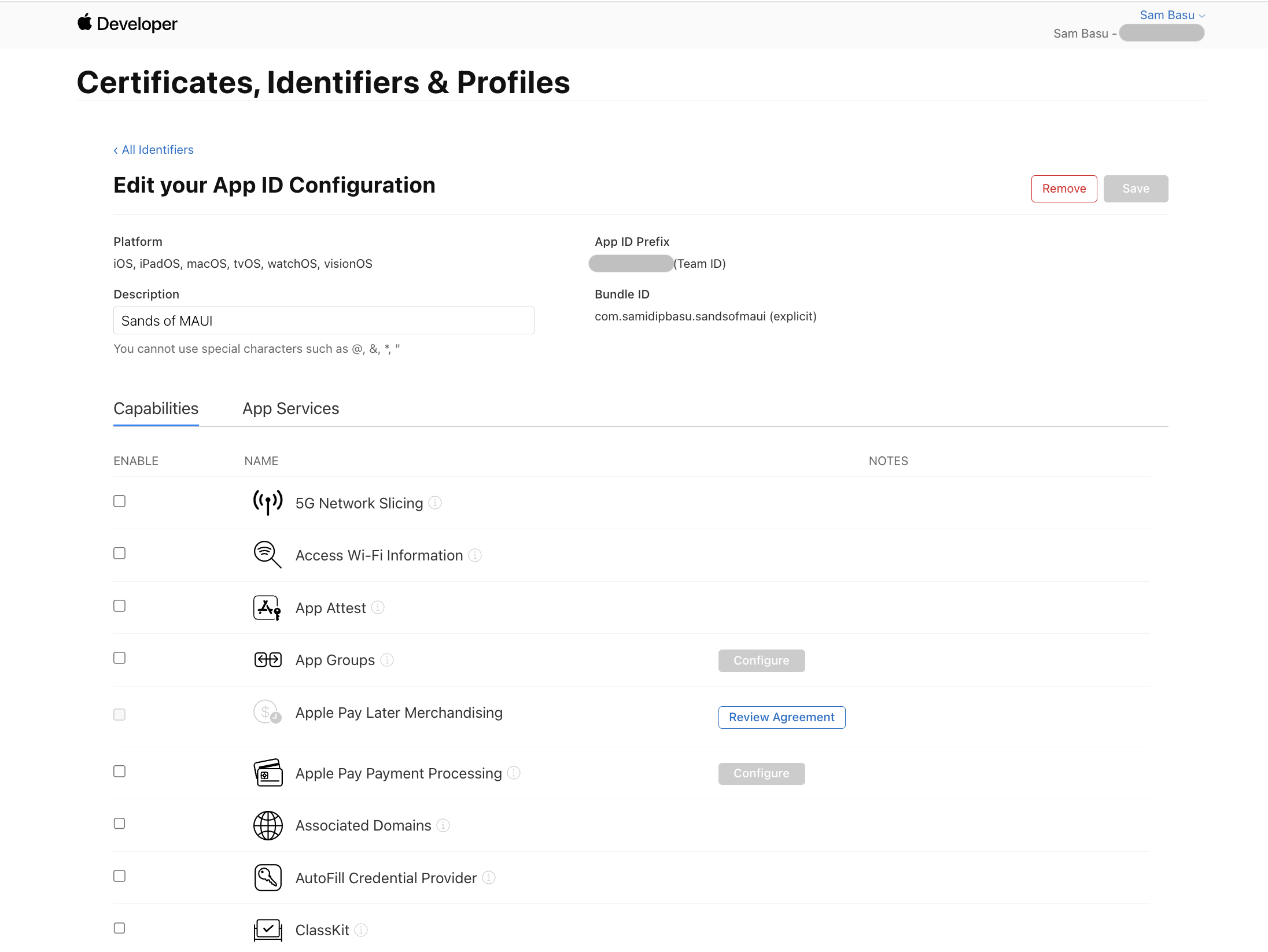
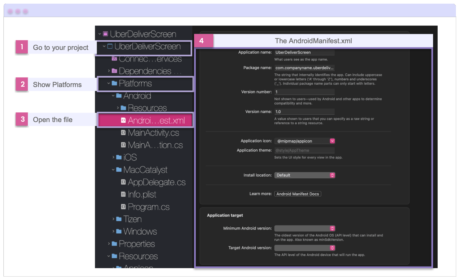
What About App Identifiers?
With certificates all squared up, the next thing to define is your app identifier—the unique way to identify your app. You want to make sure it is tied to your Apple account team name and defines the all-important BundleID—this can be generic with a wildcard or explicit for a single app.
It’s usually in the form of com.domainname.appname—up to you, but this must match your ApplicationID setting in .NET MAUI project .csproj file. Also, app identifier is the place where you declare if your app needs access to any particulars device capabilities or Apple services. Some require Entitlements.plist in addition to Info.plist for permissions.
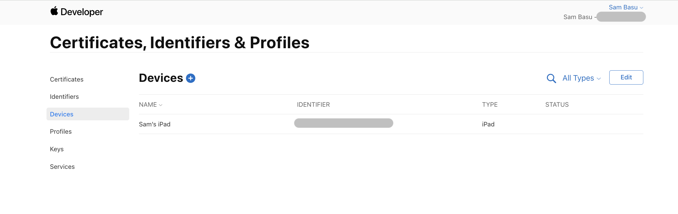
What About Known Devices?
Next up is identifying the iOS/iPadOS devices you want to deploy your apps to. When physically connected to your Mac, Xcode should register the devices—you want to make sure to fully trust your development machine from the iPhone/iPad.
You can also manually add devices. The device identifier is the UDID, which you can look up from Xcode -> Window -> Devices and Simulators or using the command xcrun simctl list to show you all available simulators/devices. Once configured, your devices should show up both in Xcode as well as in the Apple Developer Portal.
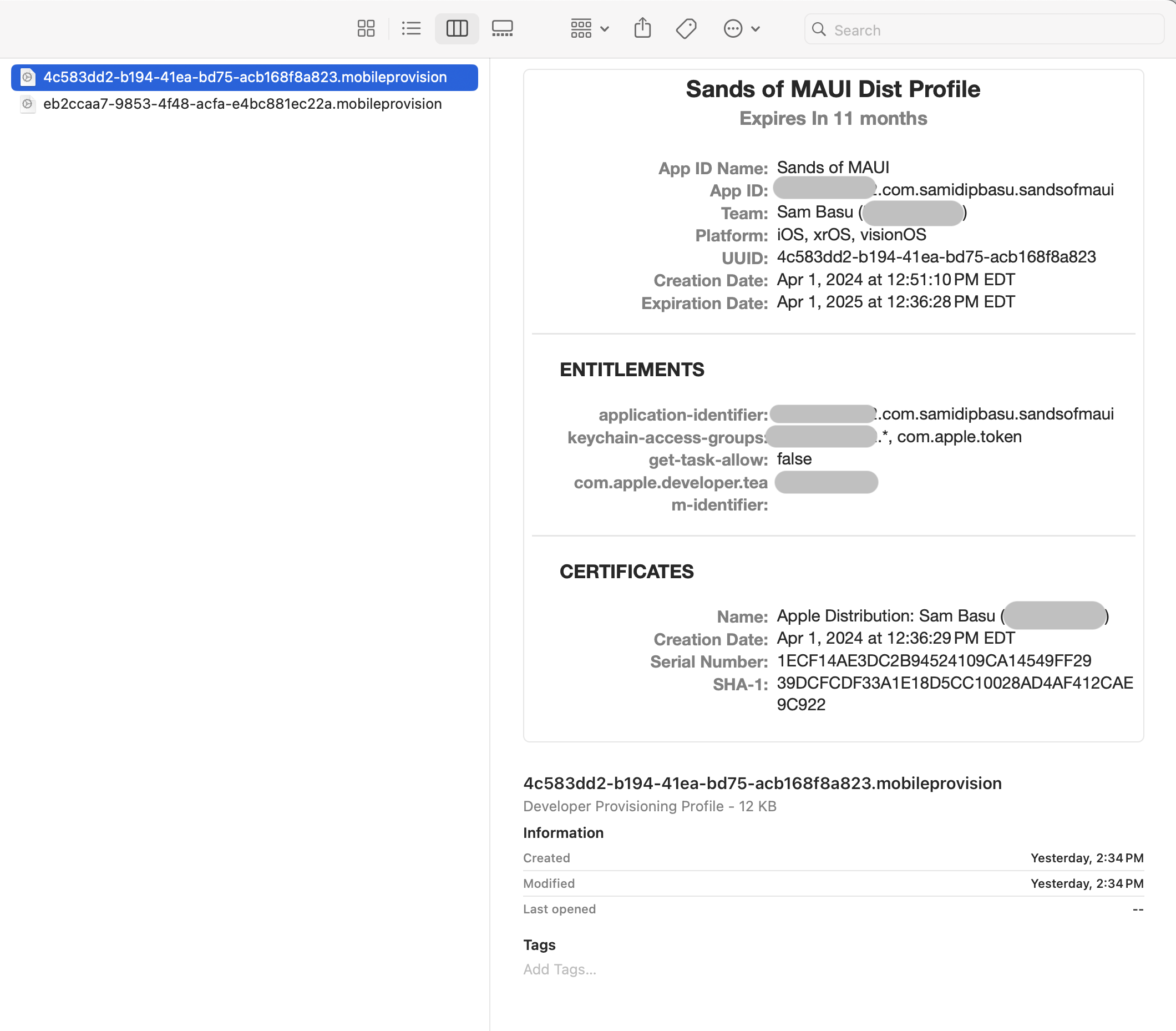
What’s a Provisioning Profile?
An Apple Provisioning Profile is way to manually sign an app—a culmination of several things together. A Profile uses wildcard/explicit app identifier meant to be deployed to target devices—everything signed together with chosen certificates. An Apple Provisioning Profile is essentially a way to say a given app with specific capabilities is signed with specific certificates and meant to be deployed to specific target devices.
How Do I Create a Profile?
While IDEs can create Provisioning Profiles for you, nothing beats having total control, and the easiest way is through the Apple Developer Portal. Hit the plus (+) sign and you are pretty much guided through the selections toward creating a profile matching your app/device deployment needs.
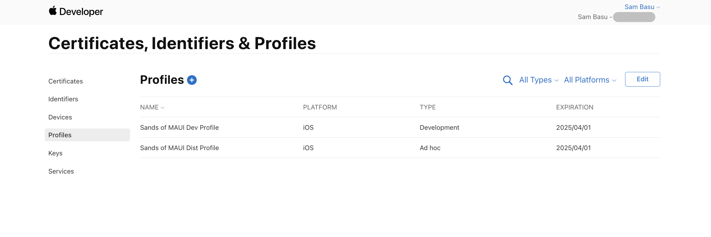
How Do I Use a Profile?
Once a Provisioning Profile has been created and listed on the Apple Developer Portal, you can simply download it locally—information contained in the file would be needed for Release builds to create app packages that can be deployed to chosen devices.
Should Xcode Download Profiles?
While you can download/manage the Provisioning Profiles, one of the sure shot ways of making sure Xcode is using the right ones is to let Xcode download the Profiles itself—press of a button from the Settings->Accounts screen.
Where Are Profiles Kept/Used from?
You pressed a button in Xcode to download the Profiles—did anything happen? Ah, another little roadblock. Xcode does download all available Provisioning Profiles from the Apple Developer Portal and stores them in a safe place—~/Library/MobileDevice/Provisioning Profiles to be accurate.
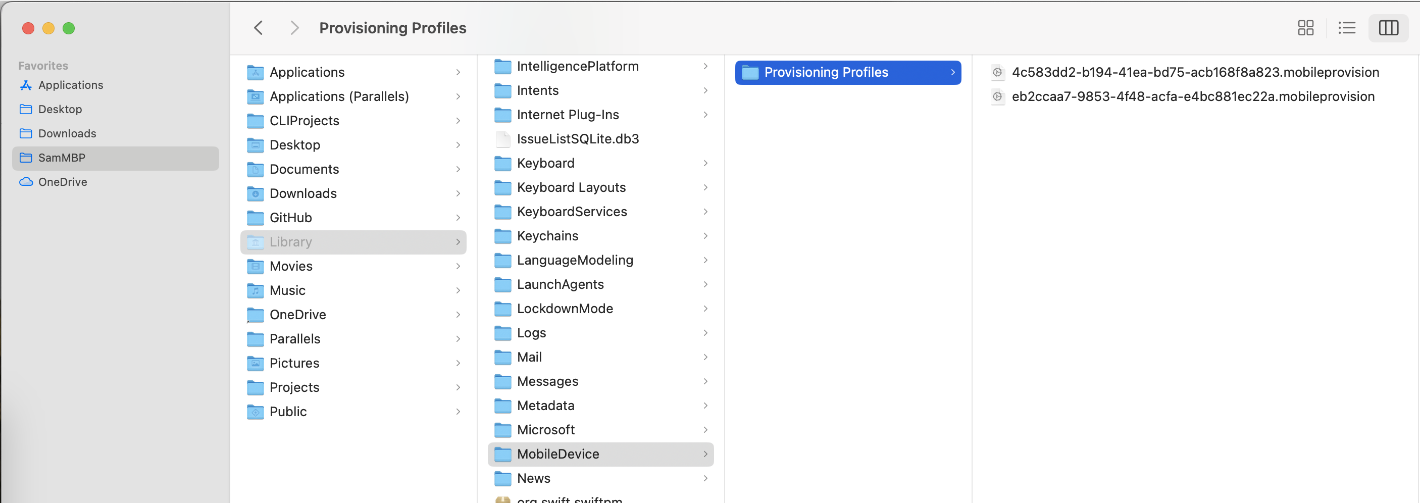
Why Are Downloaded Provisioning Profiles Named Differently?
Ah, welcome to another gotcha. When Xcode downloads the Provisioning Profiles, it saves them with random GUID file names—same files with same content, just named differently. Build commands can sometimes struggle to find a matching Provisioning Profiles—you will likely have to point to the right files by their GUID file names.
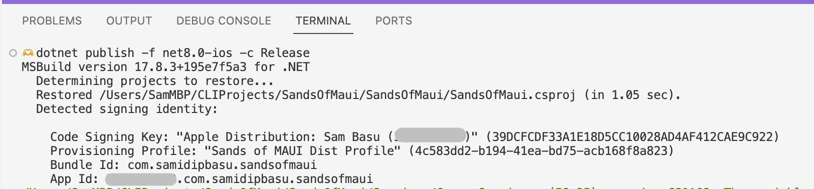
How Do I Build My App in Release Configuration?
.NET MAUI apps produce executables for each Target Framework—these are native app packages with all dependencies/resources bundled in. You want Release build to deploy to iOS/iPadOS devices. So here goes:
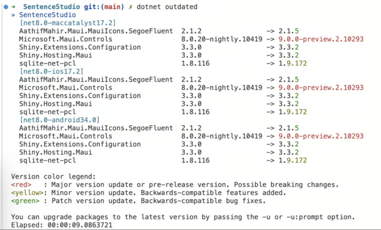
dotnet publish -f net8.0-ios -c ReleaseI Need More Project Settings?
The .NET Publish command actually takes in a lot of parameters—for code signing and other details. Instead of having long commands with changing parameters, it is prudent to have build configuration defined conditionally in the .csproj file itself. Here’s a sample from mine.
<PropertyGroup Condition="$(TargetFramework.Contains('-ios')) and '$(Configuration)' == 'Release'">
    <ArchiveOnBuild>true</ArchiveOnBuild>
    <EnableAssemblyILStripping>false</EnableAssemblyILStripping>
    <ProvisioningType>manual</ProvisioningType>
    <RuntimeIdentifier>ios-arm64</RuntimeIdentifier>
    <CodesignKey>Apple Distribution: Sam Basu (########)</CodesignKey>
    <!--CodesignProvision>Sands_of_MAUI_Dist_Profile</CodesignProvision-->
    <CodesignProvision>4c583dd2-b194-41ea-bd75-acb168f8a823</CodesignProvision>
</PropertyGroup>
What If Build Does Not Find My Profile?
With the named Provisioning Profile in project settings or CLI command, you might encounter build errors where the Profile could not be found. You may have to switch to pointing out the explicit GUID file name for the Profile, like I had to switch to in my project settings. It’s exactly the same file, just saved with a GUID—you’ll see new files every time you have Xcode download the Profiles.
How Do I Know If the Build Is Using the Right Artifacts?
If you configured everything correctly, the Build will kickoff without complaining in red. You’ll see the named Code Signing Key and Provisioning Profile being picked up for your given App ID. You may want to clear out your bin/obj directories for fresh build outputs.
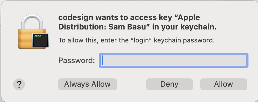
How Do I Know If the Build Is Signing My App Package?
Once your code builds fine with all dependencies, code signing will ask for access to your keychain the first time. This is the last step in producing a signed app package.
What Do I Get with a Build?
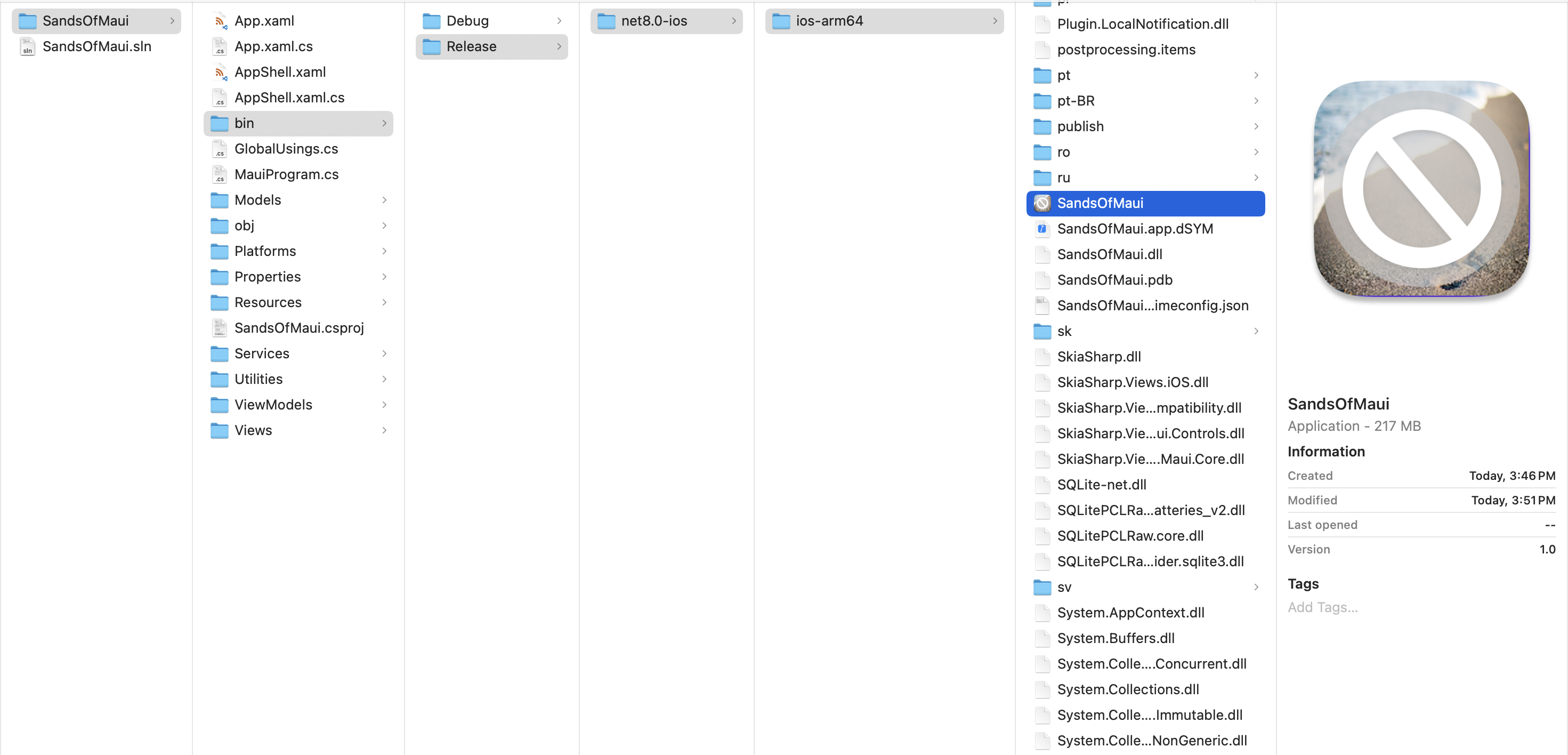
As with any other .NET MAUI build, you’ll get a platform-specific build for iOS—this time in Release mode. The Build produces various artifacts for parts .NET needed along with all dependencies—in the folder is also the precious .ipa file, the iOS app executable.
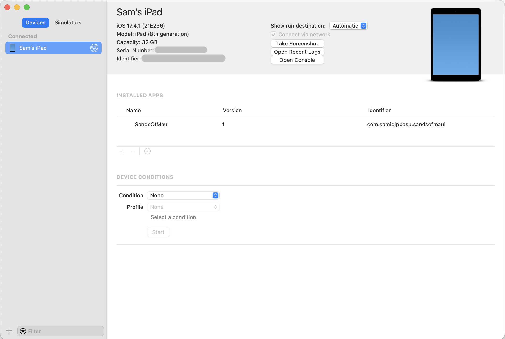
How Do I Get a Built App on iOS/iPadOS?
Once you have an .ipa file for a given app for a given device, side-loading it is easy. Xcode presents the list of devices. Simply hit the small plus (+) sign to add an app to be installed on the device. You can also do the same from Finder by dragging the built app .ipa file to the device window.
What If My App Looks a Little Blah?
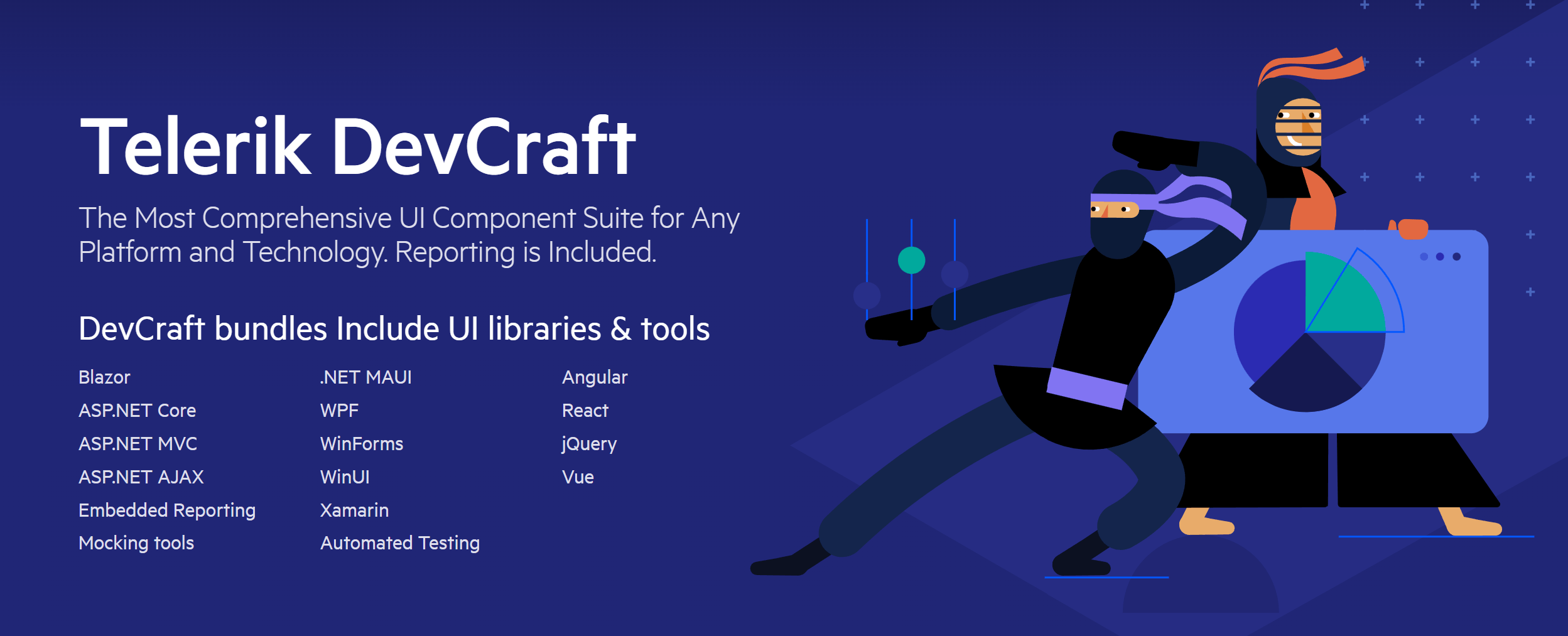
Ah, welcome to the world of self-doubt. When you deploy your app to iPhone/iPad devices, it will be, for the first time, running next to professionally built gorgeous apps. It’s ok if your app doesn’t look as good yet. You are serving a specific purpose with your app and you can always iterate. Also, reinventing the wheel for good UI/UX can be futile. Consider bringing in some polished performant UI components, like in Progress Telerik UI for .NET MAUI.
How Do I Distribute My App for Testing?
If you are using the Apple Distribution certificates, you can side-load your app to any number of devices—as long as they are registered individually and the devices are included in the Provisioning Profile used. For broader in-house app distribution, a few things can help. Look into Apple Developer Enterprise Program, Apple App Store Connect and the Apple Configurator with your Mobile Device Management (MDM) solution.
Am I Ready to Push My App to the App Store?
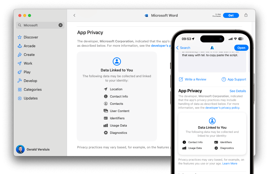
If you are satisfied with on-device testing, the next lucrative step might be to submit your app to the Apple App Store. While you get ready, there is one new requirement to be aware of—Apple is introducing a new privacy policy for including privacy manifest files in all apps targeted for iOS, iPadOS and tvOS platforms on the App Store. This will be mandatory as of May 2024, so you might as well get started toward compliance for any new apps headed to the App Store.

Everything Works—What Should I Do Now?
Congratulations on powering through and getting your beloved .NET MAUI app on Apple devices. Time to celebrate: Go skydiving. Climb the Everest. Dive with sharks. Throw a big party. Eat, drink and be merry.
]]>


 On Android


